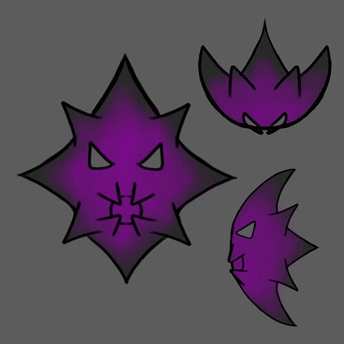
So made a rough design of this Makuta-Phantoka-style Kanohi I thought of but it feels kinda bland in the detail department. Any idea on how to improve it?
So a couple of thing that I can think of is that phantoka-era masks tend to pull towards the back of the head a fit bit, and they also often have some sort of either ridged or recessed bits on them.
The mouth part reminds me of the mutated mask undeath at least one of the other versions.
As a suggestion, I would try to add more slitted holes around it to make it feel like a Kanohi, similarly to the Great Pakari, Great Komau, Great Calix, Noble Komau, Noble Huna, etc.
Top and bottom of the mask looks to symmetrical for my taste.
You could remove the bottom big spike thing (cus I’m also thinking if this mask would exist irl, so posabilty is taken into account for more head movement) and make the two small spikes at the top slightly larger, plus some holes and ridges recommended by others.
In my head this makes the silhouette much more unique and interesting.
This mask has lots of potential for sure! Good luck designing it further.
