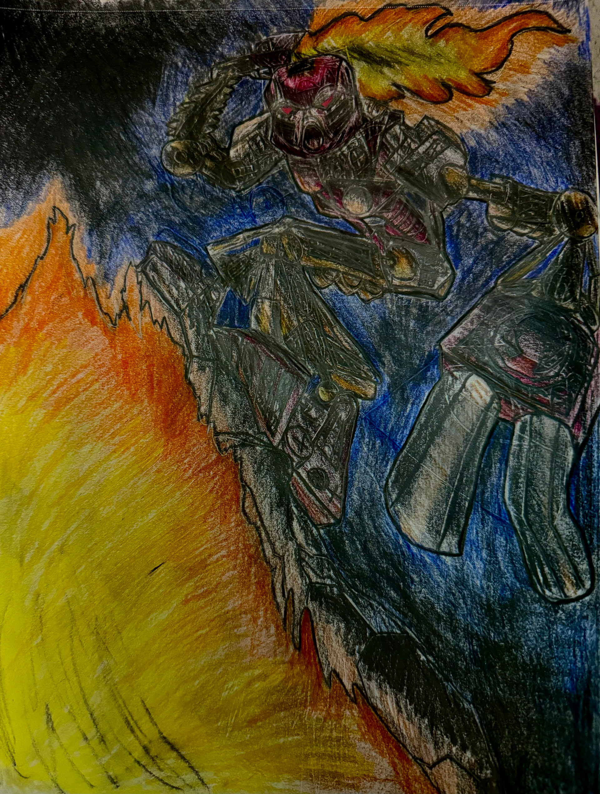
Tahu drawing (THE RED ONE!) {Redrawn}

Hello, and HAU are you doing? I have quite the HOT topic for you today, and I think I was on FIRE when I made this. I hope you all enjoy this funny scribbling. And if you are wondersing “hOW Wong DiD Ya tAK?” I took over 10 hours across two days. It was fun!
Here it is, btw.


I was inspired by Sabretooth’s “Don’t Go Hollow” drawing, which is why it is dark.
And here is the sketch:

And here is the original I drew when I was 10!

I was quite the artist, was I? lol.
And that is the red thing you look at.
Let me know what you think in the Replies section below!

8 Likes

He looks almost dark green. And that hand is BIG. Nice action shot though, very epic looking.

5 Likes

Certainly a significant improvement over the last eight years. I have to echo akiro’s sentiment, however, in that the hand seems a bit too large for the perspective, and the fingers are quite plump and juicy (ready to be picked and pickled). It would’ve been nice to see more of the ambient glow of the fire and sword across Tahu’s body in the areas closest to it, much like the artwork of Sabretooth’s you cited.

Still, the glowup is mad impressive. Keep it up!

5 Likes

The pose is a lot better than the original. As @akiro said, he does look somewhat greenish, but it’s not a bit deal. I particularly enjoy the shading. Great work!

4 Likes

minor typo, unsubscribing

I quite like this. Proportions need some work from this perspective, but overall it’s not the worst I’ve seen.

6 Likes

I love the shading here in the uncolored version! I also like the proportions, they work well with the pose. Reminds me of the old posters for Bionicle.
1 Like

For some reason, I don’t see it…

I exaggerated it on purpose. I like it big!

Agreed :smiling_face_with_sunglasses:
Master @Ghid -io:

Well, I wouldn’t say it was 8 years…

It’s a stylistic choice, and I was well aware of the exaggerated proportions when I drew it.

I tried, but I couldn’t erase the colored pencil, so the glow is there, but not obvious. :pensive_face:

Do I see praise?! :scream:
@Zhyndea the master:

Well, back when I drew the original, I didn’t know how to do perspective on things other than blocks.

Maybe he feels a little sick lol.

Shading always elevates a work! :face_holding_back_tears:

@Minethuselah has joined the server

PLOT TWIST: The typo was on purpose, and you fell for the bait!

Nioce

It is just fine the way it is. I like spindly Tahu quite a lot. Adds to the mood. And it is fun to draw.

@DuneToa :

Me, too!

FINALLY, SOMEONE WHO UNDERSTANDS STYLEISTIC CHOICES! LETS GOOOOOOOOO!

Well, yes, Tahu surfing comes from those posters and is usually the main inspiration for artworks such as this. Those posters were so cool!

Hey, you read ‘till the end!

3 Likes

I promise I can read and am not old and decrepit :old_man:

3 Likes

The colored version of Tahu is so dark and yet so epic. Please do more art like this. It is wonderful.

1 Like