I was feeling a bit nostalgic.
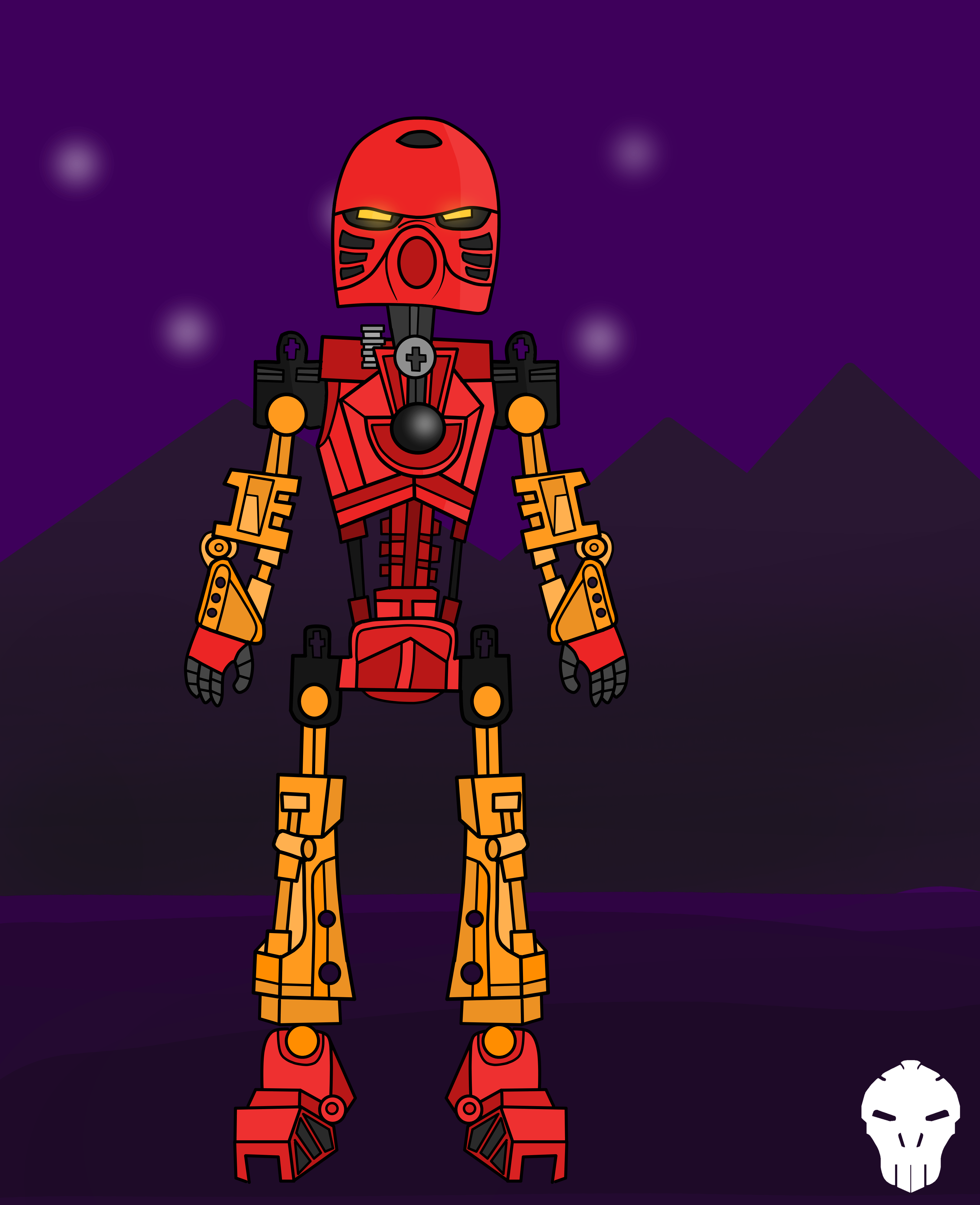
Without crappy background:
Feel free to share your thoughts on it!
Criticism is always well recieved.
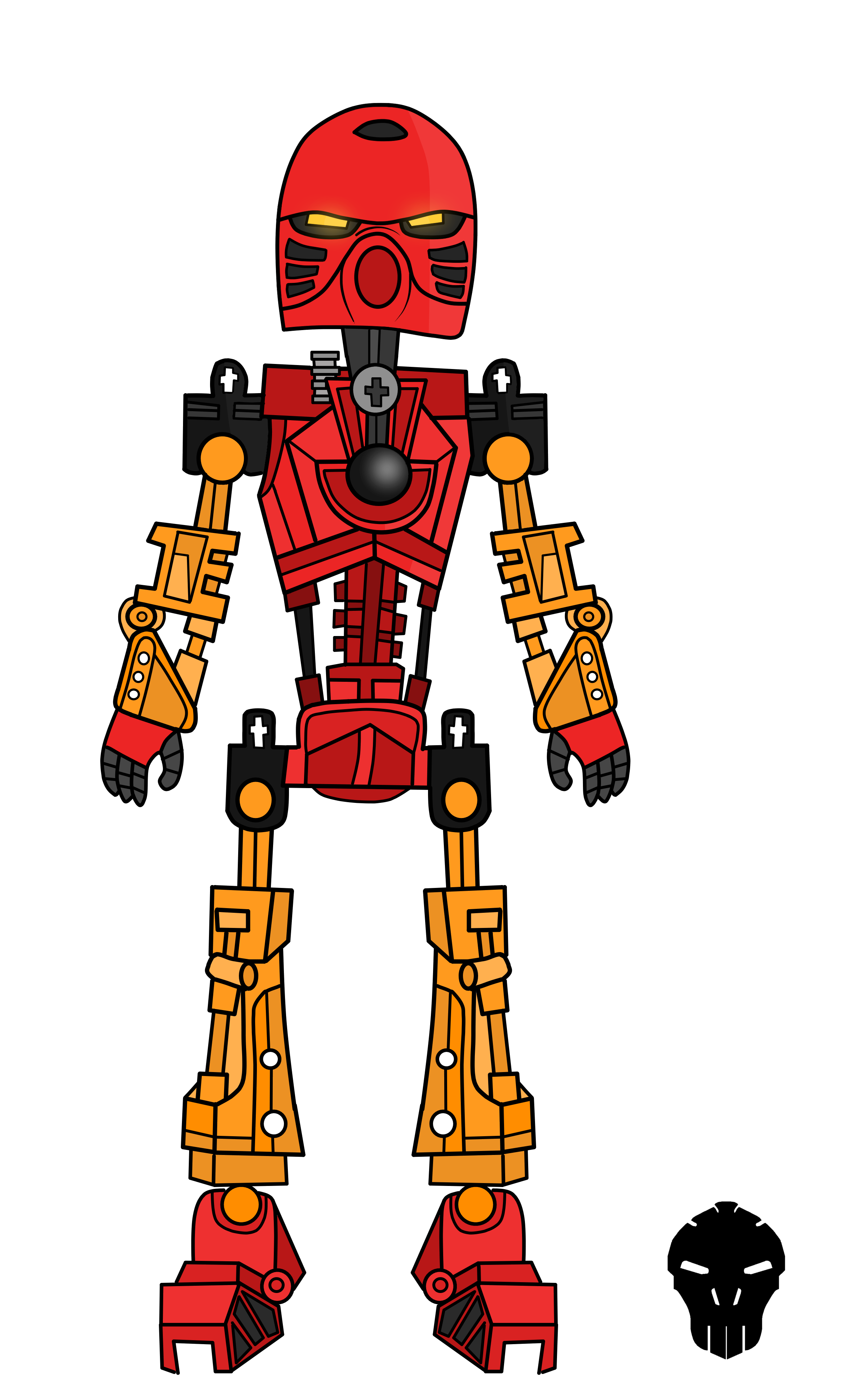
I was feeling a bit nostalgic.
Without crappy background:
Feel free to share your thoughts on it!
Criticism is always well recieved.
I feel like the arms are way too small. They should really be lengthened.
Looks neat! But that lil’ ridge curve you drew between his eyes makes him look like his sniffing something 
It was supossed to look like he was frowning :b
He still looks like he’s frowning without that wrinkle
His arms are much too small.
And as Rockho said he kinda looks like he snivelling
This is looking pretty good, but I think there’s still quite a bit of improvement when it comes to proportions. Here are a few of the things that I have noticed:
I do realize that this is your own artistic rendition of the character, and not a complete copy of the physical set, but the issues in the design choices tend to lie in how the overall thing looks, and less-so the accuracy to the source material.
Besides perhaps giving him broader shoulders and longer arms, I think this is pretty solid.
Uh basically everything @OculusNuva said, a lot of the changes will help make the thing look not only set accurate, but functional as an actual being.
Like many have said i think the arms are just to short. The rest is pretty good
I think the arms look a bit out of proportion, but the rest look great!
######the arms are so small tho
I don’t think the arms are necessarily small, I think the shoulders should be broader.
Someone looks irritated.
I think it is OK, but the arms are too short.
I’m definitely a fan; the drawing really does a good job of showing lighting on the torso and behind the eyes, and there’s a lot of high-quality detail. Aside from the aforementioned comments, there really aren’t any wrists and his hips are a little wide. Glad to see this.