The Brand-Spankin' New TTV Website

Hey, guys! As you’ve surely noticed by now, the new website is finally live!

If you’ve anything to say about it, good or bad, be sure to let me know here. We’ve come this far and I’ll be darned if I’m gonna let any bugs survive. Granted, I don’t think there’s any, but there’s only one way to be sure…

21 Likes

The twitter link is a kewa, this is glorious. FEED MEEEE

The new site looks fantastic

5 Likes

Well.
It’s very blue, and very bright.
This makes for quite the contrast between subdued blue of the boards, ut only time will tell.
I haven’t delved much deeper than that, but so far, so good…

6 Likes

the baby blue is too bright IMO, side bar seems really disproportionate, and featured video seems quite big. other than that it’s cool i guess.

3 Likes

Looks alright IMO. Also like how @Mesonak 's little icon thing in the upper corner is the skull spider mask :smile:

2 Likes

I love it. Well the way it looks any way.

Yeah same problem

Looks pretty much the same to me.

#THE BRIGHTNESS IS OH MY WOW

Especially when you compare it to the Boards.

13 Likes

I went on the site for like,5 seconds and it made my computer lag like crazy.

But yeah it does look good.

3 Likes

Love the inspiration from Gali Uniter’s colour scheme :smile:

Also, great work @prpldragon

3 Likes

It’s running a bit slowly for me, but it looks good. I hope the Boards get updated with that new banner though.

Also,
#A NEW TOPIC IN NEWS WHAT IS THIS

5 Likes

http://i.imgur.com/EHrPzEA.gif

I LOVE IT

3 Likes

ooooooooooooooooooooooooooooo pretty.

Shoutout to the amount of Exx in the background.

Good work.

1 Like

My initial reaction:

“WHERE AM I?! WHAT SORCERY IS THIS?!?!”

In all seriousness, though, the new site looks great–really professional, nicely organized, and very eye-catching (not that the old one wasn’t).

From what I’ve seen it looks really good, although I don’t think mobile has the new layout yet.

1 Like

Totally took me by surprise. It looks fantastic!

1 Like

Great way to come back to the boards! I Like it!

1 Like

This is fantastic! Great job to whoever put this together, looks so clean. Reminds me of the overhaul BS01 did a while back :slight_smile:

4 Likes

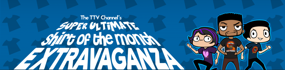
I was sad to see the cool comic book wallpaper disappear and get replaced with a brighter color, but I guess it is okay (by that I mean wow it is very bright and does not relate to the somewhat darker aspect of Bionicle). Another thing is that there is not much of a variety of t-shirts being sold (and the one that is being sold kinda bums me out because I was planing on making a ■■■■■ similar to it, but now if I do everyone will think I am a ripoff). It was cool how the old store had a variety. Is the whole idea with a different ■■■■■ every month mean that there will be only one ■■■■■ available, or will there be other shirts sold as well for longer periods of time? Other than that the site is easy to navigate.

1 Like