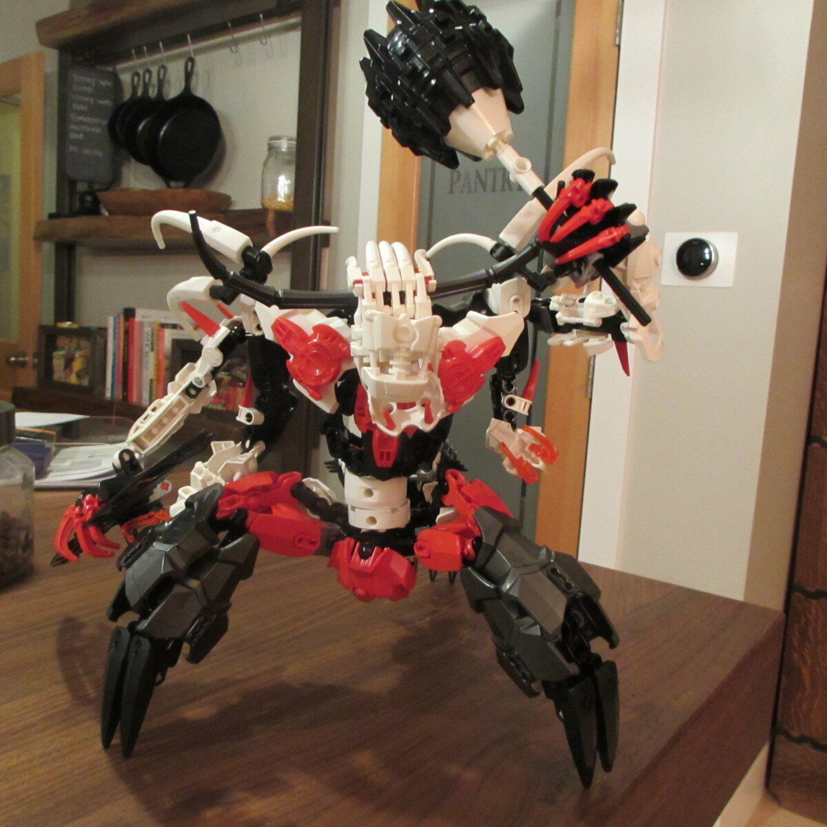
Hey guys! I’m Aquaris and I’m back with Zcheneraq. Now, I know the name is completely insane, but I like it so I’m not going to change it. I did give him a nickname, kinda like how the dark hunters had code names back in Gen 1; so you guys can address him as: The Bull. Anyway, here are some pictures!
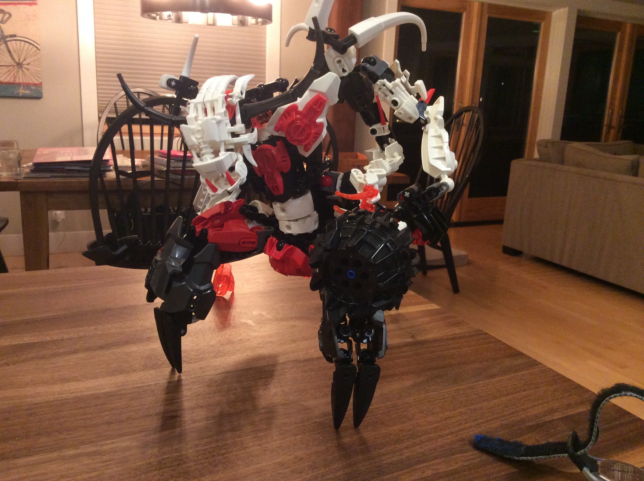
His back is pretty bare-bones, and I’m trying to find a fix to that.
Anyway, that’s The Bull. I tried to change everything you guys told me to in the last one, but all the while still keeping my personal style and his personality.
I appreciate criticism as long as it’s constructive and respective.
Thanks for your time!
-Aquaris: Guardian of the sea
P.S. I’M NOT CHANGING THE NAME! So don’t ask… jeez.
I feel like black rakshi lower legs with white studs would work better for the arms to finish the skeletal look. I’d also replace the upper arm armor for ccbs shells to have the smooth bone look. The lower pair I like though I’d instead use metru legs instead of vahki for the lower arm parts.
also try to add a different color tooth peice (x2) to the head as eyes.
It might be my love of non conventional humanoids but other than the arms I love this.
Thanks dude! I’ll try to switch up the arms and see how that looks.
Yeah, I tried to change the normal humanoid look with this and I think it turned out nicely!
It looks rather cluttered, and is a tad difficult for me to tell what’s going on. I’d recommend trying to make some parts (like the upper arms to the shoulders) flow a little better,
My child I will continue to complain about those arms because they look nothing like a skellington
Seriously though they don’t. They look like regular Bionicle limbs because they still have all the mechanical bits and same aesthetics.
He’s still cluttered…not much changed there…BUT, the coloring is way better than it was before and the nickname (although it doesn’t fix the actual name being keyboard slam material) is quite fitting.
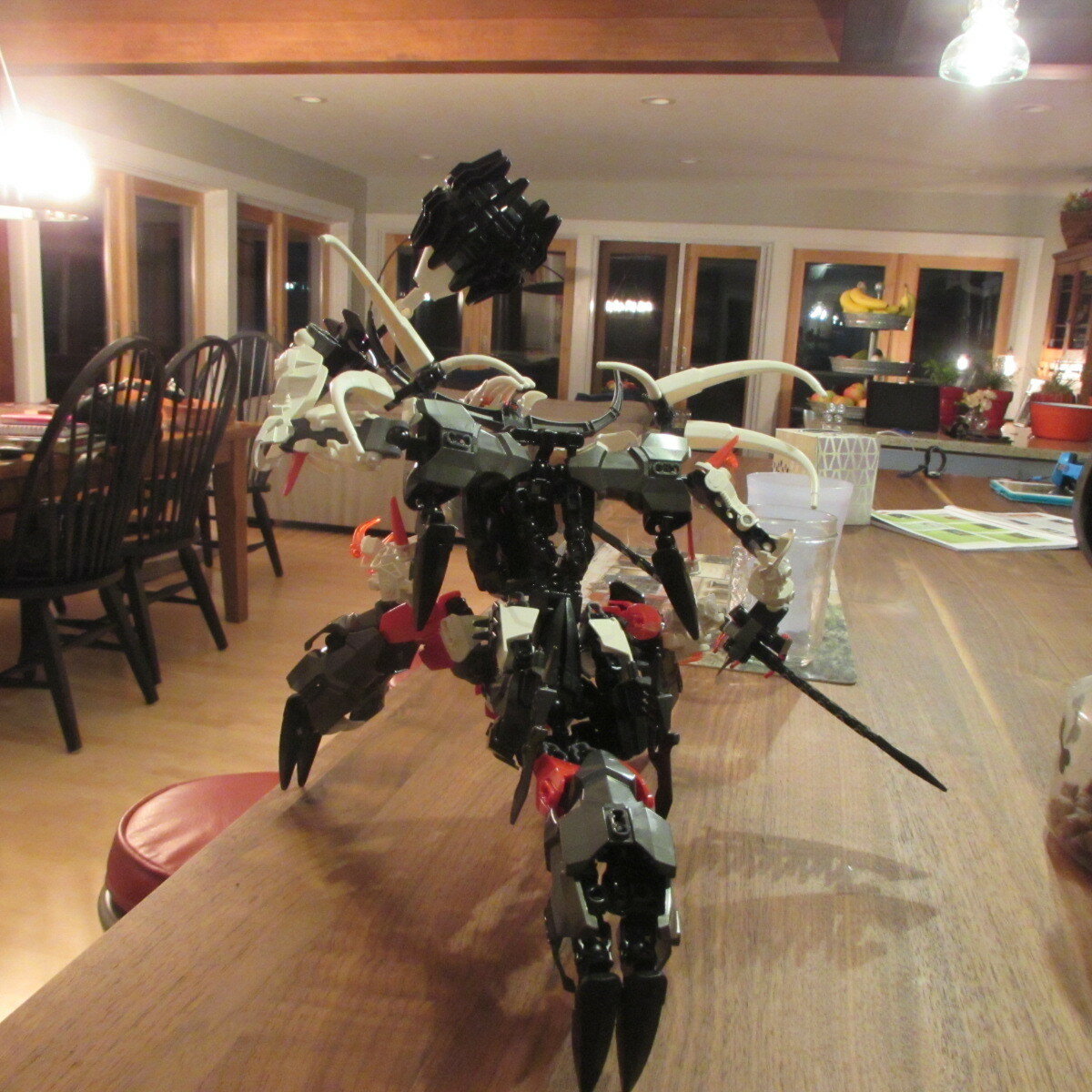
A marked improvement. Still got a long way to go, but it’s significantly better than it was before.