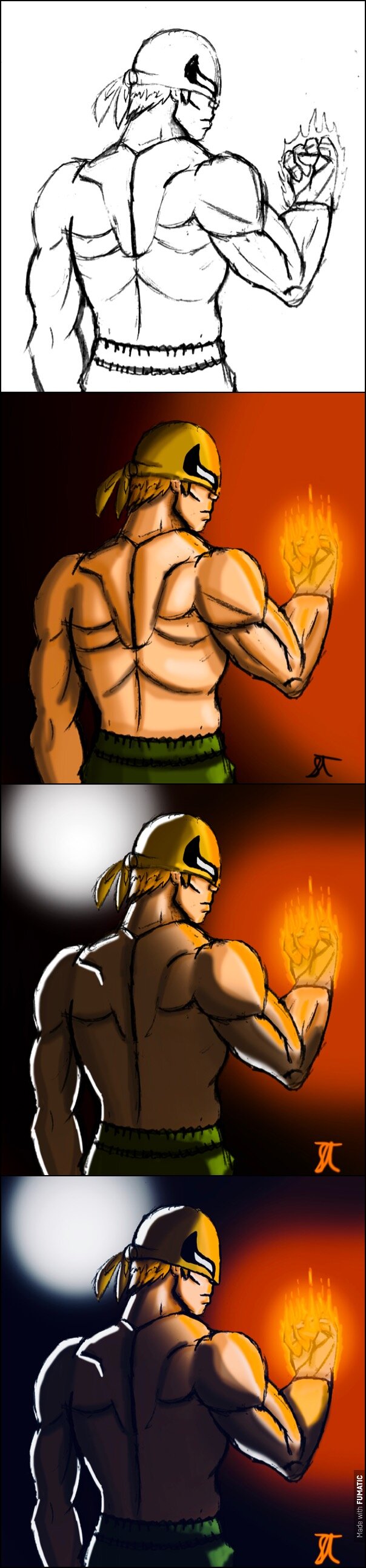
Edit #3 because third time’s the charm, amiright? I WILL get this thing to look right.
Got to try some new techniques on this one.
Edit #3 because third time’s the charm, amiright? I WILL get this thing to look right.
I’m likin’ it, I’m likin’ it.
A couple tips to consider:
You may not want to make certain parts of the muscle structure so strongly outlined, especially on the back. Even very powerful muscles won’t be so well defined, so I recommend using softer lines or colors to indicate the ripples in the skin where you can see the muscles.
I really like the shading, but I do feel as though it could be a little bit darker. The light source (I’m assuming it’s only from the glowing fist) should not be able to reach certain parts of his back, namely the left side of it. Additionally, since it appears to be the only light source, I think that the shading ought to be a little stronger as opposed to softer.
Keep it up!
Thank you so much for the advice! Now that you mention it, I did kind of screw up the lighting. I’ve also never drawn back muscles before, so this is very helpful. I’ll see if I can update the drawing to make more sense.
No problemo. Good luck!
I agree with everything @Yveran said, and another tip I’d offer is to avoid shading with black.
It looks like for a lot of the shadows here you simply used a transparent black, which tends not to look very good. What I’d recommend is to pick a color for your shadows (for this image I’d pick a darker blue, since it’s complimentary with the orange light source), then change the blend mode of your shadow layer to “Multiply.”
Using Multiply will make your base colors darker and tint them the color you chose, so you’ll see a nice mixing of the blue with the skin color here.
All in all, not bad! Keep improving!
Oddly enough, I didn’t actually use black or gray. It was a darker shade of his skin tone, with a reddish tint. That said, I love the blue idea. You guys are giving me the most helpful feedback I’ve had in a while.
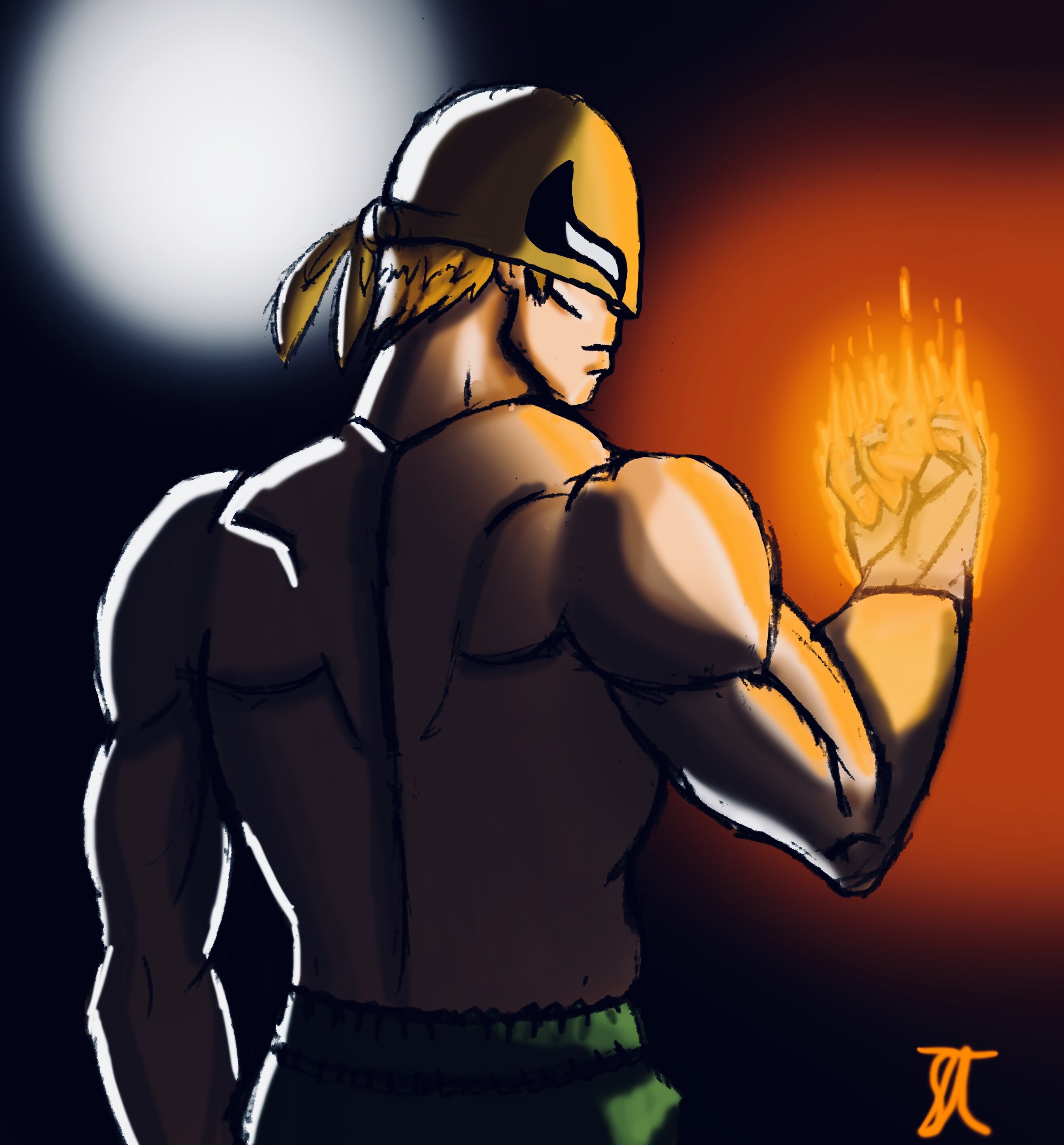
That said, I updated the drawing to @Yveran’s criticism. I’ll see what I can do with dark blue later.
dat shading tho
good job, but like @Yveran said, the muscle outline could be a little softer.
It’s really cool. Something about the mask looks off, though, around the nose. His eyes also seem to high up on his face.
Season 2 hype!
Does it still need work?
[quote=“meepinater, post:7, topic:46373”]
muscle outline could be a little softer.
[/quote] Do you lnow how I could fix that? I tried to make some of the muscles bulge out less.
Mata Nui, how did I miss that? I can’t unsee it now😂 Looks like I need to get edit #2 on the way. Thanks for pointing that out!
you could use a lighter color… maybe not black but a lighter grey or even a soft brown to go with the skin color.
For the outline or the shading? I like black outlines, because it makes for a comic-y look.
maybe you could outline it in a grey, and then do some shading to make it less pronounced… If that works. I usually do my drawings in pencil and then pen, I have yet to do one in color.
Ooooh, I love the last one. Granted, I have a little bias for dark shading, but I think that you definitely improved the piece regardless. Good work!