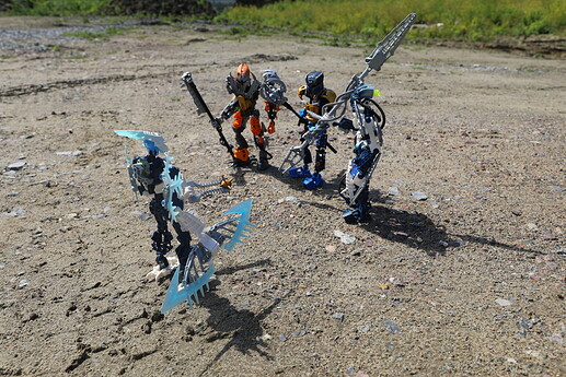
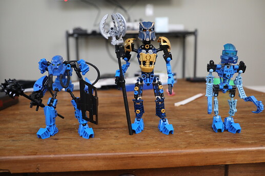
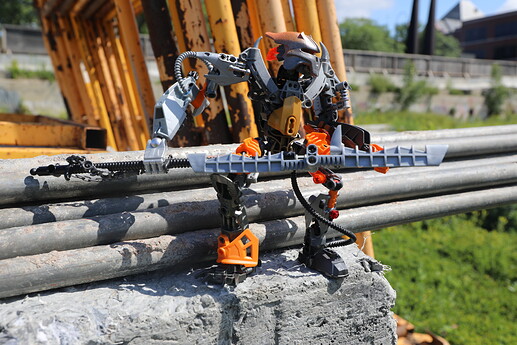
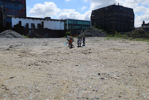
I have been wanting to build the Toa of the unfinished serial “The Yesterday Quest” for a while, the ideas for figure design have changed over the past year give or take, especially with the reveal of the canon weapons (Zaria-Staff, Orde-mace, Chiara-spear) and taking some influence via instagram polls and see what other people may like, as well as my own deeply ingrained ideas for set design. As I become more and more used to the Stud.io program, I have ended up designing these versions of Zaria and Orde via Stud.io before ordering the parts needed thanks to good old BrickLink.
Without further ado, presenting:
The Toa of The Yesterday Quest
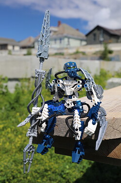
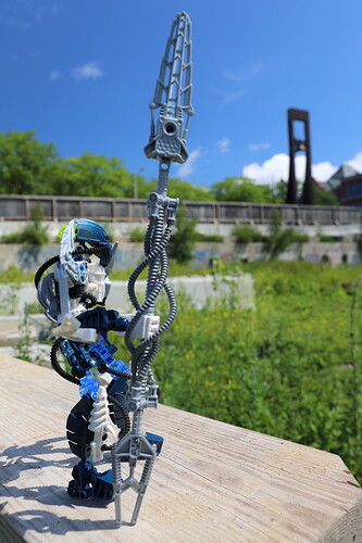
Toa Chiara
The first Toa I worked on to completion was the Toa of Lightning.
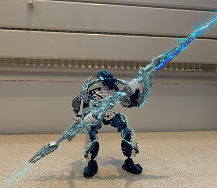
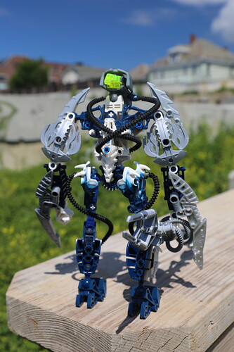
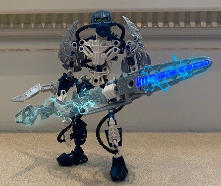
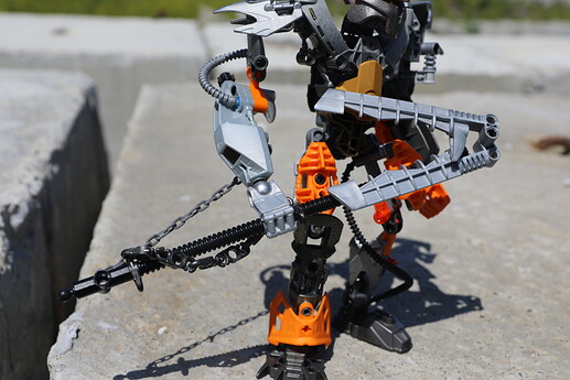
This character went though quite a journey, with the body herself being completed LONG before the rest and stayed in a certain form before noticing some black Mahri breather tubes around, decided to make use of them to go around her legs and body. For what purpose? Maybe to transfer electric energy across her body when she activates her element. Looks cool as shown by the picture below.
Note the Tahnok Kal shields on the back. I could not resist adding the Bohrok Kal of Electricity’s shields on a Toa of Electricity.
And yes, one of her elbow blades is a bit chewed up. I acknowledge that and embrace it to the character design.
As for her spear, it did not take me very long at all to come up with a spear design using a Lehrahk poison spear end and Toa Inika Matoro’s light up ice sword. Add in silver Mahri breathing tubes and some classic silver hoses and voila! A truly electric spear.
Shoot me with lightning for that pun.
Toa Orde
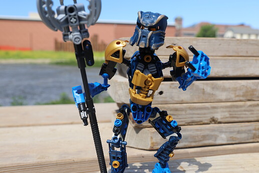
Orde, alongside Toa Zaria, went through major changes. He originally had more of an Inika/Piraka-esque build, but I think you’ll like this design better.
The main inspiration behind Orde’s redesign was seeing Bukkey’s version of the same character. While not so much in design, apart from the mask, but the philosophy behind Bukkey’s vision, making Orde as, to quote Bukkey himself:
“Another prototype of Toa Mata” or “A Toa as a ‘Test type’ with Helryx as the ‘Prototype’”.
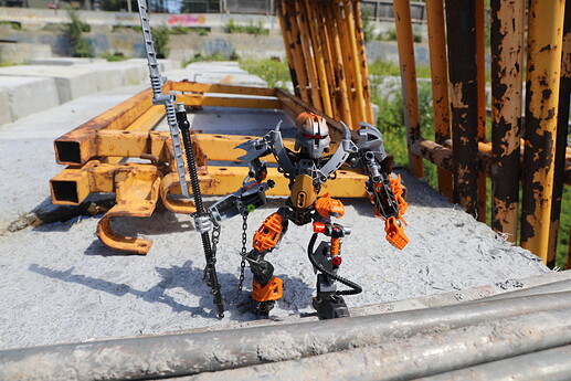
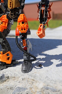
All I did was take that mentality and interpret it in my own design, using a Metru torso to act as a “bridge” between Helryx and the Toa Mata, as shown by the shared Mata foot and pre-Bionicle technic parts forming his forearms and hands. In my head-canon, Orde is among the first Toa to have gear functions, hence his gear design should harken TOWARDS the eventual Toa Mata as shown below.
As for his Mace, you might have noticed some similarities to Toa Helryx’s mace.
Again, this is quite intentional. Taking inspiration with the piece used to get Helryx to “hold” her staff I made it so Orde can hold the staff with two hands as you might have seen earlier. A Toa of Psionics like Orde could hone in his mental abilities to stun the foe just before his Mace physically impacts, sending the assailant flying
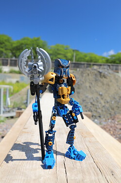
Toa Zaria
Zaria, I built myself a design of him, but unlike Orde, the old Toa Zaria seemed a bit… amateurish looking back.
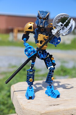
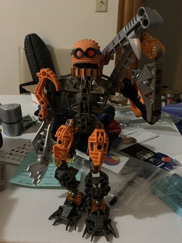
A decent model… And now here’s the new build.
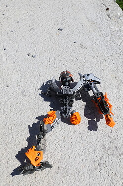
A Toa of Iron on the run from Makuta sent out to exterminate his fellow Iron Brothers, it would be no surprise if he lost at least two of his limbs to grave injury. I was surprised that a few other people have added robot prosthetics to their versions of Toa Zaria.
As for the masks, Zaria’s, alongside Orde’s, might not have been an original choice regrettably, as a rule I also try to make my newer versions stand out from others as most tend to do. While most people have chosen the Kanohi Sanok for Order and the Mask of Adaptation for Zaria respectively, I put it upon myself to paint both masks in a unique way.
Zaria had a few layers of paint to spray on the orange mask, first a good dose of silver, after that a brief wiff of orange paint with some silver to ease it out, then finally dark metal grey around the bottom and left side to signify old burns.
And yes, an improv cleft chin, Kirk Douglas-style. You may notice it.
You might notice that the staff arm looks somewhat like Toa Pohatu Mistika’s arm. Yes, it can spin around, but the attached chain gets in the way. Removing it is fairly easy.
As for his staff…
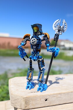
It didn’t take long for my imagination to turn towards the many Chinese martial arts films that feature a staff-wielding character. I also took note from someone else’s idea (I forget who exactly) of making Zaria’s staff like a “swiss army knife.” With that inspiration I took the old design’s weapon and put it on the end of the new staff design and presto! An extendable combat staff that looks both simple to build and lethal looking metal!
All three sets are ready to be submitted to any future contest, wether by DuckBricks or anyone else. I hope y’all enjoyed them.
