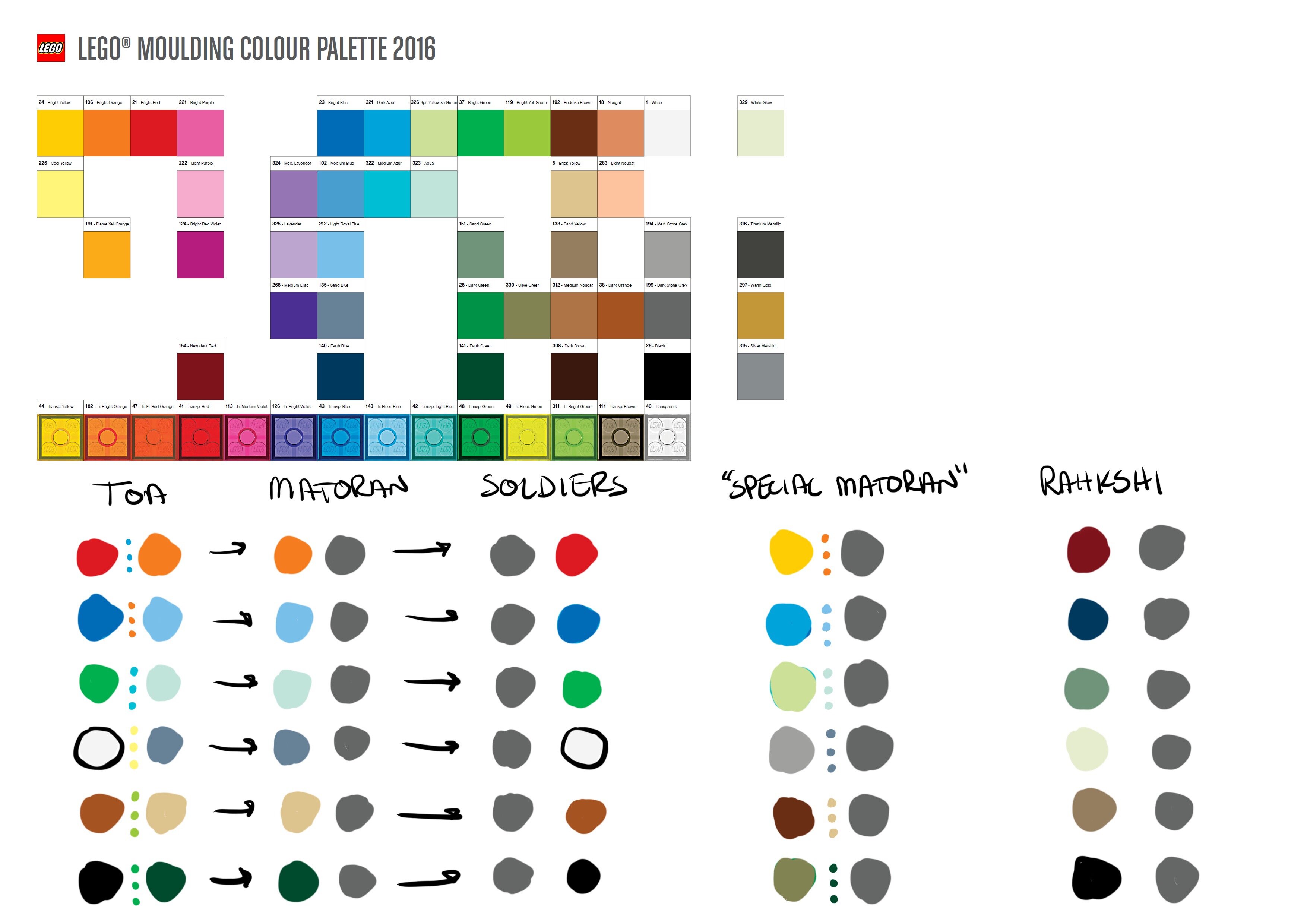
After watching the latest podcasts I wanted to see how it would look if we took lego’s colour palette to differentiate the tiers of matoran, to see if long legs could really work. Personally, I think with the finalized versions of the toa it would be really difficult. To make clear differentiations between the matoran on a small brick scale, you’d need to really simplify the colour palettes. Right now each toa has too many colours, which is why it’s becoming hard to tell the difference between earth and air matoran, etc. I made a rough mock up of a colour palette that I think would work.
On such a small scale, colours need to be really simple, with colours being exclusive to each region, and colour patterns being used to differentiate between tiers. For example, if you have a fire soldier and an ice soldier, their colours should be different enough to tell you they’re from two different regions, but their colours should be placed similarly enough to tell you they’re both soldiers.
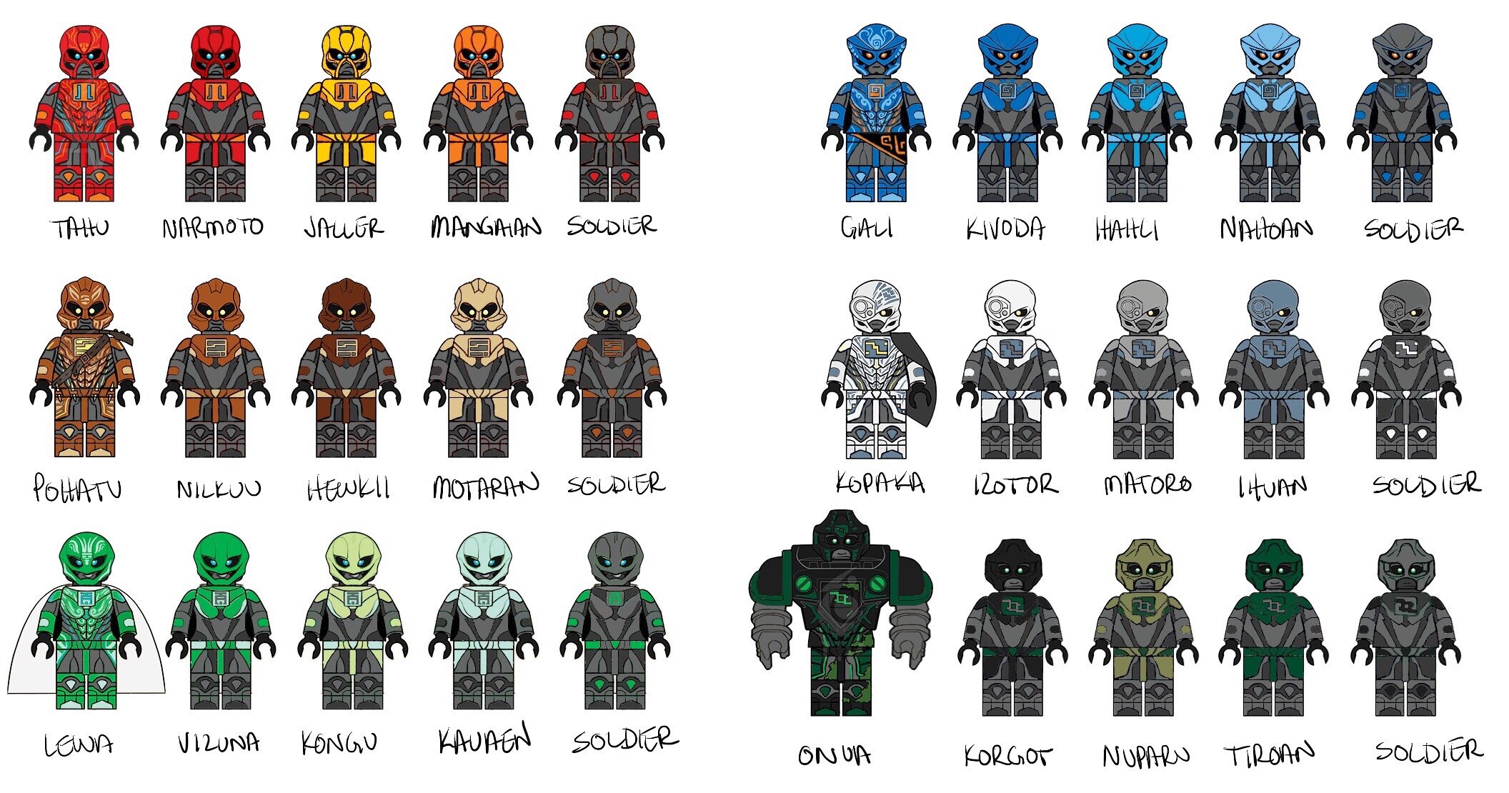
In the pictures below you’ll see that each region has a colour that represents each element. This is each of the toa’s primary colour, and the one that stands out the most. This is the region’s visual representation of power, and can even relate back to their religion. Red is important to mangaians because it represents ikir, god of fire. It shows how powerful Tahu is because he’s coloured red all over, foreshadows narmoto being the ‘chosen one’ because his primary colour is red, and soldiers wear highlights of red as like a form of patriotism, almost painting them selfs in red as they go into battle in the civil war.
Each region also has a secondary colour, in Mangai’s case, orange. It’s the secondary colour of the toa, and gets carried on to be the primary colour of the ordinary matoran in each region. For more important characters like Narmoto and Jaller, they still have highlights of orange to show relation to them being matoran still, but adds enough colour to show they’re more important to the story, without going overboard.
The last colour is dark gray, it’s the secondary colour of the matoran and the primary colour of the soldiers. Basically represents the ‘foundation’ of all brickonicle, like their skin, and also represents armour for the soldiers. Acts to contrast the bright colours of the important characters while demonstrating the unimportance of background characters, letting them blend in more.
I also made concepts for other important matoran, giving them distinct colours, but colours that also make sense with their region’s colour palette so they don’t stand out too much.
Still rough designs, and could definitely be tweaked, but I think it’s a step in the right direction in making all of the matoran visually distinctive from each other! Let me know what you think!