Hello guys!
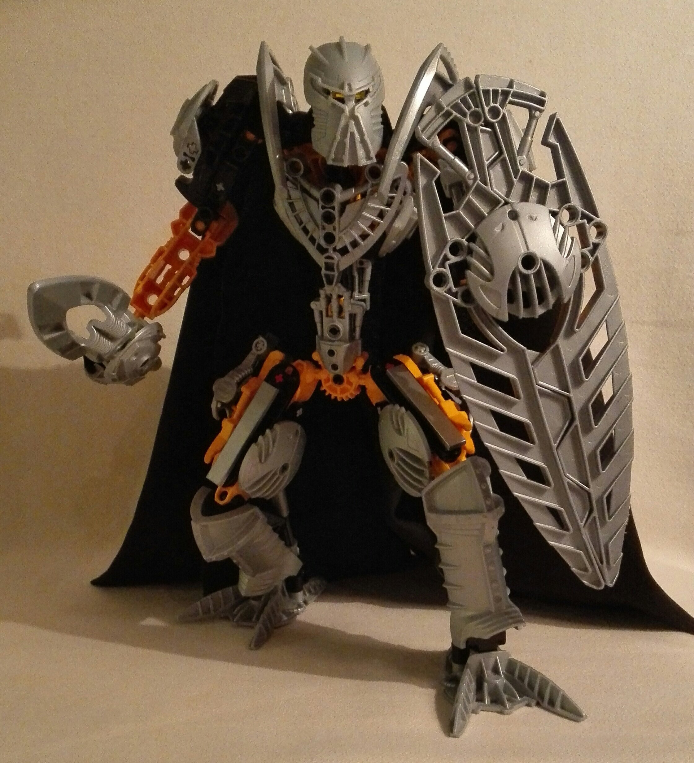
I always thought of him as a noble knight with silver armor.
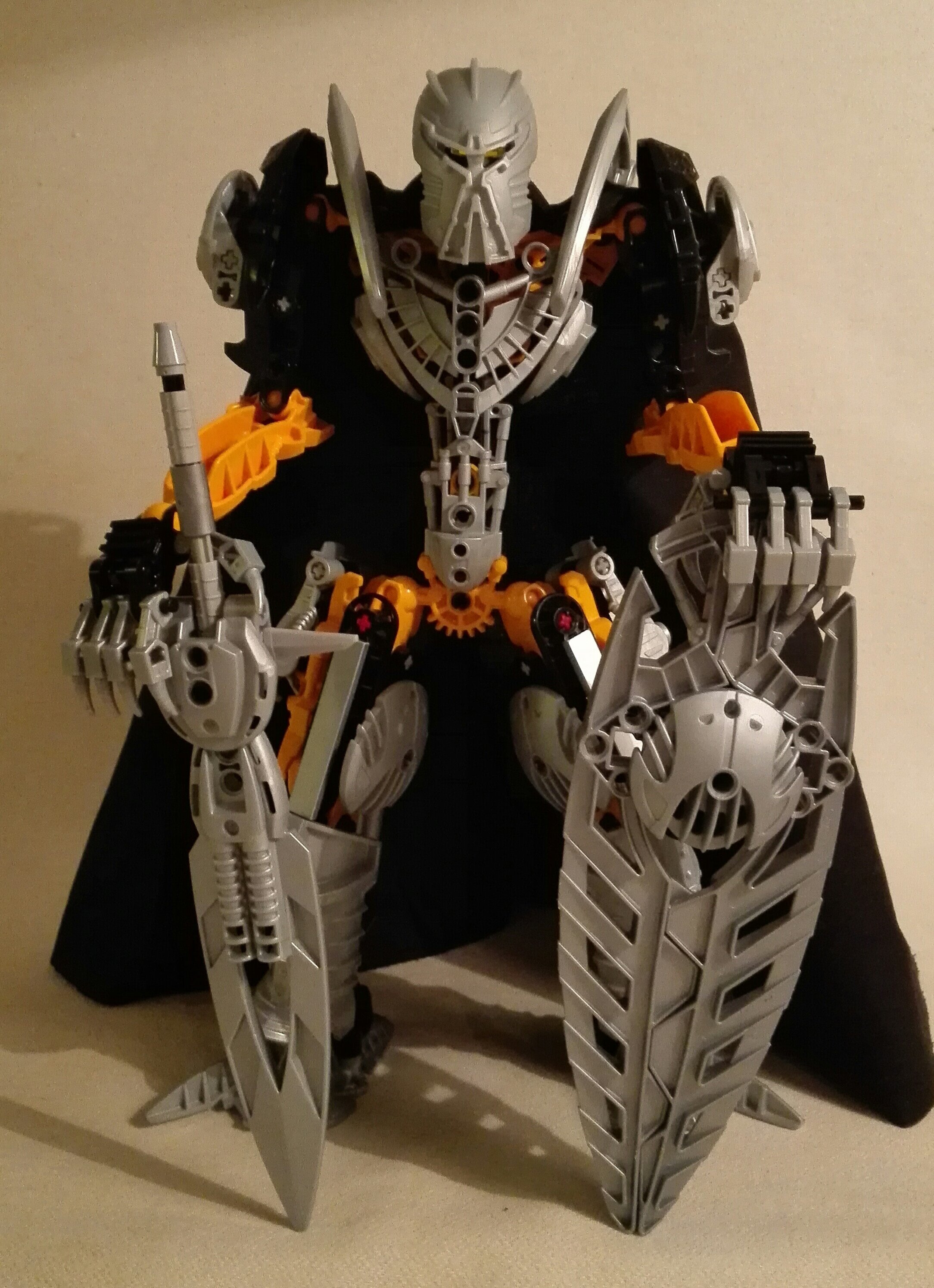
Standart pose:
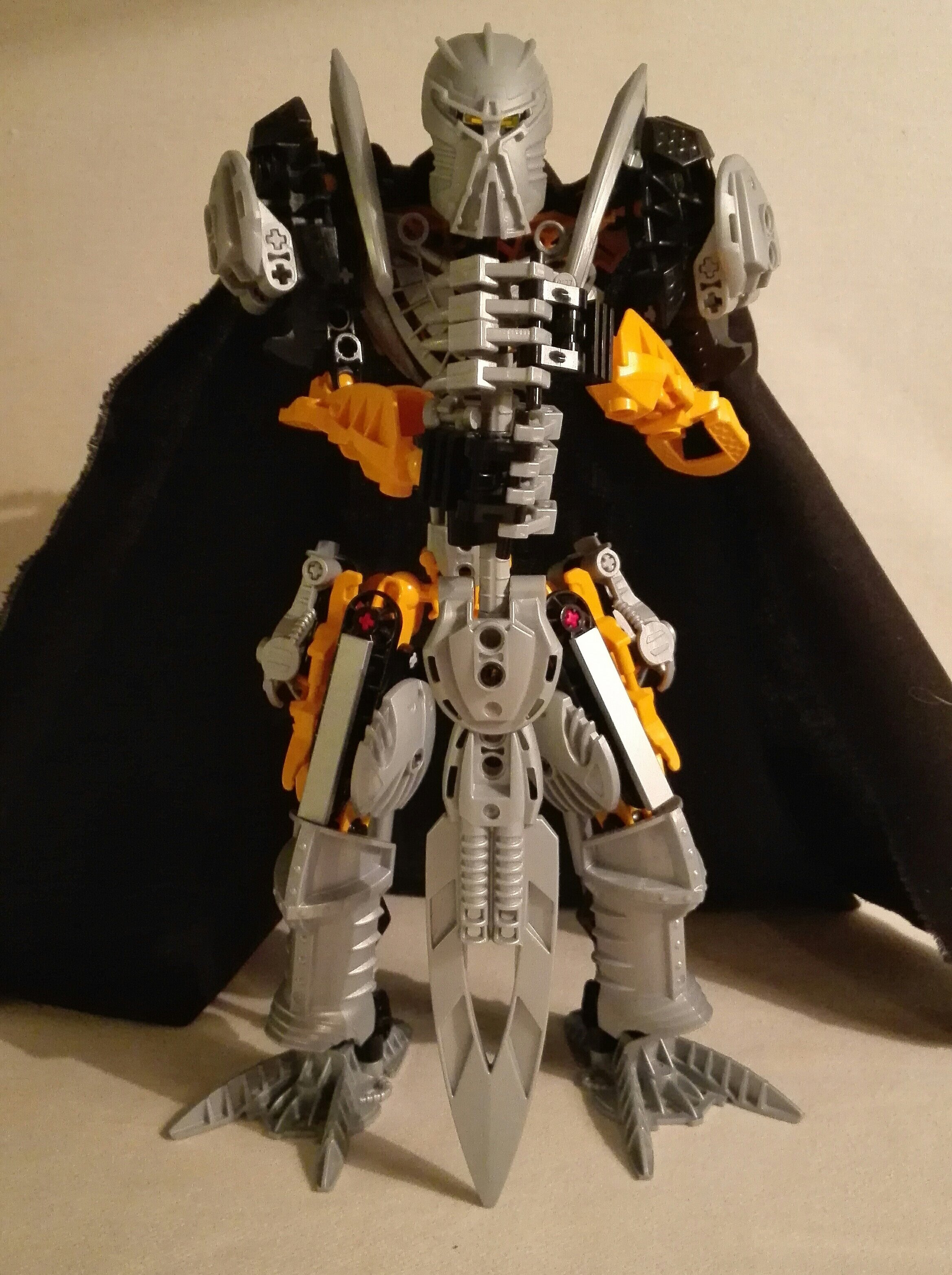
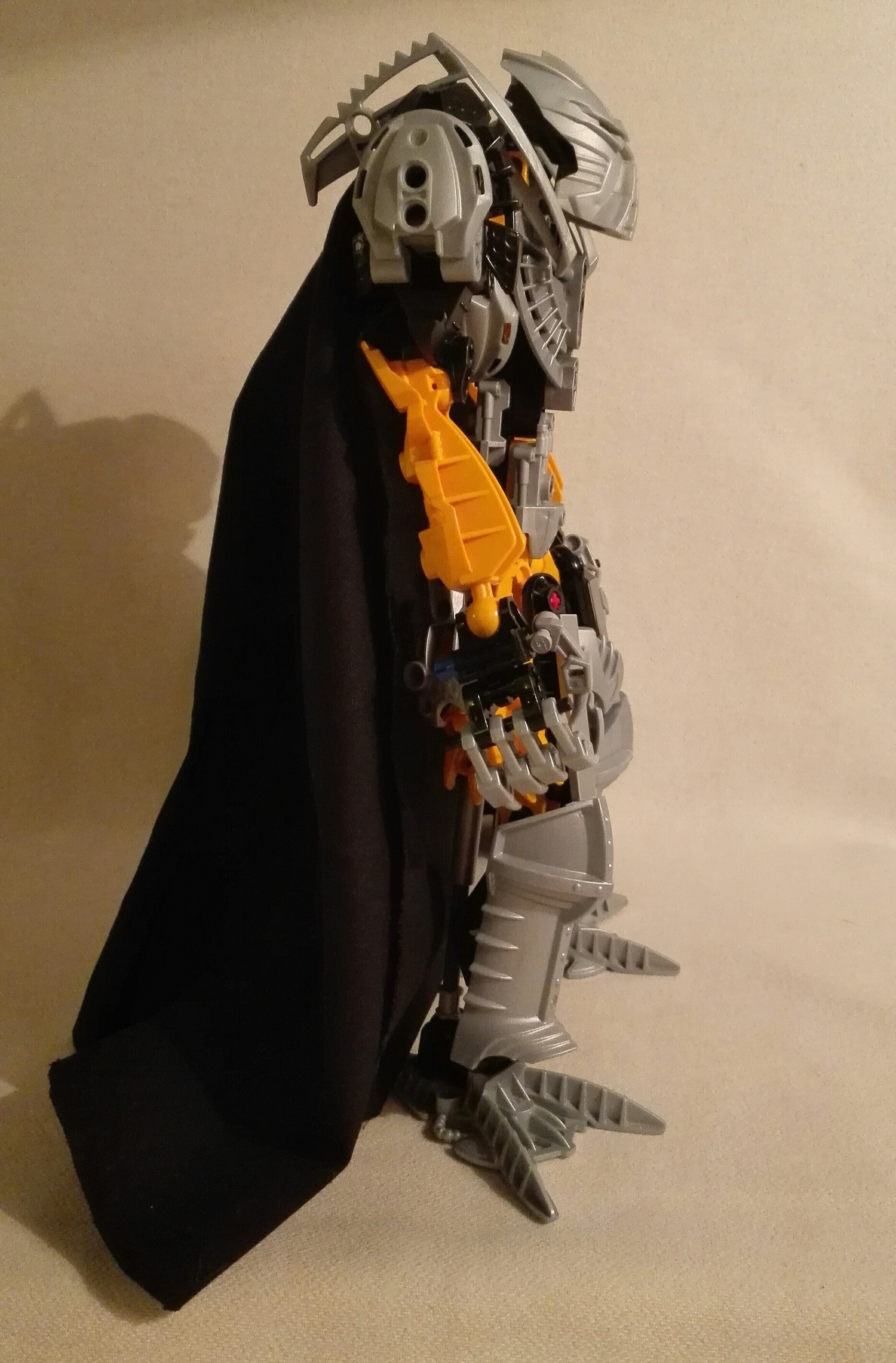
Without cape:
I know the build itself is not very extraordinary but I tryed to keep him kinda small.
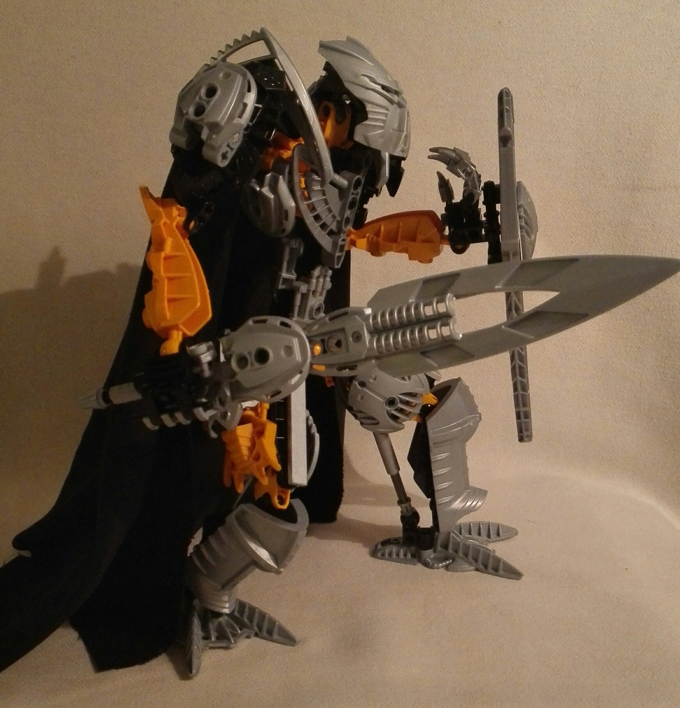
His weapons and shild:
What do you guys think about it?
94 Likes
Looks pretty great! Some places seem a bit cluttered and too bulky (namely his thighs and upper arms), and the five-fingered hands are a bit big.
Other than that, he looks solid. Keep it up!
2 Likes
_el
October 4, 2016, 9:38pm
3
This looks really good but with out the cape, he looks really skinny.
2 Likes
Novel
October 4, 2016, 9:48pm
4
Other than the slight hunchback, I feel like this is a very good iteration of Toa Ignika.
1 Like
Not bad!
and welcome to the wide world of MOCing on the internet
1 Like
Runa
October 4, 2016, 10:18pm
8
Looks great, definitely a good version of Toa Ignika
1 Like
I don’t really get that vibe from the original, but I do from this MOC. I really like it!
1 Like
Like a Sir! See what I did there?
He looks great with the cape, but once you take it off he looks like a malnourished skeleton twig.
1 Like
Hutere
October 5, 2016, 2:28am
11
That actually looks pretty awesome. (With the cape on)
1 Like
I knew that this would be the main critque point on him but i very much like it like that
This is really good, but the claws and all the black make him seem a little villainous.
1 Like
Jayfa
October 5, 2016, 3:22pm
15
Wow, all 5 fingers on each hand haha
1 Like
I feel like if you moved the Inika Shoulders up his waist, it would help with both his problems. The silhouette of this guy is impressive regardless.
1 Like
I really like this. The cape looks great though as stated the waist is really thin. I love the weapons (how I wish I owned that sword peice. Bricklink it is)
On another note I have to congratulate your grammar. You have better grammar then some English speakers online.
2 Likes
Well done. I look forward to seeing more great things like this from you
1 Like
Wait and see, wait and see
1 Like
Stoax
October 6, 2016, 2:53am
20
The choice of feet looks a little strange, but I really like this interpretation of the character. It works very well.
1 Like
This is amazing, I love the whole ‘Silver Knight’ aesthetic. I like the whole colour scheme too. As some people have stated he does look very skinny,
Also where’s his hoverboard?
1 Like