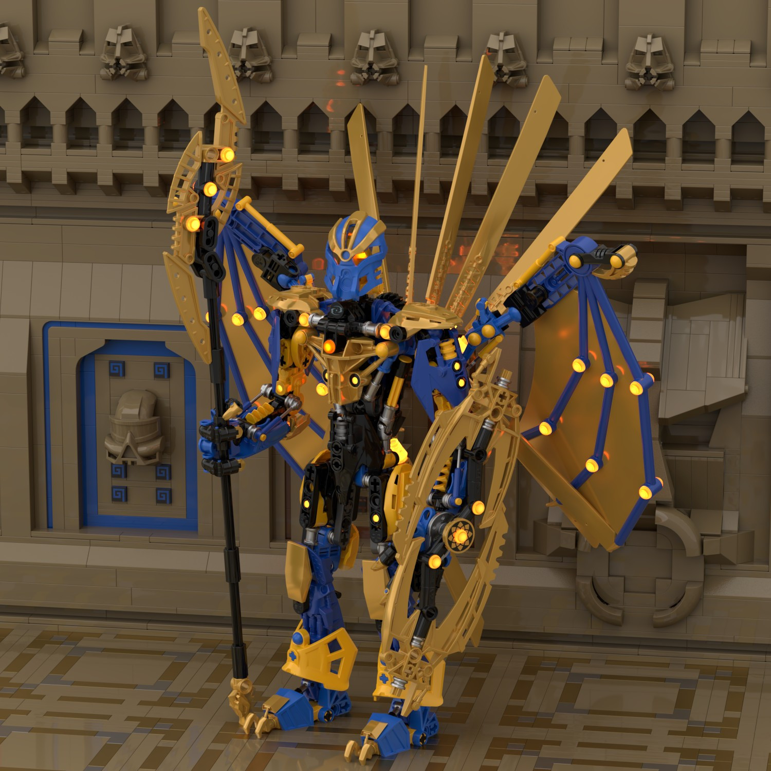
Bringing forth a very overdue welcome, comes Toa Nazza for @NattartheDragon
bionicle

19 Likes
looks great! it kind of reminds me of the miramax films where you can make out some specific bionicle pieces, but not as much some others. my only critique would be the inconsistent line size - they’re very thick everywhere but the mask and that one little piston. it feels like either the thick lines could be a bit thinner or the thin lines could be a bit thicker. that’s just me nitpicking though, still really cool!
7 Likes
Some of the elements (like the staff and shield) get a little lost in the background of the wings, but overall, I really love this, especially the mask.
6 Likes
I dig the coloring and the shaping. Like GoodGuy said, I appreciate that I can see some very distinct Bionicle pieces in some areas while in others it’s more vague and custom.
4 Likes
This is an awesome artwork of Toa Nazza you have made. Love the lighting you added. This reminds me of the enemies in Hoyoverse due to his colors.
4 Likes
yummy art, 5 star meal right here.
6 Likes
Nice! It reminds me of the art for the 2015 bionicle comics in the instructions, only better detailed.
4 Likes
can someone make a moc of this
3 Likes
6 Likes
This is an awesome render.
3 Likes
He has this villain vibe, I don’t know how to convey my thoughts exactly, but I personally love it
3 Likes
Ze, Nazaa uses neo pronouns such as ze/hir
1 Like
Why do you think he looks like a villain? Is it because of his design or color?
1 Like
I love how bright and illuminated it is.
2 Likes