Hey,
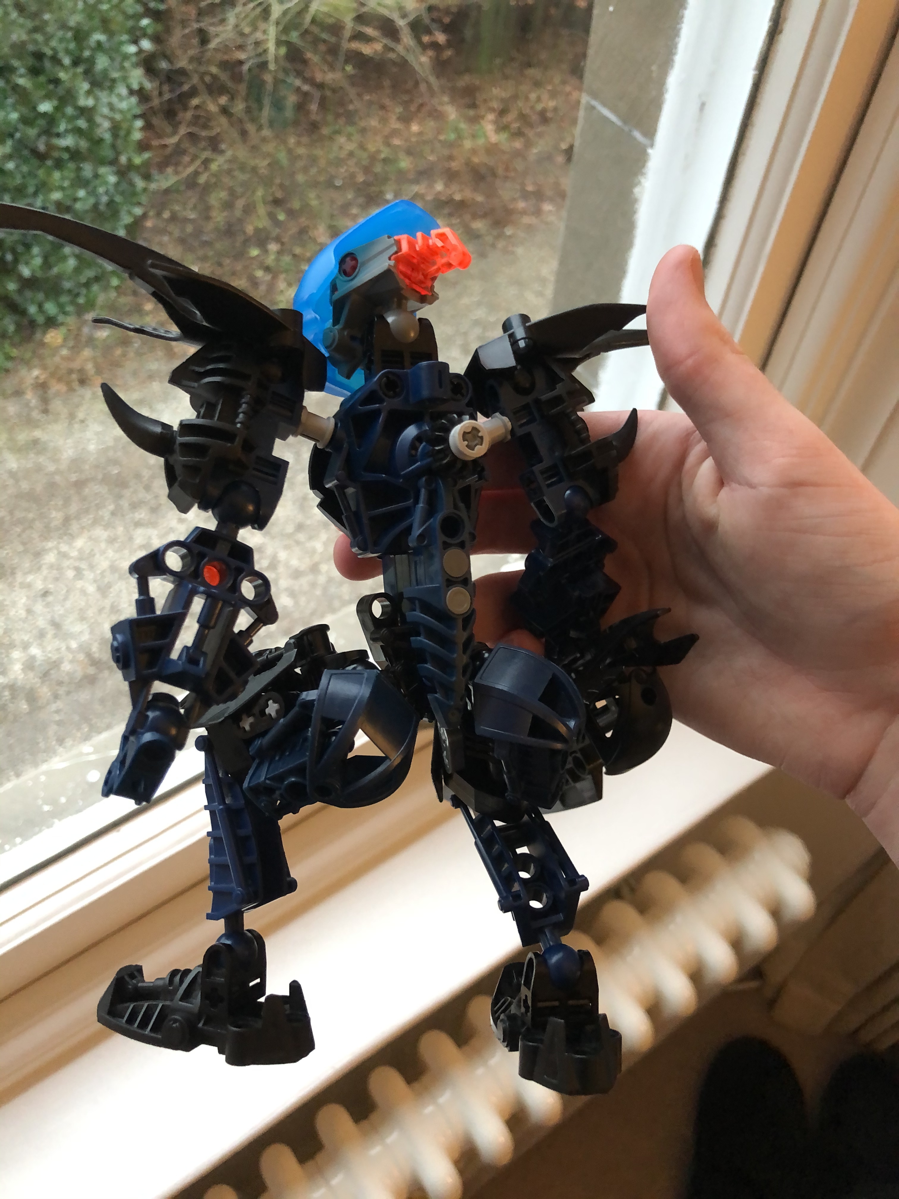
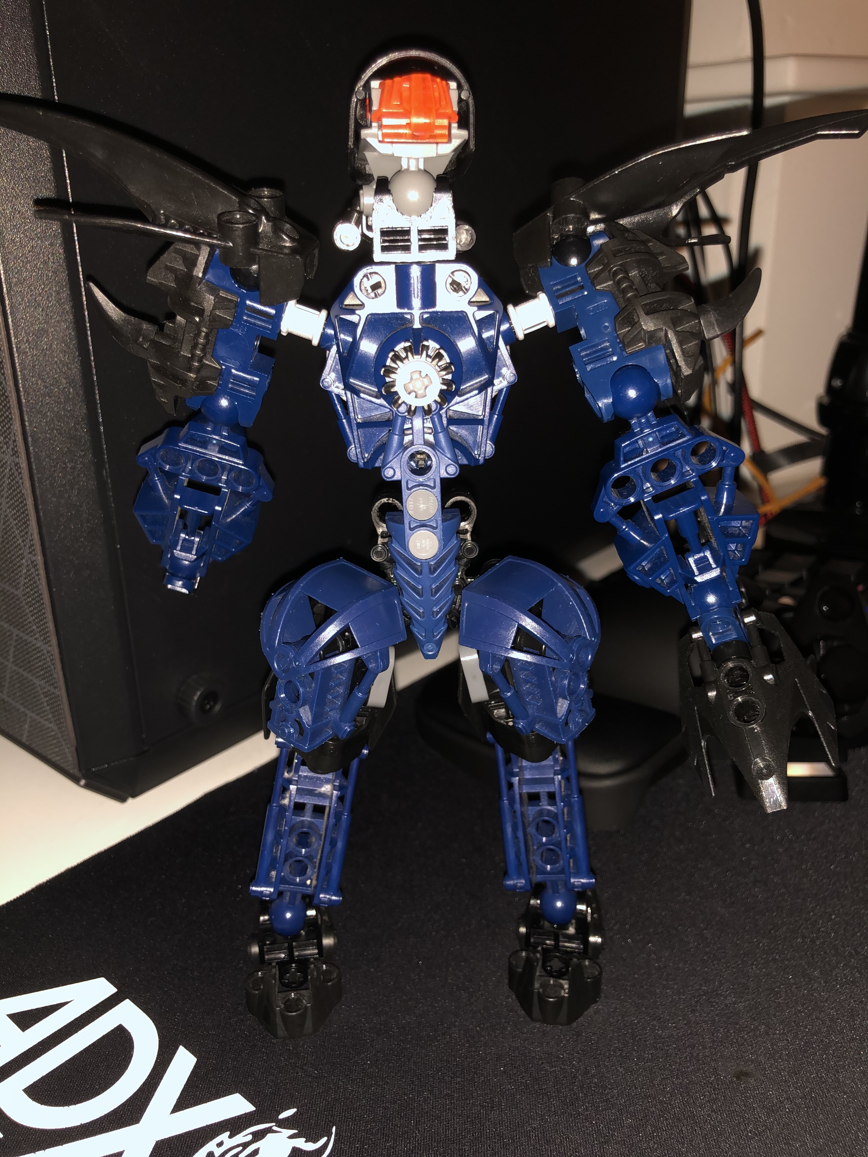
First MOC I’ve made in 5 years be brutally honest (mask is obviously not the intended one but instead the King K mask)
26 Likes
This topic should be in the LegoCreations category.
1 Like
I’m not really a fan of the black and orange in her colour scheme, but that’s more of a personal preference.
I like that you will be using the Khingk mask. I really hope that it ends up as the winning mask.
1 Like
This is actually really cool. I’d vote for this!
Yeah I added the orange right at end just for nui stone stuff but I’m regretting it will probably change cheers.
Oh, I see. I didn’t even think about that.
In that case, the orange makes sense. (Or maybe red?)
1 Like
I actually quite like the black and orange. She looks intimidating. How on earth did you attach the Metru armor at an angle on the back of her thighs, though?
…Also, said Metru armor makes her a bit thick in the posterior region. Was that intentional? 
1 Like
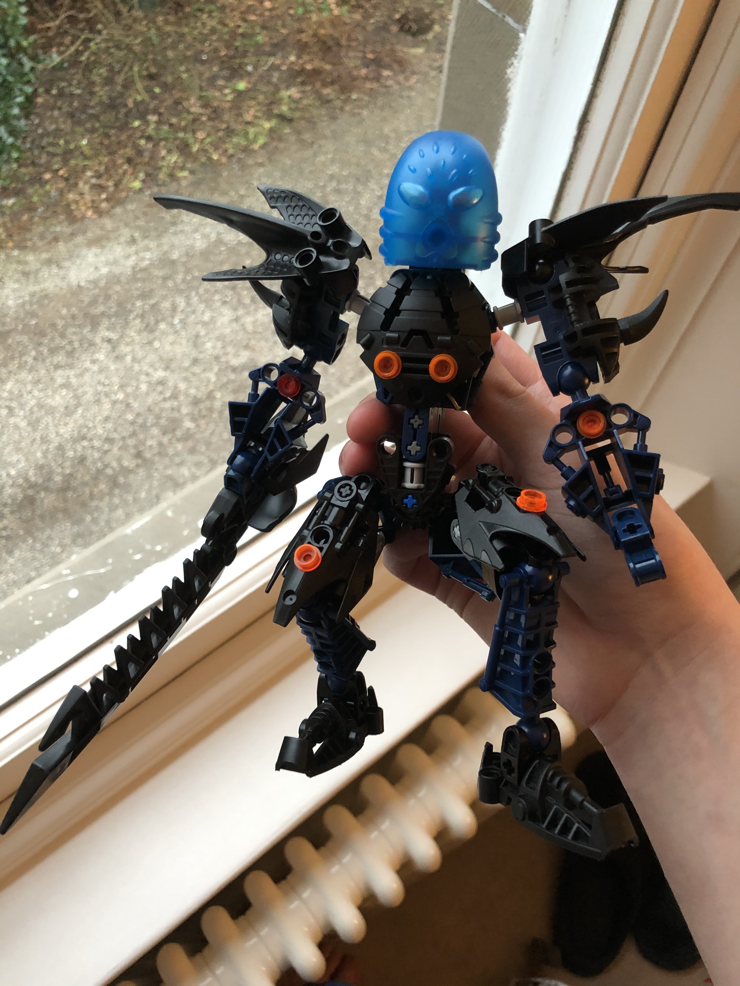
Wow nice build, I really like the colour scheme. What does see look like standing straight?
1 Like
Intially when I was building just tried to make thighs a bit bulkier but found it too rigid? Sorta found making butt like armour made it far smoother. Initially I tried to build it up by just using a metru upper limb piece with the technic V piece connected to add the armour but found it too bulky to allow the angled look.
2 Likes

I took off the orange studs just to see how it was for a bit, also used hydraxon mask as placeholder cause I’m wanting to have a black mask (it doesn’t look very feminine thou)
3 Likes
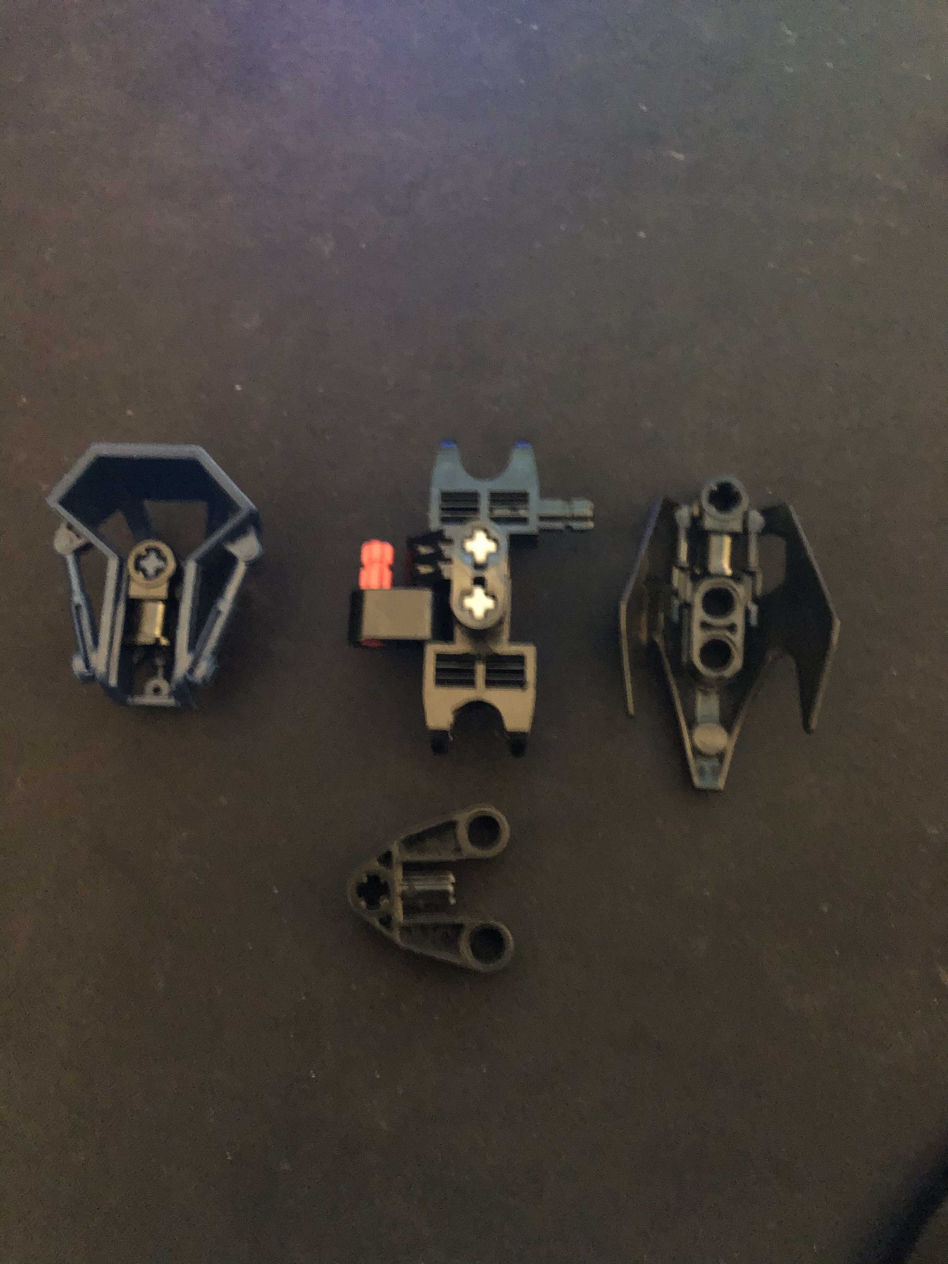
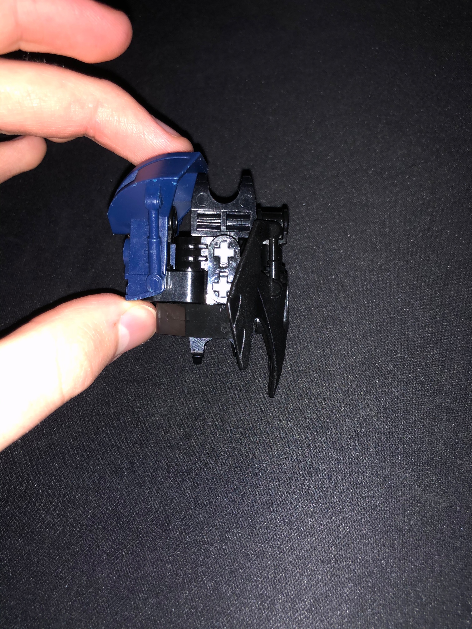
Wow, thanks, breakdown pictures are fantastic!
I think you’re right, I like the shaping of the thighs quite a bit, actually.
1 Like
I think the armor on the back of the thighs is a bit much, but I quite like the rest of it. For some reason I never imagined Tuyet having spiky black armor, but hey, it fits with her barbed broadsword.
2 Likes
The main inspiration for the spiked black was the kiina pieces, aquatic but also bit more menacing in black
1 Like
Looks really cool, but IMO the “asset” kinda ruins the proportions and it doesnt fit the moc. Really loce the color scheme tho
1 Like