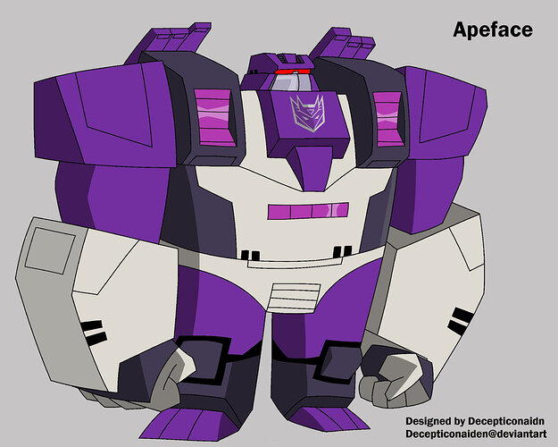
Today, I bring you all my take on a Tfa Apeface. I’ve been working on this for the past three days. This is probably the first Animated design I’ve done digitally. I think it turned out really well (I’m particularly proud of the decepticon symbol, which I had to freehand). If I had to point out one thing I don’t really like, it would be the head. It doesn’t fit the style as well as everything else, in my opinion. I just couldn’t really figure out anything else. If anyone has any suggestions, I would love to hear them! Anyways, let me know what you guys think.
10 Likes
This looks amazing! You captured the Animated aesthetic really well, and the design definitely shouts “Apeface”
1 Like
Thank you very much!
1 Like
now where’s my boy snapdragon
1 Like
Give it another… I don’t know, 3 days?
1 Like
Hmm…

Yes, I think I see the problem: the chin isn’t big enough ![]()
3 Likes
