Yeah, if anything Kopaka and the Ko-Matoran would be based more around Tibetan Monks.
1 Like
I’ve been hanging around the G3 topics for a few weeks, but I haven’t really thought up anything coherent yet, so now seems like a good time. I’ll go through each Toa specifically, but I’d like to preface my thoughts by saying that I think they’re all amazing, and that I like where you guys are taking your ideas for G3 a lot! I get that some people are opposed to change (I personally dislike it in most settings), but I think you guys have done a lot of thought, and your efforts show—plus, given that this is a fan project, the ultimate decision doesn’t need to conform to any one set notion of what BIONICLE should be. Now then, off to the Toa:
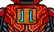
Tahu—The design and color-scheme for Tahu is great! I love the visual symmetry of the red, blue, and orange (particularly the blue highlights, which was one thing I liked about Uniter Tahu). I love how the mask incorporates the rigidity and seriousness of the Mata and 2015 Haus, while also including the softer edges and even a bit of the shape of the Hau Nuva. The choice to include only one opening in the cheek is also practical, as fitting three openings on a minifigure-sized mask would be a challenge. I do feel, like some have said, that Tahu is the simplest of the Toa, and that he needs a visual aspect that differentiates him, like the other have. Perhaps—as both a homage to Tahu 2015 and based on the idea of the Ta-Matoran being Japanese-influenced—he could wear a pair of flags on his back, reminiscent of the swords in his Master version? It’s a little different than a cape, and could reflect the cultural theme of his people.
Kopaka—The patterns and colors for Kopaka are great, and I actually like the yellow as a contrast to the white and blue. The inclusion of the scarred eye on his face is an excellent detail (and I like how you kept it from the original designs @Ragdoll made). The one-sided cape is also a good stylistic choice, and I think it fits Kopaka’s character well. The mask is another great amalgamation of the various prior Kanohi he’s worn, and the fact that the lens now has a practical use makes it even better. I do think that, like the rest of the Toa, Kopaka’s shoulders should be a different color than the rest of his upper arms. Right now, having it all blue—while fine—is a little jarring next to the other Toa.
Gali—More excellent uses of color! The orange highlights really make Gali pop, as does the light blue. The waist cape is a great choice, and it has a very marine feel, sort of like a fisherman (I don’t know why that association comes to mind, but it works). I’m not sure about the orange line on her face, though—is it a scar? Face-paint? It seems a little out of place. However, Gali’s face does look more feminine, even though it is the same general appearance. I also like the subtle difference in the chest printing to differentiate between male and female Toa. Her mask is great as well. I personally love the 2015 mask, so I’m glad to see it referenced prominently. I also think that the shape, while still imposing, adds to the femininity of the figure, particularly through the teardrop-shaped eyes.
Lewa—I’m okay with the decision to make Lewa female, as I think that the character from G1 and G2 is the most appropriate for that type of switch. That said, I think her face suffers where Gali’s works, in that it’s not female enough. The raised eyebrow seems a little off, but I’m not sure what expression could adequately communicate both Lewa’s character and her gender at the same time, given that all the faces are so similar. That being said, the tan cape is an excellent choice, both for the character and for the color contrast, and the green and white color-scheme is great. I do think there’s a bit too much white around the chest area, but the rest is fine. I also love the mask’s resemblance to a frog, as was pointed out earlier, as it really ties into the old Lewa’s jungle theme, and helps communicate her gender.
Pohatu—I like the choice of the pauldron for his accessory, as it gives him a real desert vibe. I do think that there’s little less brown than I might like, and a bit too much gray. I think putting some brown on his sides, just above his waist, might help. The bandolier print is really nice, and I like the little spike details on his waist. The mask I good, but I feel that it’s a bit too curved. The organic shape worked for Tahu, but a Stone character like Pohatu benefits more from a mask with hard angles.
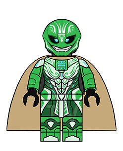
Onua—The choice of body for Onua is fine, IMO. I don’t mind the Nexo Knight’s body, and having a variety of sizes amongst the Toa is far more true to reality than G1 was when it made all the Toa one height. I like the new color-scheme and the new Earth associations, but I think Onua’s arms should be a different color. The dark tan seems a bit abrupt, and I think black might work better (I could be wrong, though). I also love the moss details on his body and legs, as well as the bolt details on his chest. The mask is something like what I think Pohatu’s should be—still somewhat curved, but with harder angles. I also like the way the tribal paint represents the original Pakari’s openings, which would be too small to make on a minifigure mask.
Overall, these are great designs, and they bode well for the coming entries into the BRICKONICLE canon! I hope you guys settle on and design Voriki soon (if you keep that name). I’ll be waiting!
2 Likes
They look great.
But something intrigues me. Why always the Toa Mata? I know everything started with them, but why not Vakama or Jaller’s Team? Why not 6 villagers becoming hereoes instead of some pre-build ones coming from the sky? What G2 did wrong, was to limit main characters to the Toa, the 6 protectors, and several antagonists and Ekimu/Makuta. I liked it to have such a great variety of Matoran with personnalities in G1.
But it’s not like I’m going to work for LEGO.
They are the most recognizable Bionicle characters, being the very first in both generations.
1 Like
That is why they are using the Mata names.
Ok, I feel like a jerk saying this, but have you watched last few the podcasts? Because it will really improve your appreciation of this discussion.
The purposed G3 Toa are a new team of former Matoran, who are loosely based off the Mata, and aren’t even named after them, but gain those names as titles when they become Toa.
Including a wide variety of Matoran is specifically one of the goals of the TTV in G3.
2 Likes
You´re right there.
1 Like
Remember kids.
Listen to the Podcast and take notes.
I myself am trying to keep up to date.
But on a note on the Toa design:
Instead of masks they need to find small boxes with the elemental power in it to restore more of their Toa pods like the ones that they have on their chest at the moment.
Replacing the Nuva symbol in year 2 and allows the armor / toa to give them more power.
Imagen a flat 1x1 brick with a print on it. Transparent in the colour that the Toa uses.
Ill make a sketch later today.
3 Likes
Just finished watching the Podcast episode where you talk about this. I am really digging the new designs and the story bible you guys are developing. I would love to make some 3d models of the masks and attempt to print them so you can see how they look like in real life. Sometimes things that look good in an image don’t look so good when the 3d dimension is applied. Is there any way I could get a side image of each mask? I saw om the podcast that there were some images showing the designs from other angles.
10 Likes
Sure! I don’t have them all done just yet, but I can get those sent over to you soon.
6 Likes
I like that Kopak’s got a scar under his mask.
2 Likes
ugh
that sounds like work.
In seriousness I will try to watch the new one soon.
2 Likes
Onua should retain purple as his secondary color, green is just too close to what Lewa has.
Yes. ![]()
Poor Vakama. Was only Toa for 2 years, same goes for Jaller. Rest in pieces.
Don’t have time hearing 1 or 2 hours of podcasts, prefer playing War Thunder or watching other YouTube Videos. ![]()
I’m aware of that. Even though, I remember that, when I was on 9Gag, there were several posts about the 2001 Toa Mata. Everyone remembered to have had these, but they had no clue about their name. The appearance of these was the only thing they remembered. It’s just story Wise that I want different caracters. The design of these are great, I just wish it would be Jaller’s crew. Just my opinion though.
1 Like
Why is Lewa the only one that has the mask a closed from the lower part?
possibly to keep the “smile” that the original mask had.
5 Likes
The whole point of the Brickonicle forum is to give TTV feedback to prepare for the podcast.
You don’t have to be completely up-to-date, 100% of the time, to post here, but please at least try to at least follow the podcast loosely.
(Again, I feel like a jerk saying this, but it has to be said)
2 Likes
I honestly wanted to try modeling these too, also wondering about the side angles. It’s good to see another working/ planning on working on modeling the G3 helmets. I am currently working on Ragdoll’s tahu mask before I move on to do any of TTV’s design. I am looking forward to modeling female Lewa’s mask. (I wonder what a female Eljay would look like. Minifigure form obviously)
I’m crying now
Just kidding, I never cry on the Internet. I think
1 Like
No, just no.
1 Like