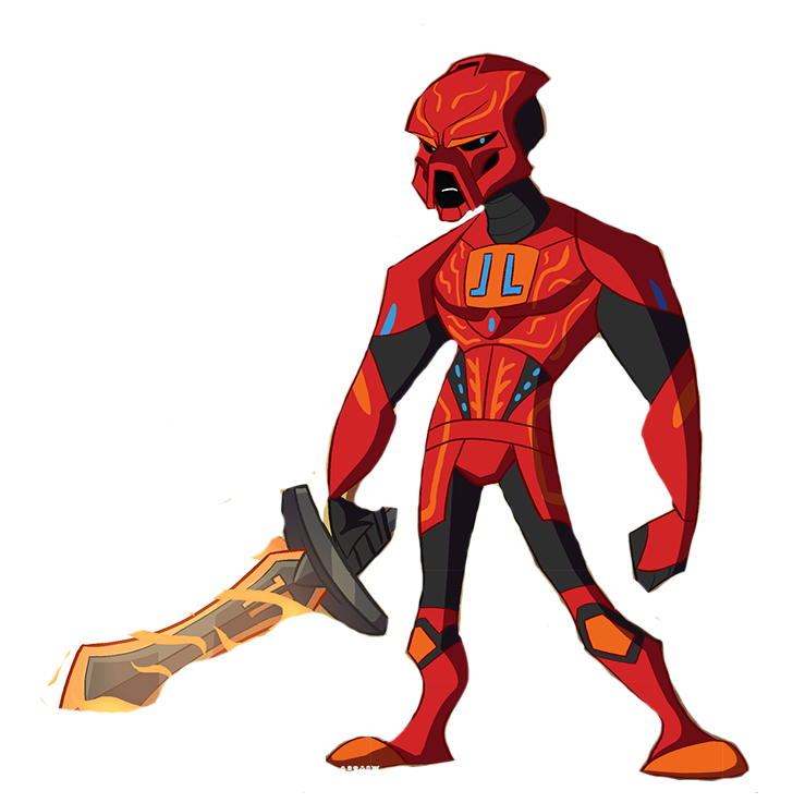
Lewa’s axes are a bit small. The blades could be a bit larger. Tahu’s sword doesn’t seem quite right, might be the hilt (that bit doesn’t matter too much, just a little nitpick). Pohatu’s mask mouth-hole is a bit too large. All the toa could benefit from a few more elements that would make them seem a bit more robotic, especially Kopaka, who looks a bit too plain in comparison with the other toa. Other than that, weapon and character design is great. The style is pretty good.
They’re all really good! Kopaka’s my favorite. I actually really like the shield.
I see I am in a minority but I would like to share my thoughts just the same.
I think you did an incredible job capturing the style you were going for @IllustriousVar but the style has never been appealing to me personally and has turned me away from many shows. For example: Samurai Jack, the art style was a big turn off but years later I rediscovered it and got into it solely because of the humor. I also feel the style has also been done to death with Clone Wars, Transformers Animated, Samurai Jack, Teen Titans Go… It is not a visually unique or compelling style. The art style needs to be something you can bring in your audience with while still resembling your product. This is where I feel the 2D style presented really falls short. Transformers Animated is the only other cartoon mentioned in the podcast that is trying to sell a product but their toys actually look like the style being used, so it works. We are talking about selling LEGO sets though, so the style just doesn’t work.
I could see the 3D rendered minifigure models working, this style would really allow for LEGO’s quirky humor, as you can be more brutal and violent with little “plastic” people and have it still be funny. On the other hand, I can see this style not really conveying emotion to well.
I feel stories and art styles need to stop being “dumbed down” for kids as these are some of the things that promote creativity and it is being lost.
Make the story and visuals detailed and kids will be able to come back to it again and again each time possibly getting something new from it (this is how Bionicle and Tolkien’s work got me hooked, plus they both had had ties with LEGO…).
I fell in love with the Bionicle theme at a young age because it stood out as being very detailed, mysterious, and unlike anything else in terms of quality and artistic presentation.
Maybe a different style still needs to be pitched. I would love to have the show be like the 3D animation LEGO used to advertize Bionicle in their TV commercials. We know it is possible because Volta has shown us that they can simply re-texture the Toa from Journey To One. Creating a 3D model for each character and generating a 3D world, like the LEGO Worlds method mentioned by Jon, would be my preference.
I love this project and hold all the cast in high respect. I hope my input is helpful.
Respectfully,
-RAKRONDEWL
6 Likes
The detail is impressive but I must honestly say I am not the biggest fan of the style. The greatest part of this is the proportions of the characters, which I find to be in some cases rather silly. In my opinion, this style is quite cartoonish and I don’t know if it would work for a serious story. However I am not current with your discussion, so you may have changed the feel of the story, and this style may in fact fit well. This is my opinion if it is welcome.
6 Likes
Looks like a stereotype CN show
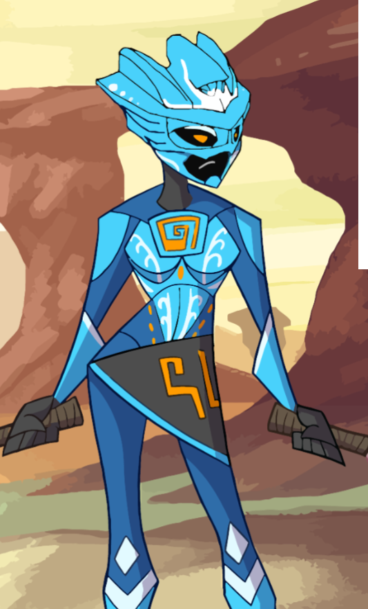
Also Gali has way too big&wide of hips
2 Likes
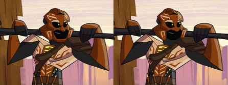
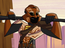
Pohatu looks scary
1 Like
I was playing with Pohatu’s mask, and I think the reason it looked strange to me was actually the chin, and not the mouth opening itself. Here is a side-by-side of the before and after. I also have one with a thinner chin (since no chin may also look weird to some).
4 Likes
I like these… maybe they could do with a little more detail, but they’re pretty cool-looking.
Maybe a suggestion would be to have more body type variation. Tahu, Kopaka and Pohatu have pretty similar silhouettes: broad shoulders, small hips, thin legs, etc. You could, for example, make Kopaka more lanky, give Pohatu a similarly athletic build (without being outright bulky like Onua), and make Tahu even more angular (for the sake of intimidation).
But… yeah. I’ll have to agree with a lot of others in this thread, Pohatu’s mask is really weird. His head shape is actually pretty good (strong jaw, expressive eyes), but the mask is too… bulky? Blocky?
I also noticed it resembles…well…
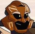
My suggestion is to make it look more like a mix between a gladiator helmet and a football helmet. It’s meant to protect his head more than the other masks. That’s the impression I personally got from the original minifig design, anyway.
13 Likes
I… don’t agree. The contours and patterns, to say nothing of the proportions, definitely look very BIONICLE to me.
Yeah, it would be, IMO. ![]() I’d be happy to toss more cash in the direction of TTV if there’s any shred of a chance that we could see 20 minute long animated episodes something.
I’d be happy to toss more cash in the direction of TTV if there’s any shred of a chance that we could see 20 minute long animated episodes something.
I feel those legs are too long.
Just me?
Edit:
I find these proportions to be better. But that is my opinion
3 Likes
var stop being so good art art
like stop
In all seriousness though, I love these designs. Onua’s legs could be a wee bit more beefy, but I don’t mind them as they are now.
I do agree with others that Pohatu is the weakest. However, I want to bring up a point that I haven’t seen anyone else make yet. Pohatu’s design, especially around the lower torso, is extremely cluttered visually. The rest of the Toa have lots of open areas on them without markings or accessories, making them much easier to look at. The only places Pohatu has open areas like that is on his arms. It’s generally unappealing to have so much going on in such a small area, especially for a simplified cartoon style. I’d personally recommend taking out some markings or accessories, and calling it a day.
also ya the nose is weird
5 Likes
I’m going to complain about gali, about her mask to be exact, I dont like the shaping at the top, I would like it to have a closer look to the '15 mask
http://cache.lego.com/r/www/r/bionicle/-/media/franchises/bionicle%202014/characters/images/additional%20images/gali/masks-gali.png?l.r=-1021375141
right now it looks like someone slashed the top, and they put an easter egg there
2 Likes
Opinions:
Onuas legs are way too skimpy for his beefy torso.
Pohatus face looks wierd im general.
Not sure how i like tahus shoulders being that far back.
Kopaka, Gali and Lewa look fine.
Also, it looks like they are all wearing slippers…
2 Likes
I like the overall designs of the figures, I just feel like they don’t look too much like LEGO.
1 Like
that’s kinda the point, to make it like the Elf Netflix show, instead of Ninjago, Chima and Nexo Knights.
If I gotta be honest, not a fan of these designs. It’s not how I’d see a hypothetical Bionicle animated series would look. I especially dislike how the clown shoes contrast with the thin legs.
11 Likes
Yeeesss. Oh man. These are beautiful. It would be real cool to have their designs get slowly more complicated over time as they upgrade and such.
I really like these. My only gripe is that they don’t seem mechanical enough. Maybe try incorporating some pistons or something?
Other than that, I like how each character is distinct while still retaining a somewhat simplified art style.
3 Likes
Will you guys eventually need voice actors for this animated series? Or do you already have them
[spoiler]Onua skipped leg day
#removekopakasjowls[/spoiler]
2 Likes