Discussed on the most recent episode of Brainstorm, here's the animated series designs I came up with after taking some inspiration from several community pitches as well as some cartoons that influenced me growing up (Samurai Jack, Star Wars; Clone Wars, Ben 10, Teen Titans).
Check out the podcast as we discuss these things in further detail (including the thought process behind certain decisions regarding proportion and style) as well as changes that will likely be coming.
https://youtu.be/BfVH125F5mM
Meanwhile, here’s some tests and other related stuff:
I actually like these designs. they also reminds me of the Teen Titans cartoon style (not the Go one)
although, i kinda wish Onua had that grass mane he had in the old consept art, because that looked good on him, plus im pritty sure LEGO would have made a new mold of the Axl body if they made new sets with that minifigure style in use.
This is what BIONICLE should have gone for with the G2 shorts. The style they used was cool enough, but it didn’t have the same visual appeal as this does. It looked a little messy and clunky, whereas these look fluid and graceful.
I think if TTV really wants to take this project to the next level, an actual series with these models (non-profit, of course, 'cause we can’t offend the copyright gods) would be the greatest fan story in all of BIONICLE history.
These look super cool, I really like the style. For whatever reason though, Pohatu’s face looks a bit odd, but aside from that I really like what you’ve gone for with it.
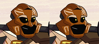
I really like these designs. Especially how you translated Onua’s larger set design into a 2D form. However, there are a few details that seem off.
Pohatu’s mask seems strange. After thinking about it, I think it’s that the mouth opening is too large. I get that it would help make him more expressive, which matches his personality, but I think it throws off the proportions of the mask a bit too much. The defined nose is also a bit unusual to have on a mask.
Kopaka’s shield being a standard Medieval-style shape doesn’t seem to fit. It looks out of place. A more stylized shape might look better. Also, is his naginata made out of ice? I remember you saying you didn’t want Tahu to have a sword that was actually fire. Isn’t this the same thing? I would think it would break easier too, even with him being able to reform it. If it’s just colored metal, then disregard that point.
Onua’s green shoulders should be actual pieces of armor, instead of the painted on look. I think it would make more sense to have them protrude out a bit, instead of being completely flat like they are now. Maybe just have the whole thing raised up off his body a small bit, so it won’t be flush with his arms.
I gave no thought to any of their weapons. I just initially drew these poses with them holding weapons in mind, so I needed to give them something before we could post them, otherwise it just looks like Onua is holding his crotch, for instance
So, I could respond to your critique by providing a well thought out reason as to why it works for Kopaka and not Tahu, but the reality is I didn’t actually give it much thought so it’d be a waste of our time to discuss it at this moment
That’s fine. I’d say the other five weapons probably won’t need much changed, if at all, so I threw in the point about his weapons, since it’s the only one that I believe would need tweaks before finalizing.
I like the style for the most part, as they all have a lot of character. However the legs/feet look a little odd to me. Especially on Tahu. I think it’s the way they bend, and the feet just look a little too big. Besides that, I love these. The weapons look very nice as well.
I really like all of these. I think they can work very well for action scenes, but would need quite a bit of frame by frame here and there, which isn’t a huge problem considering they have very well defined, somewhat easy to draw figures and not too much detail.
I also kinda have to agree with the Pohatu mask comments, I don’t think he looks much like the minifig and looks a little strange. Maybe making it look more like his uniter mask would help?
Aaaaaand Onua’s legs could be thickened and/or shortened. I think it makes him look weirdly scrawny, not quite rugged enough. He also seems younger than the middle aged version they seem to be going for.
I’m liking most of the choices on these! The one thing that bugs me is the rather large size on the front half of the of the foot. Especially on Kopaka it looks like he put on the front half of a shoe and got rid of the back half.
Really loving the look on all of them. The Samurai Jack vibe shows =]
I’d have to agree on Pohatu’s mouth hole and maybe give him a less defined nose. It looks a bit off to me.
I very much love the nordic vibes on Kopaka. The patterns remind me of the vikings and the sami. In that regard, I’d make his shield round to follow the nordic theme.