Vezon, the Disaster

“Wearing it, cursed by it, serving it, raging at it. Not always in that order.
Want it? Come, try and take it. Please."

A Delirious, Rambling Aberrant;
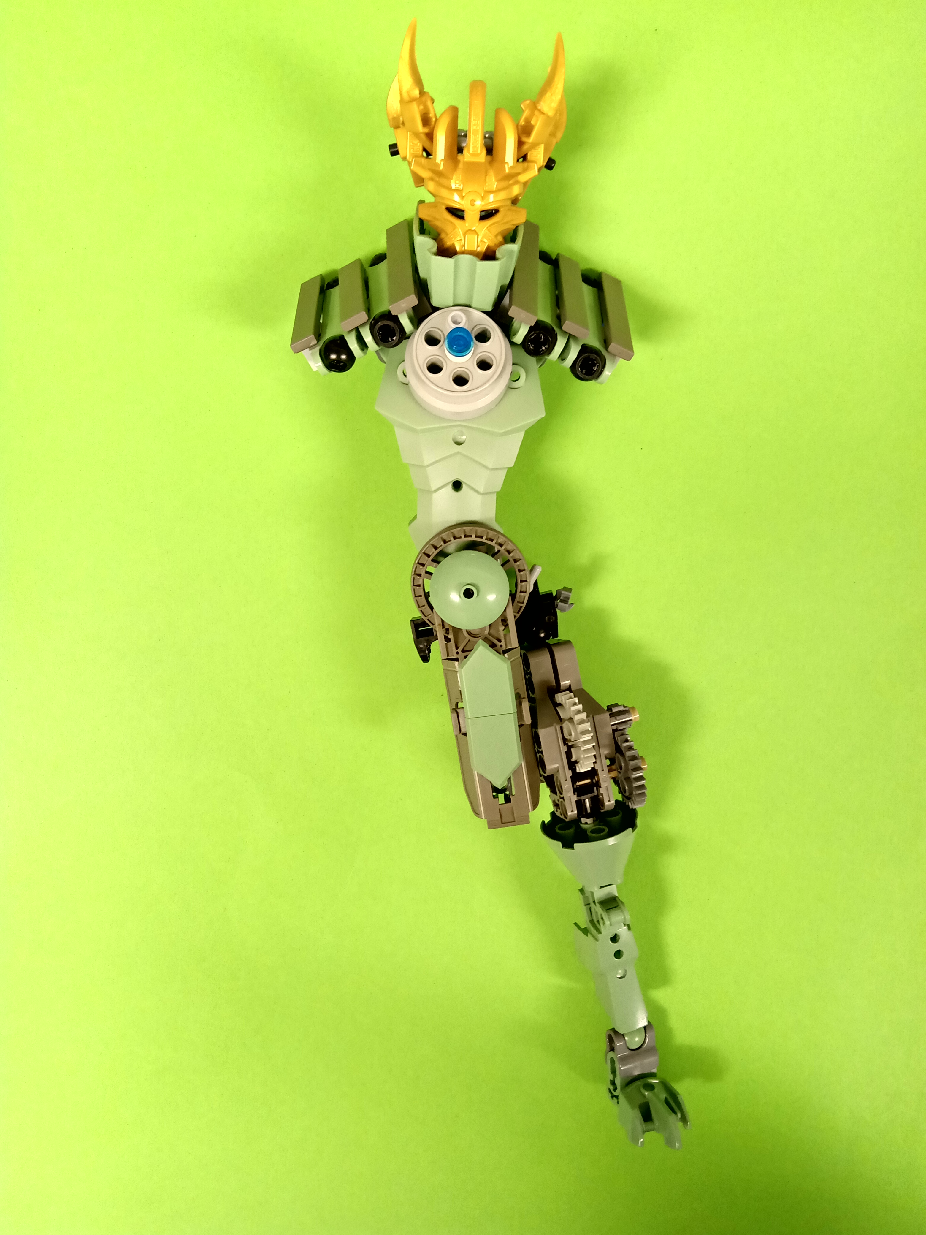
Born of a freak accident involving Vezok and the Spear of Fusion, Vezon was bound to the Mask of Life as its guardian.
Patiently awaiting his moment; A mutant spider, future visions and the two relics accountable for one’s confused existence make for interesting company.

50867145147_5b10e6dc73.jpg
I wanted to complement Vezon’s chaotic origins through body horror and actual portions of Vezok (mine and Johann’s specifically).
I reckoned it would be cooler if the mask fused into his chest (perhaps to further how toxic their relationship was), and I thought it might be neat if the spear could transform based on whether it was set to Fusion or Fission.

Another addition to my Inika/Piraka series, built to emulate Johann’s Cursed Wasteland style as his Secret Santa, while coinciding with the 2006 Collab.
My first SS attempts amounted to nothing, so around mid-December I decided to repurpose an existing Vezon WIP, emulating Johann’s grim-dark, inhumanly proportioned creatures.
It’s hilarious coincidence that he chose Vezok and committed to the half-split so strongly, without any input from me!

Props to Yanni, Brick Brickolson and Buttloaf for their collective work on these fantastic ‘box-art’ edits.

Check out my Flickr for links to the others in this collab, and my Instagram and Twitter for more photos!

66 Likes

Cool! I’m not the biggest fan of th spear, but the rest look incredibile, I particularly like the idea of giving him some parts from vezok.

3 Likes

I love the teeth!

1 Like

So this is where you went to while we were all building Artakhas… :stuck_out_tongue:

This is awesome. Like, it’s epic.

I’ll start with the only thing I don’t really like - the blue. I get where we’re coming from - bits of Vezok and all - but I’d have preferred if it was communicated more through body structure than by “breaking up his monotone” (SorryForObscurePun :stuck_out_tongue:) colour scheme. (And I suppose while I like the idea of the spear shifting forms for each mode, the traditional “spear” looks way cooler than the “scythe” to me.)

That out of the way, I love:

  • The hood, nice to see his “fabrics” repurposed (also the black skirt-thing)
  • The misshapen, deformed asymmetry. The teeth are a particular highlight.
  • The Ignika integrated into his chest (and that the “Icon” is still plainly the visible part!)
  • His somewhat aggressive heterochromia
  • Off-centre heartlight - symbolic and eye-catching
  • Clever application of light-and-dark colours giving him a bit of a “duality” motif. And thank you for keeping at least some of him silver.
  • Loincloth! And tail! (Maybe the loincloth could have been a more present colour, rather than tan, tho)
  • The extremities of each limb being unique
  • Hideously awesome spikey back
  • HisSpearIsTooAwesomeForMeToHandleWhaaaaat. Probably my favourite part of the build!
  • Such an accurate recreation of '06 promo art! It was so good I didn’t even stop to consider that someone would have needed to recreate it, at first.
  • Ok, ok, basically the whole thing. :stuck_out_tongue:

Perhaps my favourite thing about it is just how Vezon it is. It’s clearly a style-heavy interpretation, yet everything you’ve done stays true to what made the original character so great - his origin, his insanity, his aesthetic. It doesn’t feel like you’ve tried to “re-imagine” him so much as use your own very distinct style to better portray who he was to begin with. It’s really cool - probably my favourite of your Voya-Nui tributes. (so far :wink: ).

Again, for constructive feedback - some of the colours (like the blue and tan) clutter it a bit much - I get that’s not entirely dissonant with the character direction, but it’s a tad overwhelming and makes the overall palette a bit murky.

And I do kind of miss that epic cape of his. :stuck_out_tongue:

But absolutely awesome work, regardless. FenrakkWhenJk :stuck_out_tongue:

3 Likes

I waited for it. And it is brilliant! Awesome style, technique, concept, everything. I have only two personal concerns:

  • Right arm, even considering assymetry and mutations, is too long. Hand kinda lies on the ground, when not posed.
  • He should not have spine. Even half-spine.

But still the guy is stunning! I wish I could build him but…
Please make more photos ! I want to see his back, sides, inner construction, same goes for your other Piraka and Toa Inika.
100000/10, hope we see a matching Fenrakk soon.

Very impressive! I love pretty much everything about this moc: the hood, the vezok bits, the sharp teeth, the Ignika embedded in his chest… I could go on.

One thing I like is how you made the staff look quite organic, with the brown color and red/white krika weapon piece. It’s as if he ripped off some poor creature’s leg or something and bound it in leather and chains, not bothering to remove any of the muscles and blood and skin and whatnot from the bone.

1 Like

I’m really digging the grim reaper vibes he’s giving off!

1 Like

amazing.

1 Like

Thanks everyone, glad you like him!
@Toa-of-Snow


Man I wish that was what happened ahaha. I made a bit of a start to an Artakha but I flat ran out of time - not knowing which contest was next is rough for blokes like me. All good! (to me Artahka was the least interesting character anyway)

Hm, I suppose that would be decent enough suggestion if I wanted something ‘orderly’ or ‘appealing’.
Though in this case, I’d say it’s vital the Vezok arm and leg were dark blue: colour contrast is a much better way to convey they’re parts of Vezon that aren’t Vezon’s.

Though I realize this community is quite set in thinking this way, perceptions on ‘how much colour is too much’ can differ!
I don’t disagree with ‘less colours are better’ as a guideline, especially for newbies;
Using lots can indeed make a MOC look cluttered or overwhelming, especially when distributed haphazardly/ selected poorly.

Yet, in my opinion it’s totally possible to have a good-looking MOC with 5+ main colours/shades.
The important factors are intent/context, and how well those colours are grouped (‘blocked’).
Sure I’ve used black, silver, blue, tan and brown, plus highlights in gold, gunmetal and white.
The trick is to ensure each colour has a purpose, and separate them into distinct portions to draw the eye (instead of confuse it).
When done well one can get incredibly memorable builds you’d never get from a 2-3 colour limit!

@Lesnichiy
Thanks for the feedback!
I realize I added a lot of extra features (the arm/leg, spine, tail, Ignika fused in the chest instead of to the head) that aren’t consistent with the set or lore.
I suppose I’d rather have something close to the spirit of the canon that looks good, than something exact that doesn’t!

When revamping/updating anything, being able to identify which parts are core and worth keeping, and which are limitations that can be discarded, is a great skill to have.

I uploaded a side view and instructions for the head on my Insta.
I might take more pics in the future; until then I’d much rather you keep finding MOCs from others you like, then make something yourself! =)

@Atobe_Brick
From what we know of the Makuta’s creative process, I could totally visualize Mutran fishing a Rahi limb from a vat, accidentally zapping a servant with it, then presenting it to Teridax lol.
Man that thing is so immoral, actual nightmare fuel when you think of some of the implications. =/

9 Likes

Oh I absolutely agree! I was just talking about in the context of this build - not criticizing the general principle.

“It’s not what you’ve got, it’s what you do with it,” aha. :stuck_out_tongue:

3 Likes

Pretty “wicked” looking MOC, haha!
Okay, I’ll stop…
Pretty sick