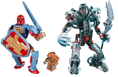
For what is otherwise a pretty standard set of Toa, ever since the debut of Toa Norik and Toa Iruni, fans have shown a wide range of opinions on how the rest of the Hagah should look - and now that we have landed on their physical designs, their metallic armour colour is one of the last points of contention to finally be settled, once and for all.
I’ve seen many armour-colour-distribution pitches from Message Boards users here, and other members of the BIONICLE fanbase across various Discord communities, Twitter, Facebook groups, YouTube and Instagram comment sections, etc… which often throw around the phrase “like LEGO would have done” - or something to that effect to justify their ideas to others…
And that had me wondering…
What if LEGO had actually released a full lineup of the Toa Hagah in 2005?
What would they have looked like?
What would LEGO have done?
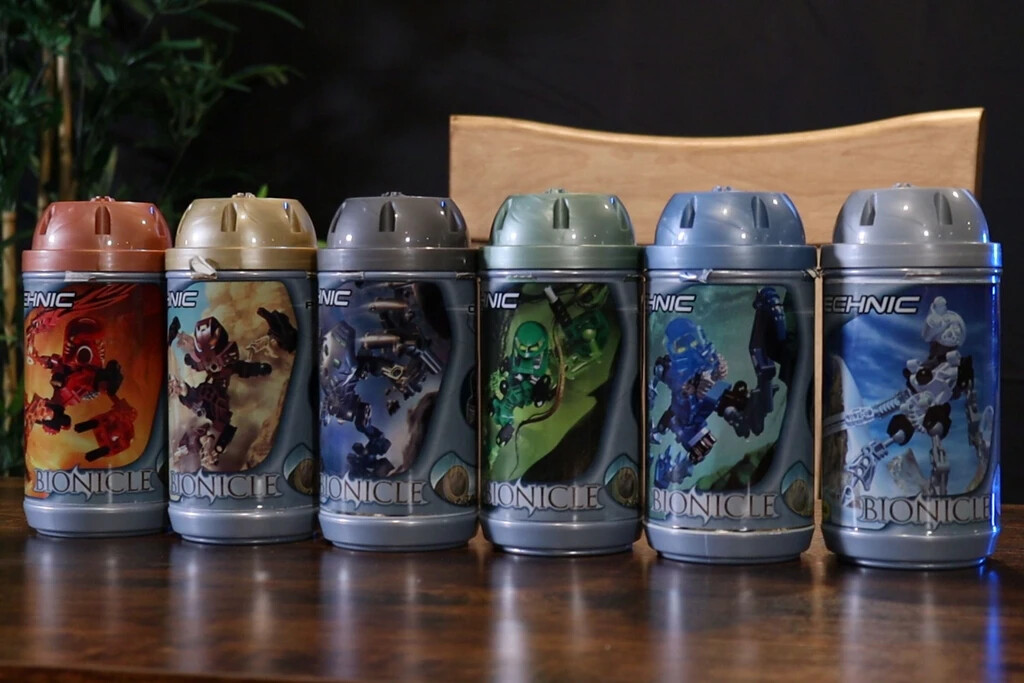
Looking back at the entire release history of all BIONICLE canister sets from G1’s run, there’s a clear pattern when it comes to the canisters the sets are released in:
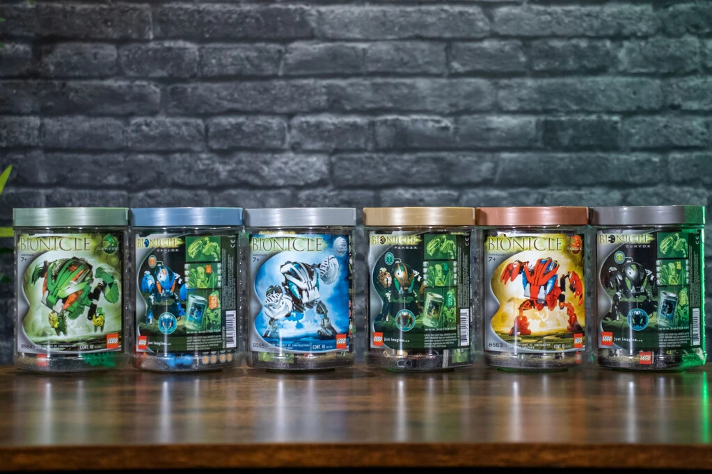
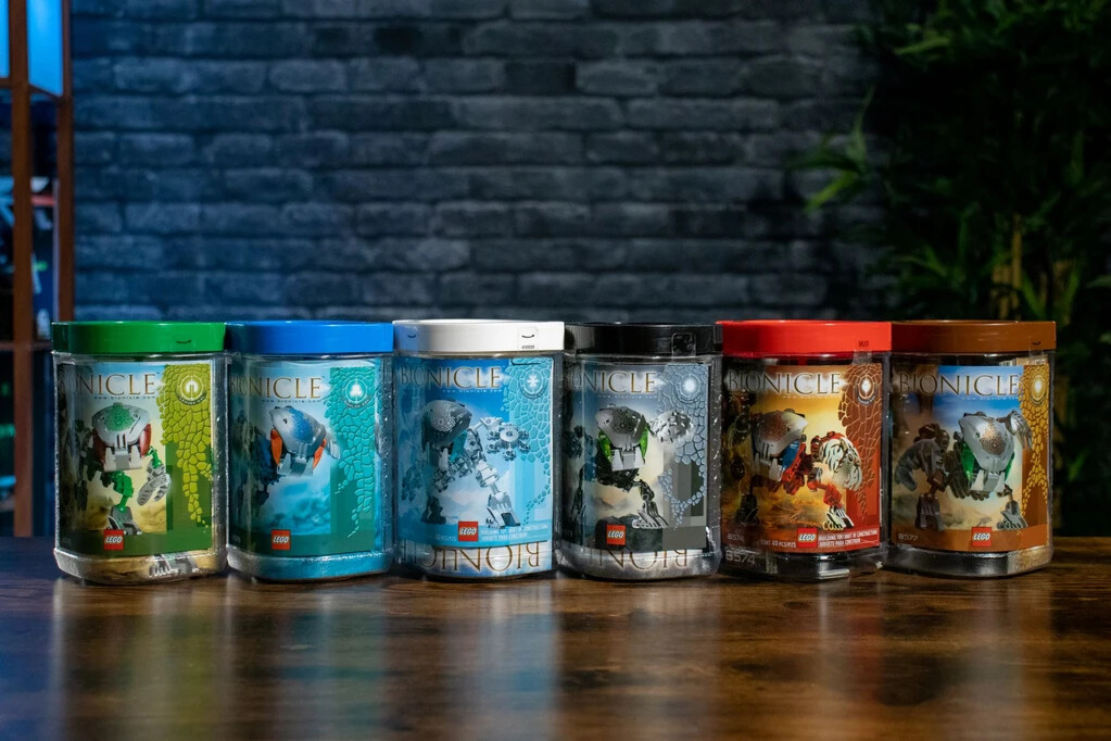
They all have canister lids in colours corresponding to the character’s most distinguishing colour. Either matching exactly like the Nuva/Bohrok-Kal/Metru/Inika/etc, close shades like the metallic coloured Mata/Bohrok lids, the earthy-toned Barraki tops, or the vibrant Phantoka/Mistika lids/casings…
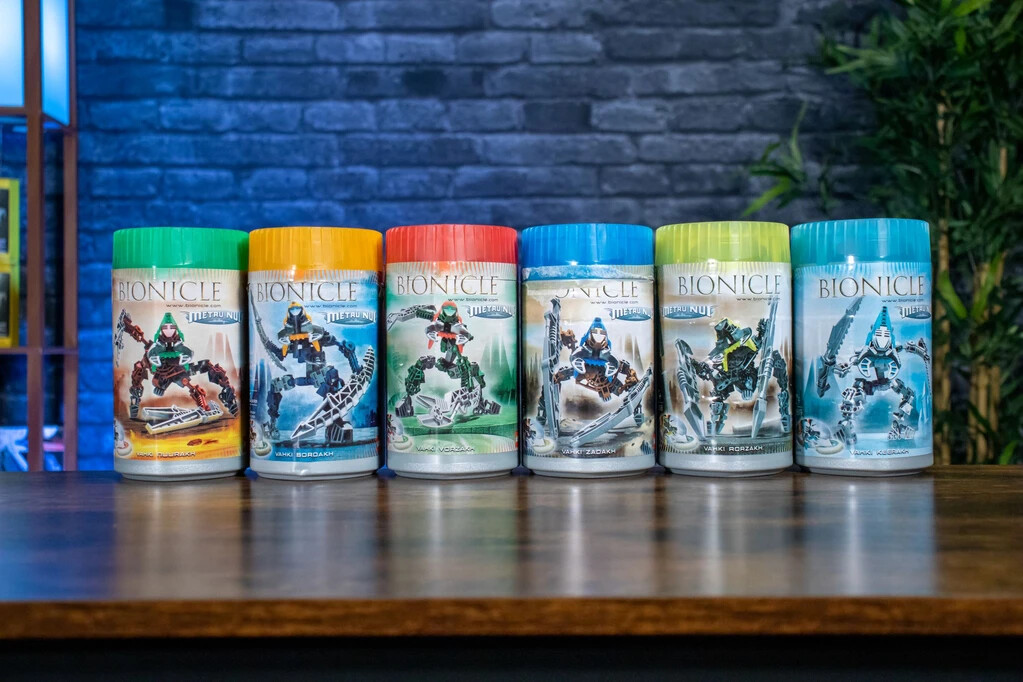
Even the Vahki with their bright neon lids match the prominent eyes/heads of the corresponding models.
One important trend that is consistent across the board, is that the lid colours correspond to the figure’s design and these colours never overlap within a wave that shares/reuses canister designs.
The only exceptions being:
The Piraka
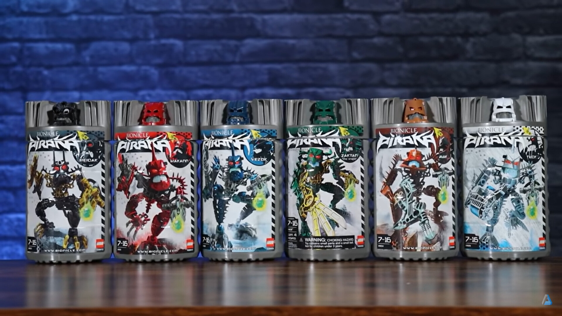
But their canister lids are both: a. all a “background” grey, divorced from the appearance of the figures, the same way all prior, and most future canisters are, and, b. topped by an additional piece that does fit this “rule”.
So what does this mean for the 4 “unreleased” Hagah?
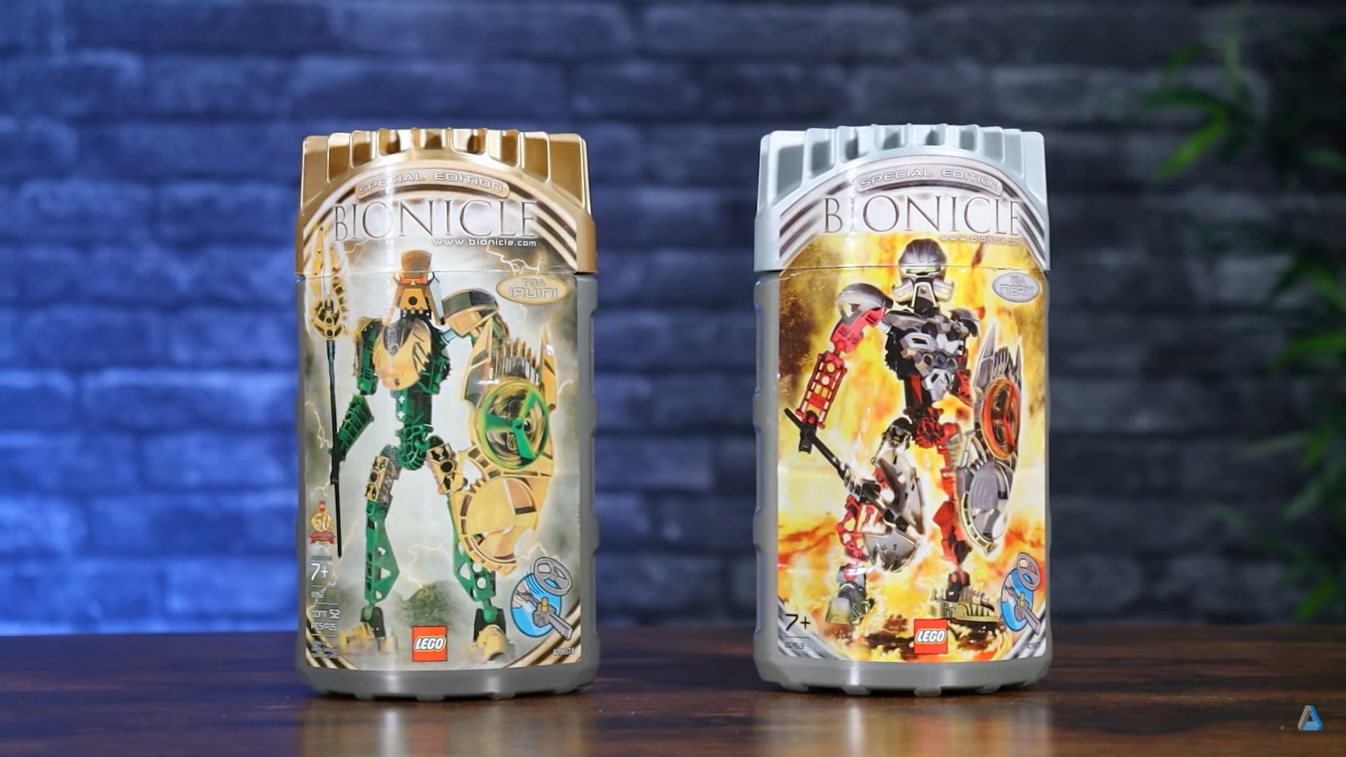
The two Hagah we got, Iruni and Norik have gold and silver canister lids, respectively - representing their distinguishing colours, but not necessarily their primary/elemental one (much like the Vahki), otherwise Norik would have been copper and Iruni - metallic green…
Instead, their metallic armour colours are the primary identifying colour, and it can be safely assumed the others would follow suit.
They share a canister design with the Toa Hordika, meaning had LEGO produced the other 4 in 2005 as well, its very unlikely they’d have used Metru red, brown, green, blue, white, or black - and instead, continue the theme of the Hagah and use metallic colours.
It’s already well-established that the Hagah had metallic armour as Toa, so this should come as no surprise, however its even less likely they’d have reused the same lid colours Norik and Iruni used, so that means no gold or silver either.
So what colours could they have used instead?
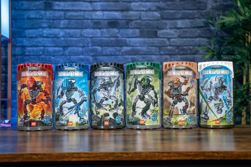
Well, the Toa Mata and Bohrok are good places to start looking. They too had metallic lids which were in a similar hue to the product they were for. They were metallic red/copper, green, blue, black/gunmetal, white/silver and tan/gold.
In fact, the silver and gold used on the Hagah canisters are the same shades used on the Mata’s/Bohrok’s lids too, and not an exact match to the plastic colour used on either of the models themselves.
An even earlier example of this slight inconsistency is the Krana-Kal, which come in similar pearl colours to the lids of the prior Bohrok, but aren’t an exact match. They are however, practically identical to the actual plastic colours used in other sets.
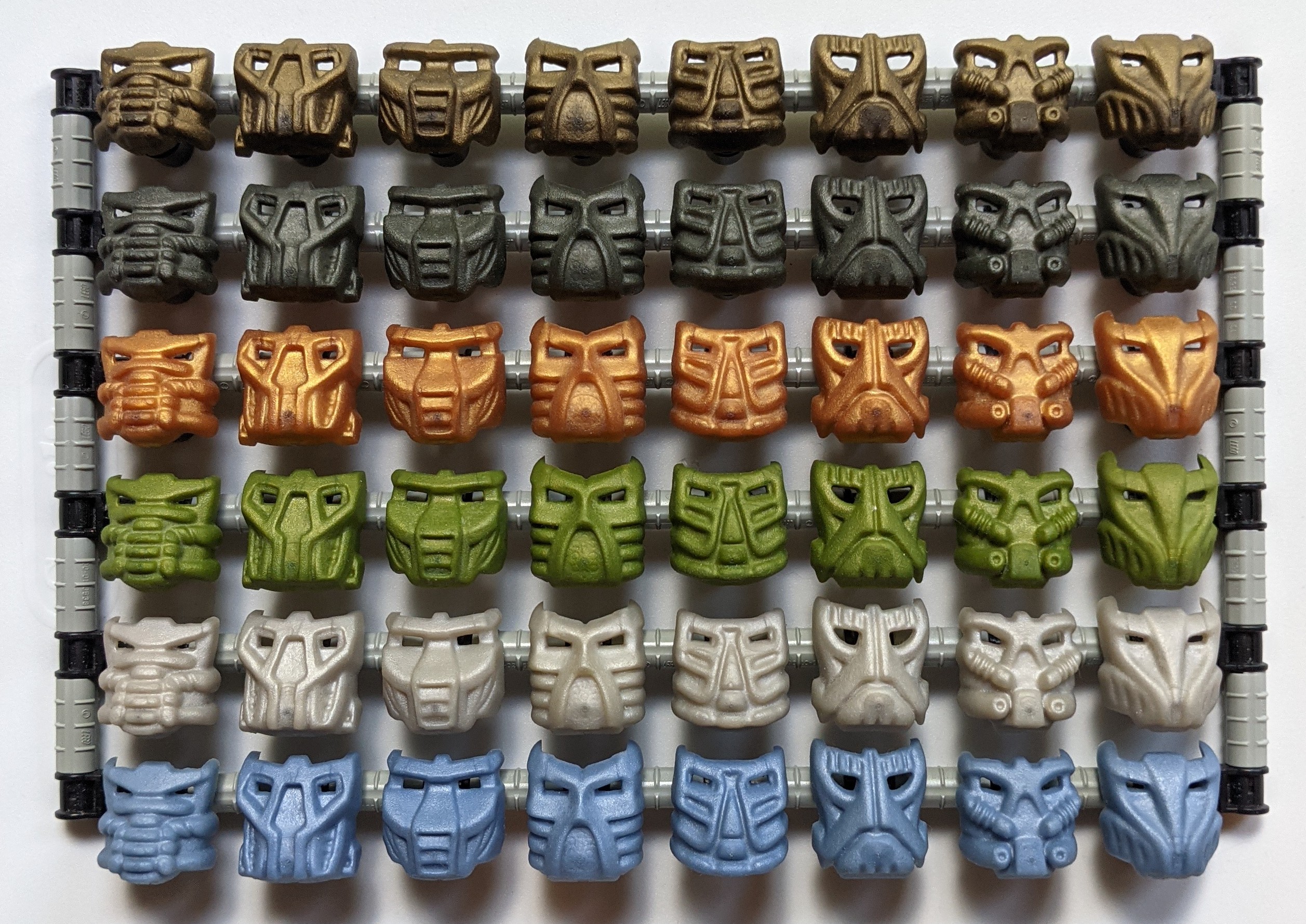
Disambiguation:
- Tahnok-Kal’s Krana is flat dark gold - like Iruni’s armour.
- Gahlok-Kal’s and Nuhvok-Kal’s are the same metal blue (pearl sand blue) and copper (pearl reddish-gold) later used in the Knights Kingdom large action figures.
- Pahrak-Kal’s is the gunmetal used prior to 06
- Lehvak-Kal’s pearly olive is an exclusive colour as far as I know (also used in Kraata), but closely matches the metallic (olive) green used on various technic fairing parts.
- Kohrak’s is pearl white, (which is pretty close to silver, but likely only not actually silver in order to contrast with the rest of the silver parts the Bohrok-Kal utilized, AND be more easily distinguished from the separate silver-state of Krana-Kal in the story, and the very rare and valuable sterling silver Krana.)
This eliminates the concern of them not having colours in LEGO’s palette that exactly match the lids, and provides tangible examples of the plastic colours they could have used.
Pouks and Kualus already can’t use gold and silver like Pohatu and Kopaka did before them, as those colours are already in use - meaning Gaaki and Bomonga likely wouldn’t use metal blue and gunmetal, respectively, otherwise they’d be the only exceptions.
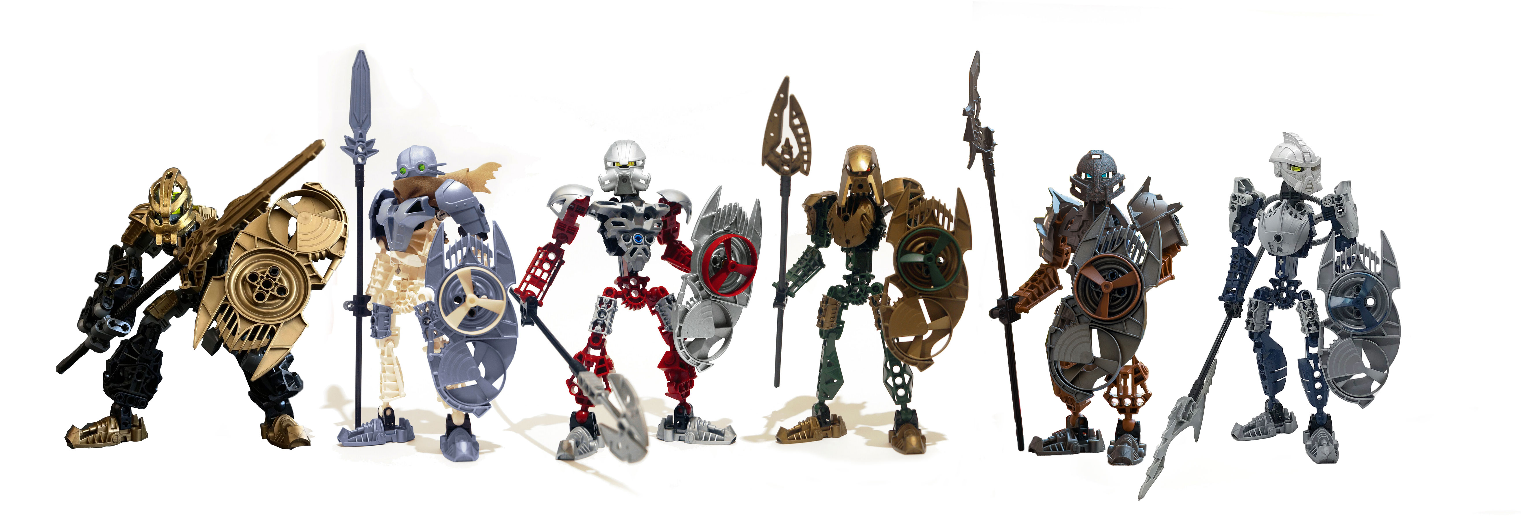
How do they look?
Since two of the Toa Hagah models that won the first half of the canon contest happened to utilize new metallic colours that fit perfectly in line with these “requirements”; Metal blue Kualus, and gunmetal Pouks - I’ve elected to keep them - leaving metallic green and copper between the two remaining Hagah…
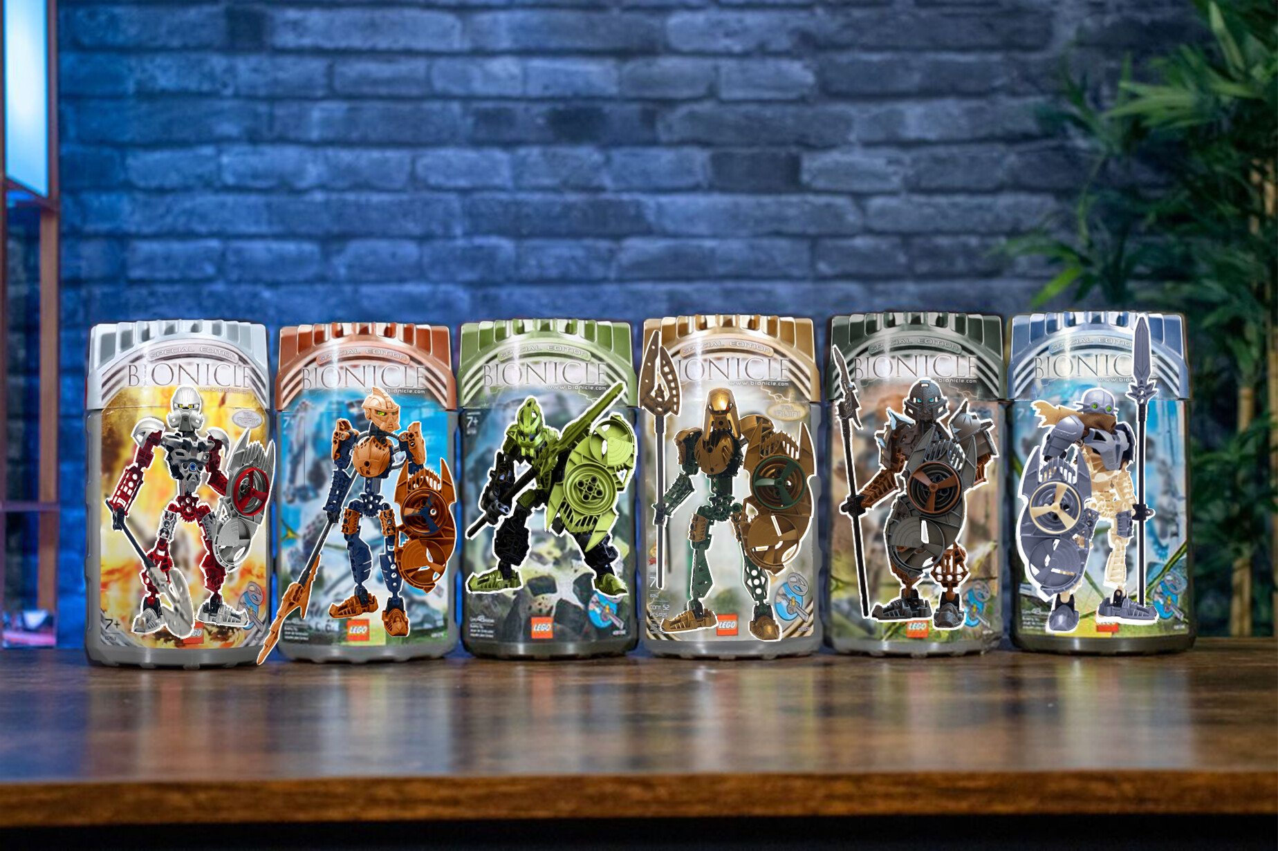
This is my personal favourite distribution of colours.
At first I wanted to see Gaaki’s and Bomonga’s metallics flipped as those felt like more elemental combinations to me and I considered them less drastic deviations from the original winning designs… but it made Pouks and Bomonga too similar to each other colour-wise.
This isn’t the definitive conclusion by any means - just the one of the potential combinations that meet the criteria of this particular hypothetical that was visually the most satisfying and appealing to me, personally.
There are many variables and biases in play here, so if you have other thoughts on this, you’re more than welcome to share them.
But just remember:
LEGO doesn’t just design the toys, they’re selling products. The marketing/branding/shelf presence is all taken into equal consideration because if that fails - the sets don’t sell; and to ignore any part of what makes the whole product when making the claim your preference is “what they would have done” is disingenuous.
Was this entire post basically pointless?
…yes ![]()
Did I have fun with it anyway?
sure. ![]()
Images used are a combination of my own, edits of my own, the winning Hagah designs by @TheUnderscoredDouble, @doni and @Kodiak, from All-Out-Brick, edits of All-Out-Brick’s, and @Planetperson.