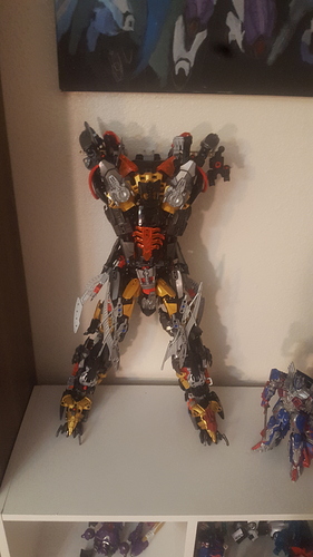
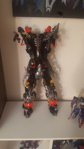
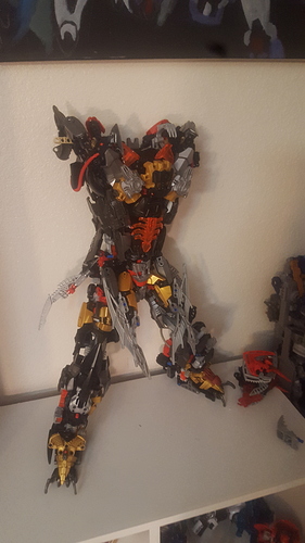
Would like constructive criticism
18 Likes
Too many different colours.
I also can’t see anything that makes this thing unique aside from its size. Try to incorporate some theme, like claws or armour or Idk. It’s a bit all over the place.
The feet are too small, you fix that, and the moc will be perfect.
It looks great so far
Maybe adjust the colors a bit
The color blocking/layering is mainly what you need to work on. Try to keep colors together, and to layer colors consistently.
Sketching the character/ finding a similar character design for reference could help a bit.


