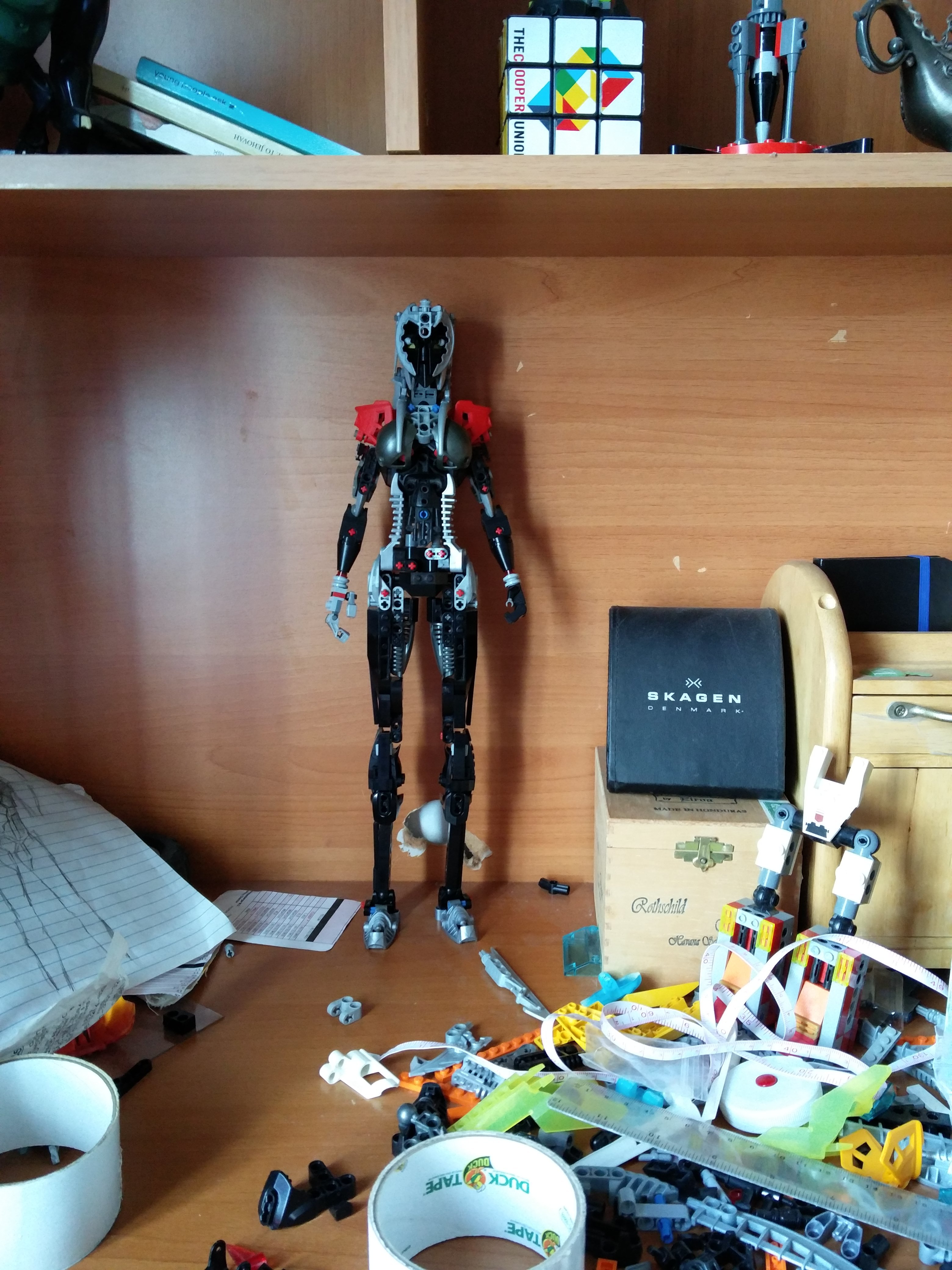
That somehow can’t stand by itself and needs a wall behind it.
It’s still subject to change but I’m just throwing it out there to see how people react to it.
UPDATE:
25 Likes
Its pretty kewl. I dont care for the color of the launchers, but they do give a nice “hourglass” shape. OVerall, nice job, mang.
The color of those launcher pieces kind of throws off the hourglass shape, but the shaping besides that is fine. I also like how you designed the legs and arms.
1 Like
I don’t understand how the color throws off the shape. If anything I think the launcher pieces lend it the hourglass shape
1 Like
I agree with Stoax. I think it’s because it draws attention there, and it has the flat part at the end.
I really have no idea why this post is getting so much less attention than the other posts, because this MOC at its current state is still at the same level or better than whatever is above this post. In terms of form and shape, this MOC is miles above everything else because of how realistically it represents normal proportions and what an actual character would likely look like. Someone explain why something like “Self-Moc v2” or some other MOC built using a standard bionicle frame and just a different choice of armor gets more views than this. I mean seriously look at the shadow it casts- if you didn’t know better you’d think that it was a real feminine figure. There are two so called female mocs posted above this one and none of them come even close to actually looking as feminine as mine.
And yeah I’m being a bit arrogant here… but just give me an explanation.
Edited for Double Post.
~Chronicler.
Hey Recynon, just so you know, Double Posting is against the rules. If you need to update something you said, use the pencil button on your post.
Hmm, shaping looks alright, though given we only have a front shot I’m not sure whether that’s just camera trickery or not, color blocking is lacking, horrendously skinny lower legs, exposed technic in the waist, just kind of a cluster of parts for a face, unfortunately, it appears to have the poseability of a brick.
Alright, you’re new here, you posted in a slow point, the moc is a wip, and the title isn’t exactly captivating.
Edited -legomaster
1 Like
I expected something mocking modern feminism / social justice; was that your goal? What is there here besides a black humanoid? I get it’s a wip but it seems kinda generic now.
As for this getting less attention
what sounds more interesting; strong independent black woman or Plague ringer (yes I know that’s shameless self promotion of my painted gundam I posted.)
As I said it’s not interesting to look at. It’s a generic humanoid.
Yes self moc v2 isn’t interesting but it gets a pass as people want to see the improvements.
Edited -legomaster
3 Likes
In fact, with the pictures you’ve given us, it doesn’t even look like it can move at all.
And yes, shaping is good, but the colors of the moc aren’t as good. It’s sprinkled with Red pins, and the other colors are poorly distributed.
TL:DR, you’re moc is good, but I don’t think it’s the perfect thing you think it is.
Edited -legomaster
I personally dislike the length of the arms, feels short.
Edited -legomaster
There are a couple things you can do that will help make your MOC more visible and more appealing without changing anything in its build:
- Use a short, snappy title. Something like: “Shadow Maid (WIP)”. Remember that on these Boards your topic title and tags are the only things that a visible while people are browsing. You need to grab their attention with these features.
-
Be sure to spend time taking good, clean pictures (even for a WIP). If you look at the most popular Boards topics, they’re almost all MOC topics with great MOCs and really clean photography. Photos don’t have to be professional-quality, it just has be well-lit and free of visual clutter. In your case, your desk offers a pretty good background for your current MOC. You just have to make sure that of the non-LEGO stuff is out of the frame.
-
Finally, be open and receptive to critique. It’s the best way to grow, improve your skills and integrate yourself as a healthy member of this community.
11 Likes
Alright I’m gonna just stop you right there. You’ve got it pretty accurate, but don’t - and I mean never - make the mistake of assuming your design is “superior” to others. It’s a quick way to make yourself unpopular and frankly, look a bit egotistical.
Because fun fact: A lot of us have skill. Plenty of it. Whether or not my whimsical Revenants follow “human” proportions (which for the most part, they do) is completely up to debate, but I’ll defend one thing about them: They’re unique, fun character designs that actually grab attention and even if they’re simplistic, each one takes a pretty hefty amount of design knowledge and style mastery to create.
On the other hand, we have here a miscolored generic humanoid that mostly follows human proportions (barring the legs, not sure how you ended up wrong with those).
Additionally, what has everybody else said? Which one sounds more interesting to the general audience we have on this site - “Strong, Independent Black Woman”…or “Agent Entropy?” Even if the latter has a pretty simple title, it’s the one far more likely to grab a teenage kid’s attention. Thus, you get less attention from the name alone. It’s a pretty easy fix that I highly recommend.
Two things: One, we can’t even see the shadow. Two, if we could see the shadow I’m sure it would be very feminine, but it would still have some of the same flaws the regular MOC does (most notably the calves).
This one, I’ll give you credit on. But that’s a fault of the other MOCs - not some reason for this topic to get free attention for having a mostly accurate feminine build. As other have, I’ll use myself as an example here - I’ve got a character who has pretty accurate feminine proportions, but has interesting additions like my Revenant species’ signature ears, a tail, and a giant sheath for a sword. Realistic to an everyday girl? Heck no. Accurate to what interests most people on this site? Yes. And she does it while still maintaining a surprisingly accurate female figure.
TL:DR
Slow down on the self-praise a bit and instead of trying to defend what you do have, figure out how to make it better. If you want views and attention, you need to figure out how to get them rather than sticking with methods that would be better suited on Facebook.
I apologize if this is little too harsh - it almost always ends up that way - but I hope this explanation assists you and makes up for the lack of actual critique on the MOC, of which I have plenty. Good luck, and good day.
11 Likes
Or the fault of what they’re based on. One is a female G1 Toa warrior, who has to wear armor and stuff, and is also biomechanical. That’s like me saying my castle is better at being a castle than a house.
4 Likes
Alright, no matter how good a MOC may be, never say that you have the best MOC ever, or anything like that. For every MOCist, there’s always someone better. It’s a fact of life and a fact of making any sort of art. There’s no “best,” no matter how good you may be. There’s a MOCist worse than I and there’s a MOCist better than I. And there’s a MOCist worse and better than them, too, and so on.
Sure, it may have a “very realistic” feminine build, but what does that really mean as far as how popular the MOC is? People like the MOCs that they like, and whether it’s “extremely feminine” isn’t exactly what dictates whether people will like it. In fact, from what I’ve seen, being more open to critique and improvement will actually make people more likely to visit your topics. Someone can have an amazing MOC but their attitude can really affect how people view it.
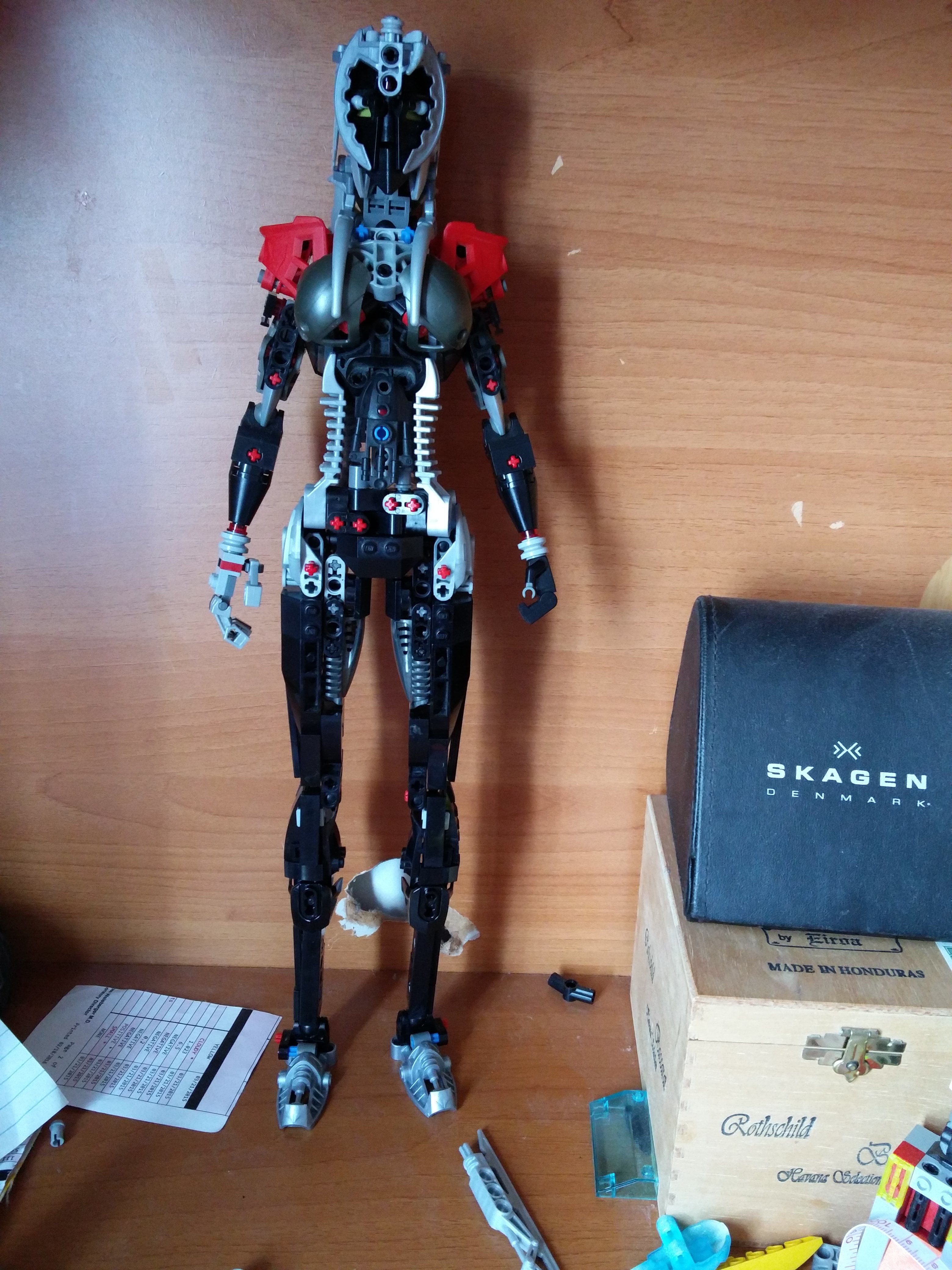
Now, about the MOC, it’s not a bad MOC by any means, but the launcher pieces on the side detract from the shaping with how much they stick out, and the MOC sort of just looks bland. It’s a great skeleton, but doesn’t really feel like a fully realized concept.
4 Likes
I thank you all for your input. Strong independent black woman is just actually a joke- the MOC is black colored and it can’t stand on its own. I do not like to name the things I build as if it’s some sort of character because I only see what I build as a sculpture and not much else.
The way I critique MOCs and judge whether I like them or not is first and foremost whether or not they have good proportions and a good shape, not even factoring in the actual design and color just yet. This is a difference in opinion, that in order for something to look good it has to have a good shape. It’s like when you draw a person; you can give that person a lot of fancy clothes or armor and armor design really pretty but at the end of the day if that thing has legs that are too short or too thick, or a torso that is not a V shape for a male and an hourglass for a female, that drawing falls short. That’s why artists start with the basic outline and work their way up. I admit that mine doesn’t really have anything interesting about it- no weapons or anything, but I do think that things like the head and hair are well done and how the pieces flow well together to produce a single shape. And that was my entire goal- to make a figure with a good shape, because I don’t think I have seen a lot of MOCs try to actually look humanoid (there are though).
I’m not saying that any of you don’t have skill, just that the other creations most likely didn’t take as long as mine (at least a year).
There is bad camerawork involved. The face is an actual face, you just cant see it. There is an hourglass shape but again the piece under the armpits is hard to see.
The arms may be a bit short that I agree on.
The color is horrible- pretty bland and the red for the shoulder pieces comes out of nowhere. But they don’t make that shin piece in any other color and I otherwise don’t know how I can improve the color- the black for the legs is needed to make the combination of pieces there look whole, I think any other color would expose all the different pieces in the legs.
Torso- I’m working on taking those launcher pieces out but I really don’t think they’re as bad as people say they are- they inherently have a curved shape just like a real woman’s torso.
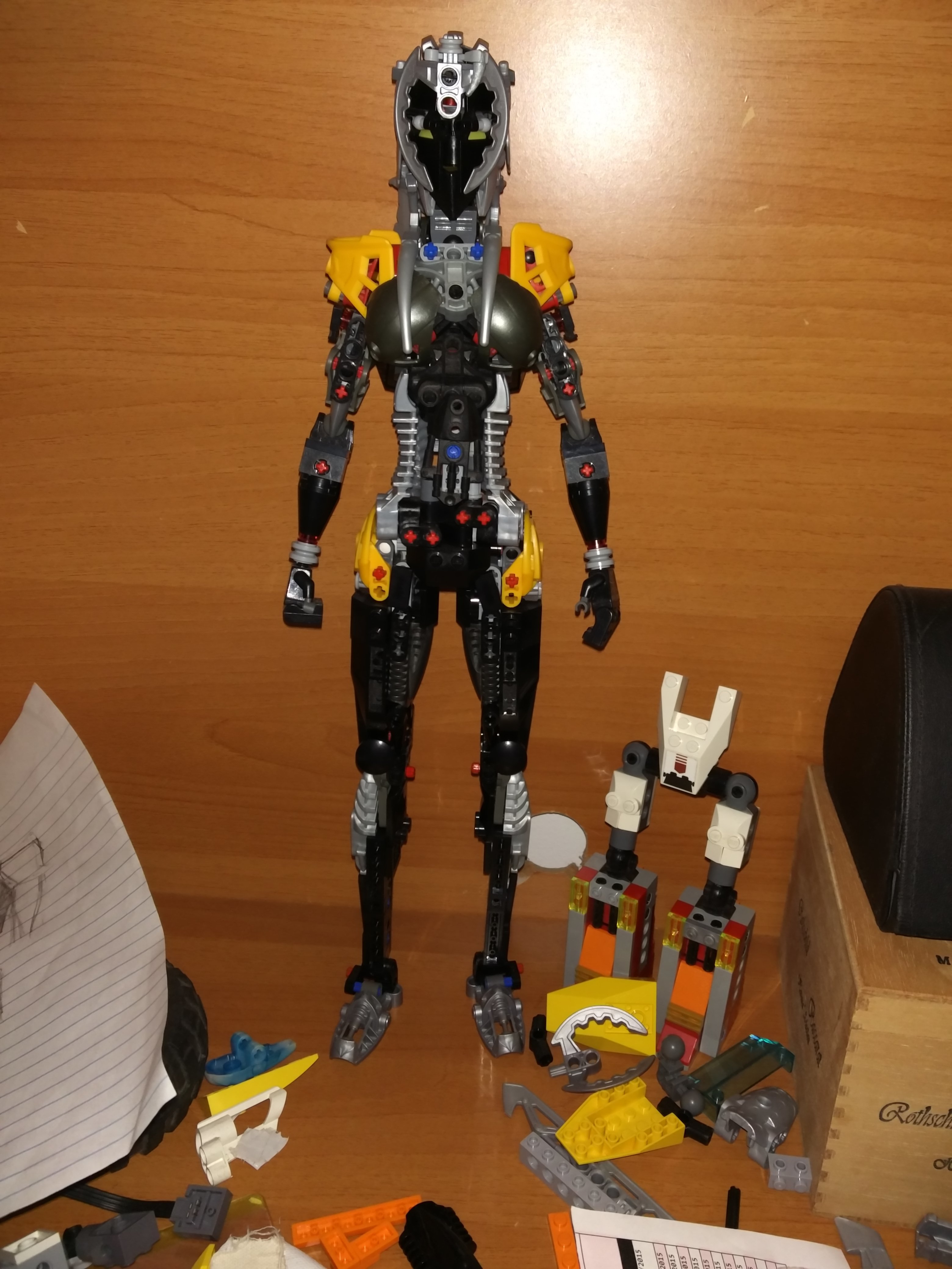
You see its shadow right there on the desk wall behind it.
Now for the proportions- I am really confused and frustrated at how the way I perceive it differs from how other people perceive it. I may be wrong but here’s why I think I am right from an artist’s perspective. I made a crude outline of the figure from the photo using the photo itself and this is what it looks like:

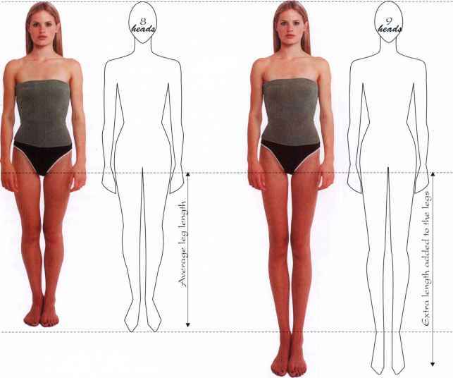
In real life the legs are not that long but in my opinion ideal proportions means longer legs and longer legs generally look better and that is why I made the legs deliberately long. I agree with people in that the torso is less than idea - there is a general widening where the waist is supposed to be but the hourglass shape is not precisely achieved. Now compare this sketch with images of body proportions and shapes found on google images:

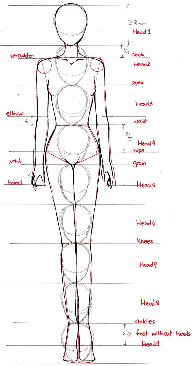
If you look at the shape of the legs, they are not in fact too skinny. The curvatures of my outline and the sketches from google images are very similar, with the torso having the most difference. The hips here are too boxy and need to be smoothened out, but like I said otherwise the waist narrows where it should. I will be working on the torso accordingly. Also, if the arms are too short they’re not that much shorter because in the first google images picture the wrist of the woman is where the torso ends, and mine is about the same place.
Many of the things that understandably bother other people do not bother me, such as the technic pins being exposed and the technic pieces near the hip being exposed. I do not think that these detract from the shape and form of the MOC at all.
I am not saying this is the best MOC, but I am going to say that I think this is the best female MOC not in terms of color but in terms of looking feminine. If you think that there is a better MOC in that respect (I’ve already seen Eoro Okkonen’s MOCs) then post it here and I will see if I can learn from it.
I understand why people would say that it’s a generic humanoid, but I think it’s quite unique because it looks the most human.
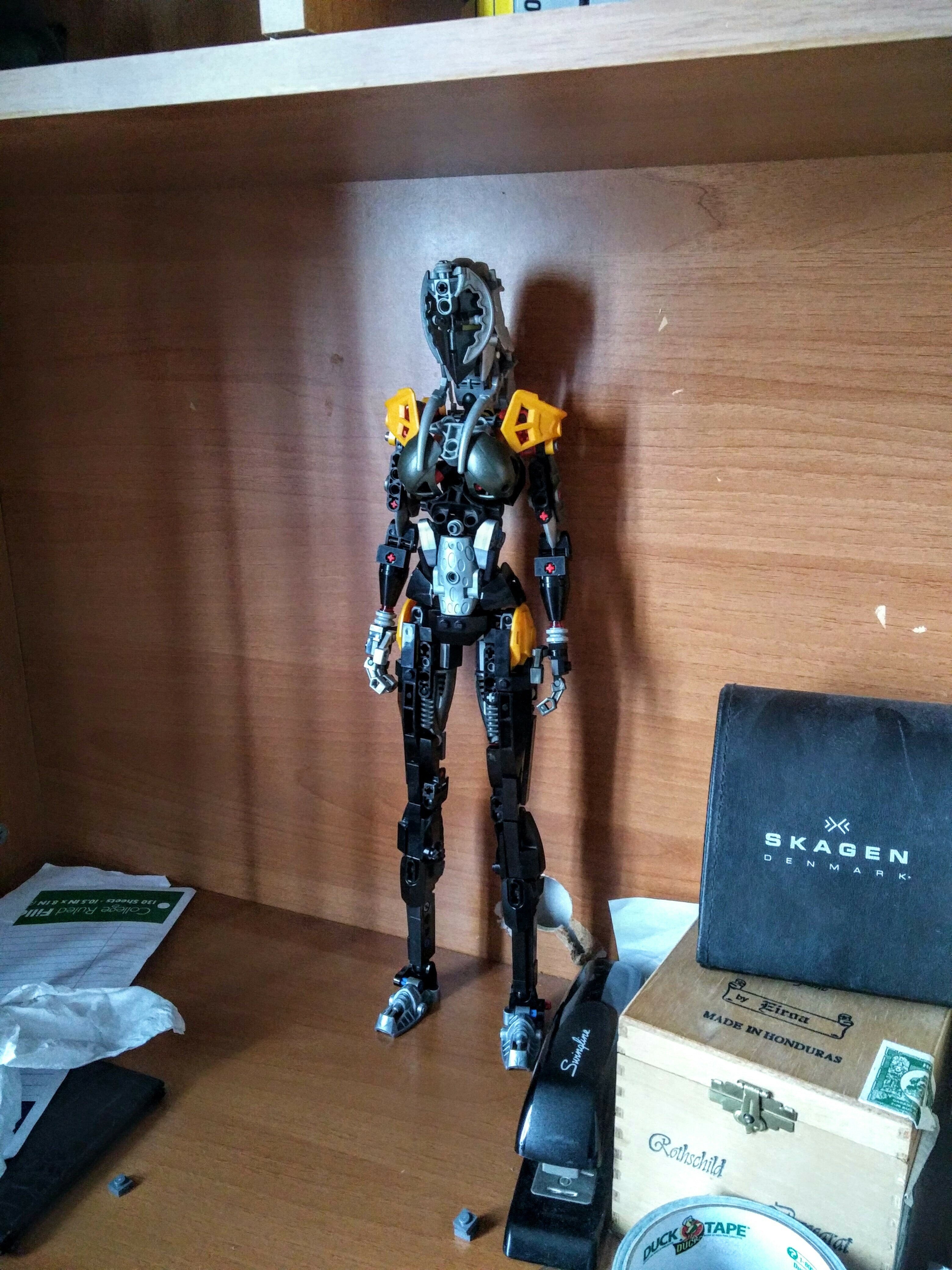
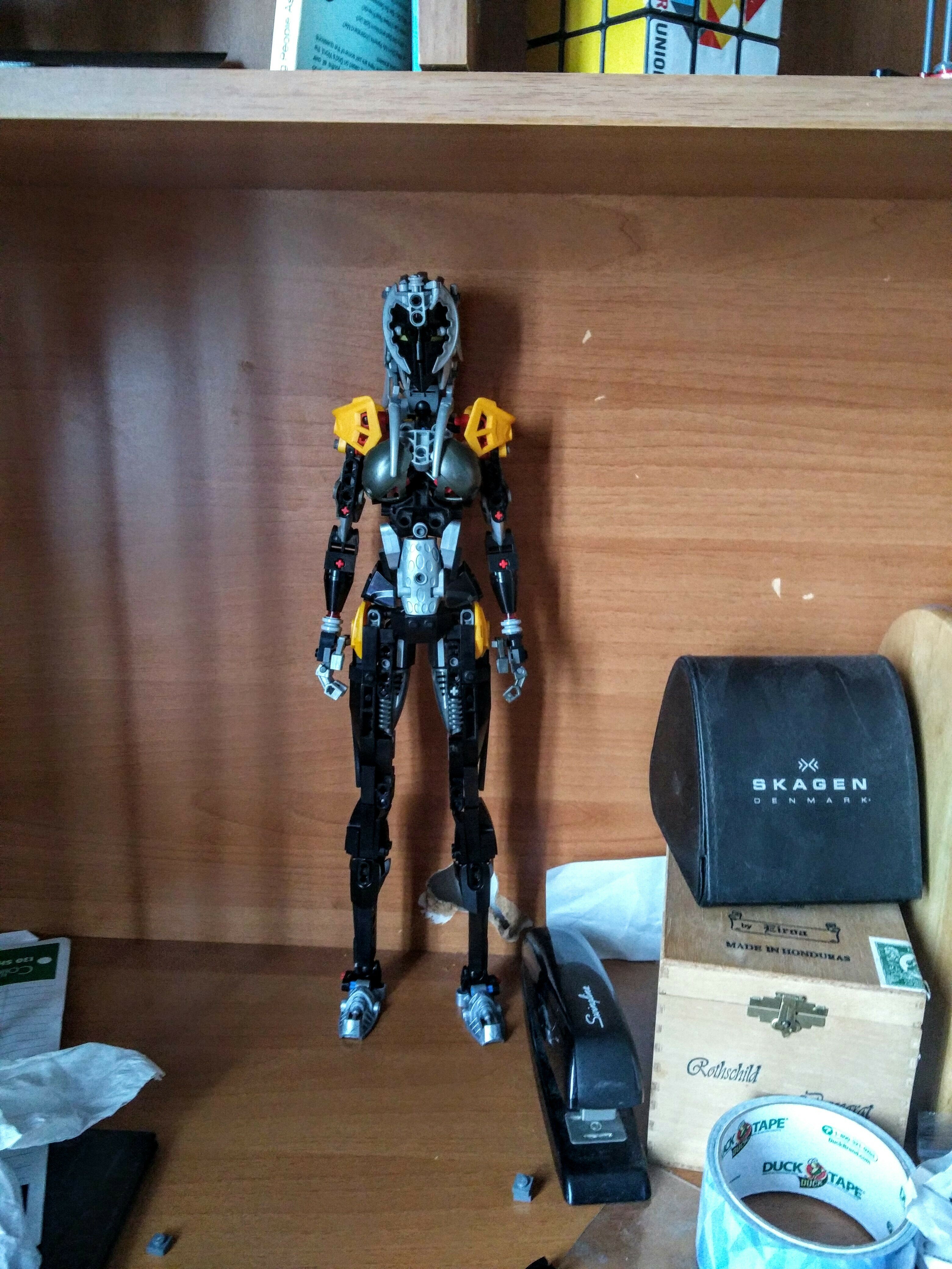
Here is a better photo of the head from an earlier version of the MOC:
Btw yes poseability sucks and it’s stiff as heck but I didn’t make it to play with it. I made it to display. I can’t do that much to change poseability without affecting the form.
I suck with names so maybe y’all could help me come up with a name.
Once again I appreciate everyone’s input, it helps a lot.
Edited for language -legomaster
2 Likes
I won’t touch on the launcher peices since everyone’s already done that but the previous version looked better. The yellow mixes better with the gunmetal, silver, and Black. I don’t know why but the head also looks better on this one. Red and blue pins are still a problem but I can forgive that as a nessesary evil.
1 Like
The worst thing about the moc is the legs, the lower leg is way too skinny, the waist also looks weird since its just a straight line from the torso
But other than that it looks great
Thanks a lot! But have you seen my reply about the shape of the MOC? I’m pretty sure that the legs are supposed to be that skinny if you’re talking about a person here. The waist is not a straight line if you look at the outline I drew. So please tell me why you think the lower legs are too skinny, because the way I see it they’re the same proportioned size as the drawings.
Perhaps in the eyes of the creator it’s accurate. As an experienced MOCist myself (notorious for making feminine shaped characters ironically enough), I can safely say it’s hard to see the same flaws in your own work as others see in it.
In this case everybody has told you the lower legs are too skinny and disproportionate. You can choose to listen or not, but as the creator, your views of your MOCs will be, by default, flawed. No fault of your own, simply the nature of creating any form of art.
4 Likes