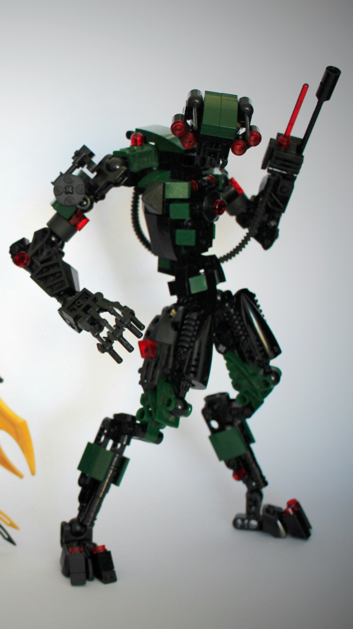
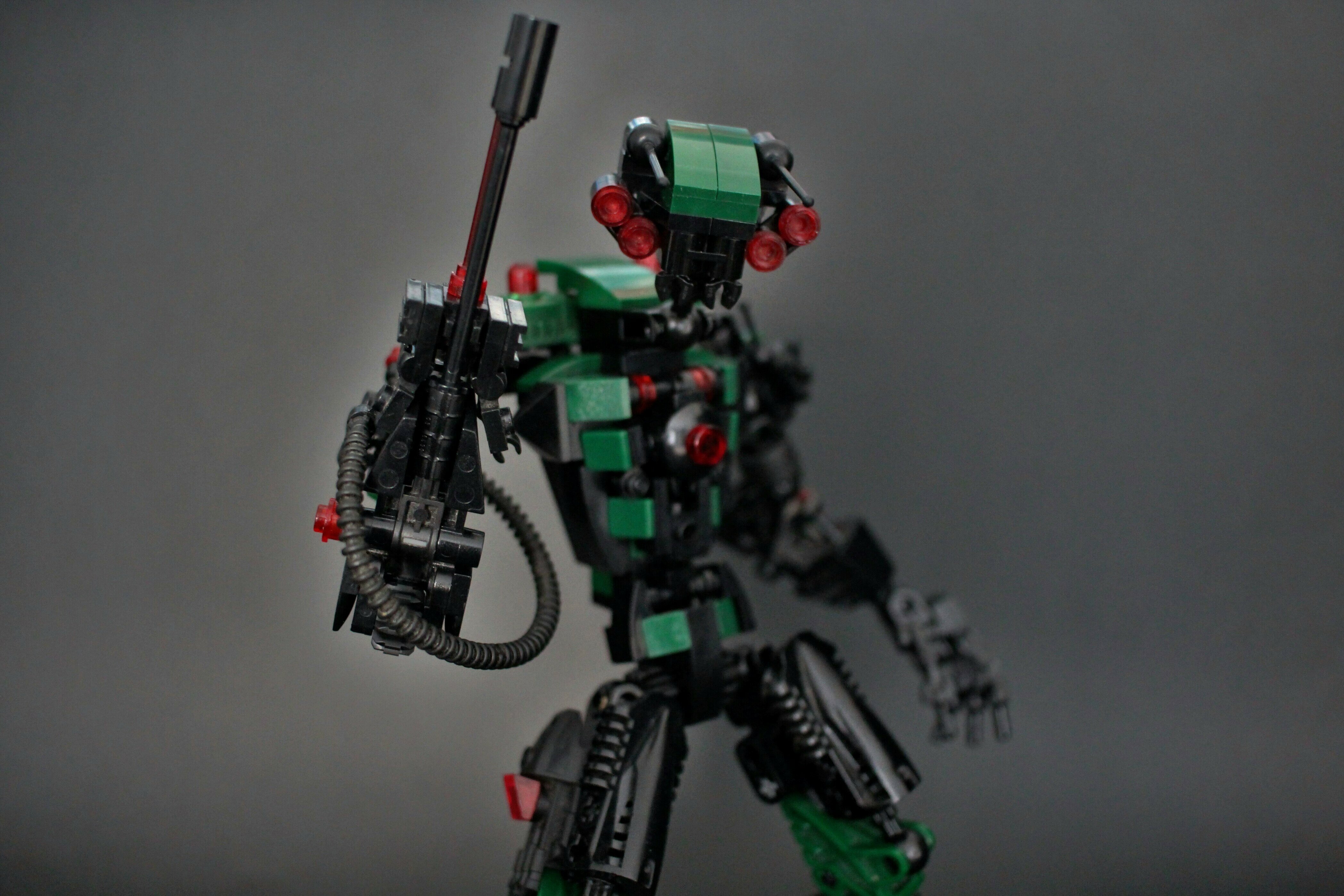
I made this guy quite a while ago but never ended up uploading him because i was never satisfied with how he looked. I figured if theres anyone who can help me finish him it’s you guys. Give me any and all criticism you have and let me know what he’s missing or things that need changing or removing.
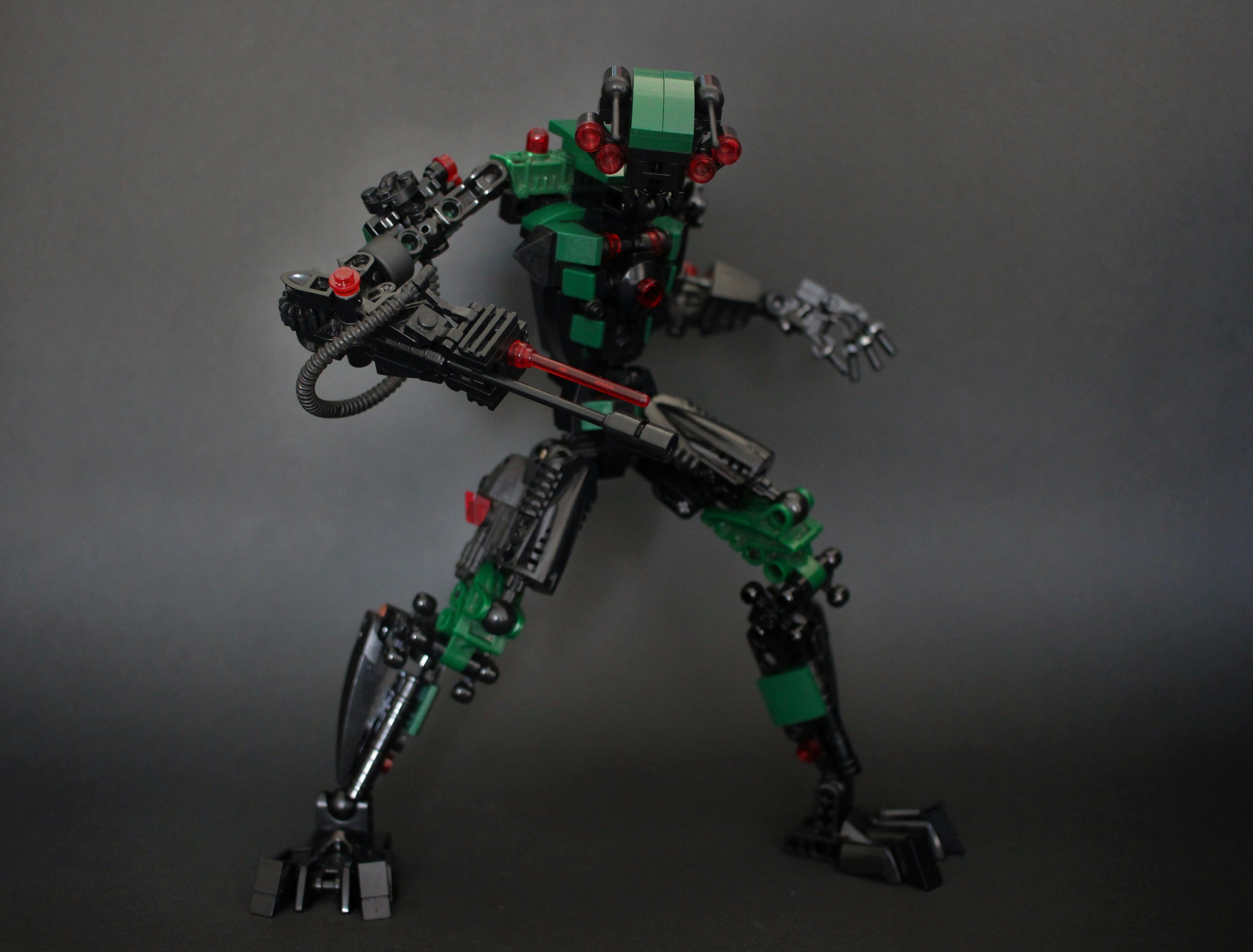
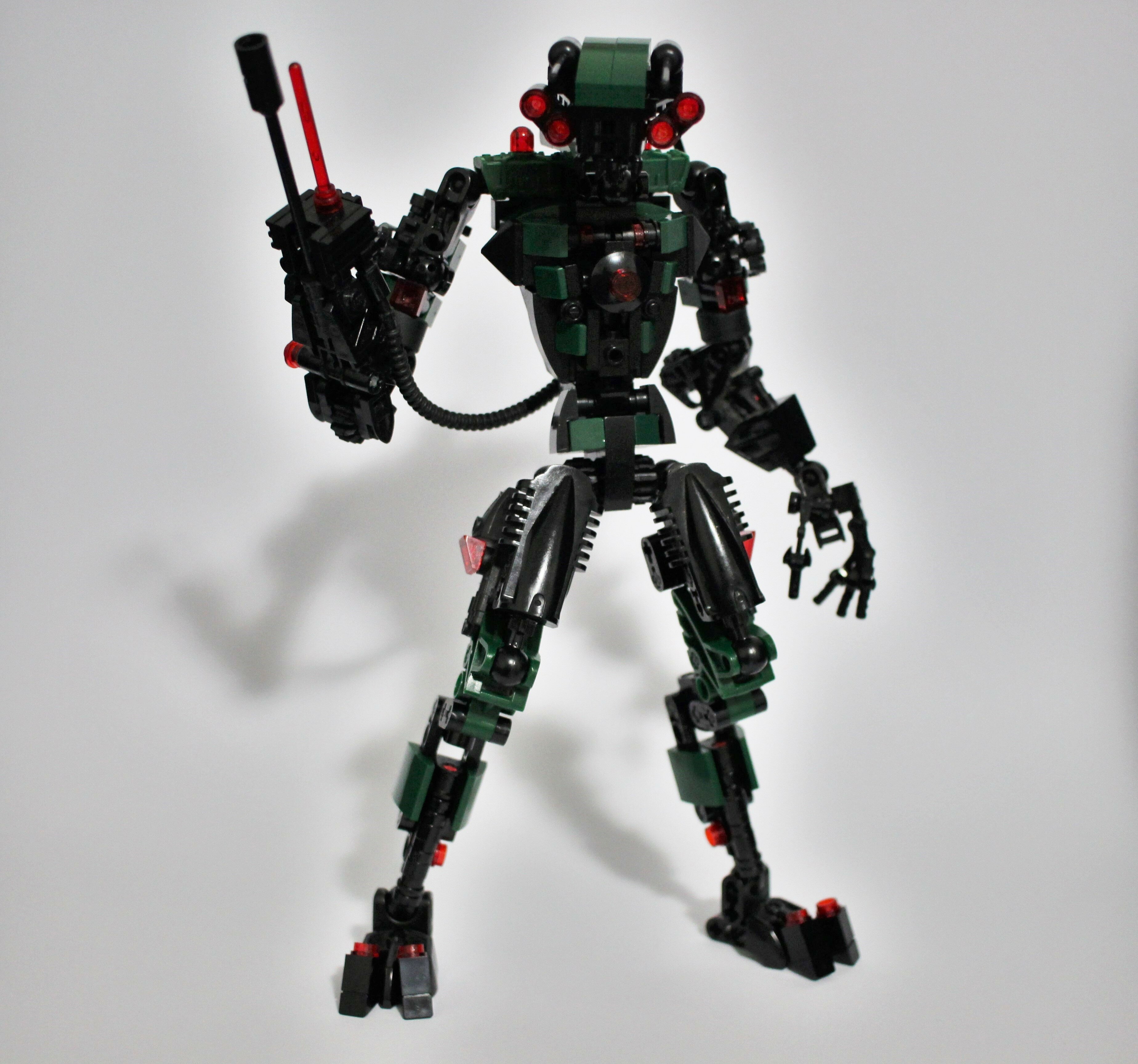
(EDIT): Thankyou all for your constructive feedback, I’m really happy with how he looks now, and if i end up changing him significantly more I may post a V2 at some point in the future. For the meantime however, here’s a photo taken from Dragonfly’s topic of what he looks like now
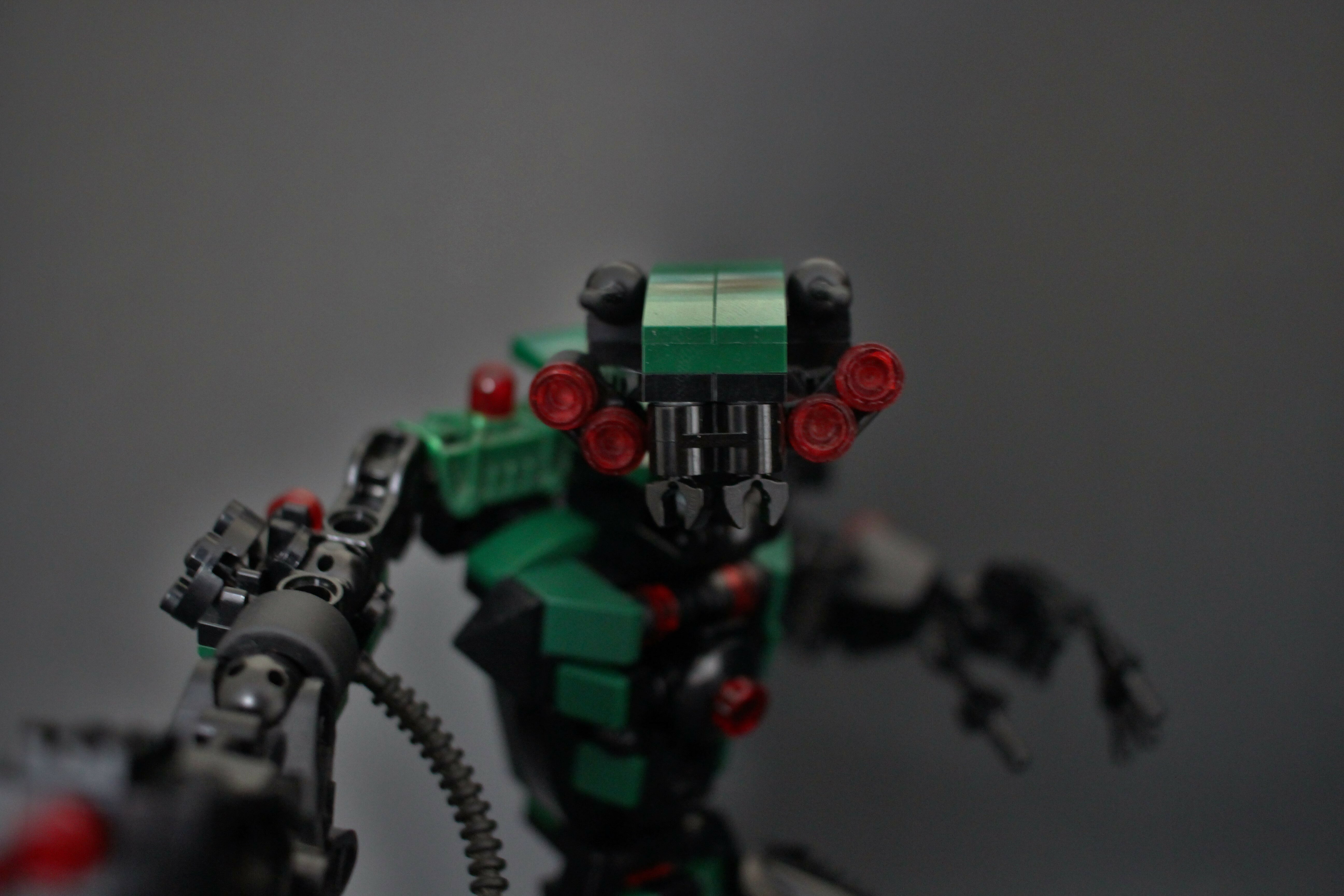
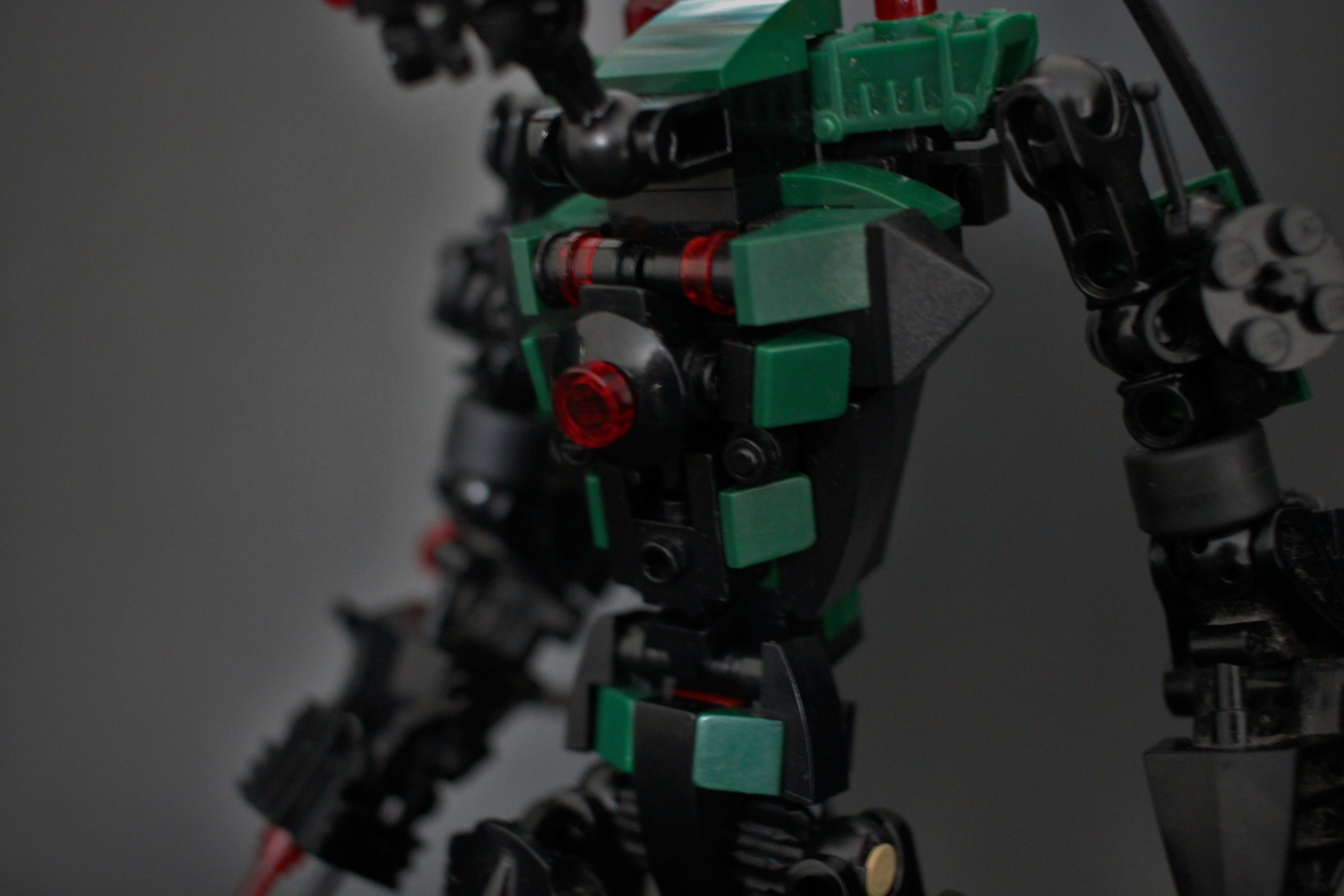
Fantastic. The dark green and black go together in a way that makes the MOC look sinister though also highly martial. The head design further reinforces this and makes for an all around cool looking character.
Maybe just because you’re so used to it? I know that can happen with my writing; I know what I’m planning and what I intended, so it doesn’t seem the same to me as it does the reader. Granted, that’s just writing, but I would think that it could happen for any creative process. You also might be comparing it to your other MOCs; I’m looking through your other work and I remember being quite impressed by all of it. Just a couple of ideas.
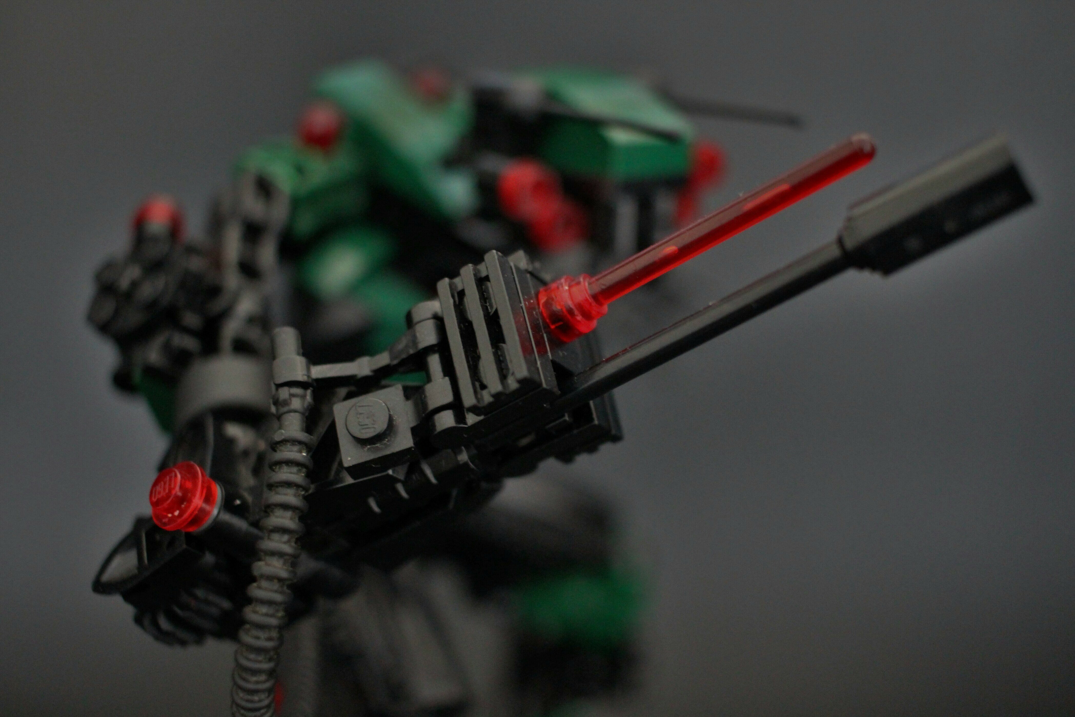
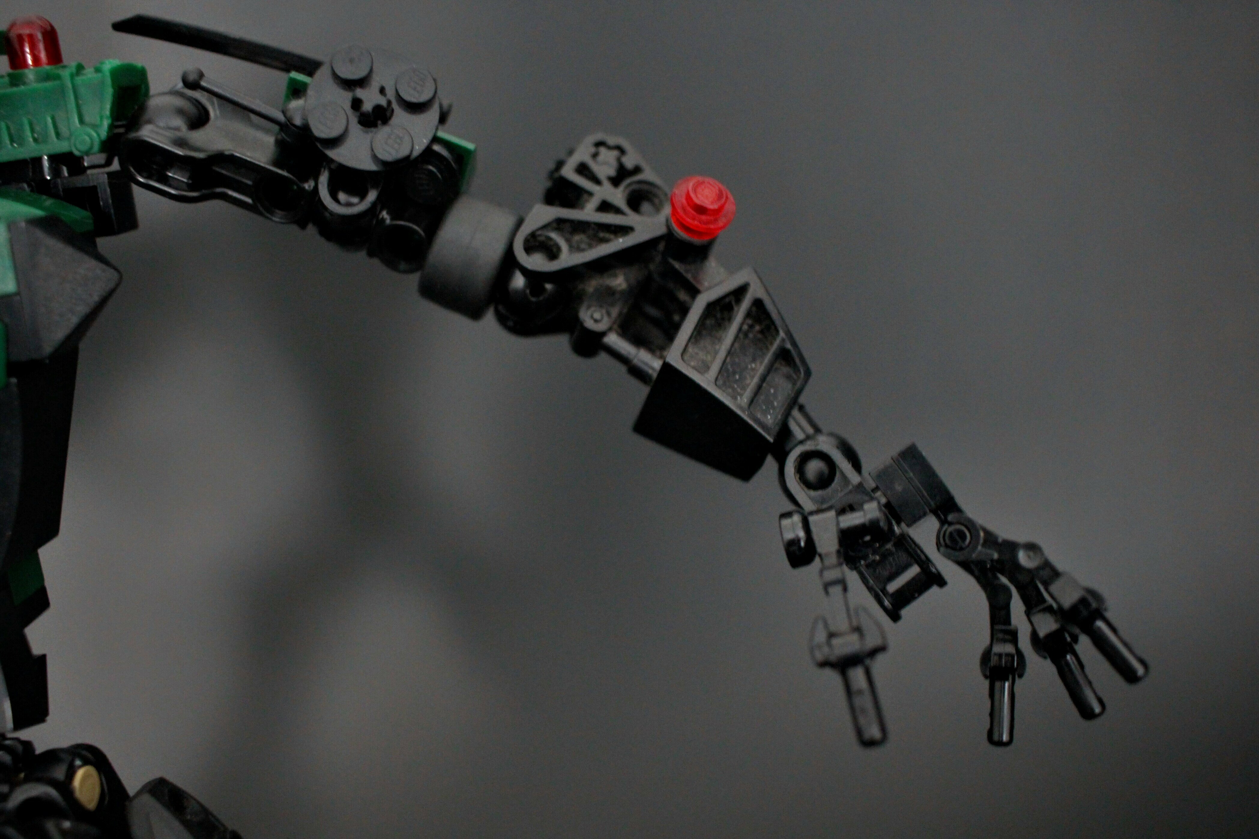
This is amazing!!! The colors look great, as well as almost everything else. The only things I don’t love about this is the outside of the calf looks sort of bulky, which goes with the mantis thing, but if I were you and I had the extra parts I would make it the same on both sides. And maybe covering up the technic holes on the arms with something, but I don’t know what. If he feels boring to you, might I suggest trans. orange or neon orange, just to add a little brightness. But he looks awesome to me.
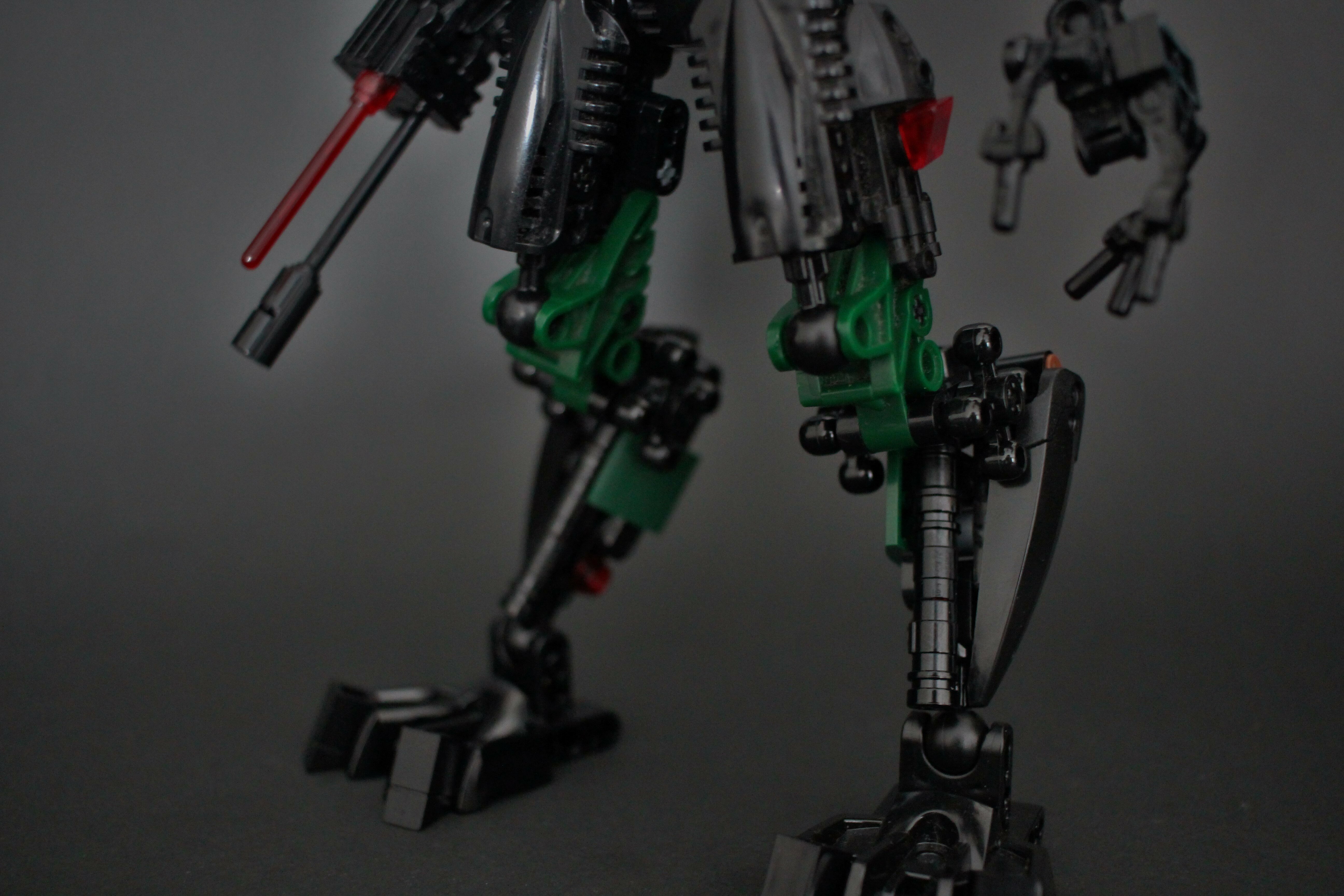
The lower legs’ asymmetry looks pretty bad imo, the front of the upper arms could probably be covered better, and without a bright accent color he doesn’t look too exciting, especially against that background. I also think the smoother texture of the system clashes with the limbs and bionicle pieces a bit.
The head is especially nice, but I really do advise adding an accent or brightening up the background. Funnily enough I had that problem once with metru blue and my old background.
I was expecting you to show up soon lmao. Thanks man, the feedback is much appreciated and i agree with almost everything you’ve said, i think the legs have always been my biggest gripe, but ive always been too lazy to do them over. But yeah considering people seem to generally like this guy i think itd be worth doing
the torso and head are brilliant the legs ehhh the asymmetry kinda kills it and the reverse double jointed knees are a bit funky with the technic gears being used to bulk them up, the feet are pretty noice other than that its pretty gud
Thanks for all the pointers guys, heres my progress so far: de-bulked the legs and made them symmetrical, made feet smaller, filled in holes on upper arms, changed pipe connection to weapon arm (sorry for bad camera quality)