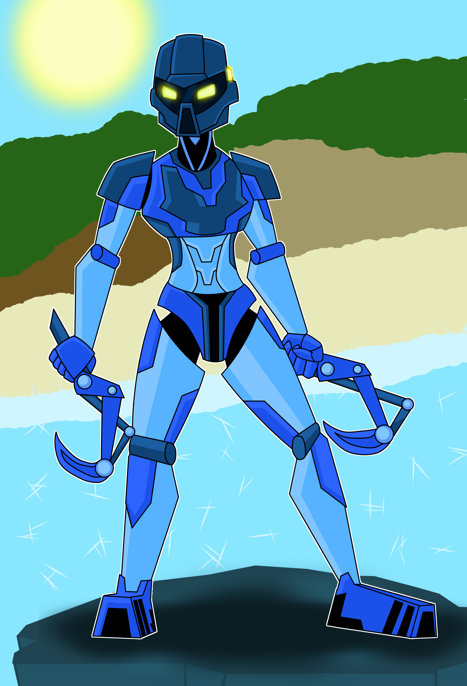
It’s been a while since I’ve done on of these, hasn’t it? Well, here’s my take on Gali Mata.
So, thoughts? Do you like it? Dislike it? Hate it? Let me know!
And if you haven’t already, check out the others.
A while ago I was feeling sortof nostalgic about G1 so I drew a quick little Tahu Mata.
[image]
I might do the rest of the '01 Toa eventually, too.
Thoughts?
Well, I said I’d do the other Toa, finally got around to trying Lewa. Really happy with the way it turned out.
[image]
Thoughts? Like it? Dislike it? Hate it? Let me know! here if you haven’t.
I drew Onua, but that drawing is really really good, so I’m going to post it after this one.
Anyway, here it is!
[image]
And before anyone says, yeah, he’s really skinny. He might look better if he was a bit bulkier, but I’m really happy with how he turned out so I’m not complaining.
But, maybe you would like to complain? Go ahead! Do you like it? Dislike it? Hate it? Let me know.
Next up, Onua! This one I’m soooo happy with how it turned out.
[image]
Thoughts? Like it, dislike it, hate it? Let me know. Tahu
Lewa
Pohatu
Kopaka will get done eventually, don’t worry.
79 Likes
I really enjoy the style of this. Nice work!
2 Likes
She looks great, but different.
I dunno if it is just my memory potating out on me, but this image feels different. I dunno. Maybe it’s the background…
1 Like
Looks pretty sweet. I how clean it is, this feels like art for an “official” BIONICLE cartoon or something.
1 Like
Altair
November 19, 2016, 1:21pm
5
For me, this is easily the best one you’ve done so far. Great job!
2 Likes
Oh yeah, absolutely without a doubt. I’m very happy with this one.
1 Like
Stoax
November 19, 2016, 2:14pm
7
Definitely one of the better drawn overall. The background looks a little odd, though, I kinda liked the more hazy effect you had with the other four.
2 Likes
Very interesting take on a classic model.
1 Like
That Kaukau is very well done- great work!
1 Like
Background’s a bit lacking, but I know you don’t usually do that.
1 Like
Love all of your work, good job!
1 Like
Yet again, you’ve made another I credible piece of artwork!
1 Like
_el
November 20, 2016, 4:05am
16
Looks good, but why is she in the desert
1 Like
Very nice! Love your take on the Kaukau and the Mata torso. Her hooks look nice and mechanical and the sun has nice glowy feel to it. She’s looking really solid overall. What program did you use to draw this?
A few critiques:
I really dig how you did the claws though I think they would benefit from some pommels .
Her left foot looks a bit awkward. The ankle seems a bit too skinny.
The blobby background feels a bit out of place in contrast to the smooth, crisp lines of the Toa.
The white outline around Gali’s silhouette, while consistent with the other Toa in this series, looks awkward up against the very dark rock. Have you tried removing the outline and seeing what she would look like?
That cross hatching technique you used for the water looks good though it almost makes it look like ice. How about using more flowing lines, like this ?
2 Likes
Firealpaca.
I originally had like, little bips on the end of the handles, but I didn’t really like how they looked.
Yeah, the idea was that it’s viewed from the side, so it’s different, but idk.
Well, as usual, i didn’t even really try with the background.
The white outline is just supposed to separate her from the background, 'cuz she’s the main point of the drawing.
Idk I thought it made the water look sparkly.
2 Likes