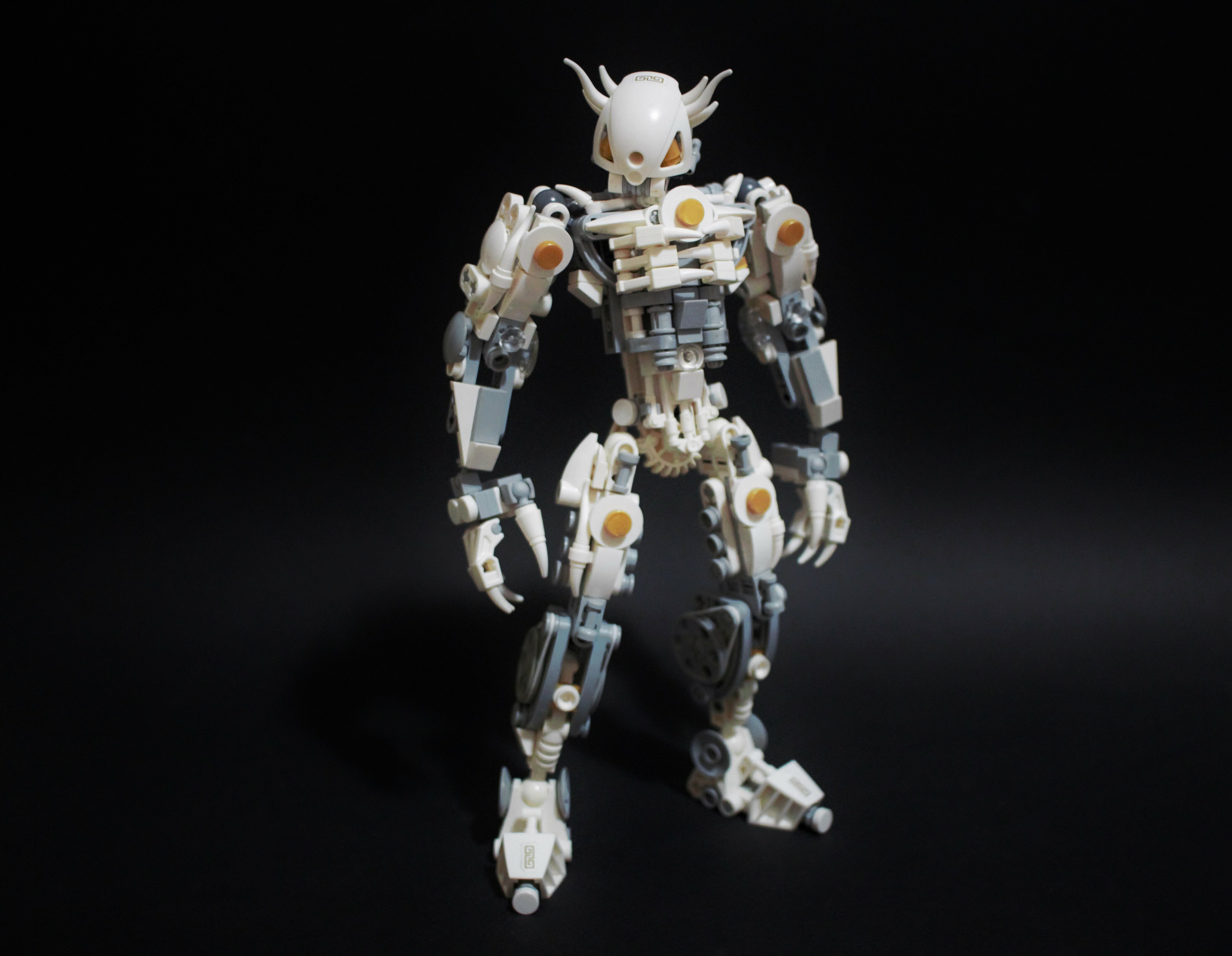
Gave Jayfa a complete overhaul, what more needs to be said?

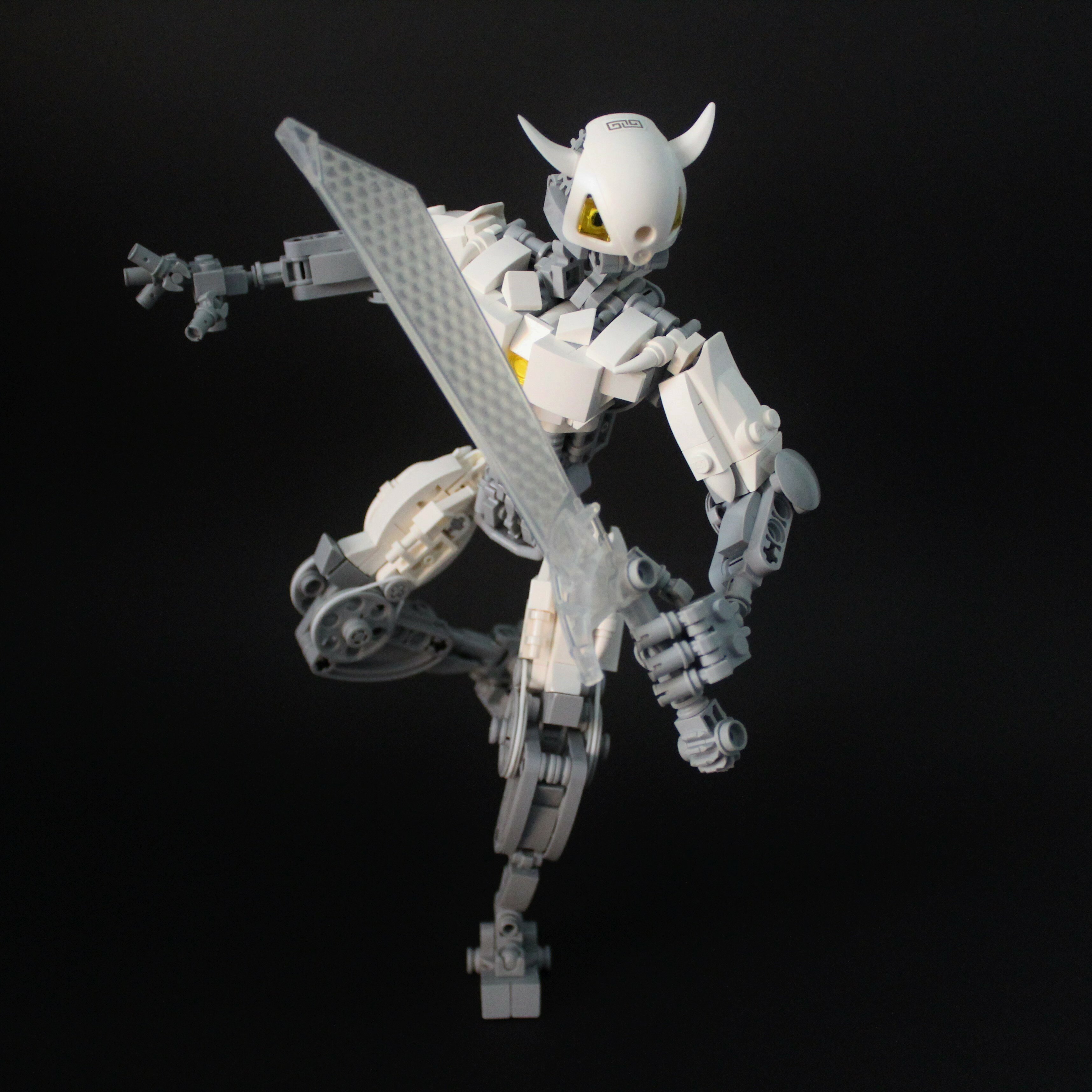

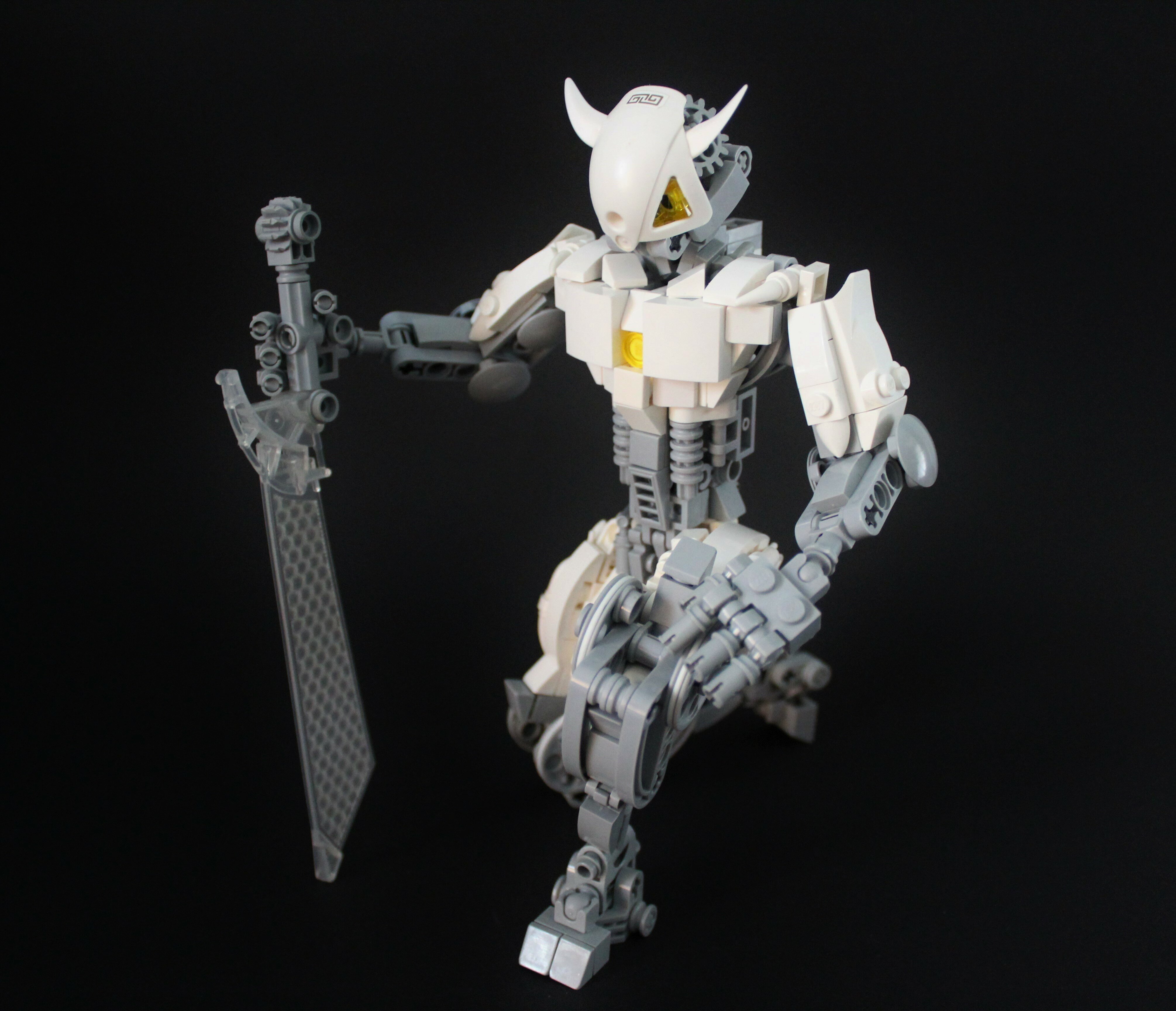

Last version
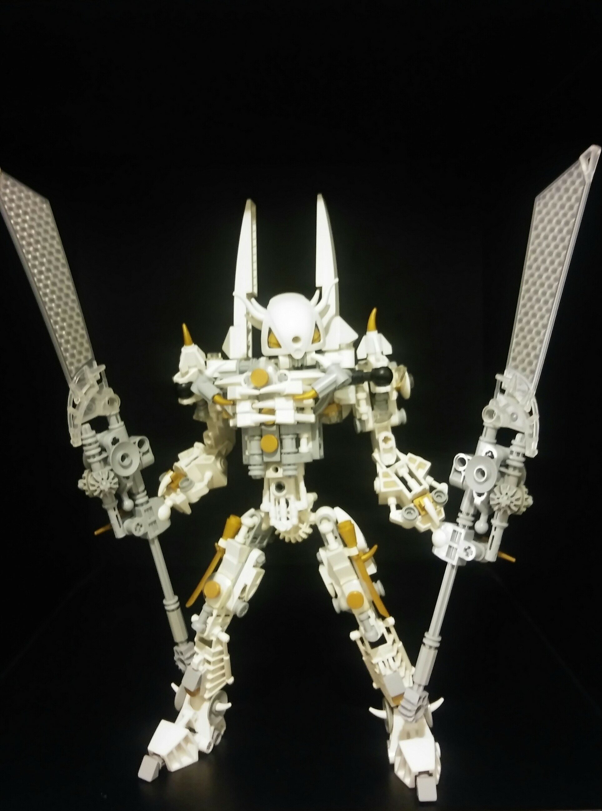
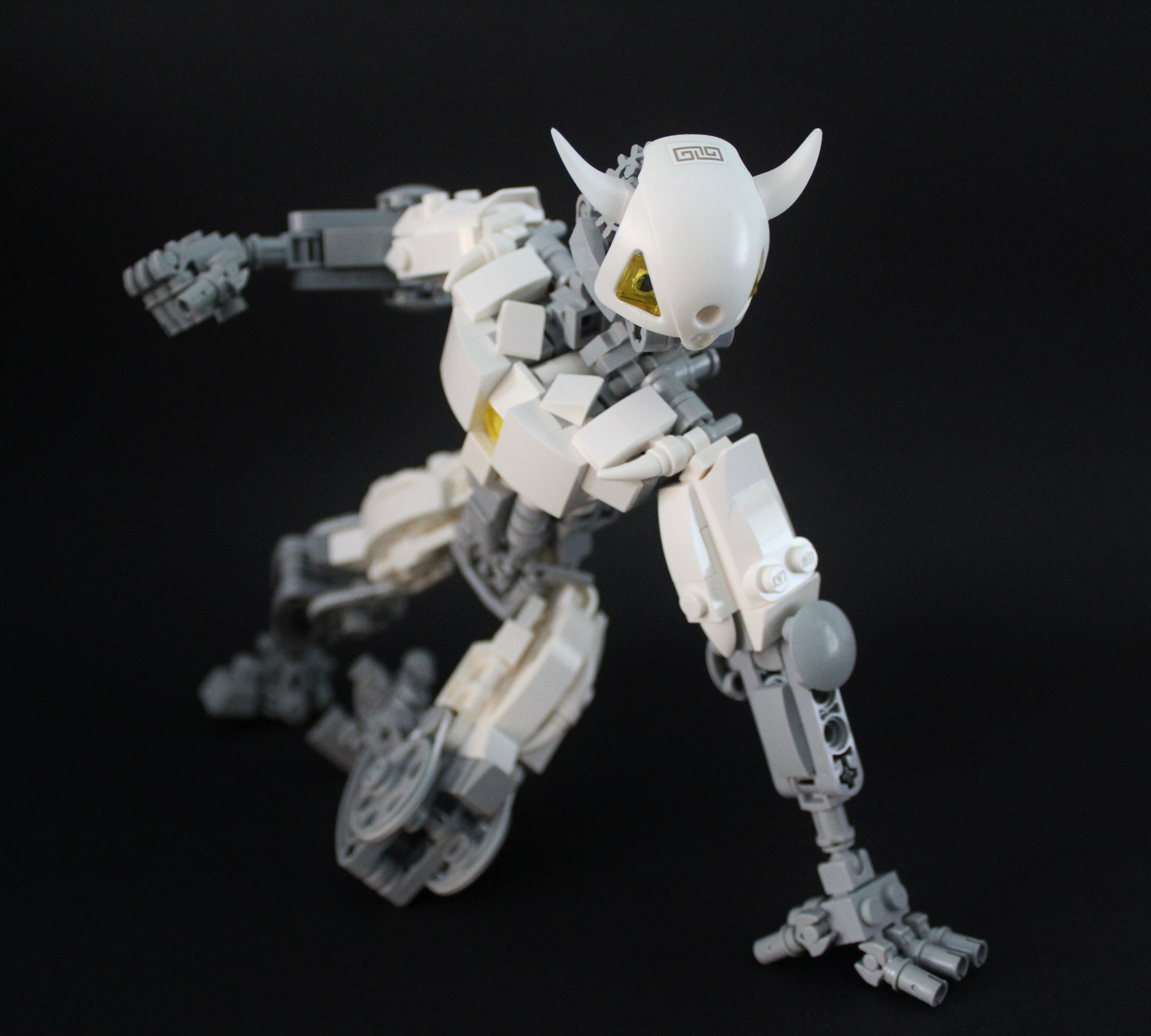
Ye olde V1
So, on the excalibur server im prett sure i told you i really friggin liked the moc, but i realized something
why doesnt it have calves reeee.
Thats seriously the only complaint i can say besides i miss the gold accents, the colorscheme seems a bit too dull now
I must say, I defiantly prefer this version over the last. It looks a lot cleaner and has a nice flow. I guess my one critique would be that the body shape is a little bland, but that is purely subjective.
I was slowly getting rid of the gold anyways, i never really liked the colour at all lmao
Ah, rip. Its cool m8
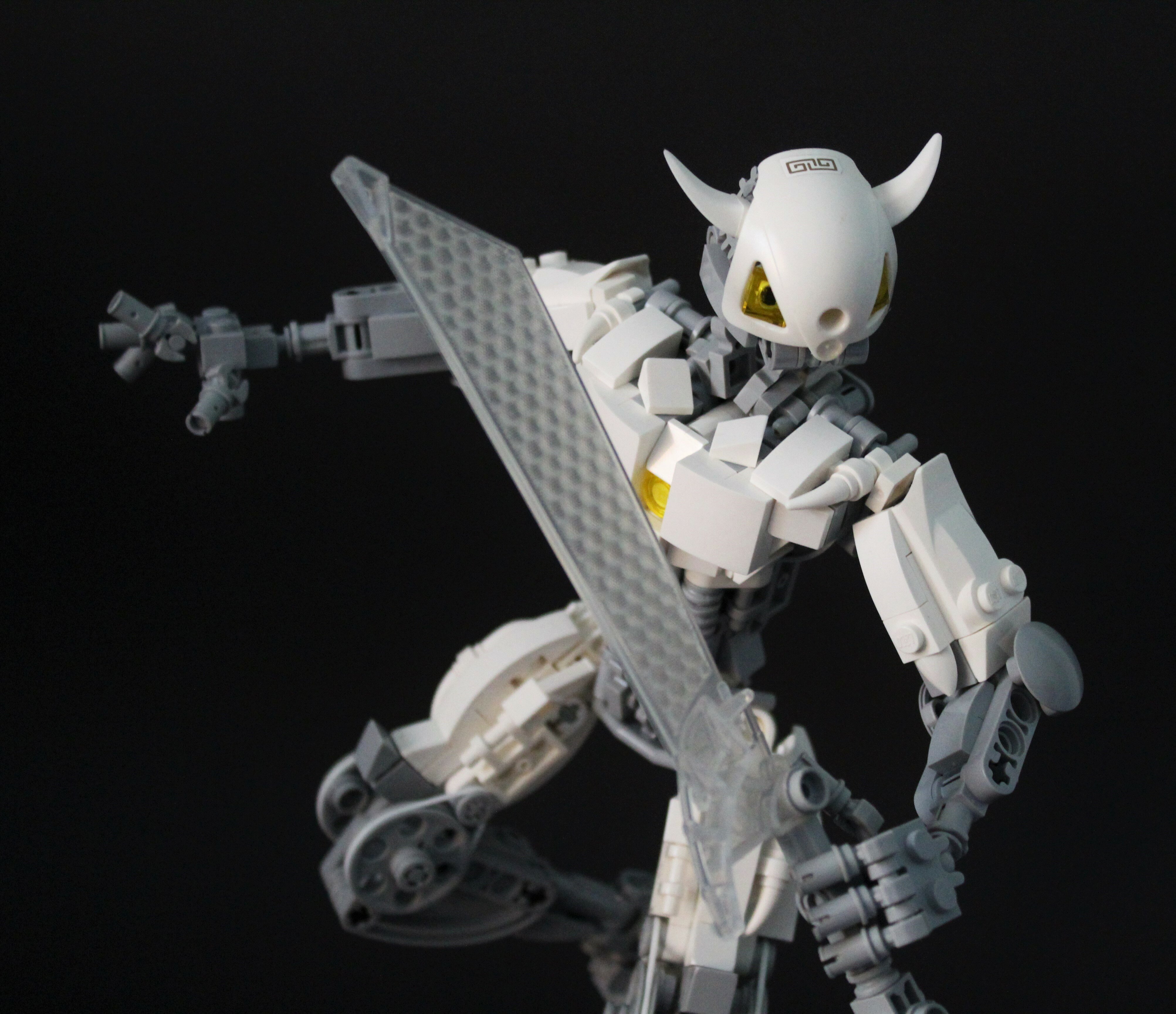
I kinda miss the textured look but the stream lined design of this is heck’s good
This doesn’t have quite the same presence as the last version (that one had wings, if I remember correctly?), but dang does it look good. The shaping and construction of it look great, though I agree with earlier critiques of the color scheme.
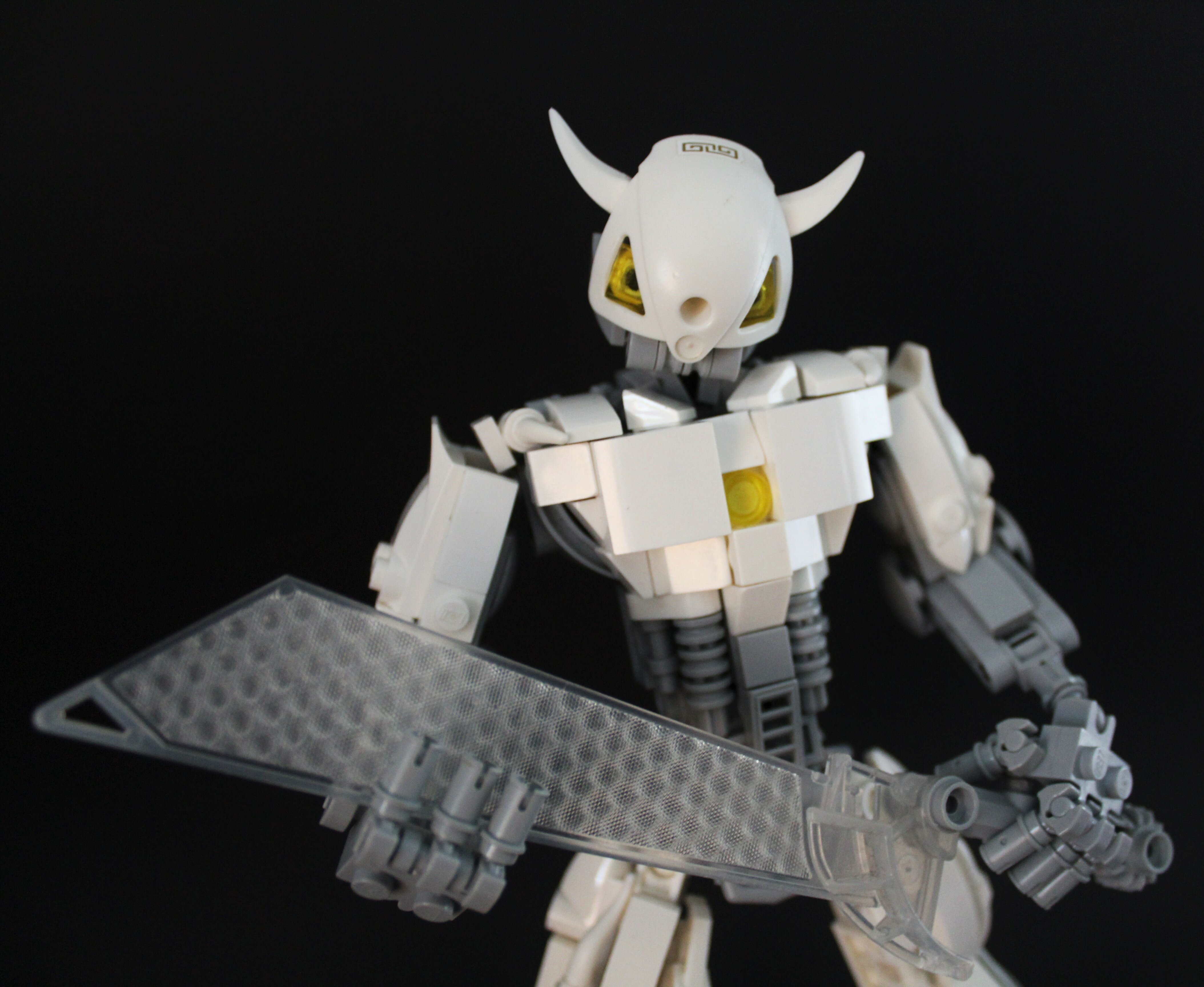
Even though I miss the gold, this MOC still looks great. The hands look a bit weird, but I like them anyway.
You have done a great job streamlining this version with system. Keep up the good work!
Elegant and awesome.
I like it’s probably unintentional Greek inspired design.
Also, cool custom robotic design.
defiantly
The overhaul you’ve made very much shows. Personally, I really enjoy it. The texturing is much cleaner, but still maintains that same level of detail as the original. As per usual with your MOCs, the shaping is superb, and the colors are well distributed. I like the switch from gold to trans. yellow. The color gives it some ‘pop’, but isn’t overkill.
so much more sleek and clean man, It’s probably my favorite out of the three!
Very glad you agree with the removal of the gold. People’s opinions seem to be very mixed in regards to the change
I prefer the chest build on the last one much more but it all still looks good.
Many people pointed out that it didn’t make much sense with the smoothness of the nuva shoulder as the face. I aimed to make this version more consistent texture wise
Well smooth masks and greenly body’s are Bionicle stable point wouldn’t you say?
lol gold is overrated
This version is just really blocky. I like the inclusion of system, but I think this MOC could benefit from a little less.
I agree that the chest is a bit blocky, but i don’t find it to be too offensive