I like tahu the way he is, don’t discriminate by color. Its whats on the inside that counts.
@Asriel It still looks like gold, but a darker gold, maybe if you swapped red with gold and vice versa
Please don’t double post! Thank you! - Eljay
I like tahu the way he is, don’t discriminate by color. Its whats on the inside that counts.
@Asriel It still looks like gold, but a darker gold, maybe if you swapped red with gold and vice versa
Please don’t double post! Thank you! - Eljay
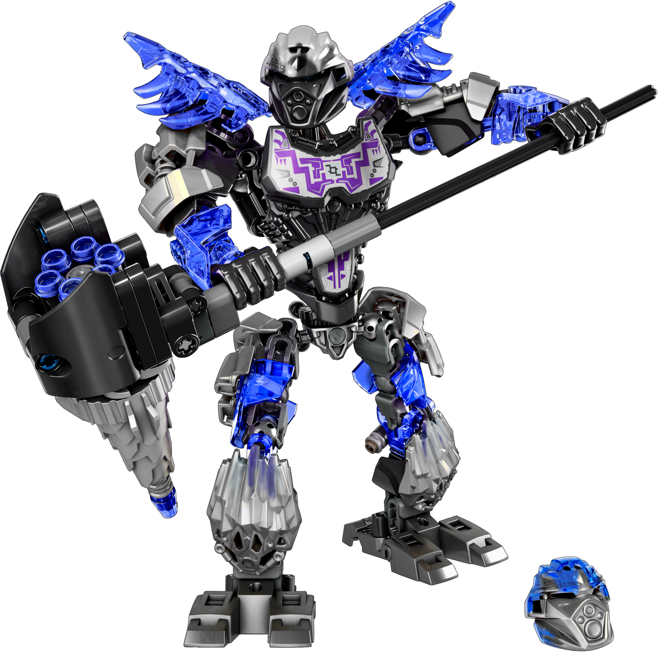
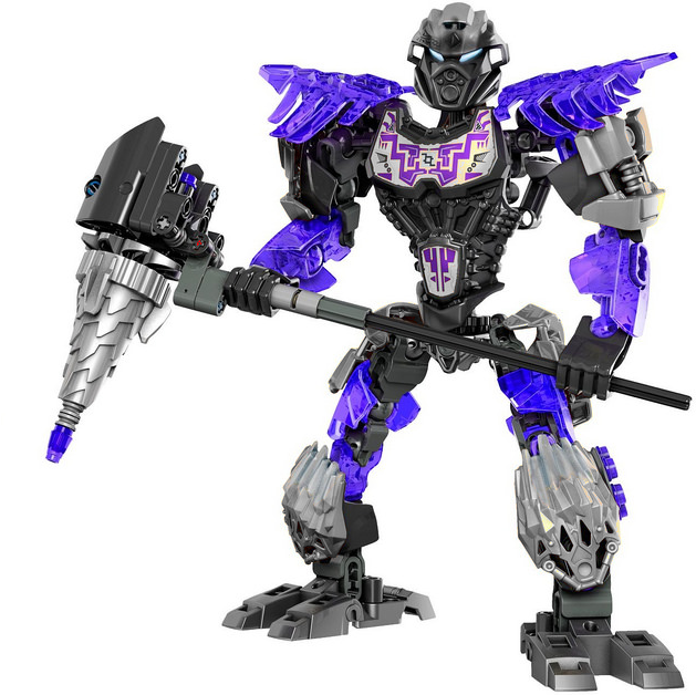
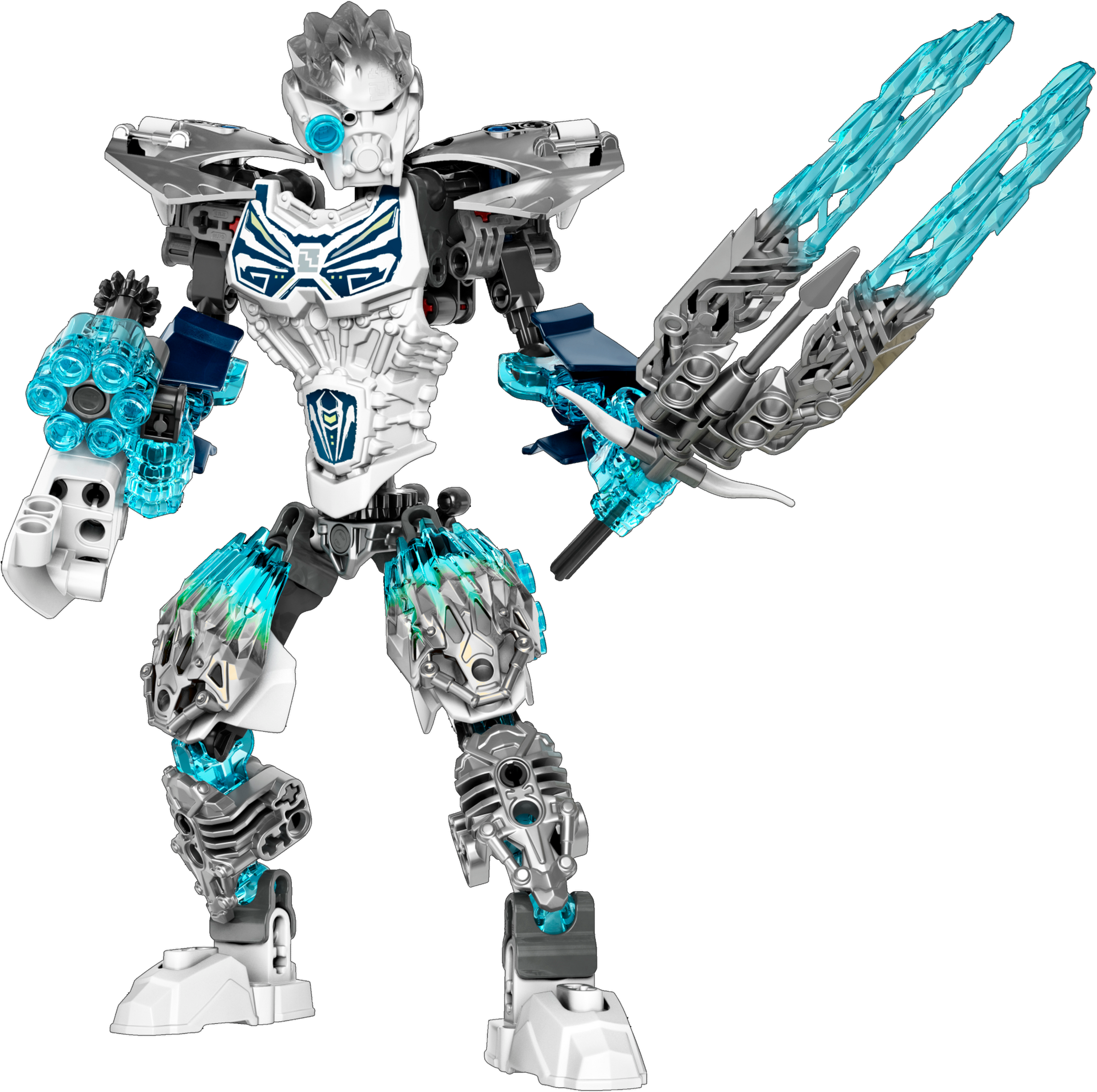
Definitely a success. The toa, in my opinion, are definitely great and for the most part better than the 2015 toa. They have a fun and useful gear function, they have cool masks, they all have unique builds, and they’re all pretty dang big.
The creatures might be the highlight of the wave though. They come at the same low price as the protectors, which were awesome sets, and offer even more unique builds and designs than the protectors did. Each creature is very unique and very fun to build and play with. Ketar is the only questionable creature, and even he is pretty cool.
Now add in the unity mode, and you have one killer wave. It’s super easy to achieve, one simple click with no deconstruction required, and you have an even more impressive figure to play with and display. The “adrenaline” mode from last year was alright, but it doesn’t even come close to how awesome the unity modes are.
This wave is definitely awesome and might be my favorite bionicle wave to date.
Kidna reminds me of the how the kardatoran rode on the toa’s backs
That silver Tahu looks like he is from Nexo knights.
Therefore he looks hideous.
Imo, I dislike Nexo Knigts a lot @Mrblackpants
Does that mean nexo knights is hideous?
lets just get this over, everyone has their own opinion, I dont like him, fin. because I feel like this is going to go on forever
god bless you
I actually kinda like that. Very neat.
The thing is that it’s now metallic orange, not orange. Orange doesn’t shine like that.
I didnt know how to make it mate
@Mrblackpants
colors a toa of fire should have:
Orange
Red
Blue
Yellow
(colors that resemble fire)
What if Tahu had a color scheme of green and pink. That would look very appealing.
I don’t know how to do it either but I wouldn’t call it orange.
…maybe if not.
I have to see it now, there is no turning back.
@Asriel
Pink is just a very very very light red.
And green is just to look weird. You said tahu already didn’t look good, why not make him look worse? (I also think it would be funny to see pink and green tahu.)
Oh my gosh this is amazing,
Would buy 10/10
Was this mentioned already? https://wwwsecure.us.lego.com/en-gb/service/buildinginstructions/search#?search&year=2016
yep, but it wasnt working
so it does work now? alright then I will go there
For me it does.
Works for me, still no bonkle products page,
i think that all sets would look better if we switched the gold to silver and silver to gold
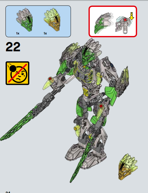
Its his nuva symbol.