We need to be more tolerant of the character’s color.
tbh, toa’s colorset had changed every year
When toa of stone are came out with non-brown colorㅡgunmetal, keetonrange, and orangeㅡ we were obviously shocked.
(The reason why toa of stone’s color changed is because brown set showed the slowest sales except for Mata Pohatu.)
Look at Inika hahli. Blue and white.
This colorset is toa of lightning, but she’s definitely toa of water
(of course toa inika have lightning elemental power-)
Mahri Hahli, Blue-Green. Yes, she is Lariska.
Greg didn’t think much of color when he was writing, and his book included things that weren’t depicted in set.
Inika jaller with double swords, Mahri Nuparu with large swords, etc.
Set designers didn’t care about color setting, they just thought of a better-selling color.
so toa’s color changed every year.
Is there any reason why we can’t do it since Lego has already done it?
i think that although we ignore Greg’s words a little, we can use more colors that make our creations look better.
If it’s not too unnatural(like a pink-body toa of earth or blue toa of fire.) I think we can use more colors.(especially for second color-third-fourth etc…)
(Add as edit)
and alternative colors should be allowed, especially for parts that lack a variety.
For example, we can replace burnt orange with orange or keetonorange.
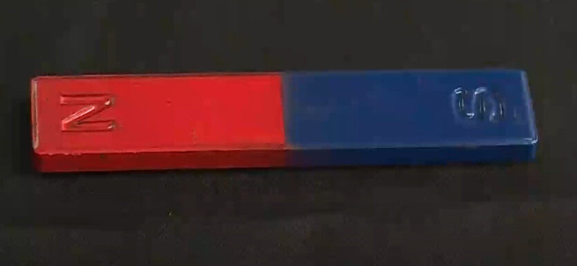
It’d totally work. Pick Metru red or Metru blue as the base color, do white accents. Simples. Of course, this would mean we’d need a different color scheme for Lightning. I’d rather just axe the blue.
There’s no reason for them to have named the Fa-Matoran after Michael Faraday, or the De-Matoran after Alexander Graham Bell. In fact, there’s no real reason the different elements should have differing color schemes other than for children to be able to differentiate them. I think it’d just be a fun design choice that’s grounded in the popular culture’s idea of magnets.
That’s true. And in their case, there’s not even a reason they should be organized into elemental tribes. And there was no Magnetism tribe. Point is that the Magnetism colors can be anything for any reason. Gravity isn’t purple. The mind doesn’t have powers, and they certainly aren’t blue powers. Lightning isn’t blue. My point is that choosing a color scheme reminiscent of real-life magnets would be a good clue for the audience as to what the elemental is at a glance, without confusing them for Earth, Sonics, or even Iron, which all look pretty similar to Magnetism as it is now.
(also, this discussion is inconsequential, as the canon color scheme for Magnetism is black, gray, and silver, and that’s not changing)
I dunno, I think dark red and white looks pretty good. ¯\_(ツ)_/¯
EDIT: Forgot to mention, but another reason I think red and white would be good for Magnetism is because it creates a contrast with Lightning, which is blue and white. You could even fit Plasma in there. And that’d all line up with the Kolhii tournament from MoL, because that’s the red team, blue team, and orange team. See? It rhymes. I’m not crazy I swear
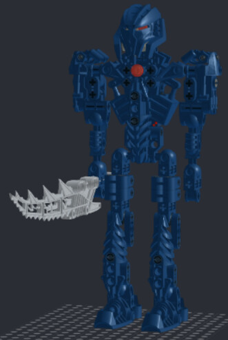
A completely uniform color scheme is kind of unavoidably bland. It’s hard to make it work, and I don’t feel this Tuyet succeeds. The build is good, but she’s an indiscernible blue mass.
Yeah, I agree with that. She shouldn’t look evil. That was the problem I had with Galva’s original Mask of Intangibility. This would work for Toa Empire Tuyet, but it’s too evil for prime reality Tuyet.
Sorry to interrupt the topic, but I need to make a belated apology to @Hazash.
I realized after a night’s sleep that we sometimes refer to metallic brown as “copper”, metallic light gray as “silver”, metallic dark gray as “gunmetal”, and metalic yellow as “gold”.
And if I haven’t misunderstood you yet, I realized what you meant to say: “Lhikan had yellow armor that turned metallic when he transformed into Toa.”
And if you mean this, yes, I agree with you. He did indeed have “yellow”.
(I should have realized earlier that even Krakua had “metallic dark gray = gunmetal” on his chest.
I also thought that as headcanon, Matoran Lhikan didn’t have gold, and was exactly red and yellow armor, much like Jaller, but I don’t know why this didn’t help me notice)
have you considered that that is not a worthwhile goal
No, then it just looks worse. Idk how else to say it, but making Tuyet monochrome is a terrible decision and I can almost guarantee that this isn’t gonna make it to round 2 if you enter it. It just looks…flat. That’s the word. Flat. There’s nothing to break up the blue, nowhere for the eye to really settle, nothing to draw your attention over absolutely everything else. I get it if you wanna do something novel, but this ain’t it, chief. And I mean that as constructively as I possibly can.