There’s no reason for them to have named the Fa-Matoran after Michael Faraday, or the De-Matoran after Alexander Graham Bell. In fact, there’s no real reason the different elements should have differing color schemes other than for children to be able to differentiate them. I think it’d just be a fun design choice that’s grounded in the popular culture’s idea of magnets.
That’s true. And in their case, there’s not even a reason they should be organized into elemental tribes. And there was no Magnetism tribe. Point is that the Magnetism colors can be anything for any reason. Gravity isn’t purple. The mind doesn’t have powers, and they certainly aren’t blue powers. Lightning isn’t blue. My point is that choosing a color scheme reminiscent of real-life magnets would be a good clue for the audience as to what the elemental is at a glance, without confusing them for Earth, Sonics, or even Iron, which all look pretty similar to Magnetism as it is now.
(also, this discussion is inconsequential, as the canon color scheme for Magnetism is black, gray, and silver, and that’s not changing)
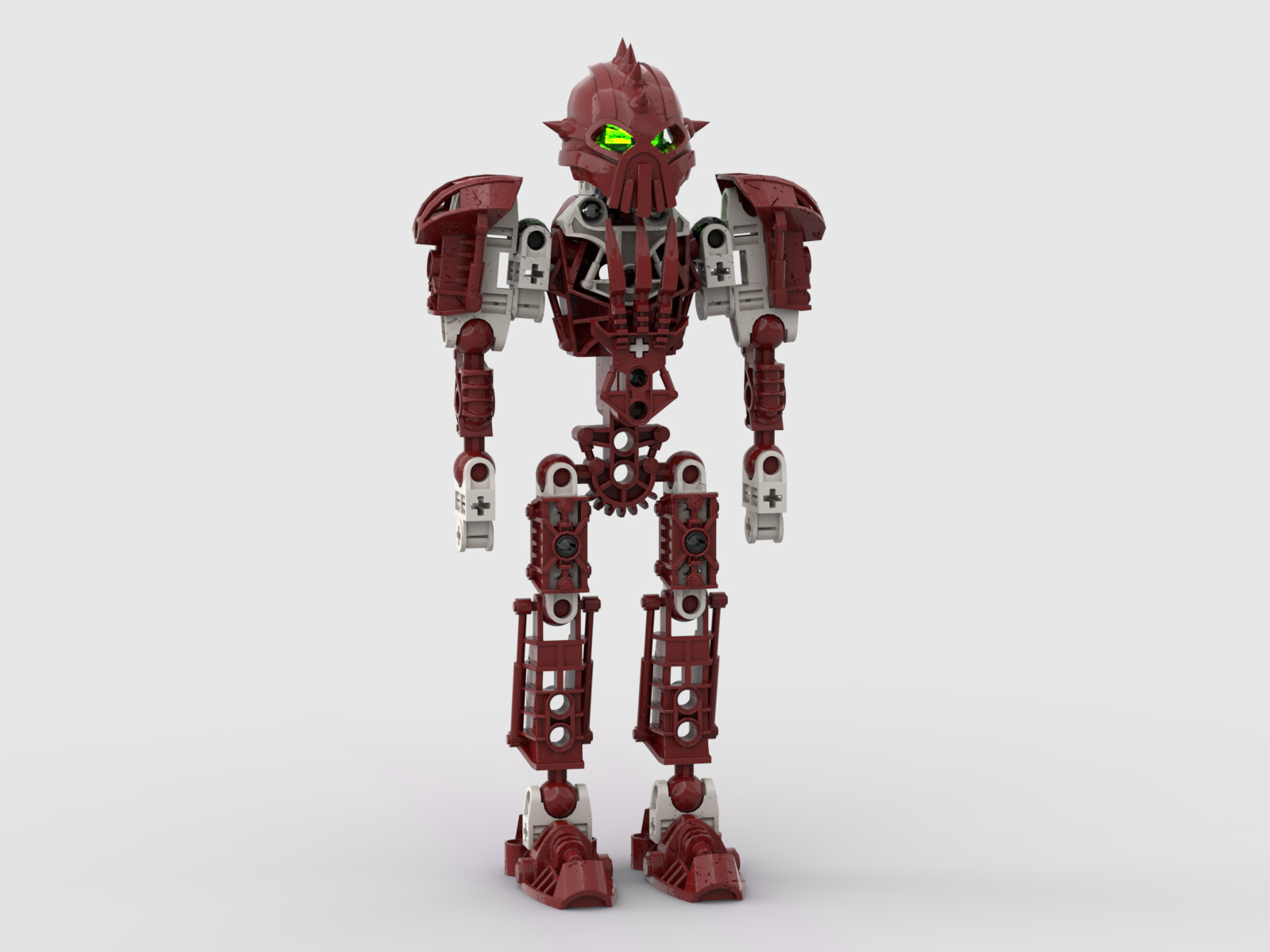
I dunno, I think dark red and white looks pretty good. ¯\_(ツ)_/¯
EDIT: Forgot to mention, but another reason I think red and white would be good for Magnetism is because it creates a contrast with Lightning, which is blue and white. You could even fit Plasma in there. And that’d all line up with the Kolhii tournament from MoL, because that’s the red team, blue team, and orange team. See? It rhymes. I’m not crazy I swear
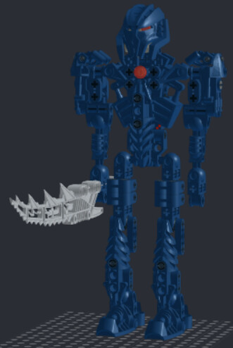
A completely uniform color scheme is kind of unavoidably bland. It’s hard to make it work, and I don’t feel this Tuyet succeeds. The build is good, but she’s an indiscernible blue mass.
Yeah, I agree with that. She shouldn’t look evil. That was the problem I had with Galva’s original Mask of Intangibility. This would work for Toa Empire Tuyet, but it’s too evil for prime reality Tuyet.
Sorry to interrupt the topic, but I need to make a belated apology to @Hazash.
I realized after a night’s sleep that we sometimes refer to metallic brown as “copper”, metallic light gray as “silver”, metallic dark gray as “gunmetal”, and metalic yellow as “gold”.
And if I haven’t misunderstood you yet, I realized what you meant to say: “Lhikan had yellow armor that turned metallic when he transformed into Toa.”
And if you mean this, yes, I agree with you. He did indeed have “yellow”.
(I should have realized earlier that even Krakua had “metallic dark gray = gunmetal” on his chest.
I also thought that as headcanon, Matoran Lhikan didn’t have gold, and was exactly red and yellow armor, much like Jaller, but I don’t know why this didn’t help me notice)
have you considered that that is not a worthwhile goal
No, then it just looks worse. Idk how else to say it, but making Tuyet monochrome is a terrible decision and I can almost guarantee that this isn’t gonna make it to round 2 if you enter it. It just looks…flat. That’s the word. Flat. There’s nothing to break up the blue, nowhere for the eye to really settle, nothing to draw your attention over absolutely everything else. I get it if you wanna do something novel, but this ain’t it, chief. And I mean that as constructively as I possibly can.
I mean, it is, but if you’re serious about getting it canonized, constructive criticism is your friend. And if you’re not, all it can do is help you improve at MOCcing.
Thats extremely objective for a term that is extremely subjective in nature. A MOC doesn’t have to be made to satisfy other peoples whims and nitpicks above your own.
He’s presenting what he likes and is openly accepting that others may not like it for the same reasons he does. I say props to him for sticking to what he likes.
What Keksalot is saying is if he intends to present that as canon-approved material, how much people like it actually matters the most, because if nobody’s a fan, nobody will vote for it.
Also, whether or not Kek’s whims and nitpicks are correct, his statement is: constructive criticism makes you go nowhere except up. His block of text with no paragraph breaks may not necessarily qualify, but this MOC will only benefit from discussion and critique.
Yeah that was pretty clear.
But often what that boils down to in these forums is kind of a unification in appearance of design as people will start to encourage the most popular techniques as if they’re some sort of new building code.
(Ex: People on this website seem to be anti open socket, open ball sockets, controlling other people’s color schemes, nitpick an axle sticking too far out, complain that something doesn’t look ‘smooth enough’ etc)
A lot of criticism in these forums simply tries to beat out some of the originality of different builders so they can try to hit a like count. I think of rather than homogenizing people’s MOCs we shoulder encourage that diversity, it definitely reduces the likelihood of feeling like you’re observing a bunch of clones.