the question is, what’s bomonga’s secondary color?
1 Like
Yes. The fact that we did not get an even translation from identical Rahaga builds leads me to believe that secondaries are more up for grabs. I’ve repeated this now but it really would help make them feel like actual characters and Toa that come from distinct regions.
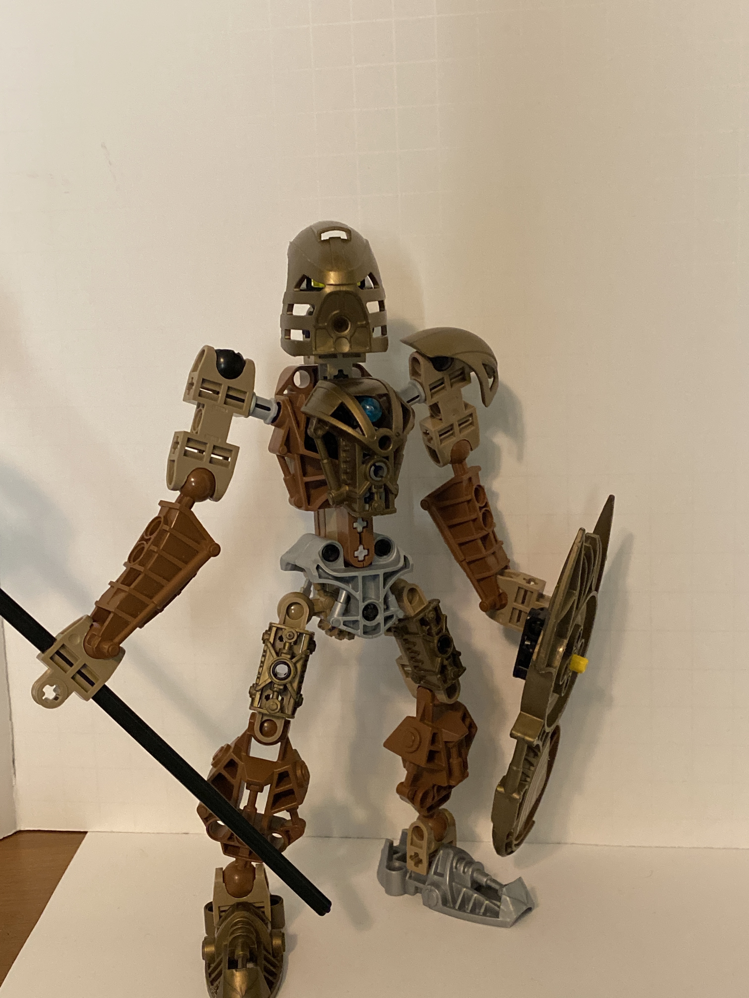
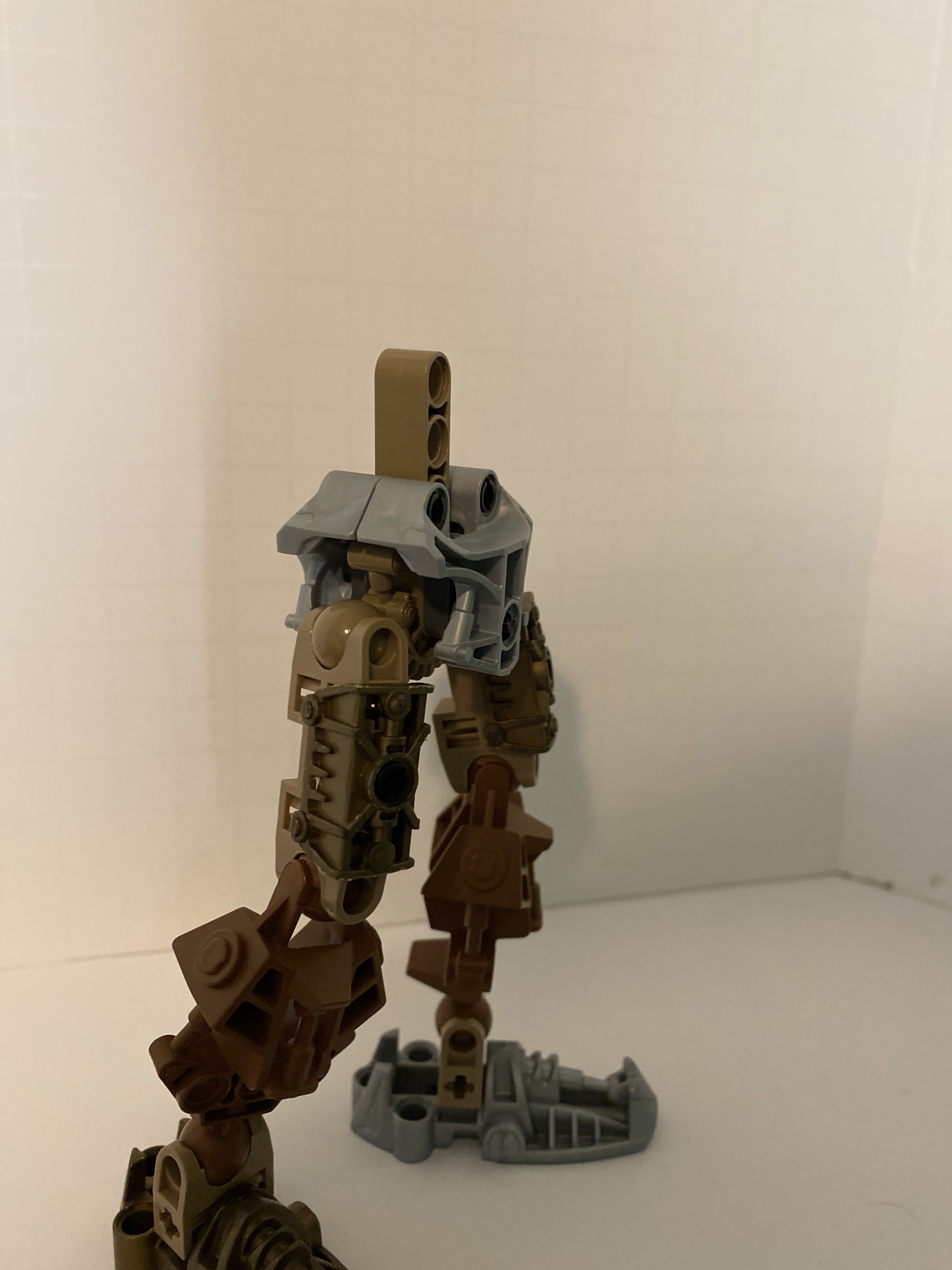
based primary grey, secondary black bomonga
1 Like
What about keet-orange? 
4 Likes
bomonga is only buildable if you have the keetongu from the prototype tower of toa set
6 Likes
Idk, I think I did pretty well - and he’s accurate to his Rahaga colors (except for the orange but dang it, they did not release any slizer pieces in that color). 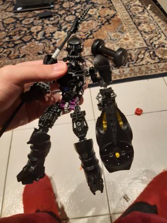
4 Likes
>accurate to Rahaga colors
>purple out of nowhere
Also I ain’t buying it chief, the so-called “metallic” black looks so indistinguishable from normal black it’s not gonna cut it, I’d use a different metallic color (actual metallic, like gold/silver/gunmetal).
6 Likes
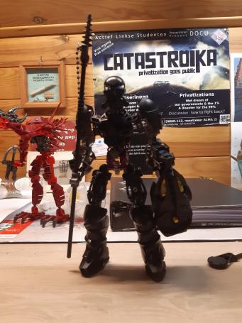
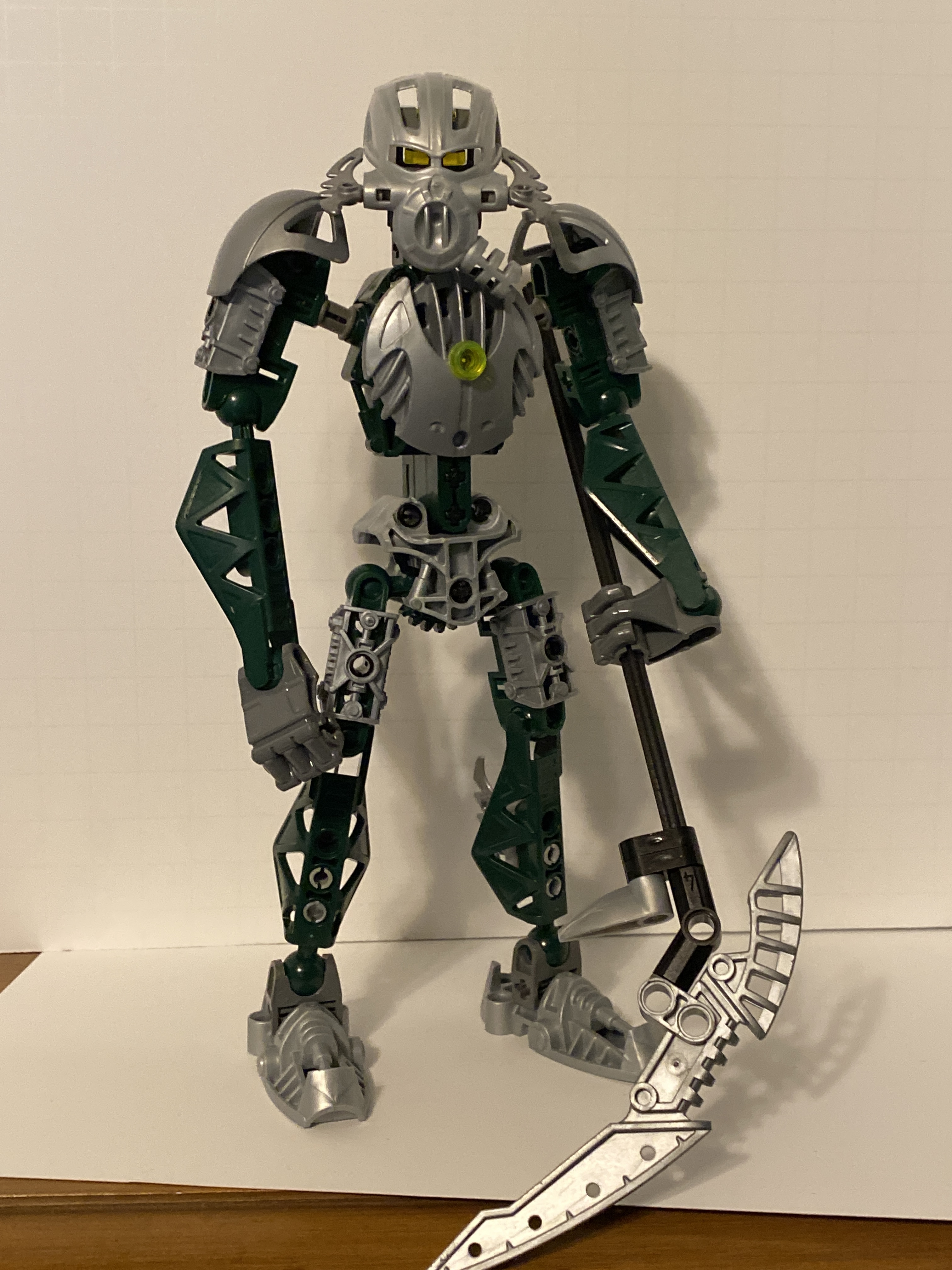
Colour concerns aside, that’s a really good build. It keeps the proportions from the two existing Hagah while also bringing new builds to the table. And, even though the metallic colour choice isn’t the best (in my opinion), the shinguards and shoulder armour still stand out, as they should.
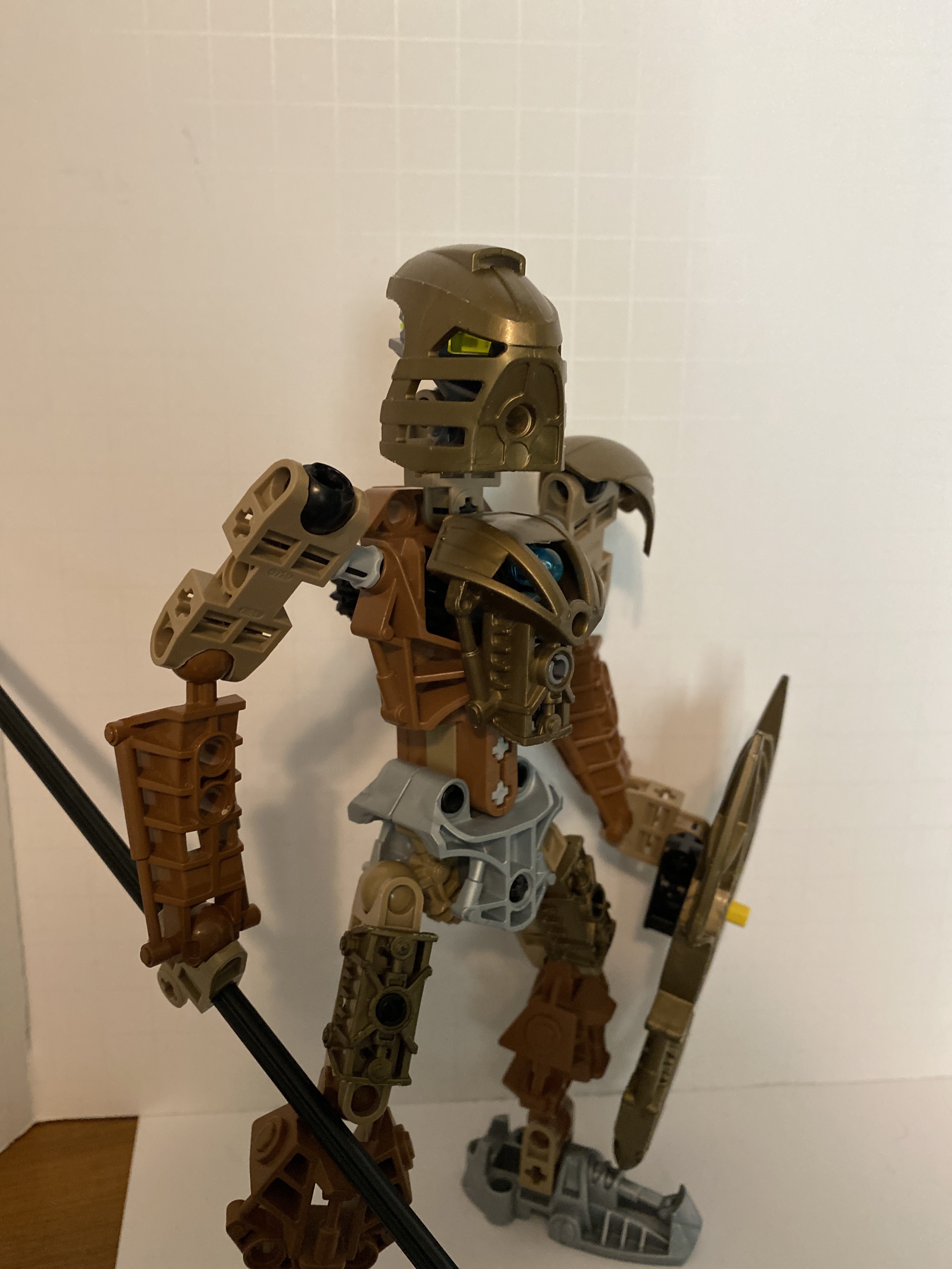
One other suggestion for the colours: if you’re going to introduce purple, I think you need to go all-in on it; don’t just use it in one spot of the build. Maybe you could extend it to the shield. The Bohrok eyes do come in purple, though they are very rare. Even if you don’t feel like paying 5 bucks a pop for the purple eyes, at least don’t use yellow eyes; having yet another new colour starts to get a little messy.
2 Likes
The yellow eyes are just a placeholder, probably going to either replace them with black or indeed pay five euro a pop for eyepieces, how insane that might not sound.
I was bent on using shins, which come in a very limited range of colors. Beyond that - the armor has to be the same color as the mask, meaning that gunmetal/metallic black is pretty much out of the question. And there is only shade of golden befitting the Toa Haga that also appears in mask form, which is already used on Iruini. I also never said my black was metallic - but like TheJerminator said, it looks like it is made from metal which fits the criteria.
Personally I wouldnt vote for it because it sticks out so hard. For me the moc contest is for tangible models. I may actually be able to add the Hagah to my collection unlike some of the other complex mocs out there. I want them to look cohesive next to each other and personally I think that it stands out too much. Still a nice looking build from what I can tell (although I recommend working on photo quality. I am also bad at taking pictures)
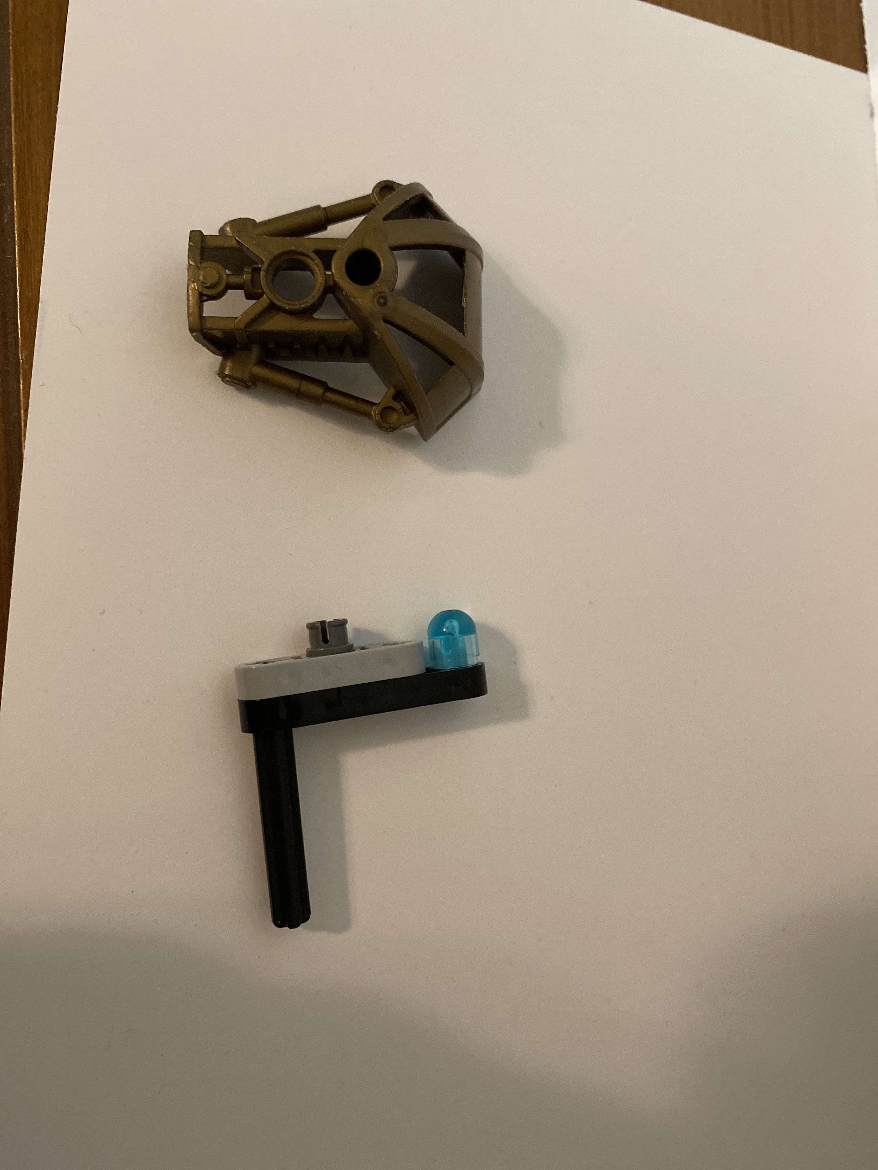
you mean these?
these came out in orange, even in a Slizer set
Anyone who can replicate this art style for the art portion of the hagah contest will get my vote:
9 Likes
4 Likes
Femboy Pouks?
I don’t think “feminine” armor is necessary, considering that most Toa teams we’ve seen have uniform, gender-neutral armor.
7 Likes
I agree, I tried not to overdo it. I tried to keep it in about as line as Gali Mata, which was the proportion inspirations. May not even use it, but I thought they were fun little building methods. I’m all about sharing and adding variety.
1 Like
Well the Metru shoulder as a torso piece does look neat, I have to admit. The Metru chests on the hips, uh…lowkey look like a diaper.
5 Likes
Hey, I couldnt of done it without you. 
Maybe it looks more diaper like because the silver contrasts so hard… I don’t think it’d be so diaper-esq without the contrast
1 Like
It’s mostly the shape. If you make it red, then it’ll just look like a bloody diaper. Make it green and…uh, actually, don’t do that. Make it blue, and it’ll look like it was soaked in wiper fluid. And so on…the idea was neat but the execution is cursed. And it’s largely because it’s so dang bulky–it looks almost poofy because of the space between its front and back edges.
One alternative, less diaper-ey thing would be to take a Metru chest in the front and just affix it via pins to a Slizer foot in the back.
2 Likes
I added a photo above on Nidhiki, imo it doesn’t look so bad. But hey, to each their own
Reminder to please keep conversation in public topics PG.
8 Likes