I’ve never seen what you just posted, where is that from?
This is where I got it. I do not know where they got it though.
They do not have one for Norik.
I’m not sure how much this matter though, since the comics show them in another orientation completely, with the “prongs” at the top.
I don’t know which version gets prioritized.
Or maybe they’re both canon, and even the exact same unique shield can be held multiple ways?
1 Like
Huh, odd. Strange because in all of his images he holds the shield in the same manner as Norik as well. But Bionicle instructions have had inaccuracies before. Who knows man.
Who all is going to be using the Knight’s Kingdom gold weapons?
4 Likes
Cool. So I guess they are the same after all. (which is still different from the comic, but still.)
Weird that that website didn’t have the one for Norik.
1 Like
@TheJerminator @Monopoly
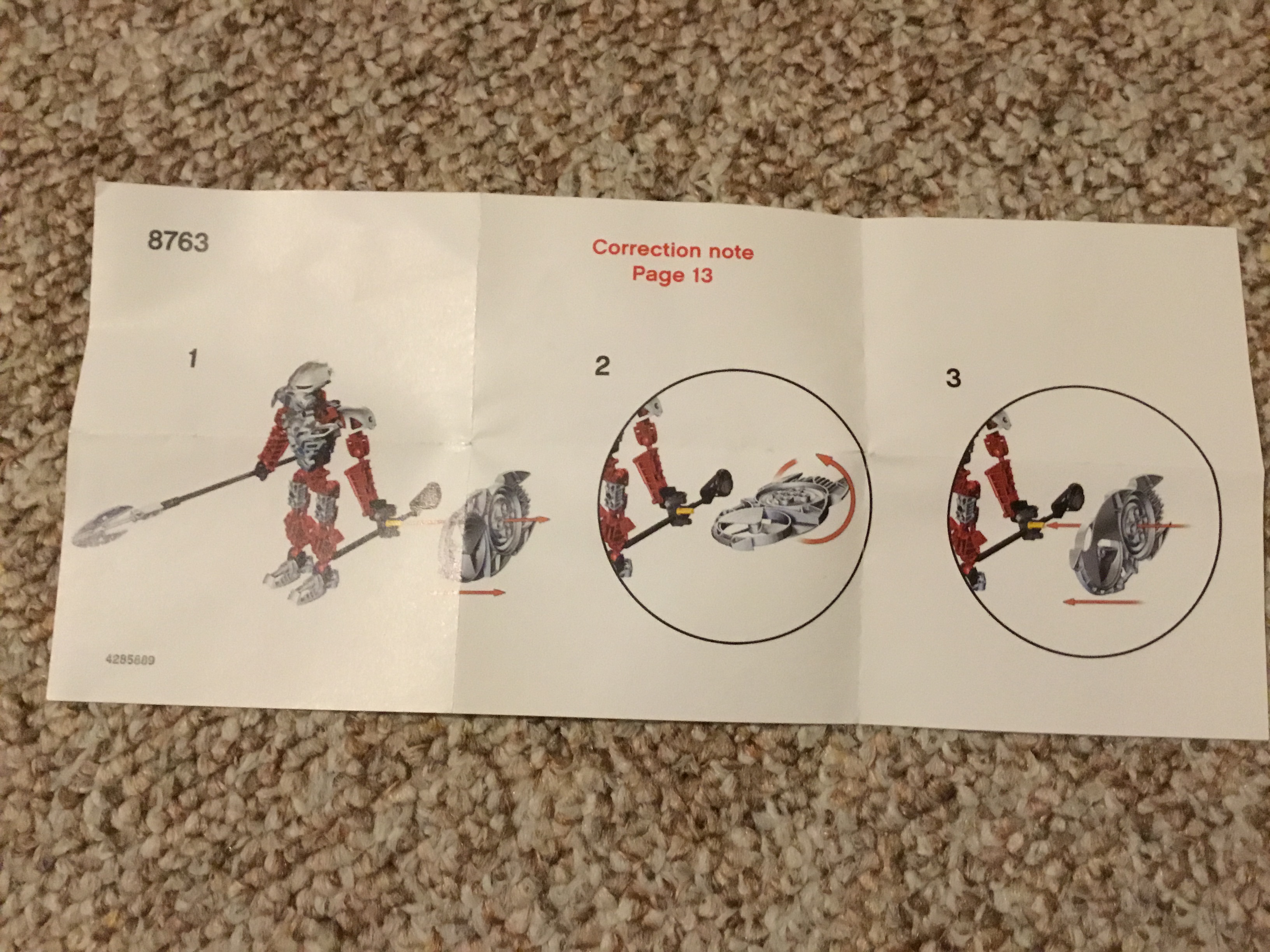
Huh. That’s fascinating. I wonder if those correction notes were region-specific? Does anyone outside England remember if their Hagah had similar corrections? The Norik I bought had no such correction note, but it was used off Ebay, so it could have easily slipped out over time.
(Also, is Lego in the habit of slipping in these kind of correction notes? First I’ve ever heard of it.)
1 Like
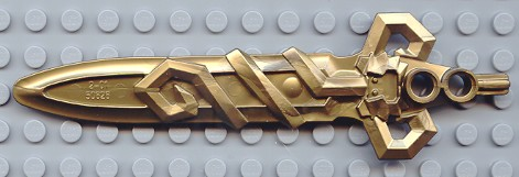
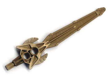
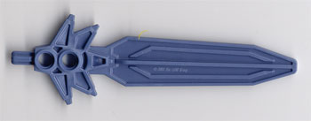
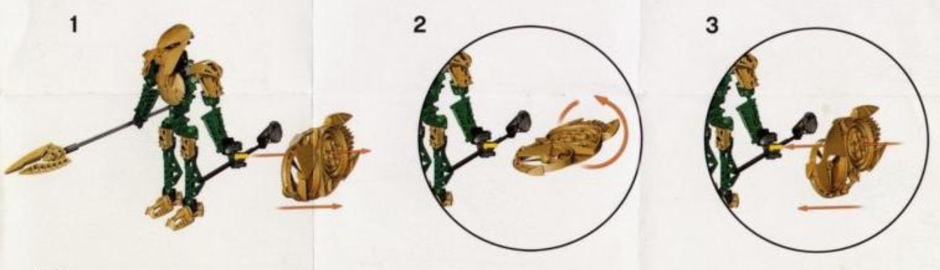
Seems like an odd correction because the original orientation has much more details of the piece. Usually pieces are faced with the more detailed side up.
2 Likes
I honestly think that was a mistake. I’d say both ways are official since the official artwork shows the more detailed side.
You know what I’m using this for.
People really gotta stop overthinking the shields.
5 Likes
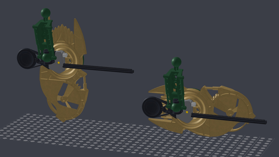
Perhaps they made a mistake in the correction due to miscommunication. Thing I have noticed is that the instructions have the shields orientated differently from the promotional images. The left is the orientation seen in most images, on the right is that from the instructions.
1 Like
I always preferred the orientation on the left, it looks more like a medieval pavise shield, the one on the right just looks awkward to carry.
1 Like
Now all I can think of is some Lego employee trying to contact the instructions designer.
“Hey, we think there might be a mistake in the instructions for some Bionicle sets that just came out.”
“Yeah?”
“The figure’s shields are attached the wrong way round. Could you just make a correction note to fix the orientation of the pieces?“
“Oh yeah, sure.”
6 Likes
This is my lego employee headcanon now
1 Like
I know that they have done some stuff like this for Star Wars before, but I don’t really have any specific details.
I don’t think anyone really cares about the shape of the shields, so much as the colour of the shields; people want to use metallic colours other than silver or flat dark gold, so they are wondering if they can go with a custom build, or if they have a paint an official part.
2 Likes
So how many people want to vote purist on the secondary color scheme? Such as keeping the color scheme to pretty much just the base color, black, and metallic, rather than having another color accent.
1 Like
I do. (I assume your referring to the Hagah)
2 Likes
Well, it was said in April, so his stance may have changed, but this is what Eljay said before on the matter:
Considering their insistence on rules that don’t require painting parts in order to enter, I highly doubt the actual piece will be required for the moc portion. (Assuming there’s a seperate moc and art portion, of course; one more reason they need to be separate)
Frankly, I’ll probably vote for those with an accent color, so long as it’s well integrated.
4 Likes
It’s important to remember that, even though they’re a team now and must all be metru builds with metallic armor, spears, and rhotuka shields, the Toa Hagah all still came from six separate teams, presumably from different places across the matoran universe, originally. If would be weird if they stuck that close to the same color pattern.
2 Likes
I agree, I was curious of other’s opinions. We even see color inconsistencies between Iruini and Norik, although there are striking the similarities. I personally wouldn’t be opposed to it myself, although I find the appeal of the consistency.
3 Likes
I would prefer a single non-metallic colour, but that won’t be super high on my priorities; I’d vote for a well-done two-toned MOC before a crappy single-colour one [in reference to the non-metallic colours].
It sure seems like it. Between the possibility of 3d-printed parts, and the Lego-induced limitations of the shield.
I would run it as it has been done for these last two, but swap the masks and the shield; the Art has to keep the MOC mask, but then the MOC shield is a placeholder to be replaced with the “official” shape in the Art.
(Also, what limitations will be on the spears? I know that any spearhead is allowed [even 3d printed, as far as I know], but what about the shaft? Does it have to be the same length and Norik and Iruini’s? Could there be addons, such as Technic tubing or bushings, to make it thicker?)
(Also also, what about the placement of the metallic armour? For example, I have seen quite a few MOCs that put it on the shins, rather than the thighs. How closely does its placement have to match Norik and Iruini’s? Personally, I think both should be allowed. Same goes for the spears; customization is allowed, within reason.)
1 Like