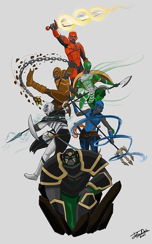
Here’s a poster I did of the Toa done in a Studio Mir-like style. I used my altered designs for them, which you can see here:
Words cannot describe how much I love this
All it needs is a logo… nice work though! This is a beautiful looking poster. Everything blends together perfectly.
It looks good, though the toa just kinda look like grey skinned people dressed up in suits. Over all though they look good, especially Onua!
Yeah, since they’re based on minifigures instead of constraction figures, I wanted to make them look more biomechanical as opposed to mostly mechanical. That seems to be how most of the artists here draw them, anyway.
@Tarvaax I simply copied the masks straight from the official minifigure designs. Which give them very human looking mouths and general facial features, like eyebrows. As for the eyes, I wanted to give them more expressiveness which I felt wouldn’t be as conveyed with pupil-less eyes.
Holy cow, this is great! I have no idea how people can pull this type of thing off.
I think a little panel lining and a more metallic shading on the grey would fix that, I’ve seen the greys as silver/gunmetal since day one, so it doesn’t really bother me.
Regardless I rather like this, I’m not entirely sold on the weapons, but the amount of variance in their designs is exactly what I would want, good show.
Love the Dynamics of this.
Great stuff.
“It’s a mastuh Peace.”-Videogamedunky
I really like how you’ve translated our designs into your own style! I also love how you incorporated their poses into elemental attacks - it’s really well done!
This is phenomenal, onua’s colours are spot on.
Onua looks a lot like King Lui form the live-action Jungle Book (the one with the CGI, not the one with animals), but not as much as he does in the original art. Over all, it’s radical. I also like Pohatu’s claws. Still not the biggest fan of Lewa’s mask looking like a chin-strap, though.
Pretty good, though I don’t think they have enough mask covering their faces. Gali suffers most from this. I also don’t like how the eyes are done. Too human, they don’t have that BIONICLE feel I expect. Like, it has that weird feel when you take something that isn’t human and give it too many human facial features. Besides, BIONICLE faces in general look better and more unique with glowing eyes.
With them grouped up like that, it looks like Onua is carrying the team.
Like he always does 
ABSOLUTELY SPOT ON!!! the only thing I would change however is perhaps make Onua’s loin cloth, or whatever that is, I’m not sure, purple instead of green, just so that there’s a little more color variety among the Toa, that and Purple goes so well with black and gold, other than that, it’s perfect!
