Hey, new member here which means I can’t post more than three images, so this will be split up into two parts. I just recently got into Bionicle through TTV’s podcasts (never really into Constraction as a kid, so Bionicle never interested me, but Bionicle as a system theme got me interested), so I decided to do some fanart based loosely off their official designs. I say loosely because I’m not a fan of all the armor being similar with color swaps, so I did my own thing while still keeping their designs in mind.
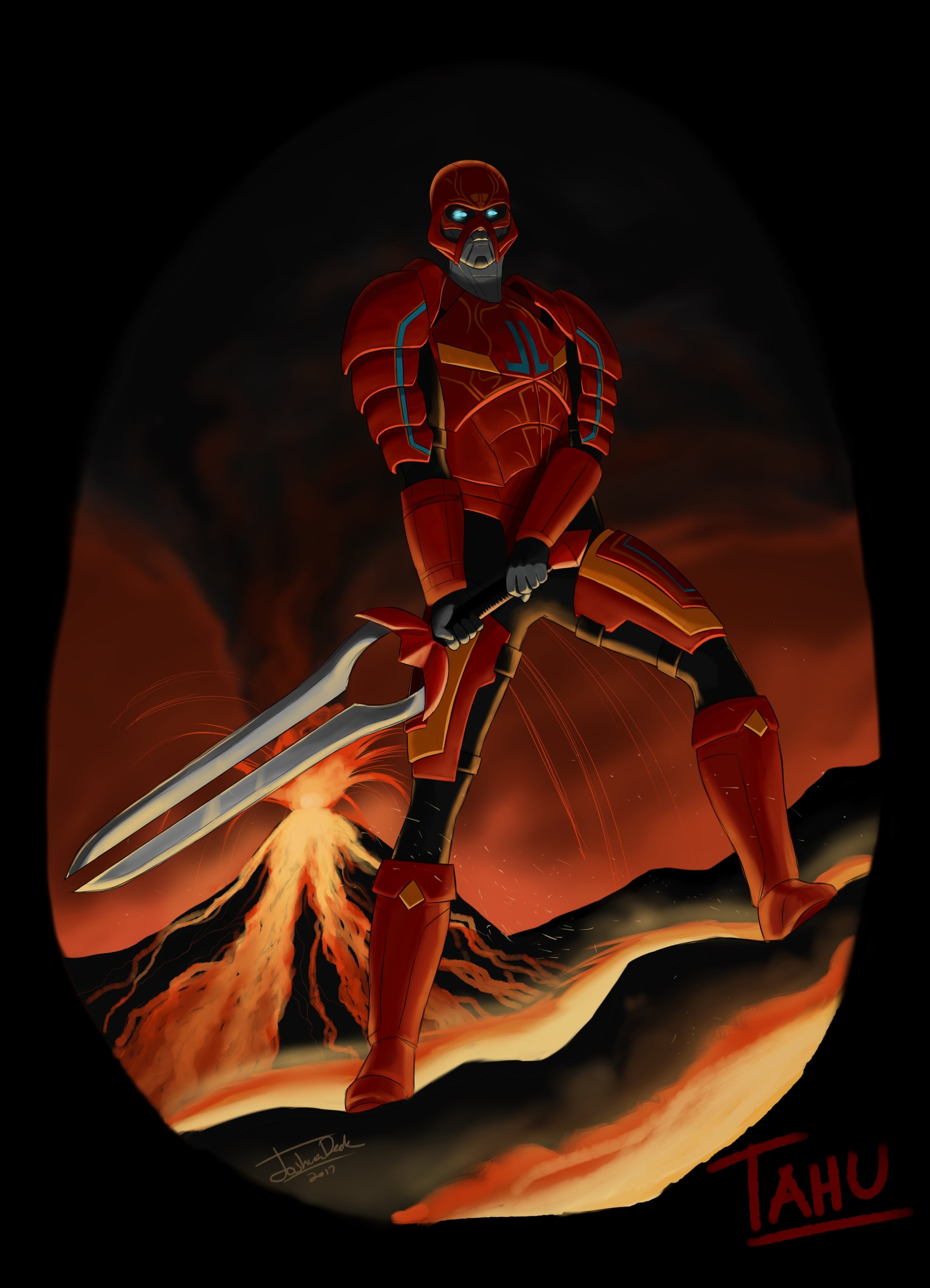
Here’s Tahu. You’ll notice they look a little more humanoid than they’re usually portrayed. I designed them so that they’re made out of a sort of synthetic muscle (think the nanosuit from Crysis). For Tahu, I originally had the idea that the blue markings on him could be an external cooling system that ran through his entire body to compensate for his surroundings, but ultimately scrapped the idea.
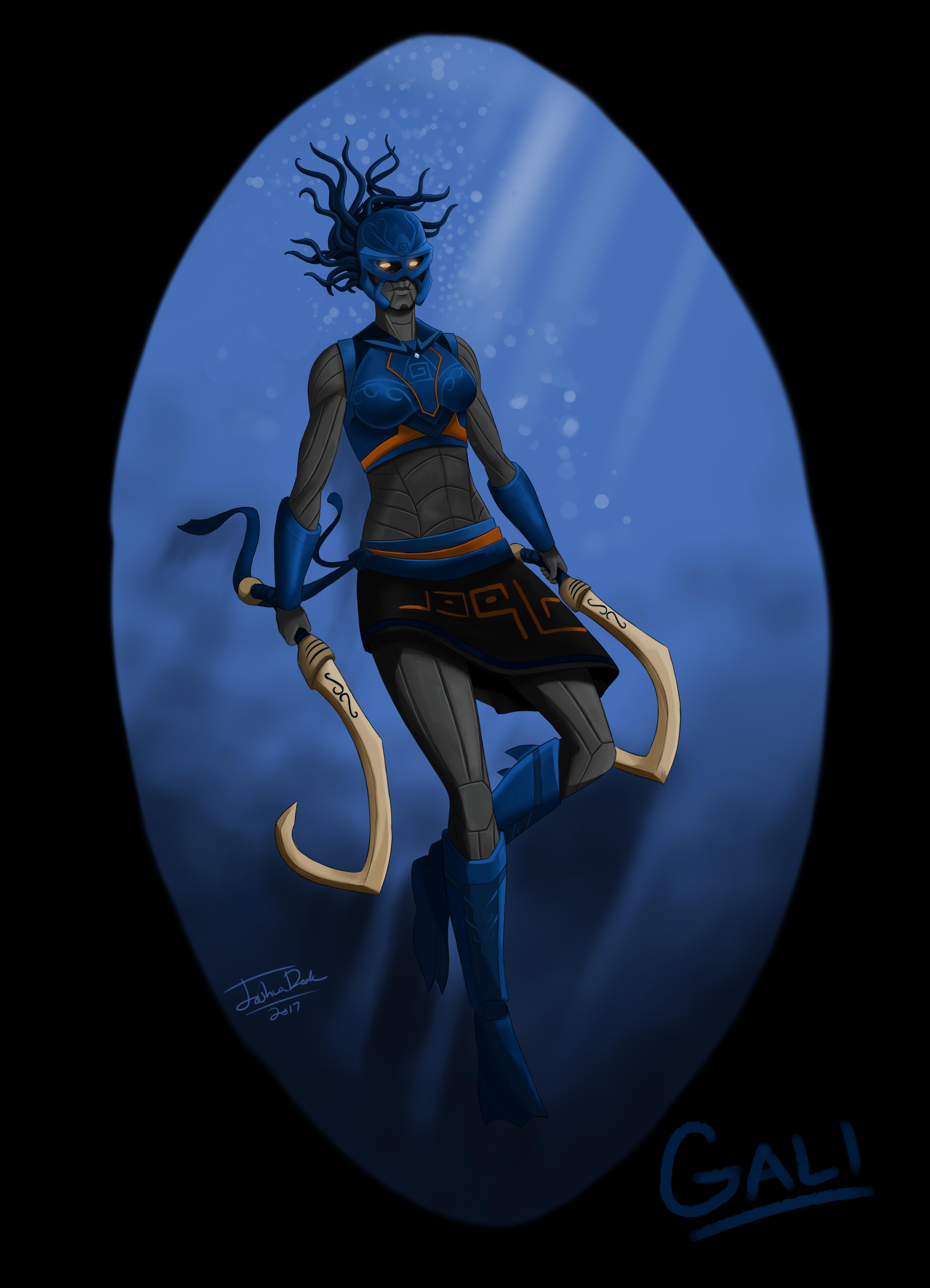
Gali. This design I went a little different with, giving her more of a swimmer’s attire, which lets you see more of how the synthetic skin/muscle thing works. And I did give her hair, though I designed it to look more like tentacles (or dreadlocks) to fit her element. When out of the water her hair would just lie straight. I figured this would probably get a little bit of controversy, but that’s why it’s fanart, not official designs.
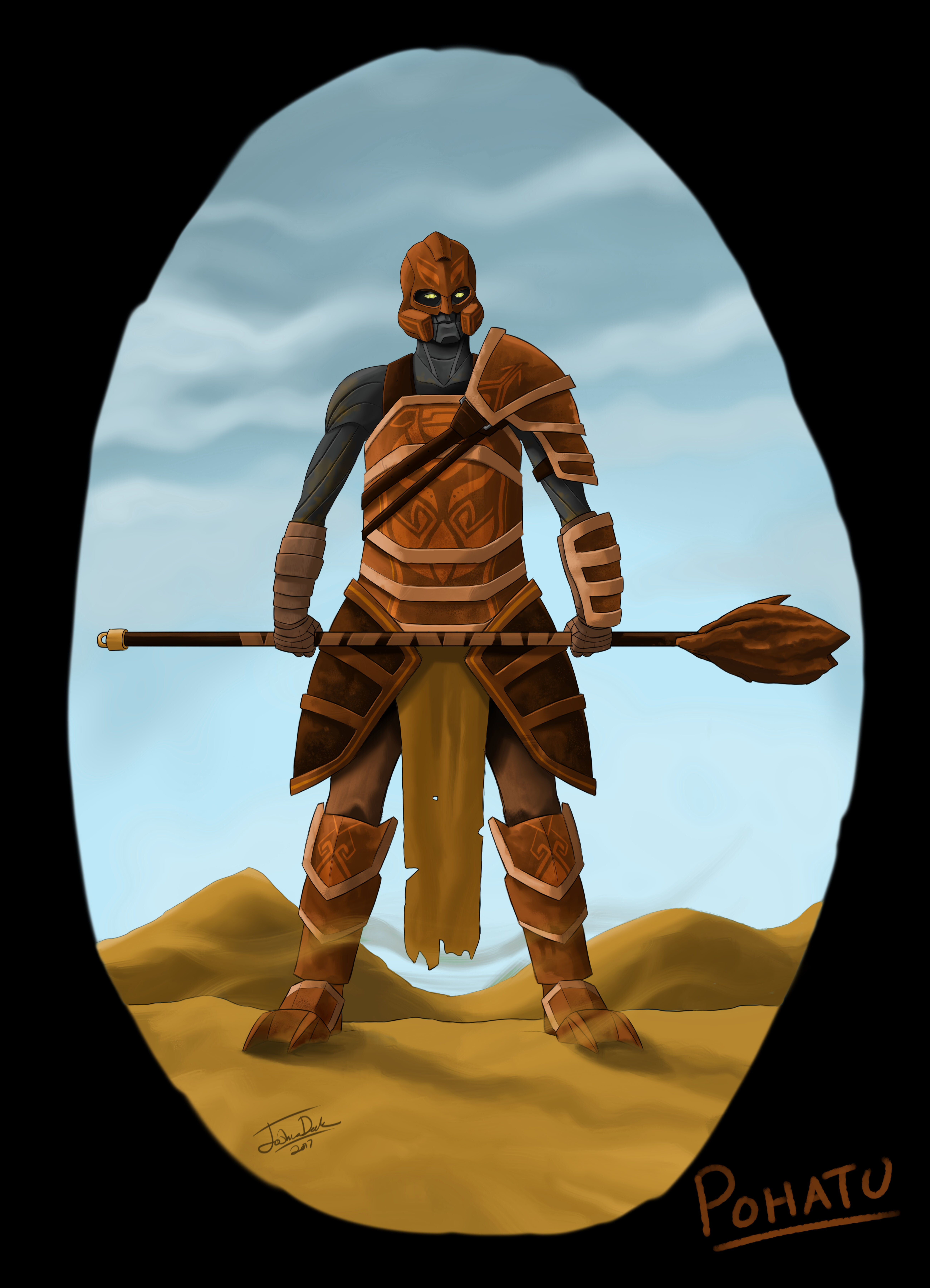
And here’s Pohatu. I really liked the design of this armor. It almost feels gladiatorial, with the asymmetrical pauldrons. I figure the armor itself is made out of some sort of sandstone, or ceramic maybe? I also gave him the foot spikes as well as the bo staff/mace.
That’s it for the first post. The next one will feature the rest.
