I’ve been cranking out two pages a day, and I’m exhausted.
7 Likes
Yikes, you draw these in the same timeframe you release them? You wouldn’t be able to tell based on the art quality.
2 Likes
Wow that was a cool introductioning issue to this story, can’t wait to see more issues! Also is that a scuplture of the GSR, the actual thing, or is it spoilers?
2 Likes
Hell. To. The. YES!!!
I am SUPER excited to see this finally return! I was enthralled by the first run. @NickonAquaMagna, can’t wait to see what new things you try with this retelling! Your worldbuilding and expansion of the BIONICLE lore in the first iteration of Nova Orbis was awesome, and I know that I’ll be equally impressed by the new version!
4 Likes
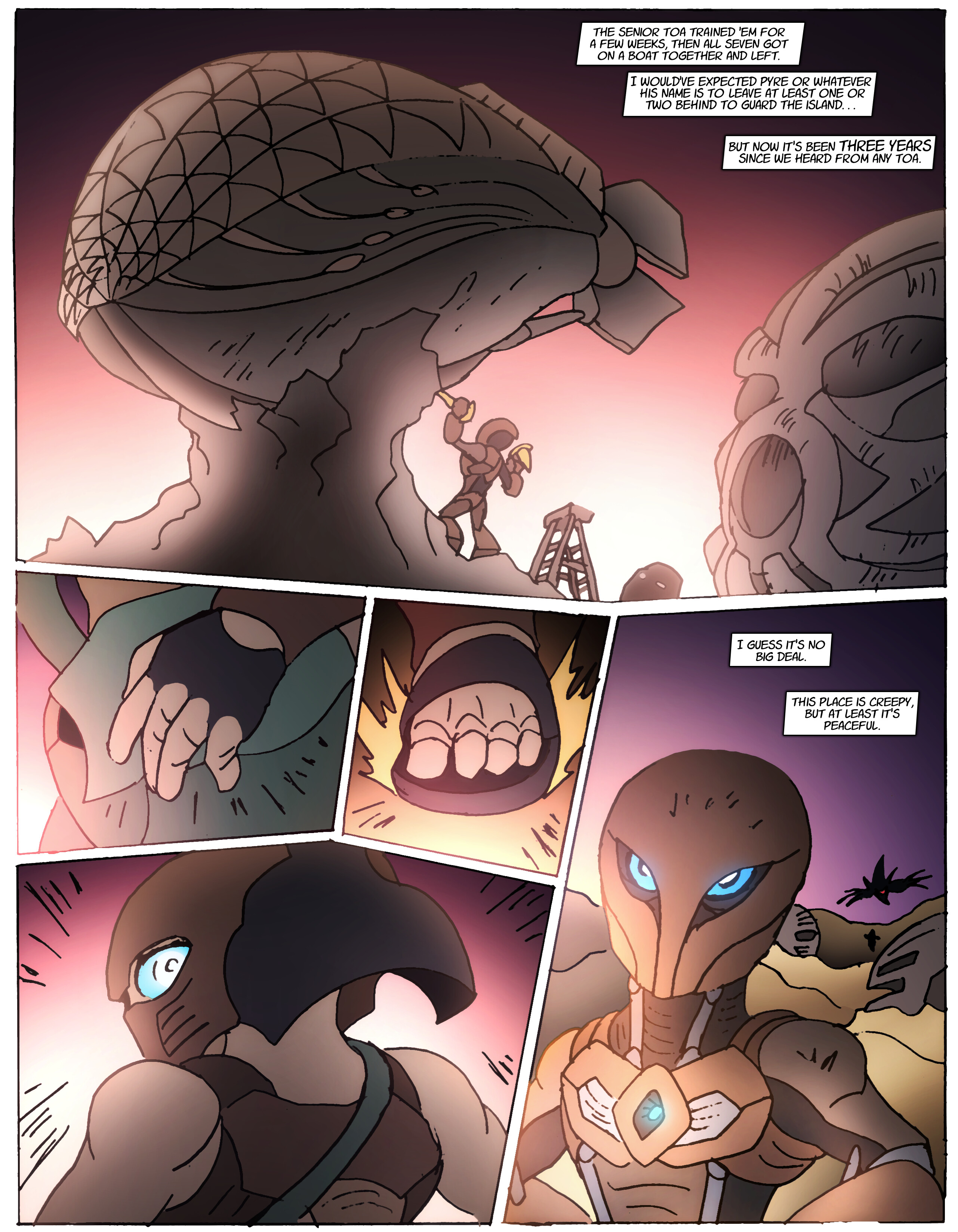
Just a sculpture, but it was here LONG before Ahkmou started carving up the place.
7 Likes
I really like the idea of Ahkmou carving these statues to preserve his memories of the past even if they aren’t good ones
Great job so far, keep up the fantastic work
7 Likes
I have to say, from a purely subjective point of view, I preferred the prose format of the original to the pure comic-style of the reboot, but I’m still very interested to see where this new version goes.
4 Likes
For me, it’s more like… when I try to read the prose now, it’s insufferable. The characters all sound sooooo far up their own butts, because I was up mine at the time. I used overly long, flowery language like George Carlin said not to, fake tension, artificially drawn out mysteries… none of it feels real now, you know? My writing style has become much more condensed and streamlined over the years.
9 Likes
I mean, I don’t think the format was the cause of that necessarily. It’s more than possible to write in prose without making dialogue sound pretentious. I also just find it easier to get immersed in a story when the actions are described in text. Like, for some reason “Ahkmou stared at the statue” followed by dialogue, draws me in more than just a picture of him doing the same and then speaking. Just a quirk of my own mind I guess.
That said, whatever format you feel best fits your writing style is fine; I’ll be reading nonetheless.
3 Likes
It’s generally better to show than to tell , though it’s hard to worldbuild in pure comic form.
3 Likes
I’ve realized my writing is just a better fit for a more constricted art form like comics. With prose, it’s almost like I can’t HELP drawing it out and repeating myself. Comics make it easier for me to trim the fat, keep things concise.
9 Likes
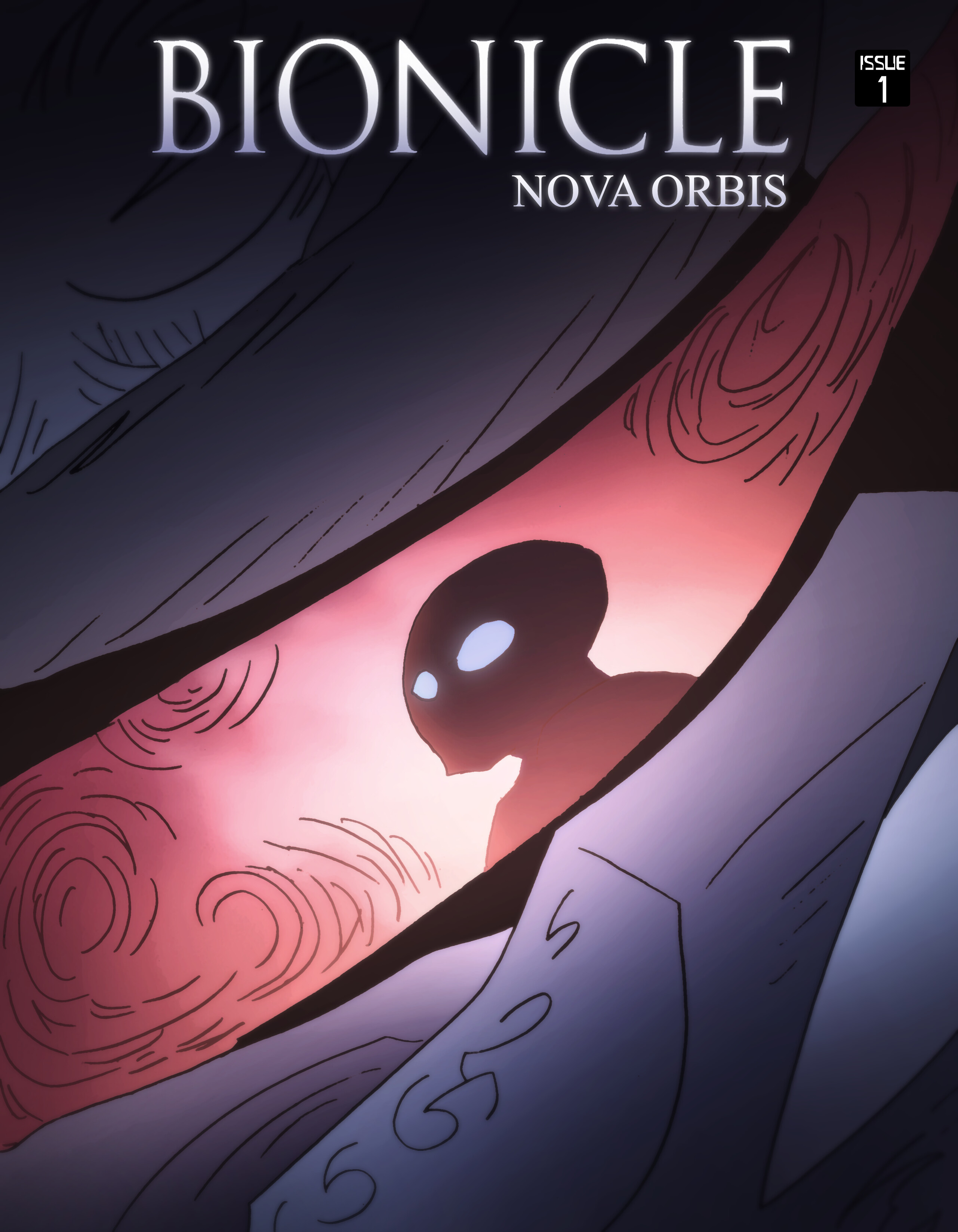
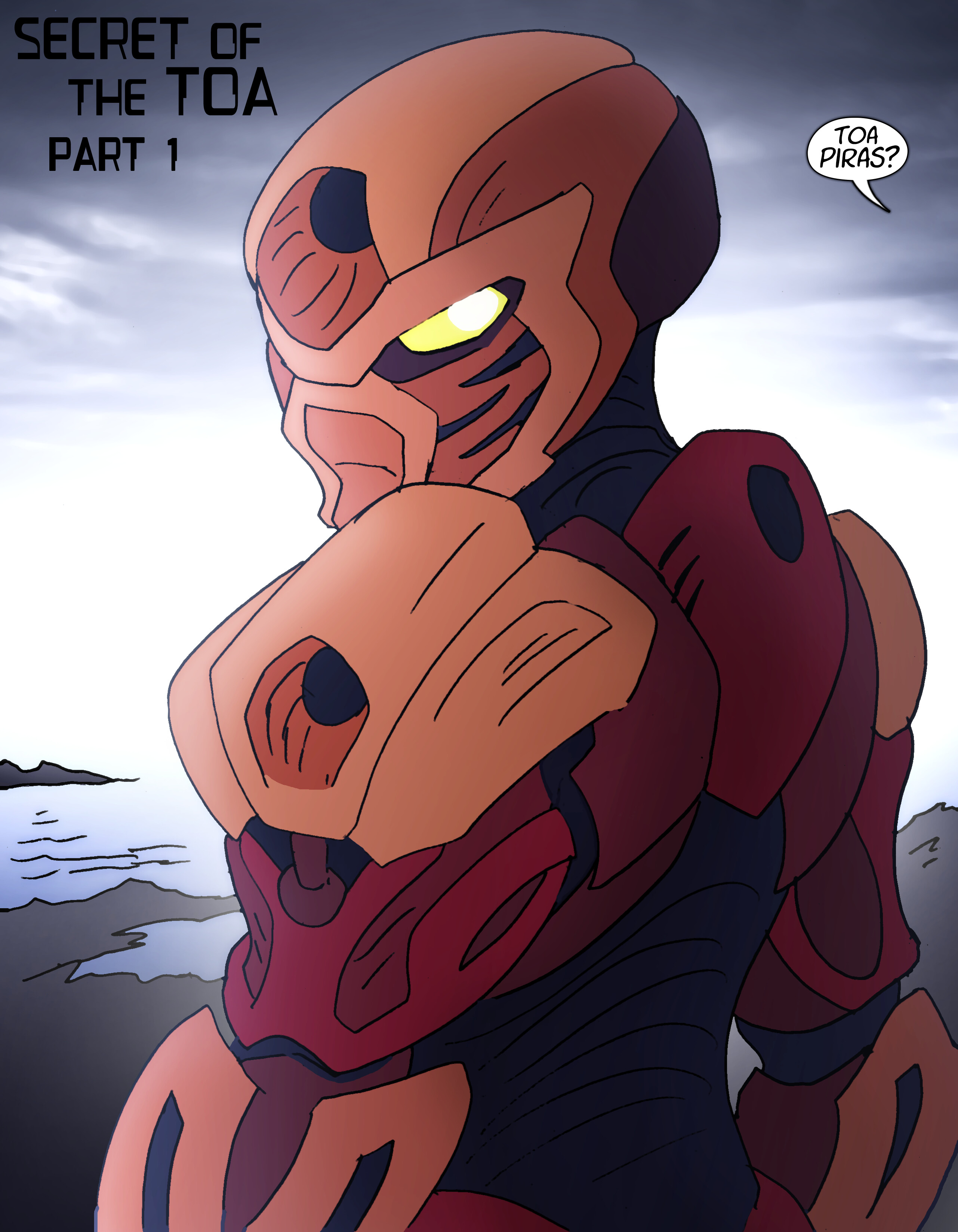
Issue 1 is complete! Here’s all 22 pages, along with a coupla’ variant covers!
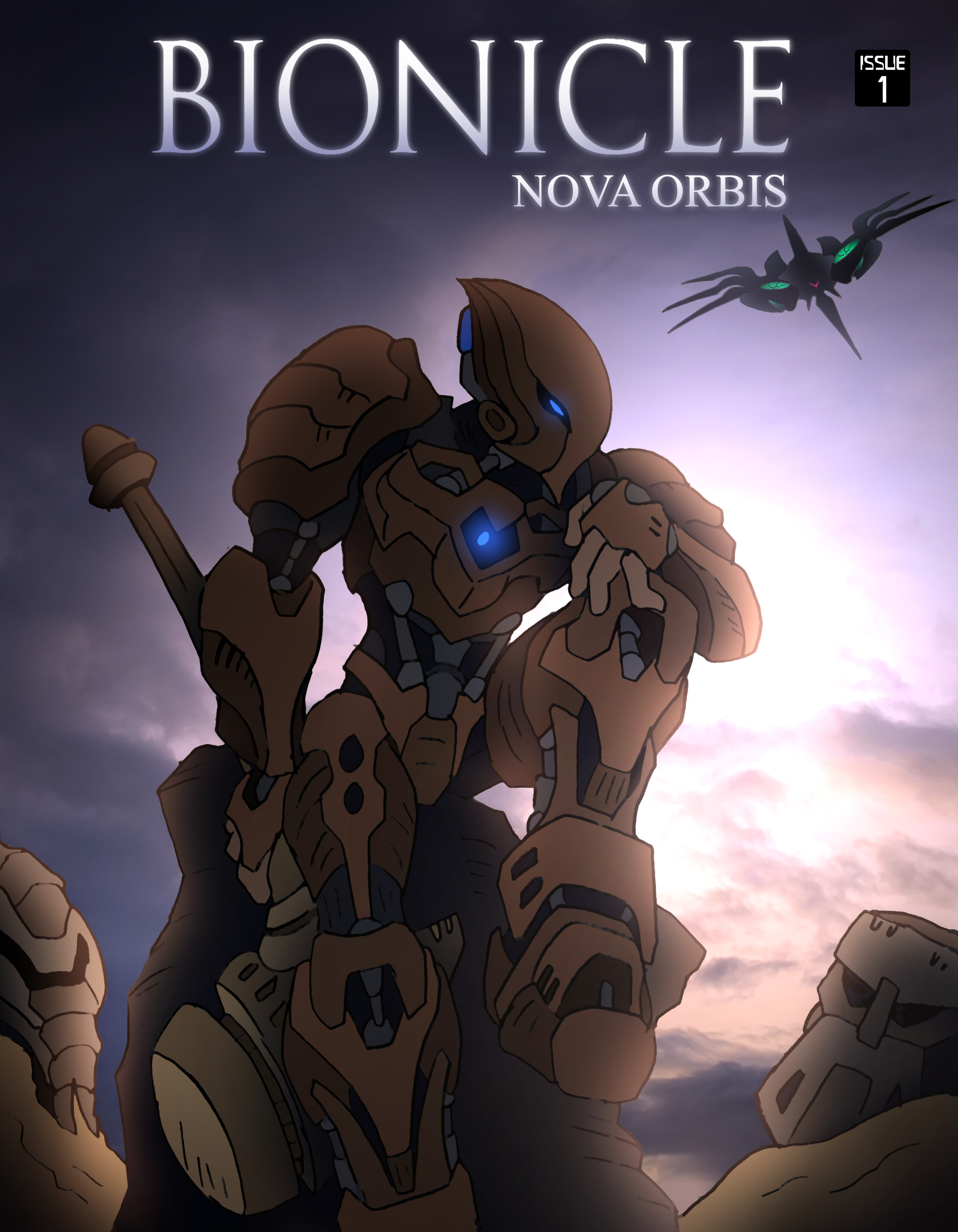
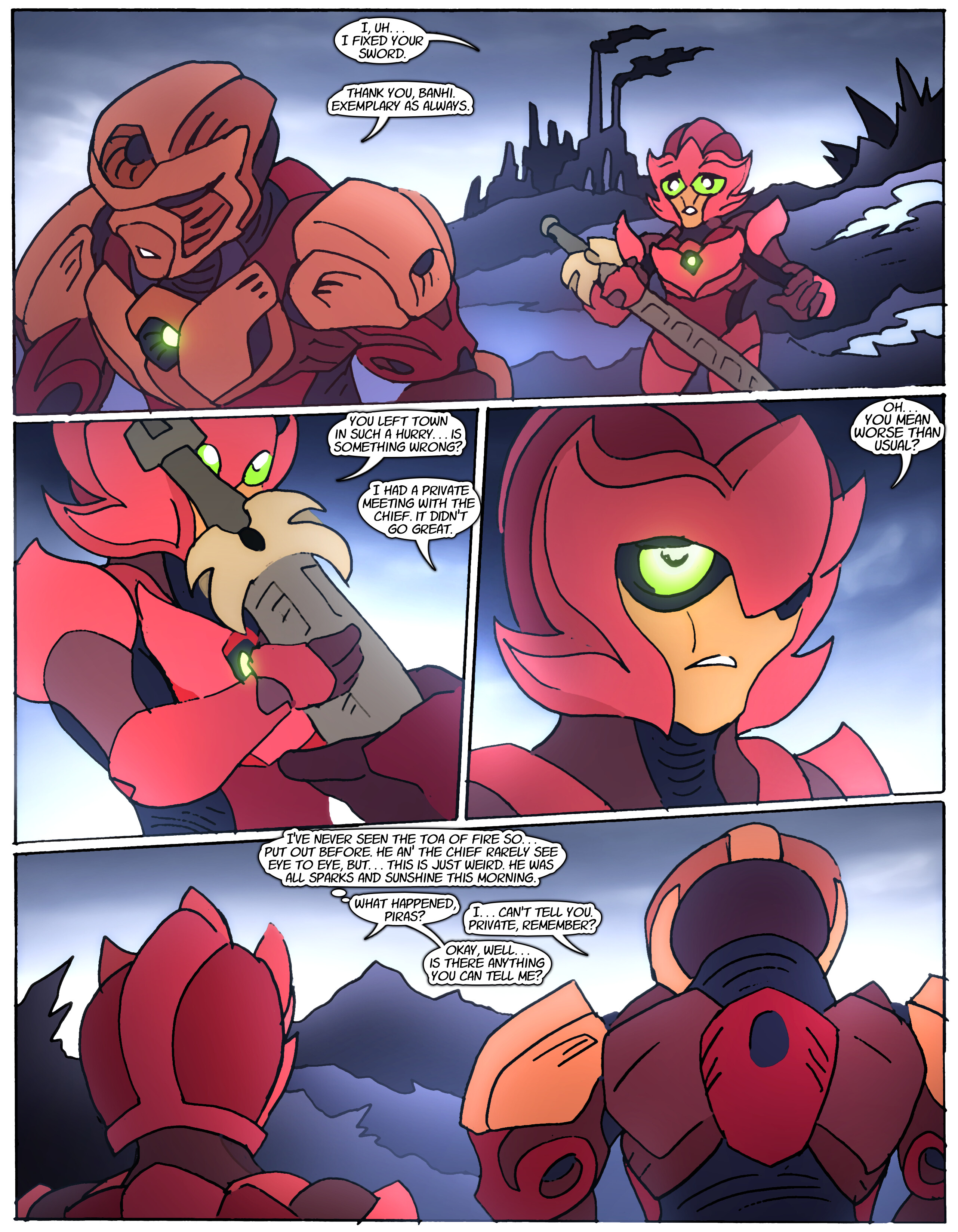
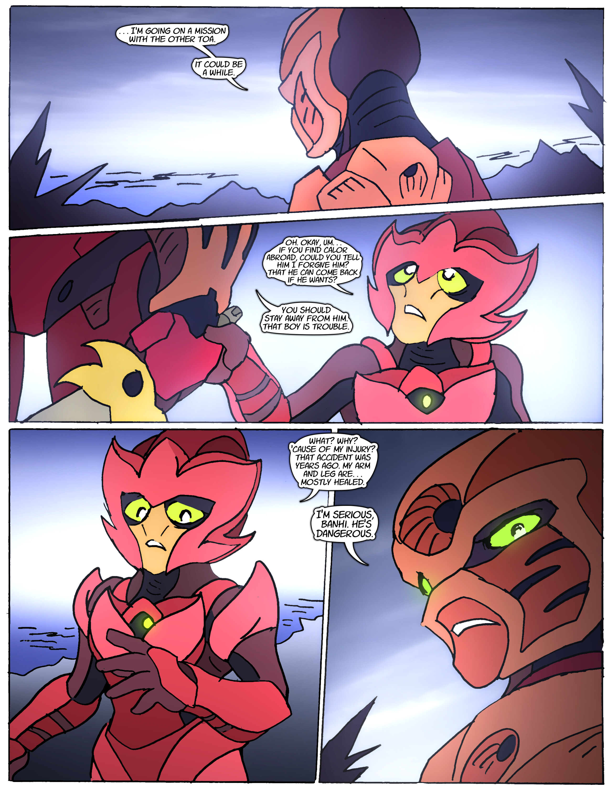
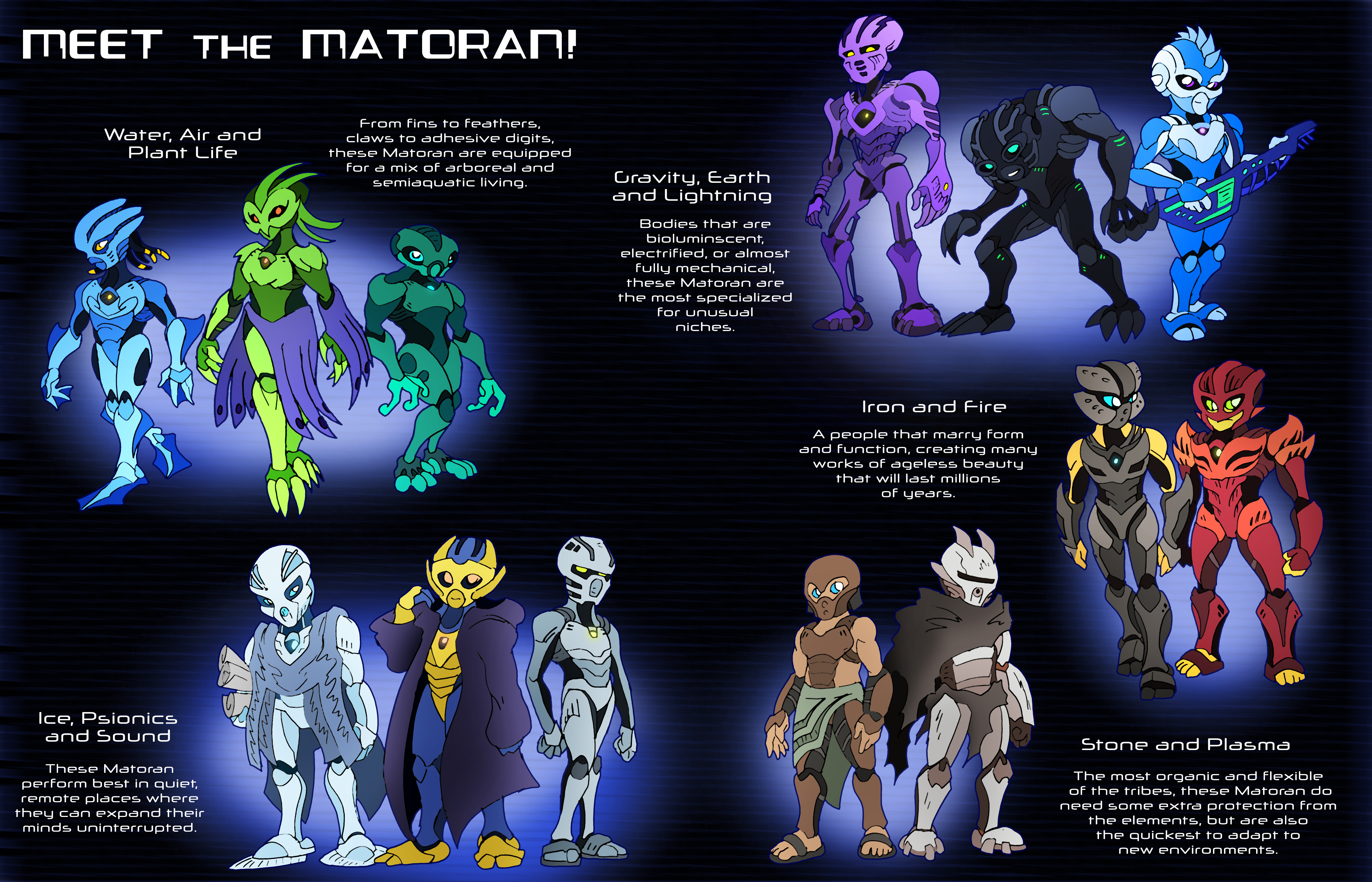
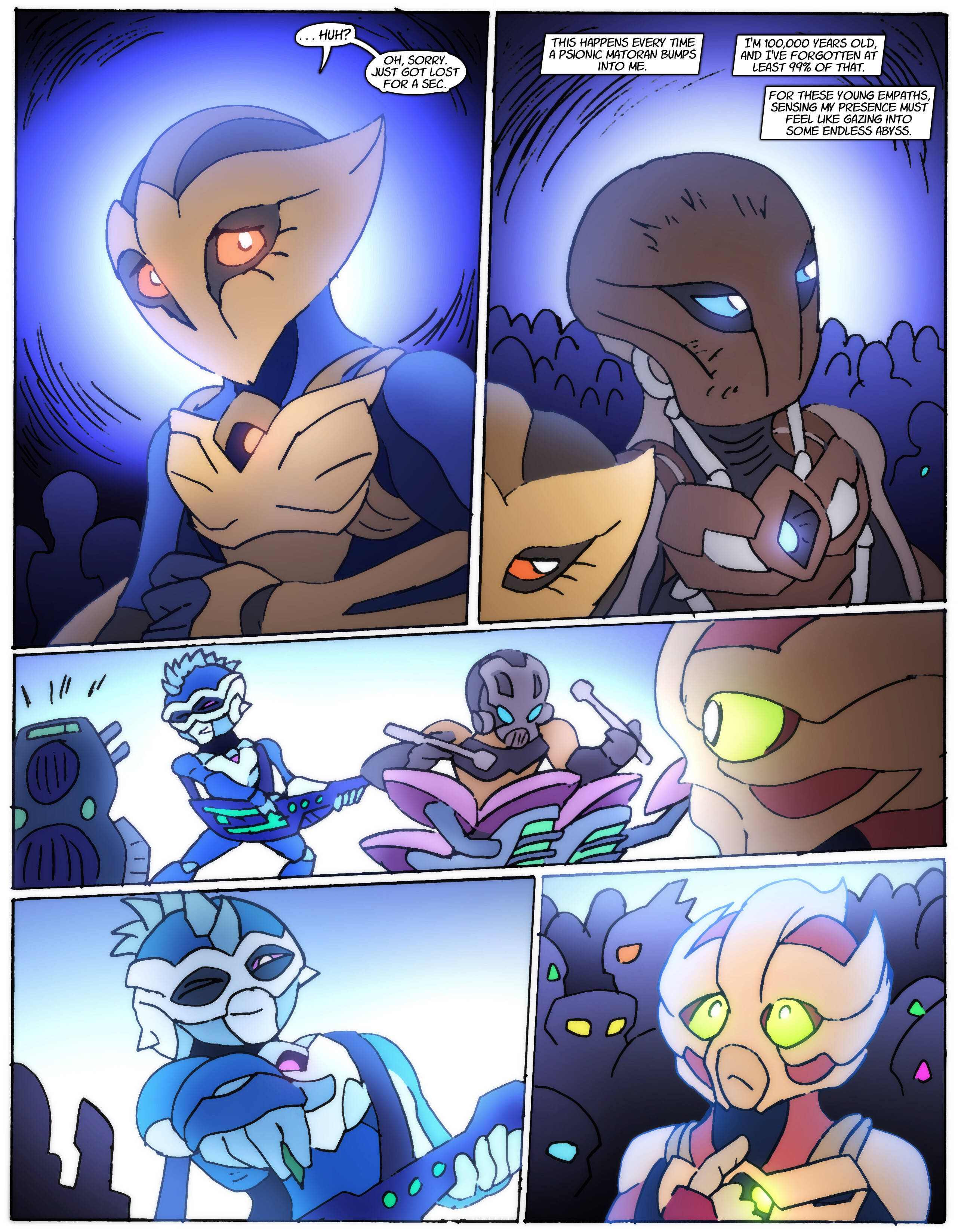
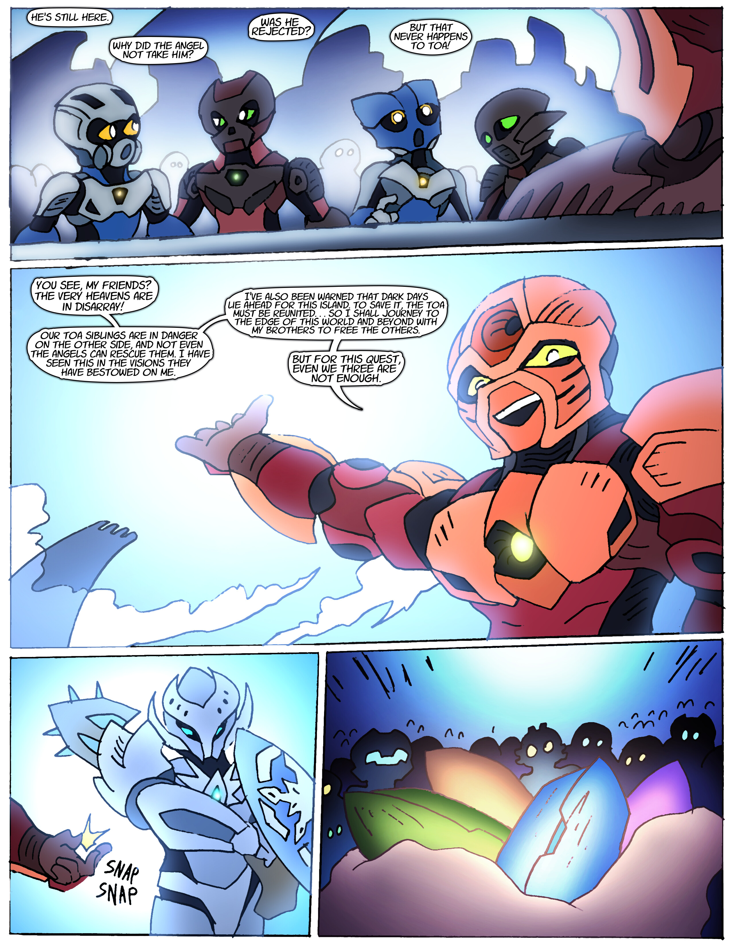
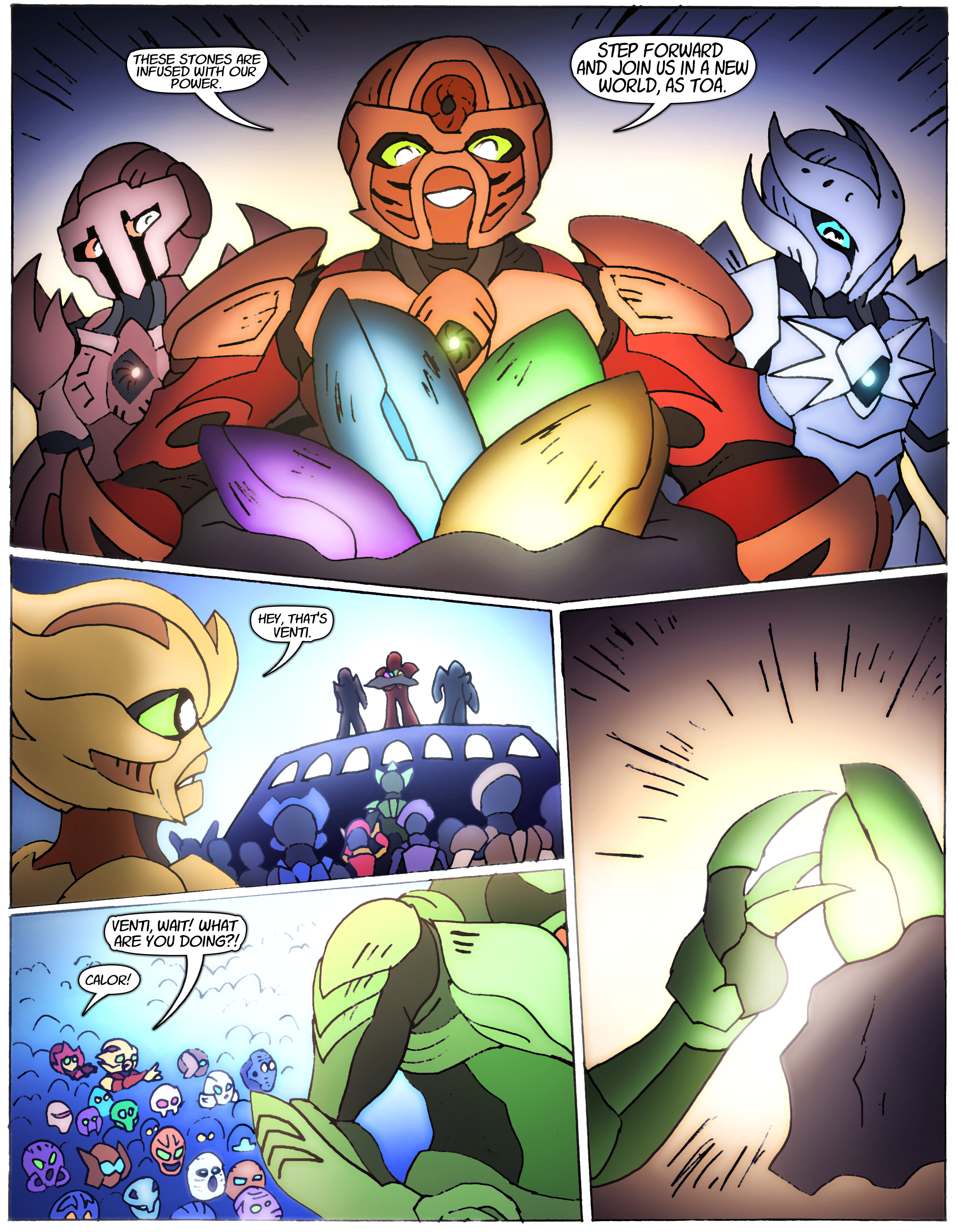
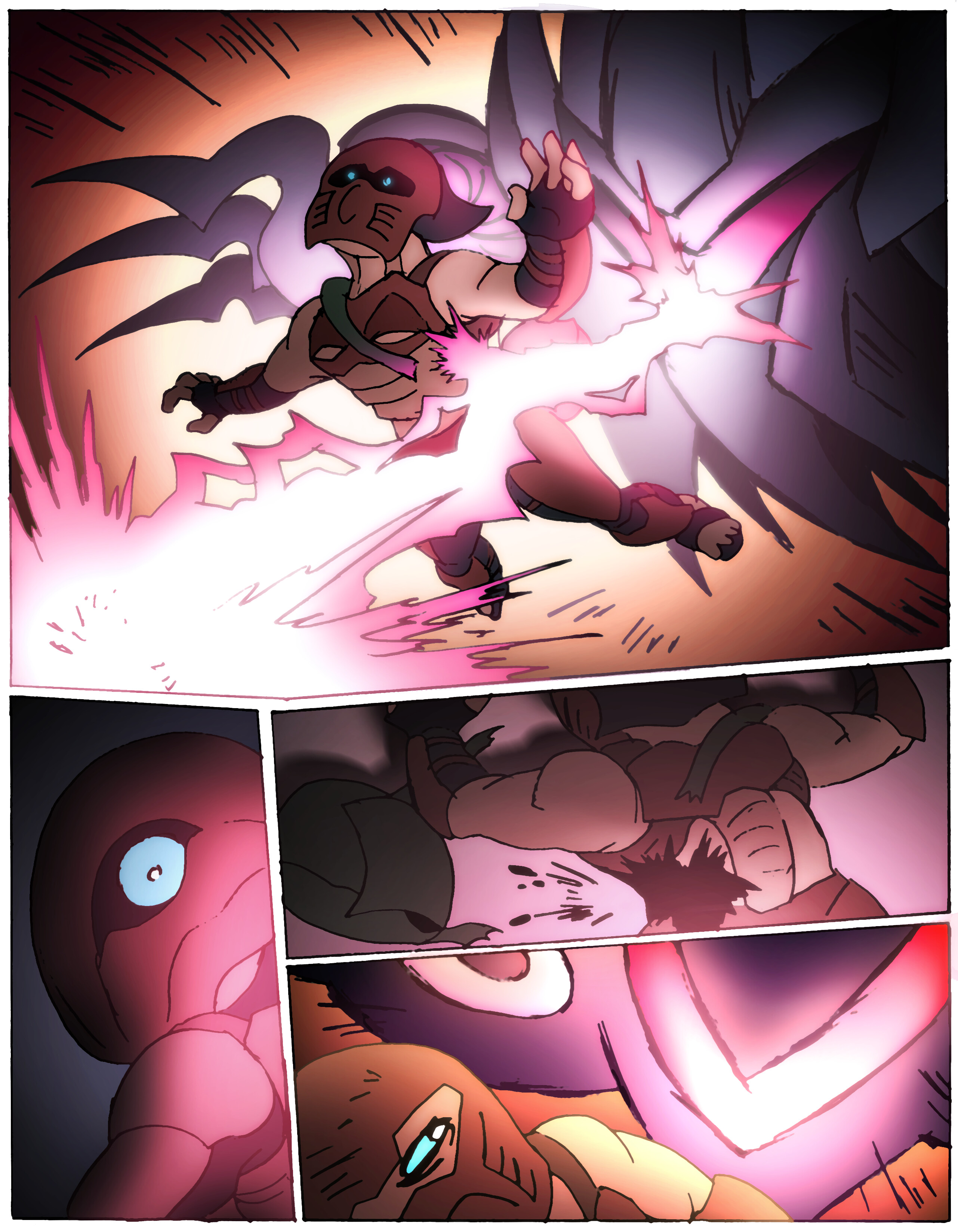
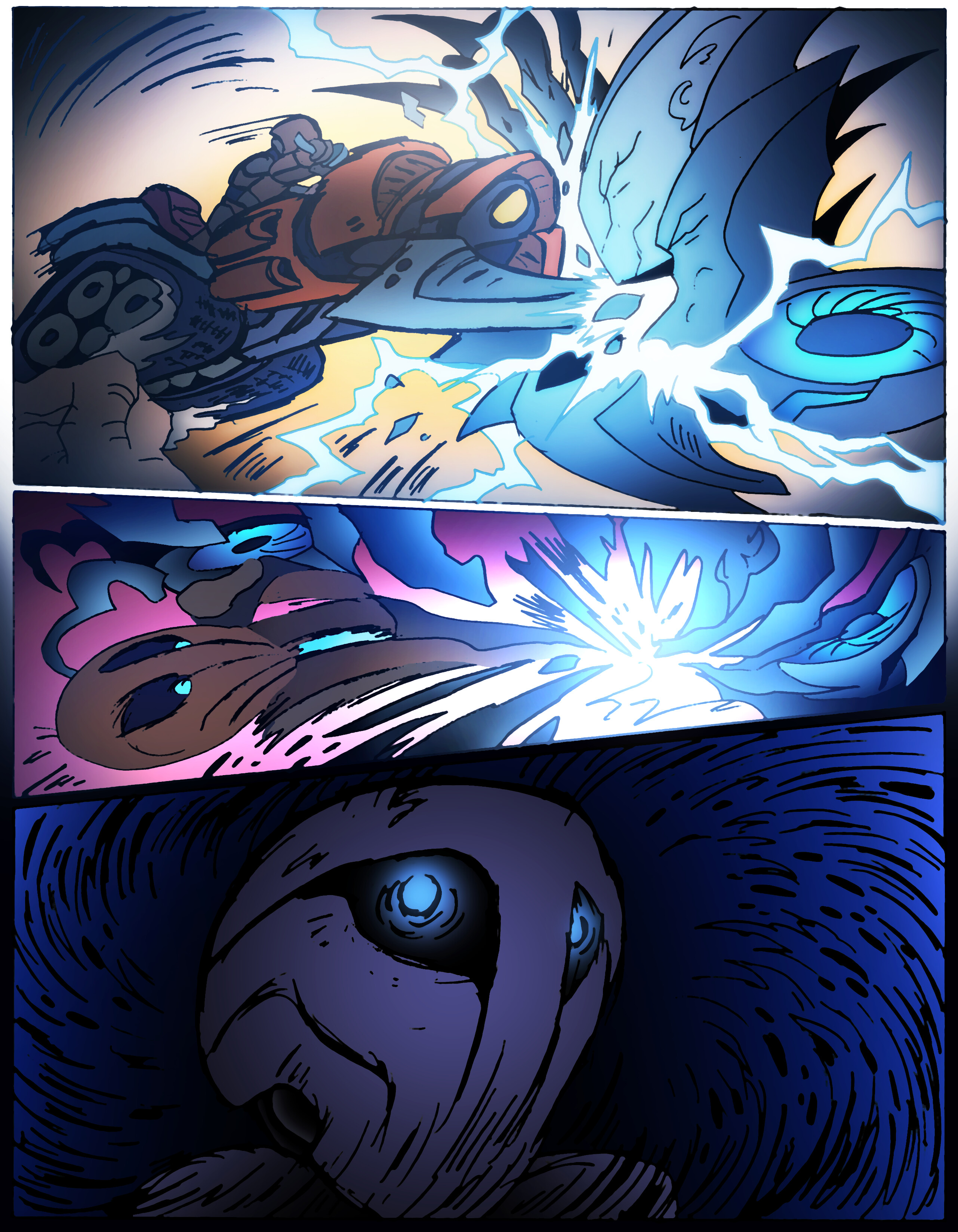
Yeah, Piras and Banhi’s introduction goes VERY differently than it did originally. Piras himself is unrecognizable next to his old design. Both versions were designed with the same mindset, though. I always wanted Piras to be “The Ultimate Toa,” an amalgamation of traits from the Mata, Nuva, Metru, Inika, even flipping Glatorian. Back then though, my idea of doing that was to piling a bunch of messy firey crud on him. This time, I wanted him to be more cohesive.
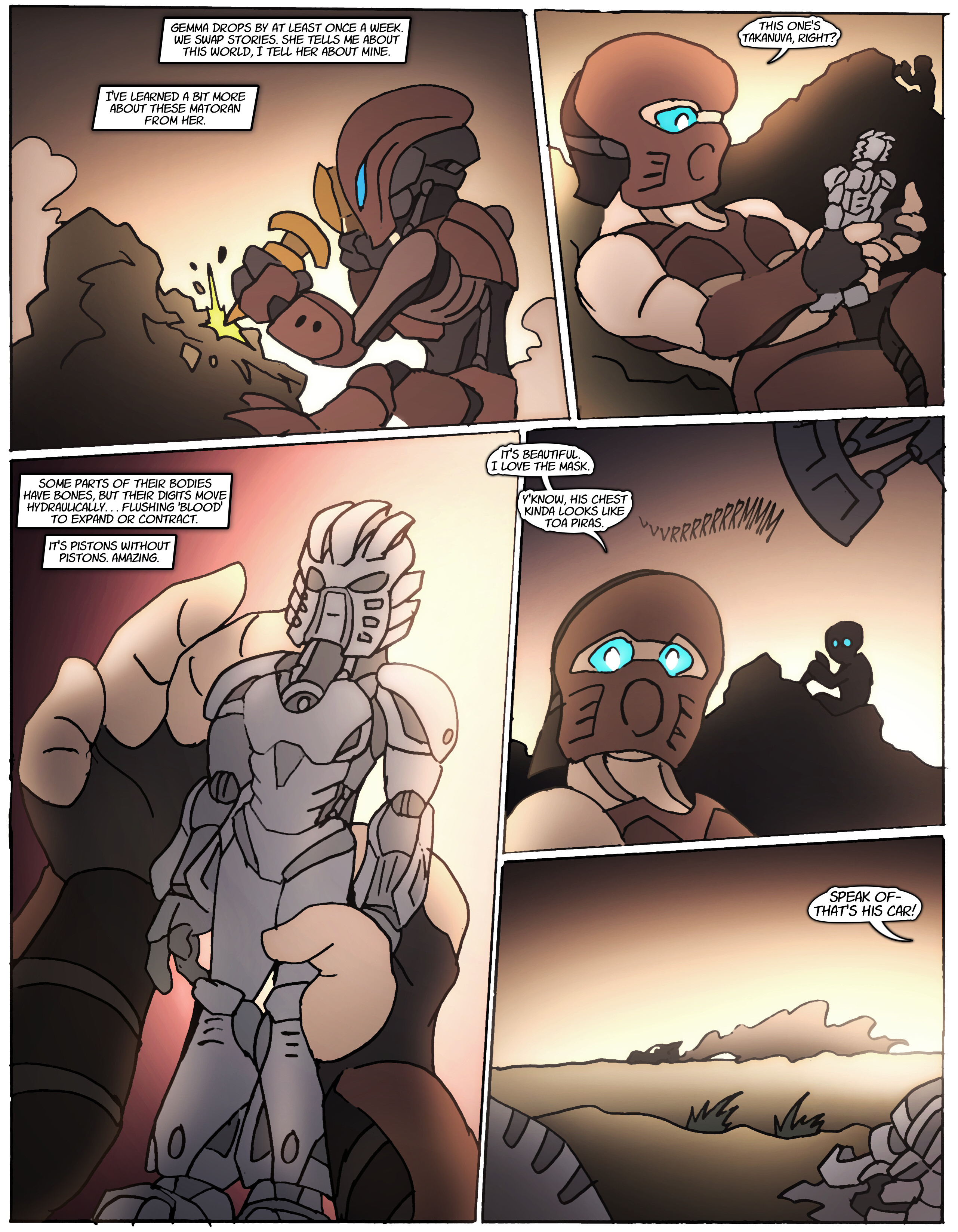
Yes… the “New Matoran” are essentially upright-walking crustaceans.
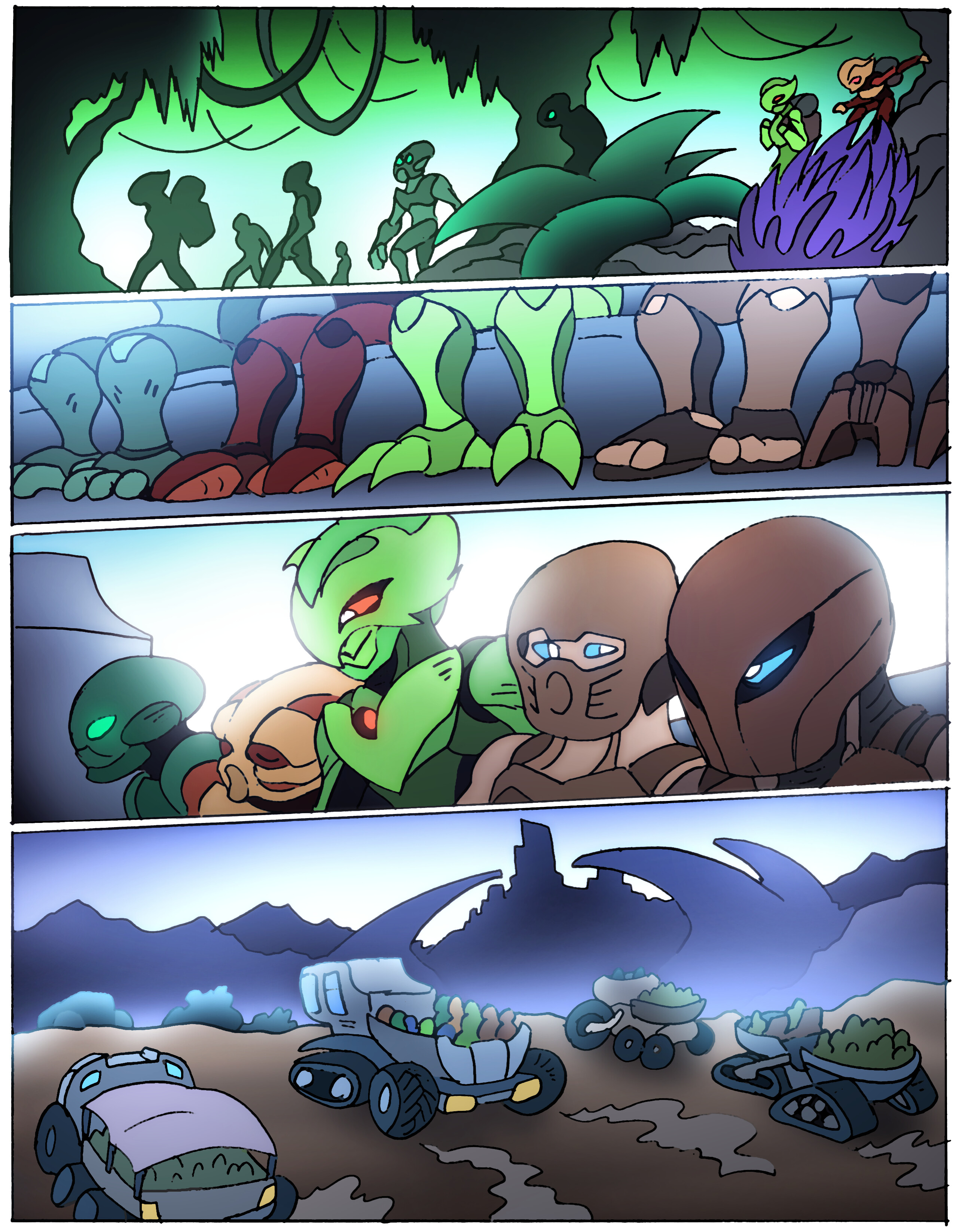
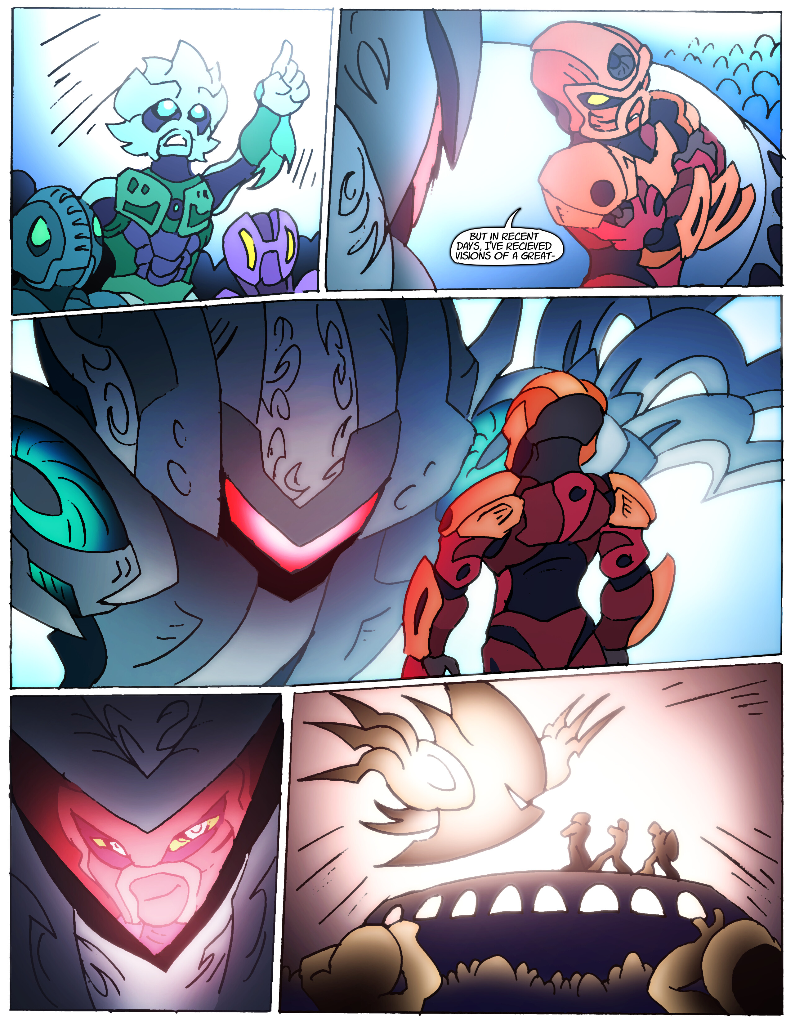
Nothing like a good ol’ mid-issue infodump, just like mom used to make in the OG Bionicle comics!
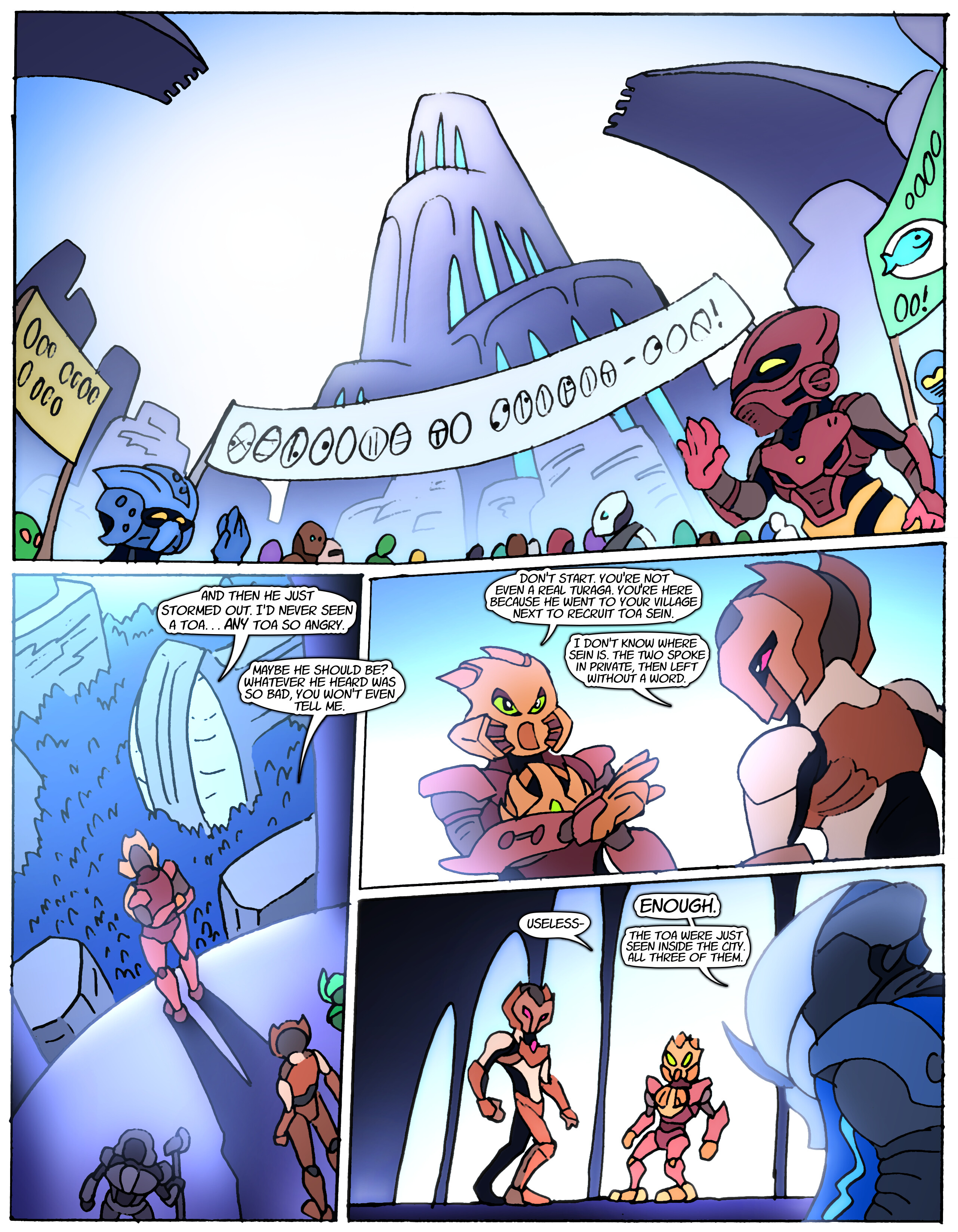
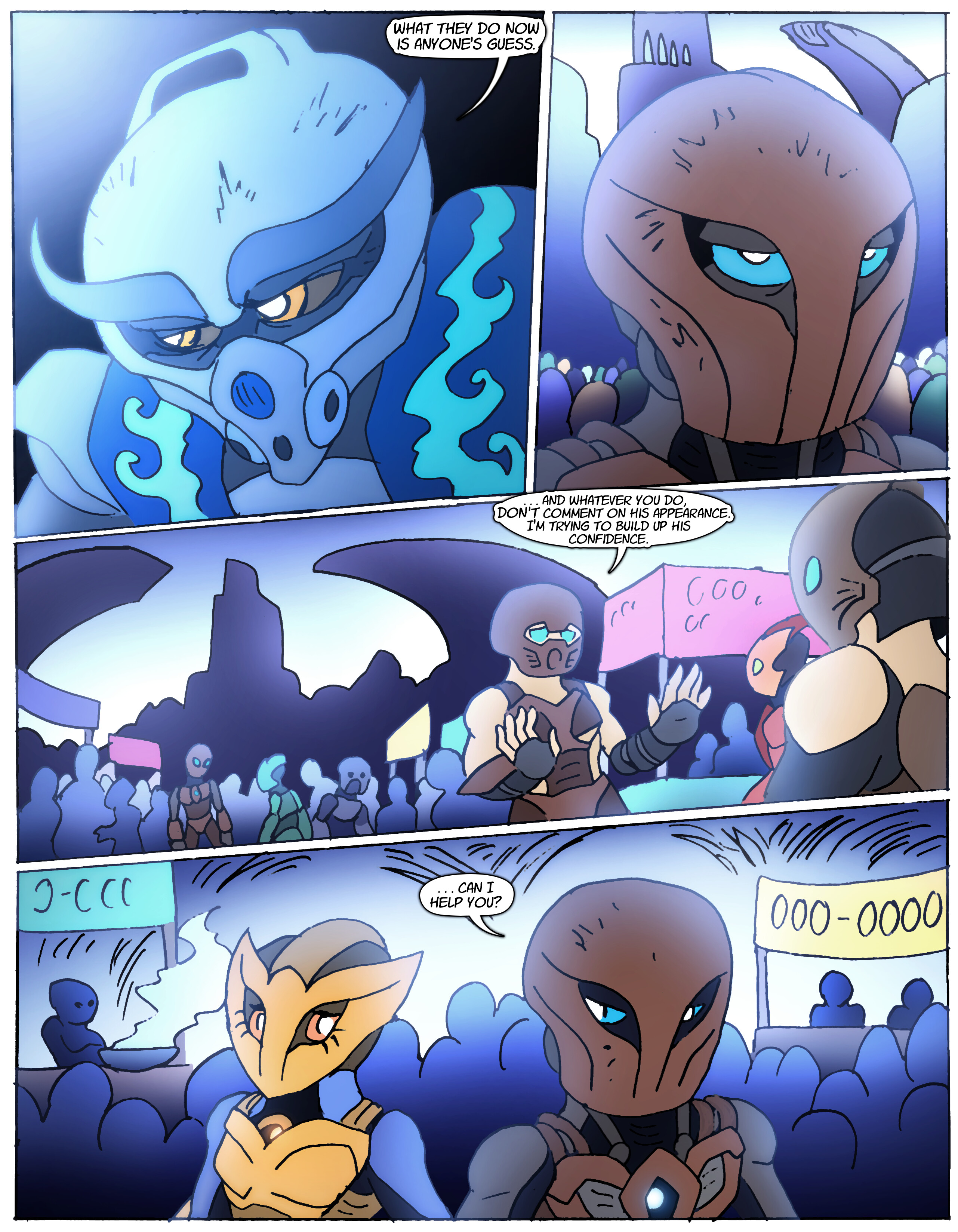
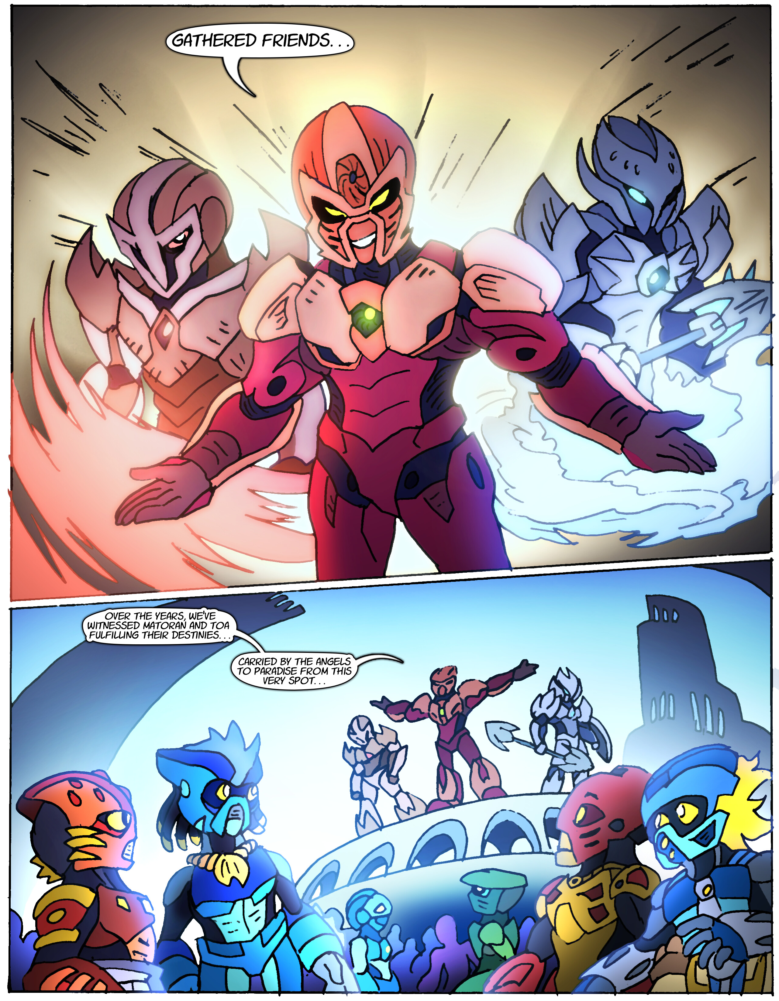
A lot of the background Matoran in these more crowded scenes are Nova Orbis fans’ OCs.
Pillar Men theme inteNSIFIES<
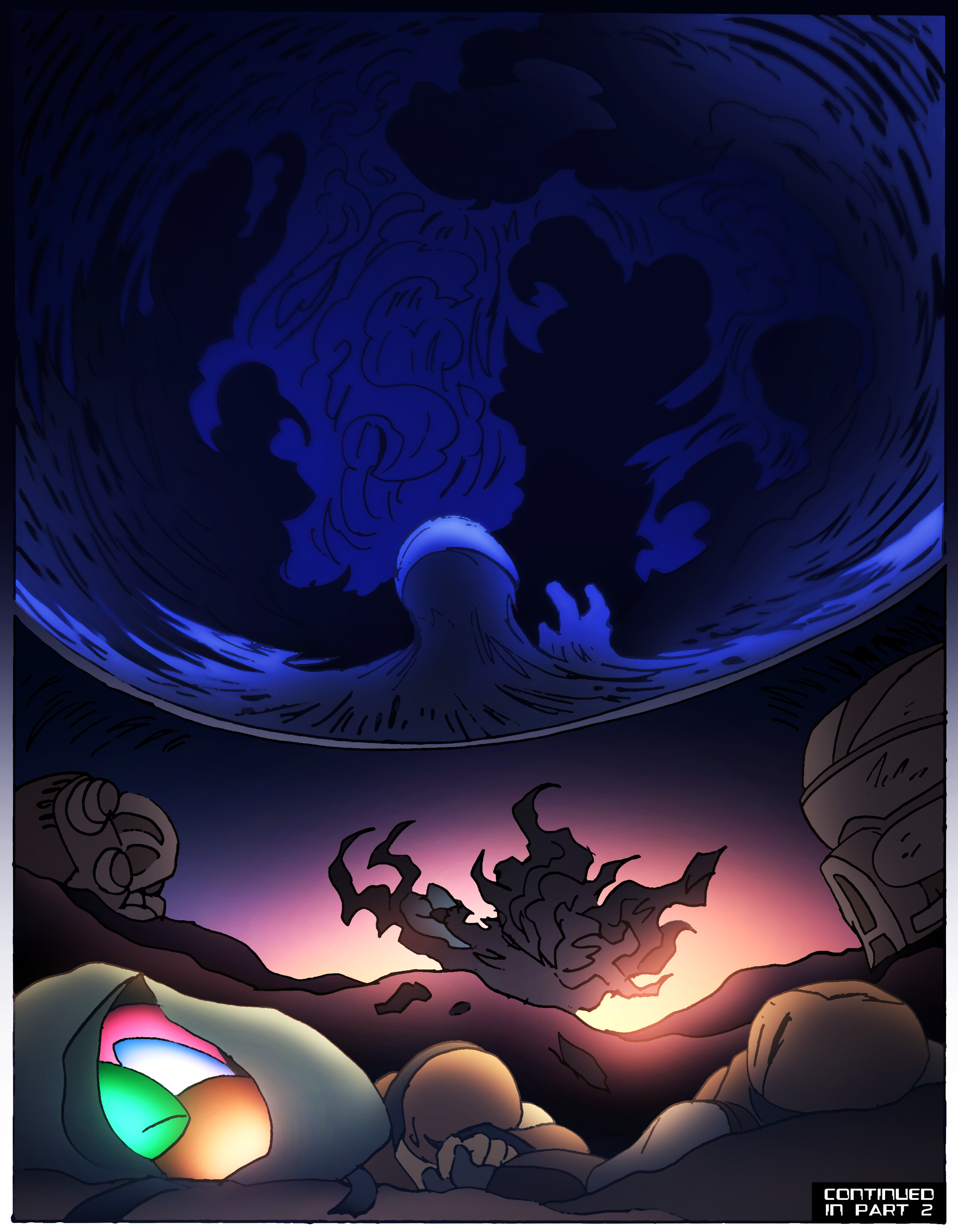
Aaaand that’s it for this issue. Waddya’ think? Characters, designs, tone, atmosphere? Feedback is always appreciated.
20 Likes
Long have we awaited.
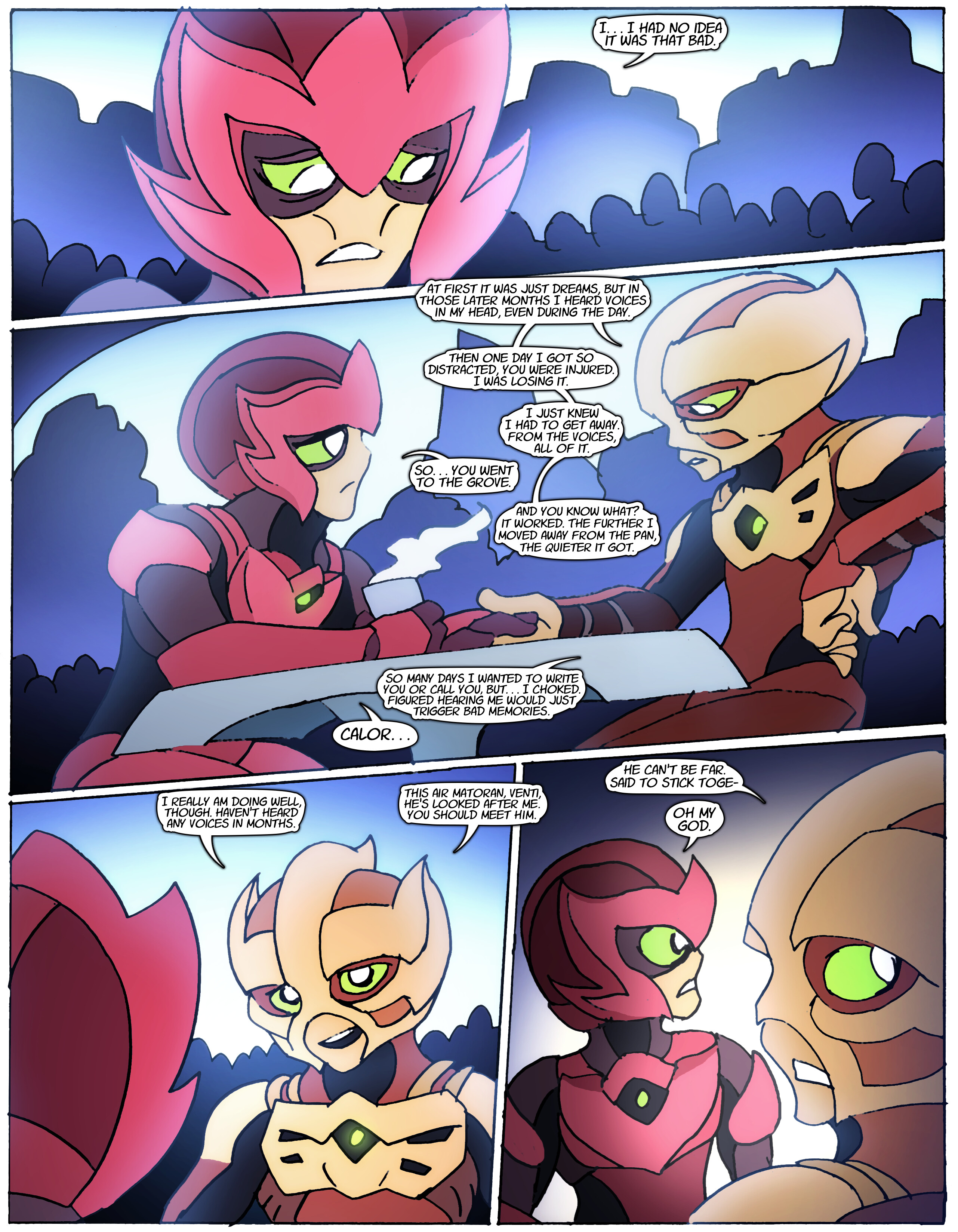
I find the atmosphere in this to be nothing short of crushing. I am thoroughly … not creeped out, or disturbed, just … saddened. I eagerly await the next issue.
3 Likes
There’s a lot to say but I really like how because Venti is an organic matoran, he grows wings like he evolved.
I especially love the lighting and atmosphere. It’s influenced my illustrations for a long time and I appreciate that.
The mask designs are also amazing especially in the background matoran. A little nitpick I have is that some don’t look like they’d be easy to mold which is a huge part in the design language for the original bionicle. Of course you’re not limited by those restraints and you’ve come up with really cool designs. I’m not sure if the toa of gravity is wearing a rau but it looks sick.
1 Like
As for my thoughts on the comic so far
I like it.
The atmosphere is fantastic and the art style is just the icing on the cake.
4 Likes
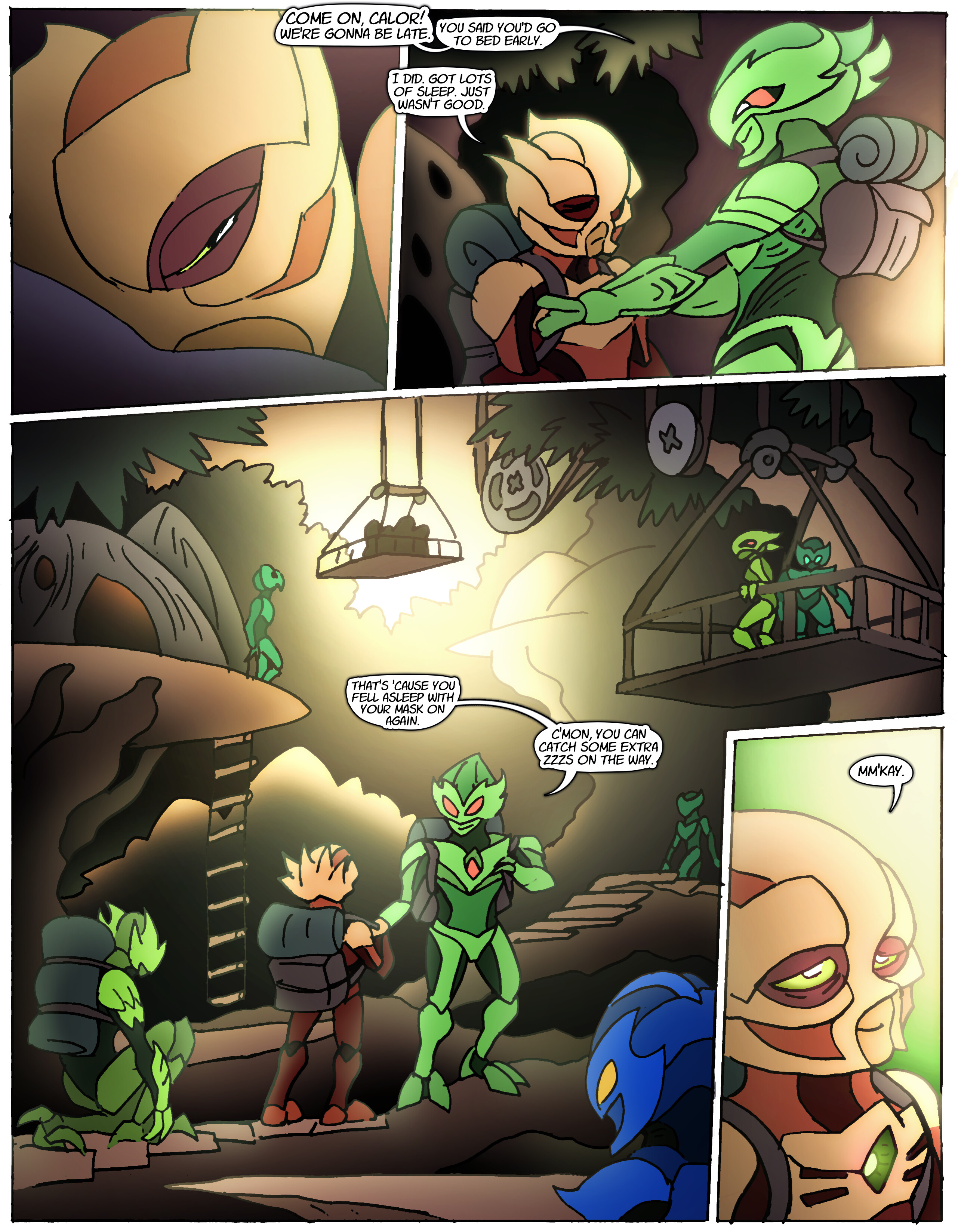
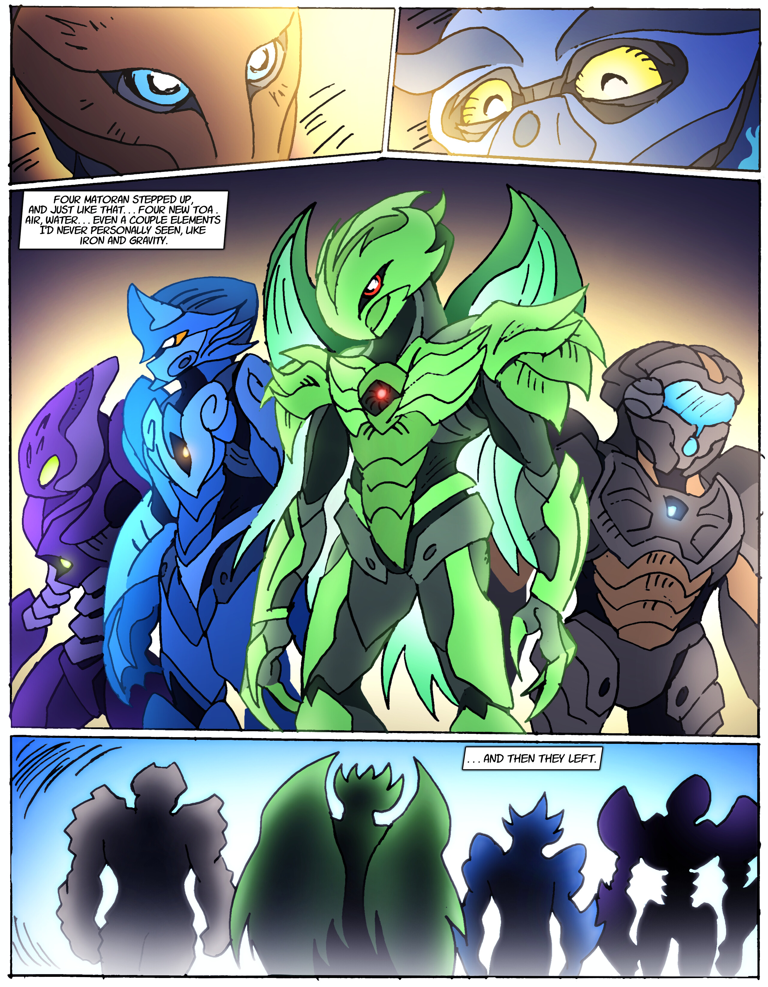
With him, I tried to make it hard to tell where his mask ends and his head begins.
1 Like
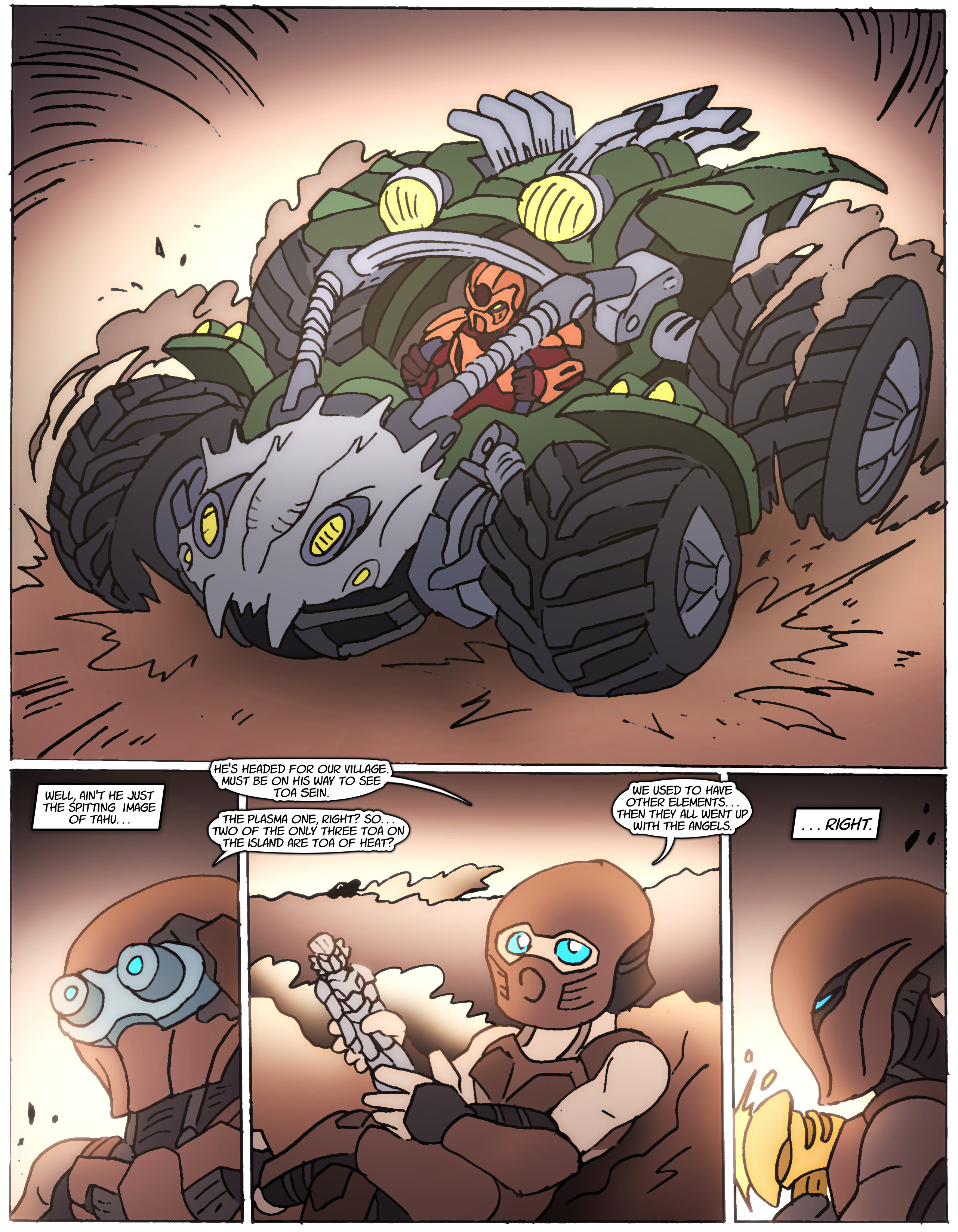
Very cool vehicle, it looks very close to being buildable. Loving the comic so far
5 Likes
Maybe it’s just because the sequence with Piras recruiting new Toa was more drawn out in the original, but the plot really feels like it’s moving at lightspeed right now. I’m still enjoying it, but hopefully it takes some time to breath a little once the whole core cast are introduced.
4 Likes
That’s a good point. I liked the reason Piras chose those four from the original. Here it feels like he just brought the first ones to take the offer.
2 Likes
Well… I’m trying to see if I can tell a cohesive enough story in about 20 pages at a time as an exercise in restraint.
@KanohiReqi There is a reason, but I can’t tell you now without spoiling a big reveal.
Edited for Double Post - BioKnight
6 Likes