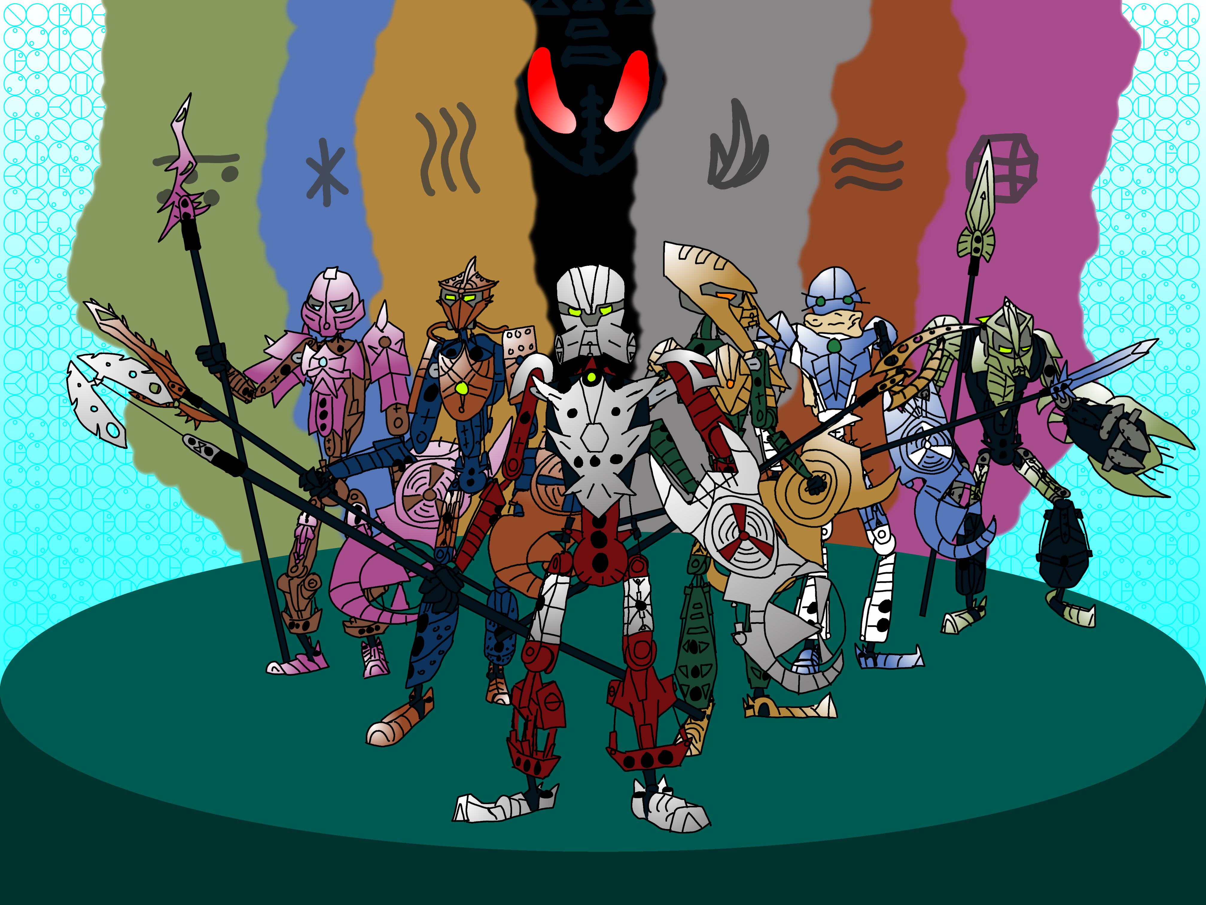
Lackluster in artistic skills, but with a grandiose vision, I present my Toa Hagah group artwork. I don’t expect to win - in fact, I don’t expect to get any votes. But I’m submitting this to make a statement - that pink Pouks is what we need! (And who knows, maybe I can ride the meme potential of pink Pouks + bad art to the finalists’ circle.)
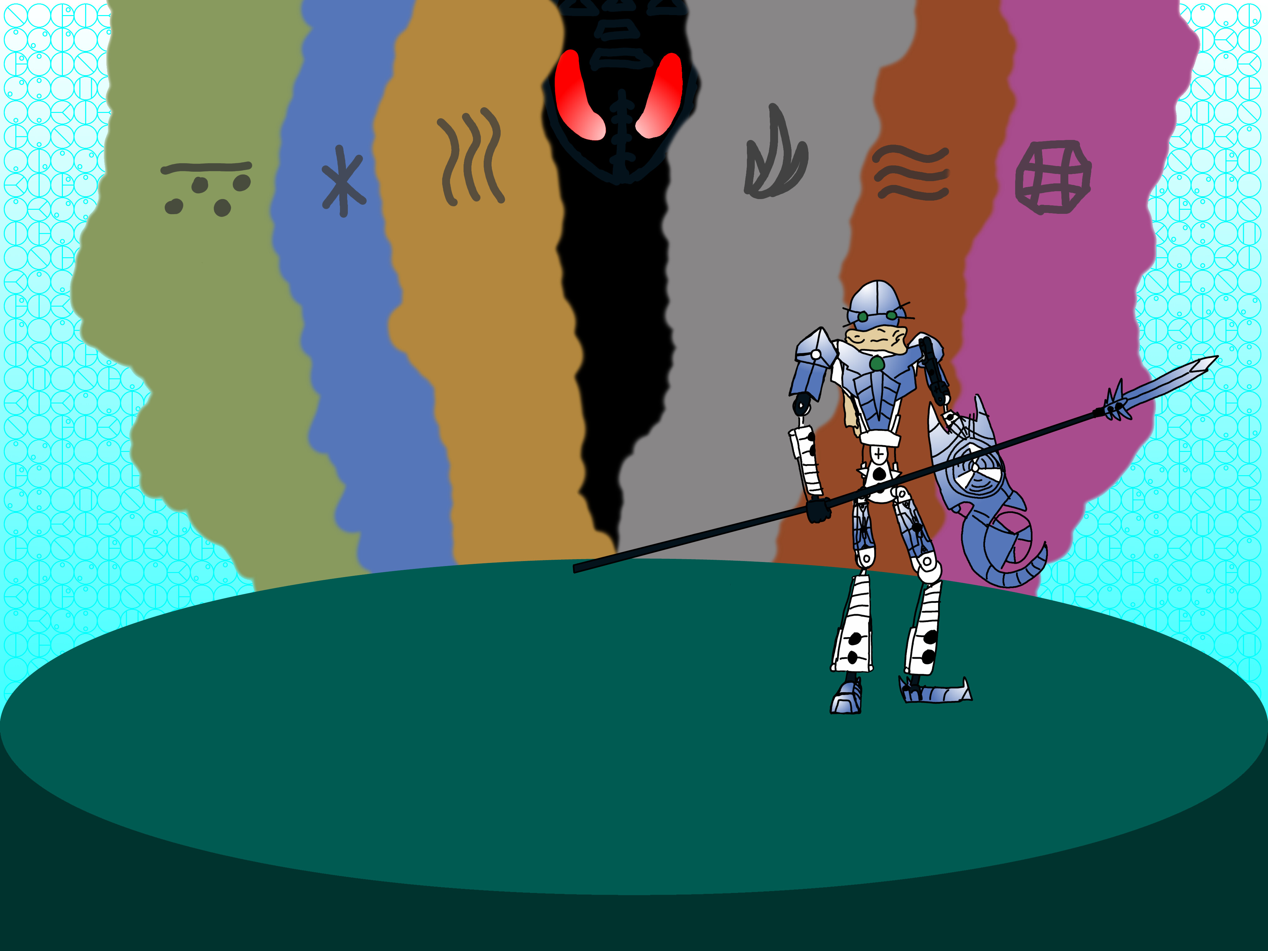
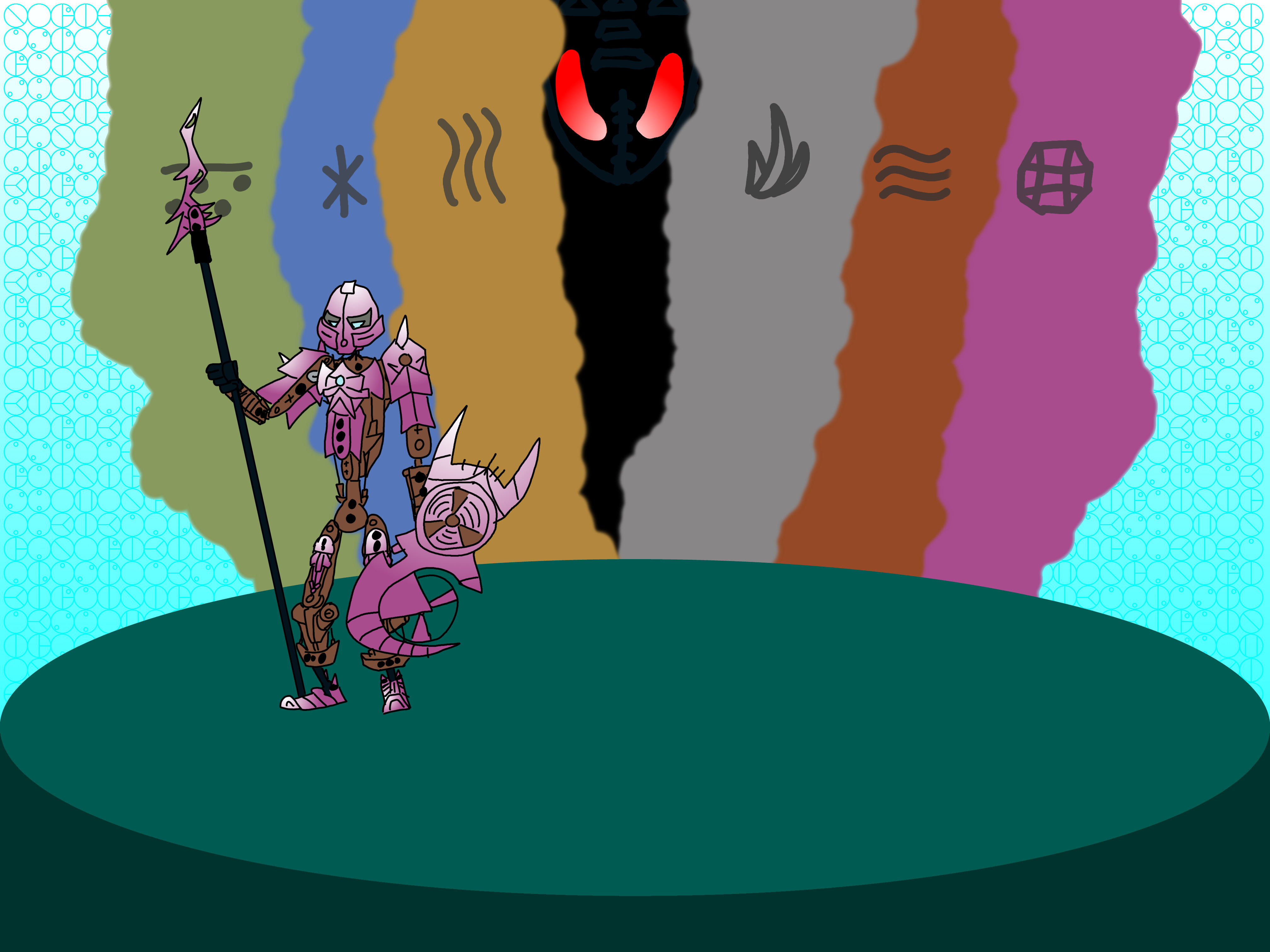
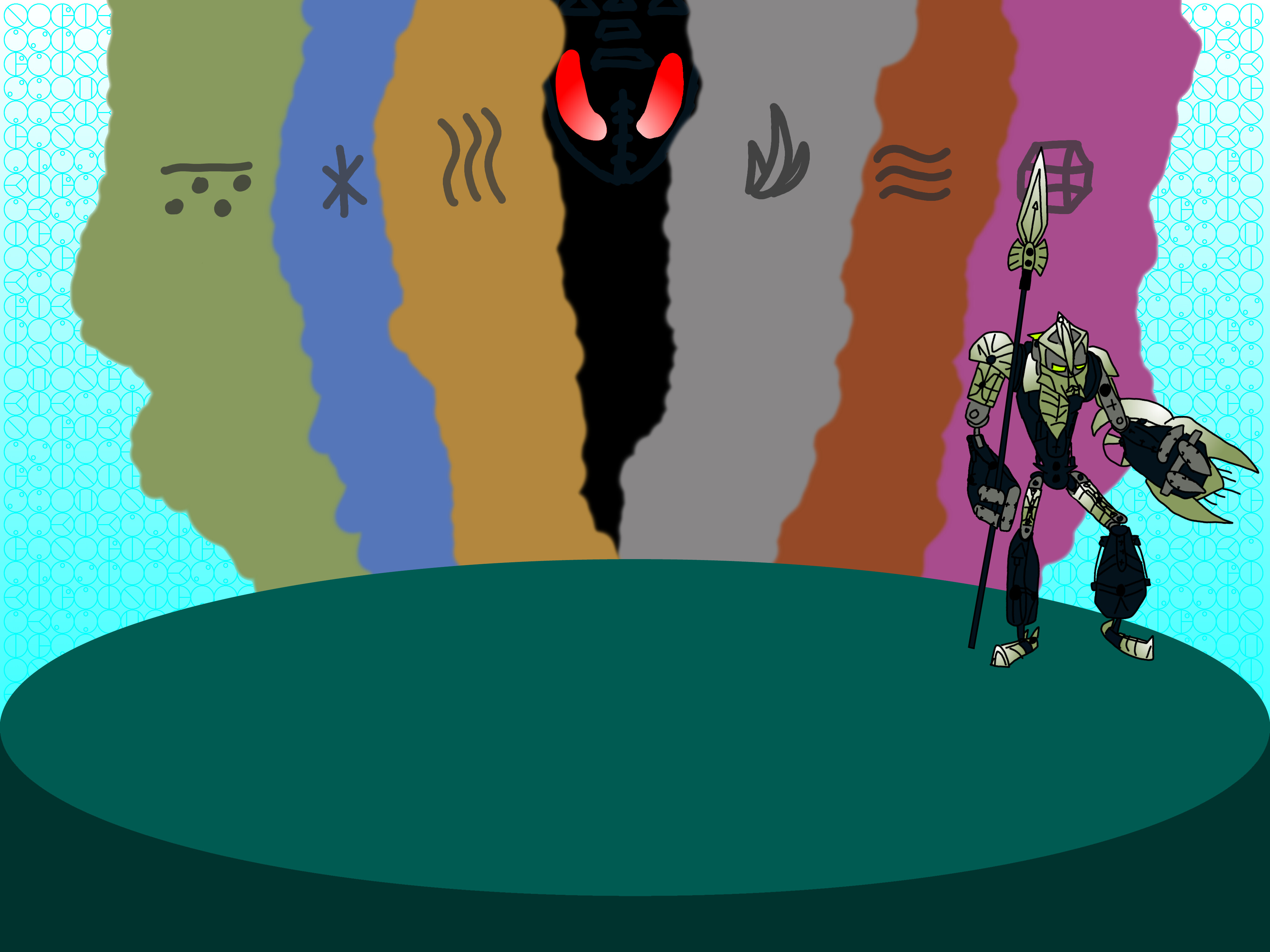
I really like the story of the Hagah. They hail from a time when Shadow was an honorable power to wield. They witnessed the angels fall firsthand. On top of that, they’re incredibly powerful Toa, guards to the big man himself, Teridax. I believe that, culturally, being vibrantly-colored would be admirable or intimidating to the Matoran, since so many beings are so varied in color, including Toa and Rahkshi. This team attempts to exemplify that standard I’ve conceived.
Here are some design notes.
Everyone maintains their masks and spear tips from their respective physical models. I’ve changed Gaaki’s mask to a Mask of Adaptation Galva’s new Mask of Clairvoyance because Galva dislikes the original Mask of Clairvoyance they designed, and does not want it canonized.
Everything is vaguely stylized, and I tried to incorporate themes of details coming in six or three.
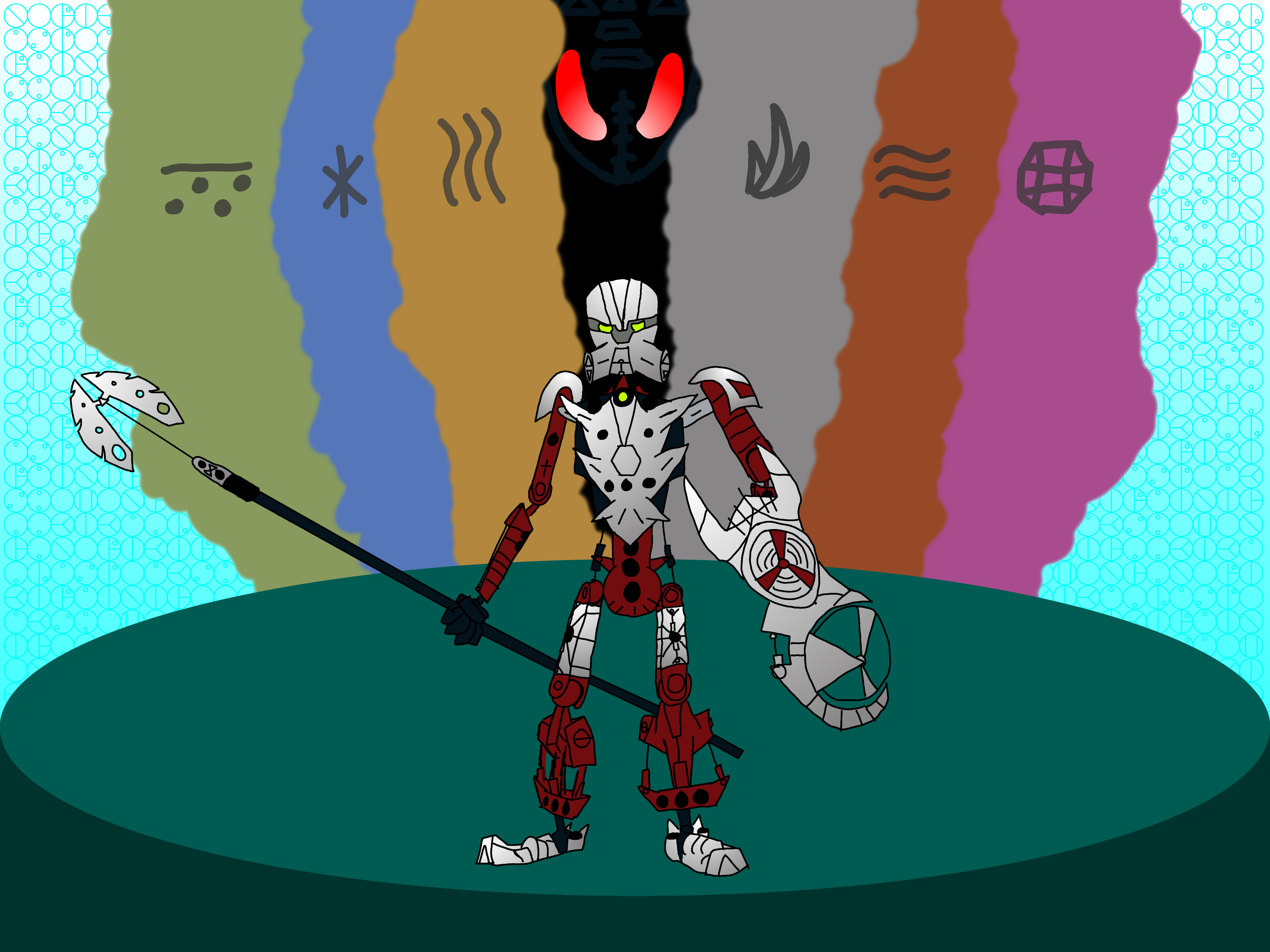
The grip on Bomonga’s shield is the color of the Rhotuka launcher, to imply that he has one on it (unlike the MOC).
The official metallic colors are, from left to right - Chrome Pink, Copper, Flat Silver, Flat Dark Gold, Metal Blue, and Metallic Green.
I consider the color justification to be thus: Iruini, Norik, and Gaaki form the “medallion” colors - gold, silver, and bronze, while Pouks, Bomonga, and Kualus form the “rgb” colors - red (pink), green, and blue. This bakes a 3-3-3 split into the 6-way color split.
All of the colors on the figures (except the pure black for the lineart and pinholes) are pulled from the Stud.io code.
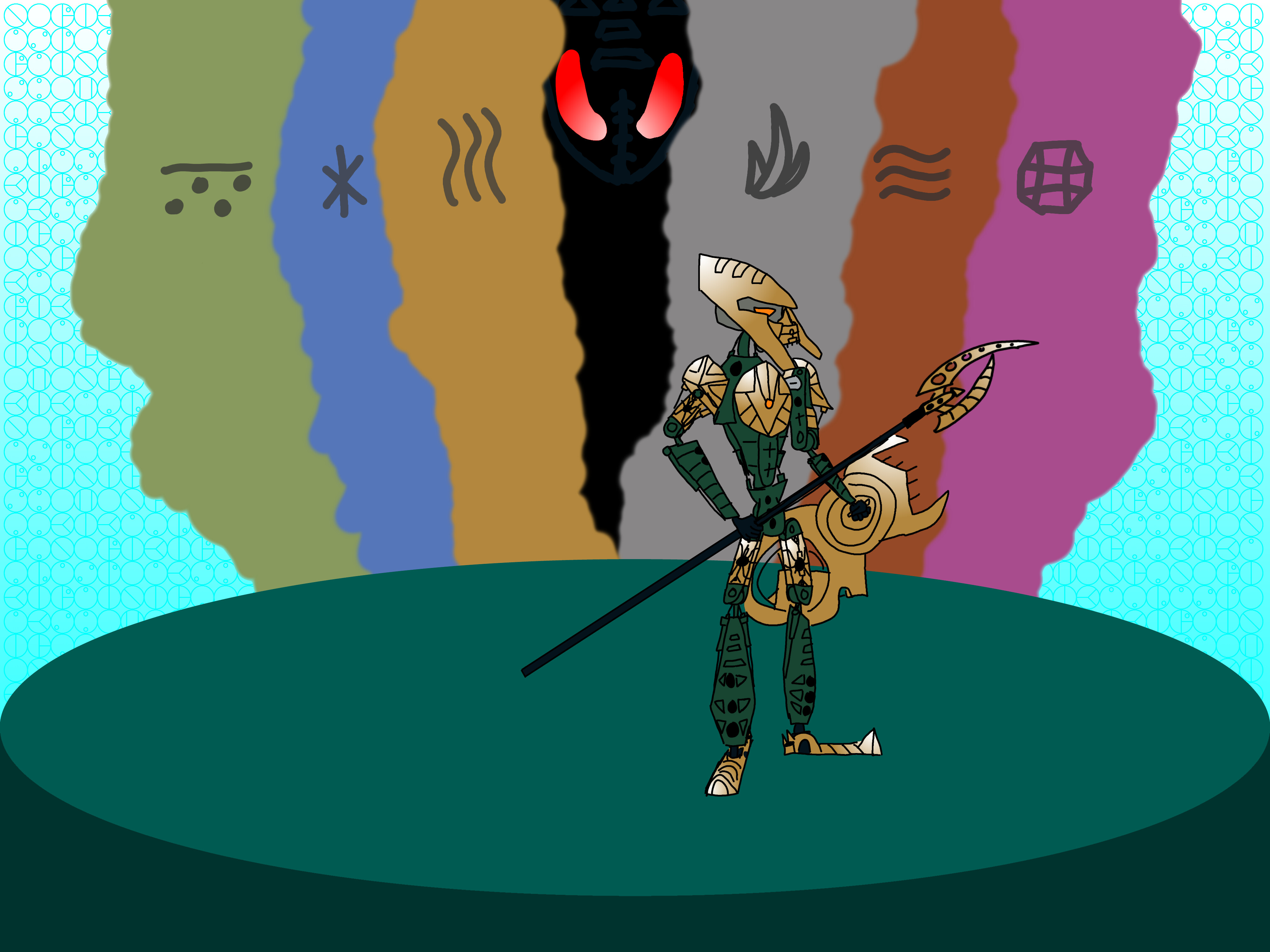
Norik and Iruini are in front because they were actually released.
Iruini is detailed the best because I actually own that set and had him as a model. The rest are freehand.
I started on a paper, took a picture of it, traced it, colored it, moved them around, and made the background, in that order.
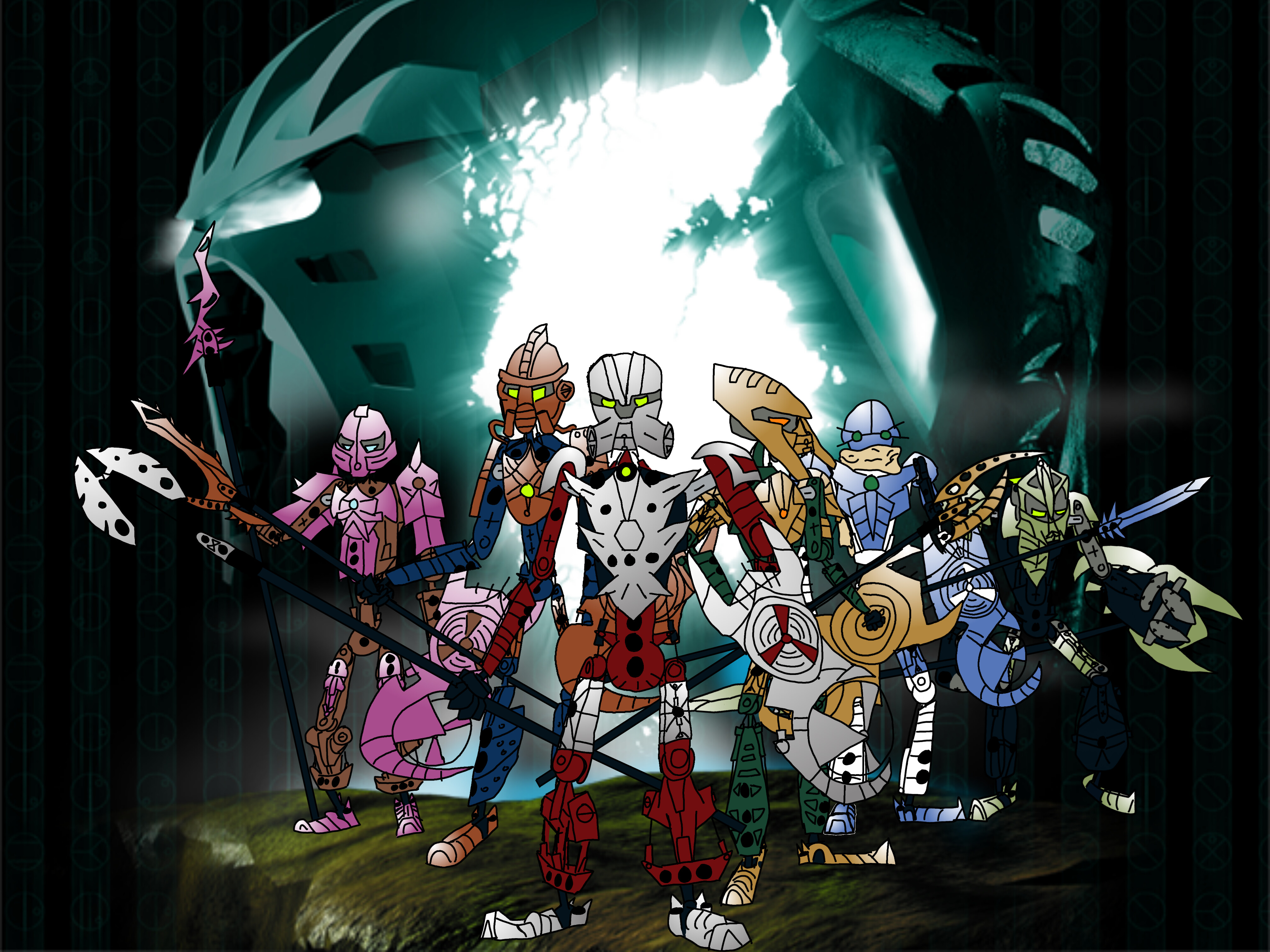
They’re in one of Makuta’s lairs. It’s styled after the Mangaia entrance from MNOG. I like to imagine they’re leaving after being given their new armor, masks, and weapons.
I like to put balance in my drawings, so the colored smoke in the background is in reverse order (i.e. Pouks is on the left but his colored smoke plume is on the right)
The text is a reference to the 2003 titan box art, which also had floating text in the background. I had a version of this on the titan box art background, but I didn’t like it that much.
EDIT: Made some tweaks. Gaaki’s mask has been changed, a circle on her pauldron has been changed from black to blue, and Bomonga has been moved slightly.
Another EDIT: Changed Gaaki’s mask again.
Last EDIT: re-posed Bomonga. Winners’ circle, here I come!
Good luck to all who have entered, and let’s rally for pink Pouks!
You stuck with Pink Pouks throughout all of this, and that deserves some honest credit. It doesn’t even look bad either IMO. Best of luck in the voting
I like how Iruni’s mask looks, I find it so hard to get masks on an angle looking right and that captures it well. Same with Pouks mask, it has a good expression to it. I do have concerns though about Gaaki’s mask seeing as the creator of said mask said they wanted it changed but oh well. Do the symbols stand for anything in particular?
I’ve kind of gotten attached to the 2/2/2 split, but I really, really like what’s going on here.
Obviously Pink Pouks looks great, as does Green Bomonga (which is surprisingly popular, I’ve noticed). In general, the unique colours really work.
I absolutely love the stylization on Pouks and Iruini’s weapons as well; they both have completely different feels from their original parts, but I can still clearly tell what their respective inspirations were. Keeping Pouks’s original thigh parts is also a big one for me, personally; not many of the entries so far have done that.
The stylization on Pouks’s chest is great too; apparently I just love everything about this Pouks.
If there was one thing I’d change (if you still can), it would be to make Gaaki’s tubes silver. You’d want to check with Eljay if that’s even allowed, but I had never really seen her tubes as being part of her metallic armour as much as a part of her natural armour/body. This is a personal opinion of course, but it’s something that I haven’t really seen any other entries explore yet.
Funny enough, I actually disagree with both of these points.
First, I wouldn’t want Pink Pouks to win as a meme; I want it to win on the basis that it’s a unique colour that really adds to the Hagah’s unique elite status (plus you picked a cool shade here).
As for the “bad art”… I think it’s that unique approach that led to the stylization I love that I mentioned above.
Overall, I can easily see myself voting for this in any round.
Personally, I find this whole “you may edit your art once” thing to be kinda BS, especially because I was in the middle of changing Gaaki’s mask when that was announced. I will flaunt that if I have to.
I debated with myself on whether or not they should be silver. I looked at some other entries and saw that they were changing the tubes too, so I changed them for mine. I can ask in the official discussion.
I mostly call my own art bad because I have a very shaky hand and I’m bad at consistently sizing, balancing, shaping, shading, and detailing things. I make up for it with the stylization. I’m really glad you like it that much.
I gotta say, out of all of them, Pouks is my favorite (and no, it’s not just because he’s pink, though it certainly helps) the art as a whole is very bright and vibrant and it really pops. I think that’s what makes it a stand out entry for me. Brilliant job!
Thank you very much! I figured that it’d be best to lean into the vibrant, low-detail style than try to do what I can’t. The MNOG-style background certainly helped.
Thank you @KDNX for entering the contest! While your entry does not seem to explicitly break any rules, there is a potential issue with your depiction of Bomonga.
In your art piece, the spear tip of Bomonga’s Seismic spear is obstructed by other characters. Since the spear tip design was locked by the author of the inspiration MOC, it should be depicted in the submitted artwork.
We recognize that your individual artwork for Bomonga shows the correct design, but since it is the group shot which will ultimatelly get canonized, we would like to ask you to make a small alteration to your entry, so that the spear tip design is recognizably the requested one.
Since no other issues were detected in your entry, making this alteration in the next seven days would enable it to be accepted and move on to the polls.