I love this piece… the colors… not.
BUT if I were to vote on any 1-1-1-1-1-1 scheme, it would be this one.
Altogether very beautiful. I do think Norik could use some better lighting though
2 Likes
Not the greatest fan of the armor colors but I have to admit: thats one well made picture if ive ever seen one
Oh woooooww!!
The metallic orange on Gaaki looks SO good!
Not a big fan of green Bomonga, but I love the aesthetics of everyone! Really awesome!
1 Like
Smol norik gets a lol from me. GG
2 Likes
I want to eat this entry. I want it in my body.
13 Likes
please somebody do this
1 Like
This reminded me so much of an old LEGO magazine cover I decided to make this. Also I really like this alot! Will be voting for this one!
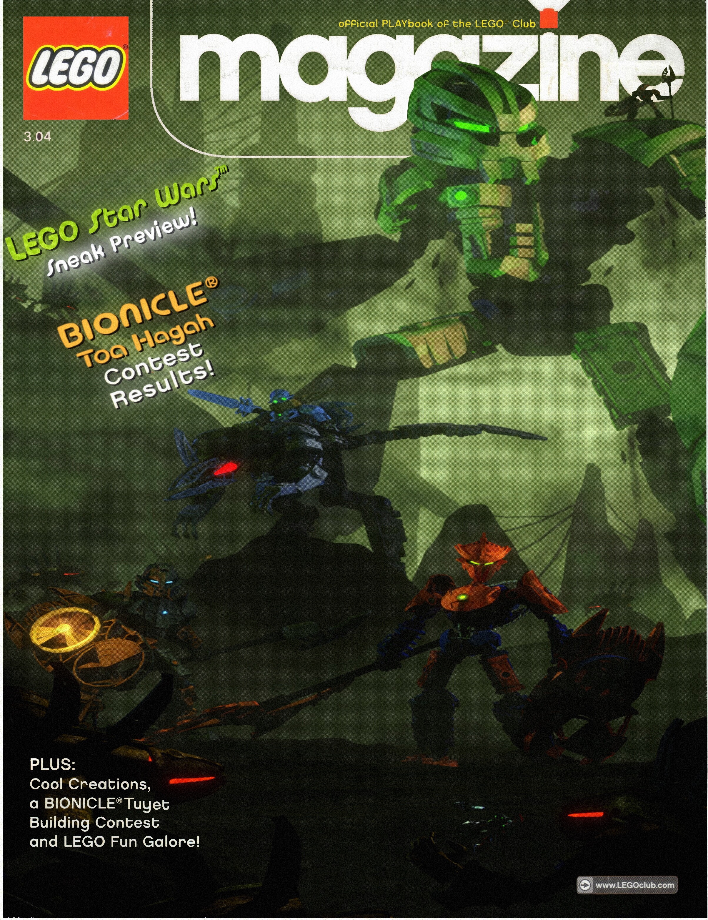
30 Likes
Ha! That’s really cool! Man that brings me back to the good ol days.
8 Likes
Oh the nostalgia!
1 Like
Woah this looks amazing! I would love to put the entry photo onto my wall if I get the chance.
Also make sure you link this into the entry list so that we can vote for this fantastic entry!
This is phenomenal work, it’s absolutely incredible, I think the quality is better than anything Lego themselves ever produced.
You’re an absolute legend.
This is amazing! Your entry is my favorite so far. You definitely have my vote.
Love the giant green Bomonga, copper Gaaki, the launching rhotuka of Pouks and the rahi Kikanalo! In addition, I especially like your redesign of the characters and I can see that you have made a lot of efforts on the background, which reminds me of some of the official commercial art styles of 2005.
The foreground is a little dark for me to see the toa, especially Norik. Maybe you could add some lighting like fire or something to the ground to make the characters look brighter.
I am not sure if i am the only one who prefer the magazine version by @powjump above, I think this might because of the aspect ratio, maybe longer picture make Bomonga looks a little bit too big and takes up too much space?
I also took part in this contest so I know how difficult it is to design and compose a exquisite scene for a team like this, but you made it very well! 
6 Likes
These are fantastic! I really like seeing them all together. What program did you use to makes this?
The submission image has now been updated slightly based on feedback. nothing extreme
I adjusted Pouks’ position in the scene
minorly tweaked lighting,
and created more mist around the foreground in order to increase visibility
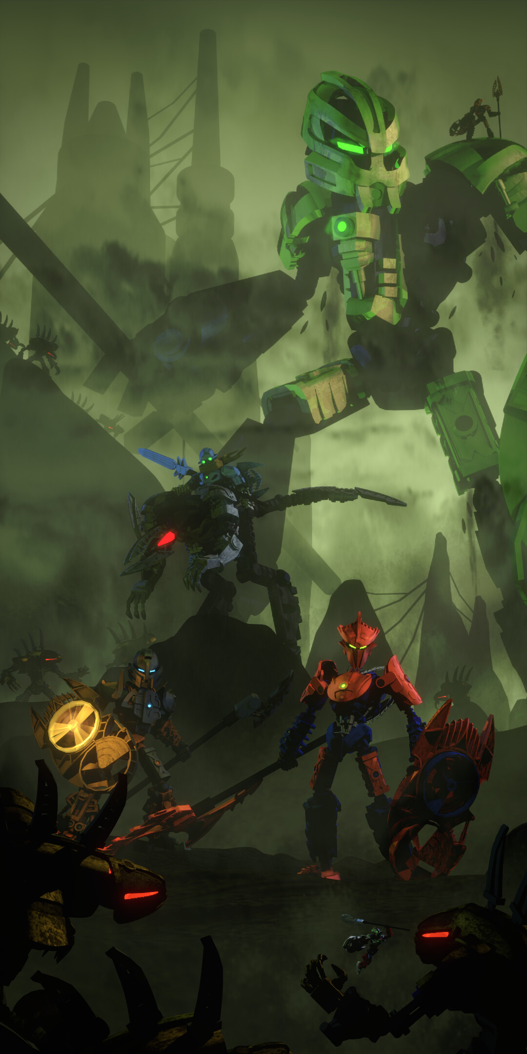
these changes are so minor its likely no one will even notice the differences lol
14 Likes
This is amazing ahhhhh
1 Like
Wow! I was initially skeptical at first about Gaaki’s pear gold, but after looking at your artwork I’m digging it!
1 Like
I think that’s copper, not pearl gold.
4 Likes
Gaaki’s copper looks way better, making the Kikanalo less blue makes Kualus stand out more, and even Pouks movign slightly to the side has increased the quality of the piece by a lot. Excellent edits for an already excellent entry.
You’re right! It almost looked like a light-gold-type color at first glance
This has become my number 1 spot.