Heroes Again (Bionicle Canon Contest #3: Honor Guard, Part 2)

A possible third Pouks option that I will throw into the ring to be cheeky… the Arthron.

Either the original or Galva’s redesign (seems only fair to use another mask of his), it has a ‘horned’ look that pairs well with the large pauldrons.

Also, is that the CCBS-spear from the MOC or a recolor of another piece?

3 Likes

The ccbs spear is from the original moc. The arthron is nice but I feel that the texture is too streamlined for the armor. It’s hard to explain but the arthron has a design that points downward while the chest armor points upward which I feel is too distracting.

1 Like

Beautiful.

Utterly beautiful.

2 Likes

Darn I kind of wish whatever wins uses a different mask for pouks, again I kind of want to see a different mask for a brown character

3 Likes

I just realized the spear tip is a Tahu Mistika blade. It looks awesome! On top of how the Toa already stand out in this artwork, the spear tip ads additional icing to the stone cake

I hate to disappoint you but Pouks’ spear is the original piece from the moc but thanks for the feedback

1 Like

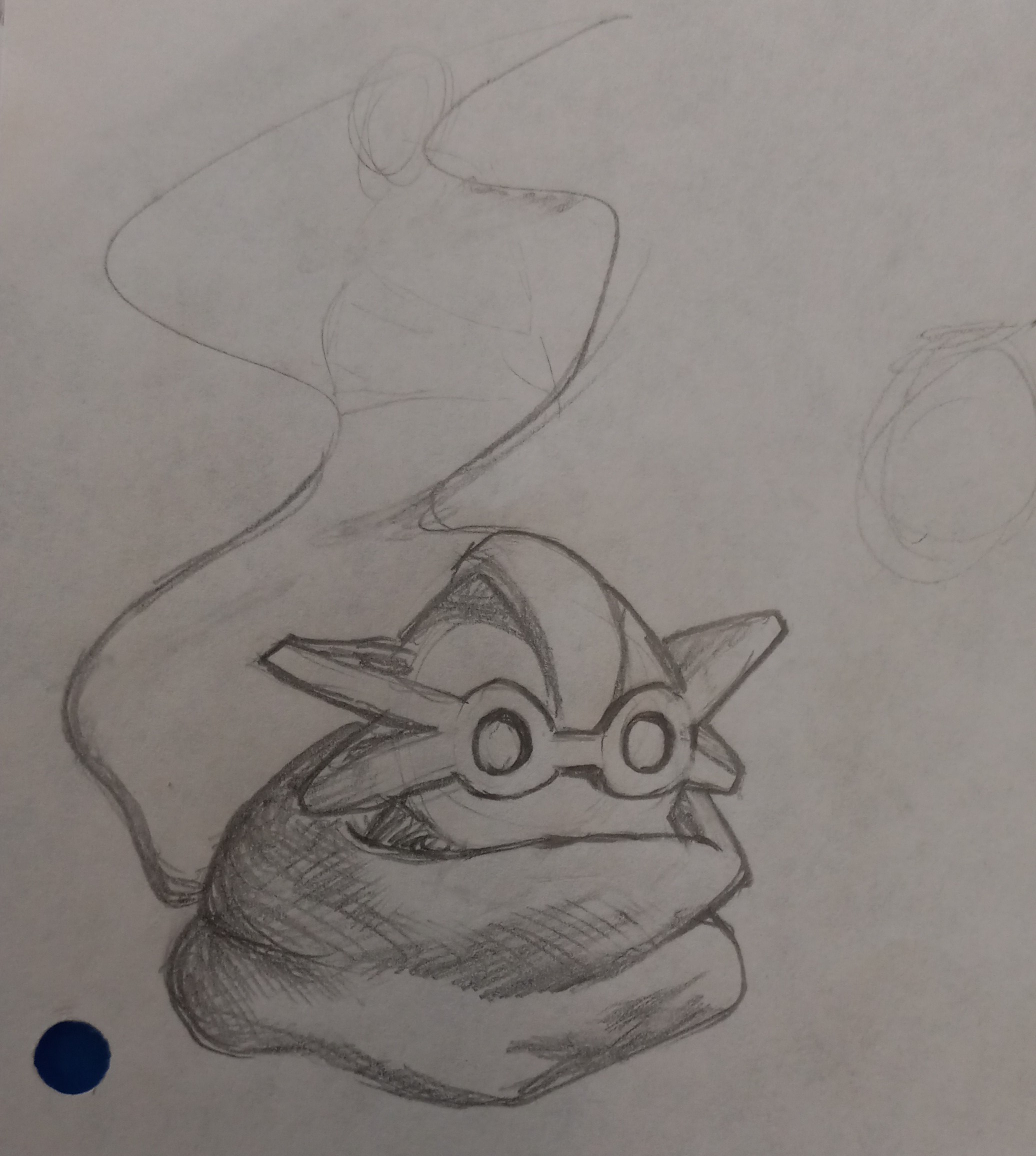
I’m starting to notice it, but I think my issue with Gaaki’s mask is it looks too chalky. What I mean is I think it could use some smoothening in some places, maybe that makes some sense?

1 Like

Do you think you could point where it needs smoothing out?

2 Likes

Oh, my apologizes. They almost resemble each there (might just be me). This is still my favorite art entry. Hope you win it all!

1 Like

This is probably my top choice right now. The art is nice, it has a completely unique mask for Gaaki, and it keeps all the mocs original colors which is what I’ve been feeling the most. I do like the he 1/1/1/1/1/1 split but I like the original color schemes better

1 Like

Thank you! That was actually the third mask I did for Gaaki. The first was a practice illustration using Red Star Forge’s Maks of Emulation, the second was my entry which used Galva’s Kadin which I’m thankful didn’t win because the mask was too big.

Sketch for Kualus because scarfs are cool

10 Likes

Somehow, Bomonga looks cute? Love the energy and dynamism in this.

1 Like

I drew his sketch using circles so maybe that’s why. Also thanks

4 Likes

Ah, its those soft round shapes making him look all huggable. Makes sense!

2 Likes

I can’t wait for the artwork results to be announced

1 Like

I love Norik just chilling up on Bomonga’s shoulder haha nice touch.

1 Like

He’s also smaller than the rest of the toa. It’s not just perspective

1 Like

don’t you mean norik?

Nope Nirik, he’s a totally original character and nothing at all to do with Norik lol thanks as always for correcting my bad spelling and stupid fat phone typing fingers.

1 Like