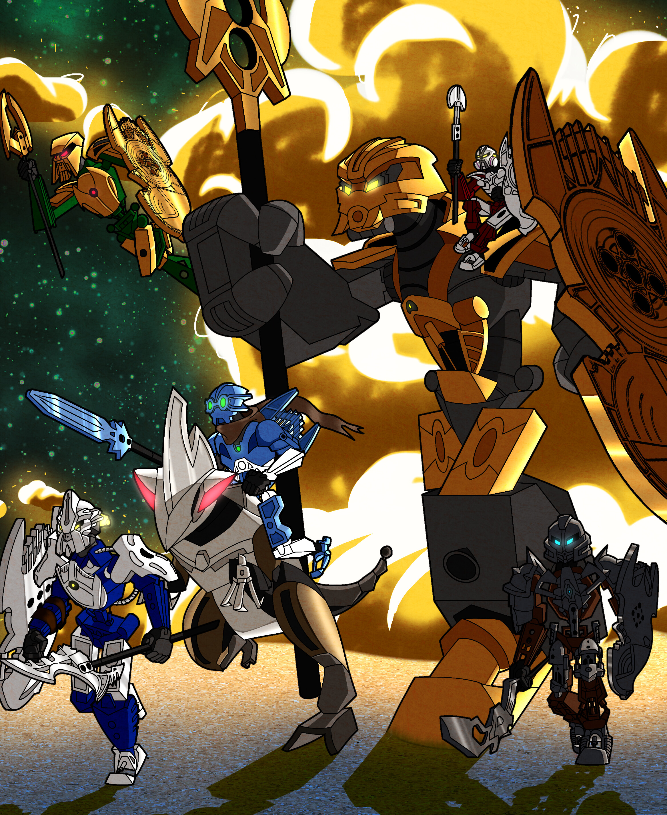
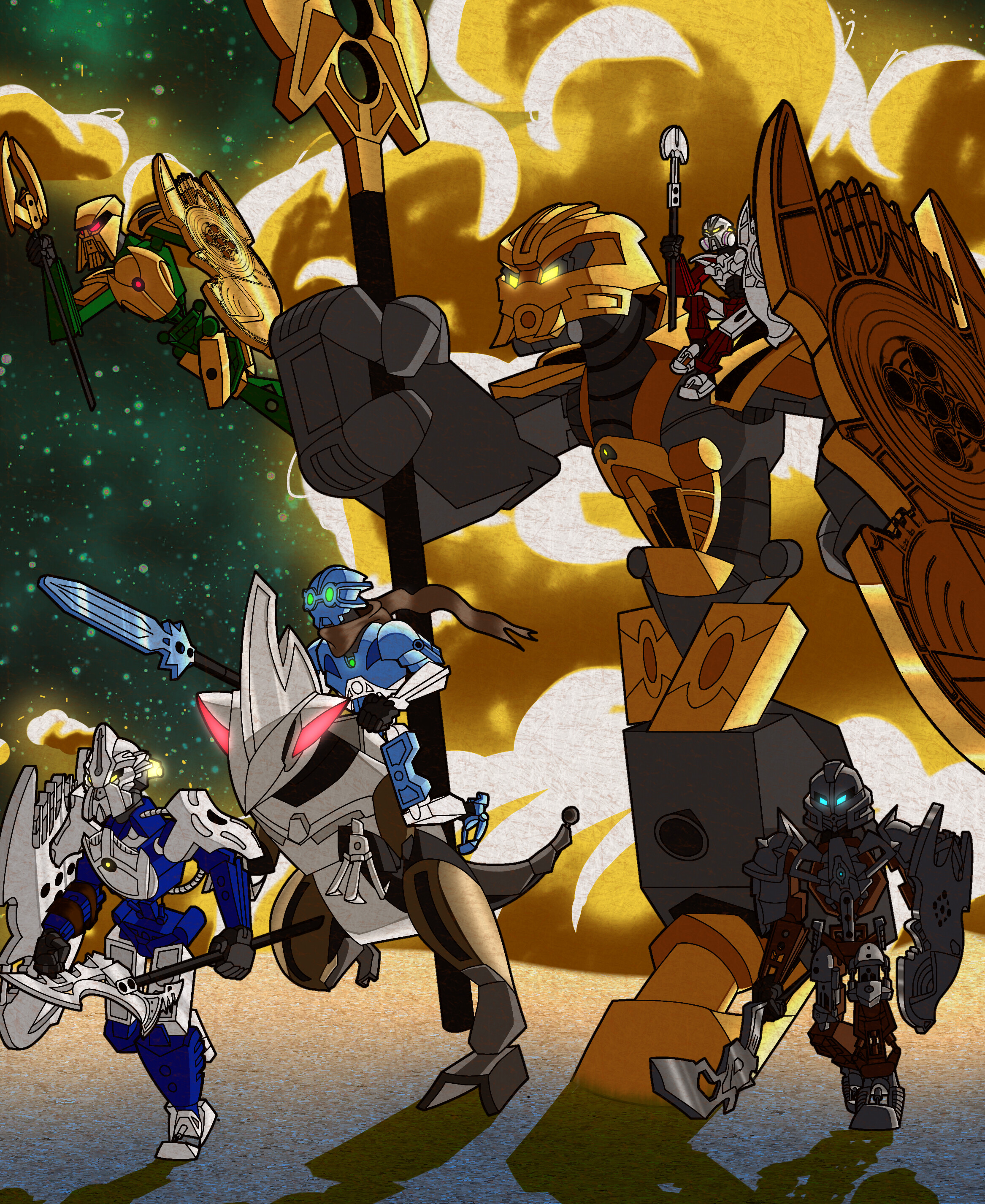
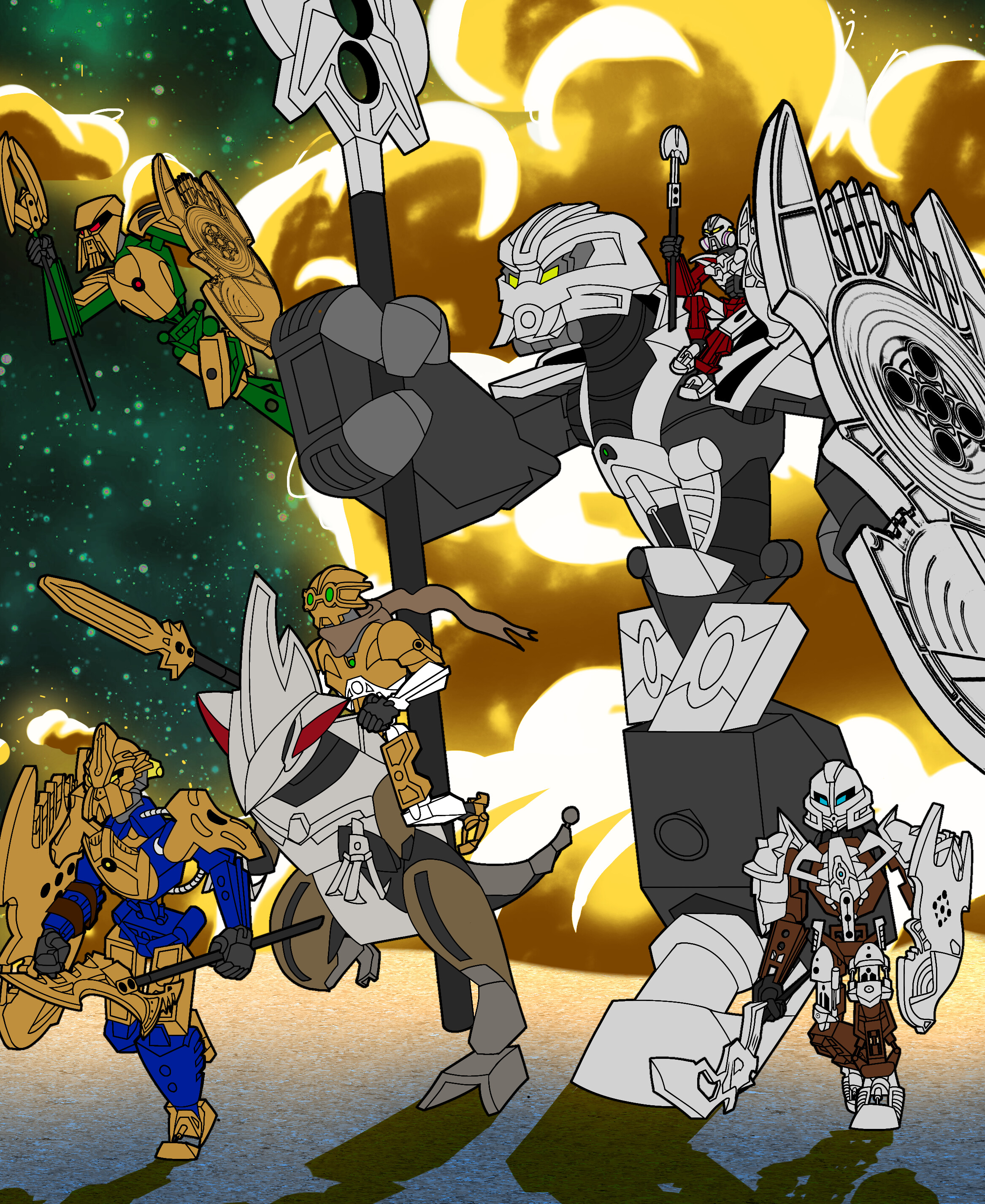
For this piece, I wanted to go all out and draw them in the miramax of course with a few creative liberties. Bomonga was more of a challenge since his body type was so unique, because of this I drew him with a large tube in his spine instead of a piston like the others. The background colors are inspired by the color scheme used in the Toa Hagah commercials in 2005 where there was a yellow light contrasted with a green sky. Not enough people were drawing Kualus with the slider foot on his chest so I added it to stand out. The kikanalo he rides is supposed to be a breed with raptor-esqe proportions.
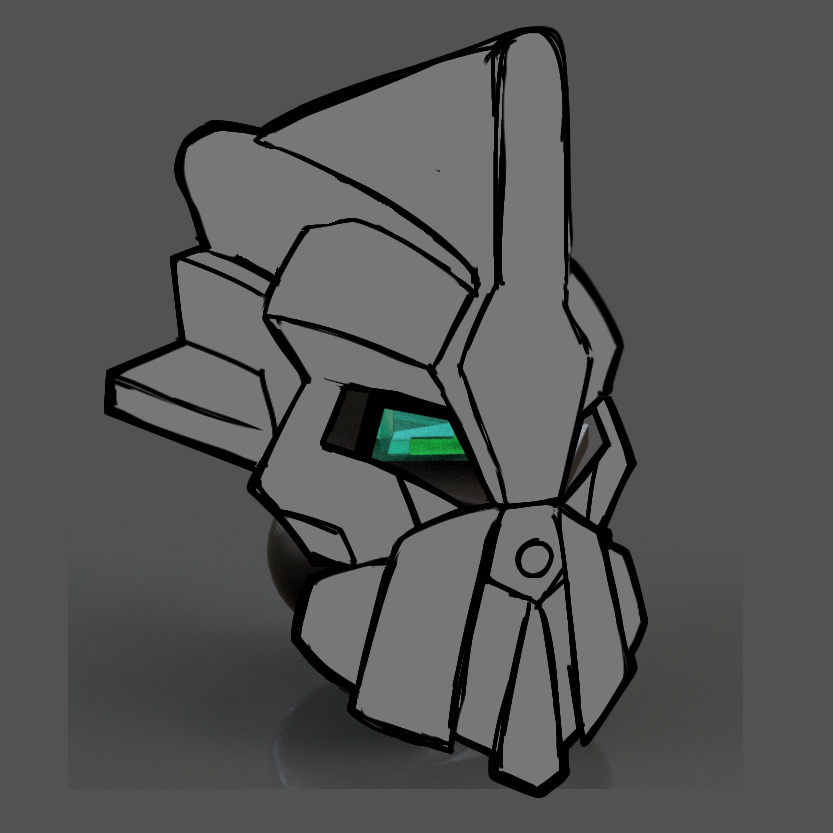
For Gaaki, I made a special mask prior to the moc contest that is supposed to be the Noble version of the kanohi Kadin. That way I can still have Bomonga honor Lesovikk and Gaaki honor Joven like in my previous entry. The mask itself is inspired my Jetfire from Transformers RotF. Here are the reference pictures.
I like your noble kadin, also, how did you keep count of the time it took to complete your drawing? And nice, classic heroes with backs turned to an explosion (if that’s what the yellow cloud is)
An excellent piece, this is easily one of my favorites! I especially love how you’ve got Norik riding on Bomonga’s shoulder, and I’m very glad to see your Noble Kadin again. The attention to detail you’ve put into things like the green sky and raptor-Kikanalo is noted and appreciated as well.
That said, I’m not as much a fan of the 2-2-1-1 color split, it doesn’t hit a “balance” that I would have liked to of seen. But, considering all the good the rest of this drawing does, I think I can easily look past that. Best of luck in the contest!
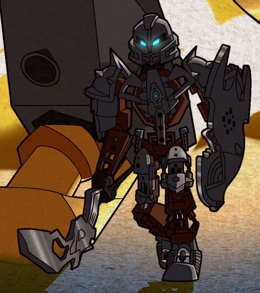
P.S., those silver Bomonga and Pouks look slick in that last picture.
The program I used for this was Ibis Paint X which records the time put into an art work. Am I insane for doing all this on a phone? But yes that is an explosion.
Yes they all have the colors from their original mocs.
This might just be my favorite entry so far. I absolutely adore your art style. Also big props for keeping the original color scheme. This has my vote at the moment.
Okay, this is probably my favourite so far. I don’t mind the 2/2/1/1 colour split, that noble Kadin is great, if Pouks’ Kakama had been changed it would be perfect (all subjective of course!).
This is the best instance I’ve seen of individual elements being relatively simple (but still accurate), allowing them to be dynamic and distinct from the environment.
Fun fact: a few days before the original deadline, I was thinking about giving Pouks the mask of possibilities. It went well with the shoulder armor and I thought it was sweet how two toas are honoring Lesovikk and Nikila (not like I ship them or anything). Eventually I went with the kakama because it shares design elements with the shoulder armor. Hopefully this inspires someone else to honor Nikila.
I’m not a big fan of Gaaki’s mask but wow, the rest looks great!
But yeah, if the mask was more like Justin’s then this might end up getting my vote. With that being said, this will probably still be a close second or third.
Like I said, my only gripe here is Gaaki’s mask, and with Justin’s my only gripe is Bomonga’s foot not being connected properly and Kaulus not being the same light blue used here.
Maybe I could change Pouks mask but I already like how it blends with his chest. Plus I had trouble getting Khingk’s parts on stud.io so I couldn’t see how Nikila’s mask would look, and a poll I did on Twitter preferred the original mask.