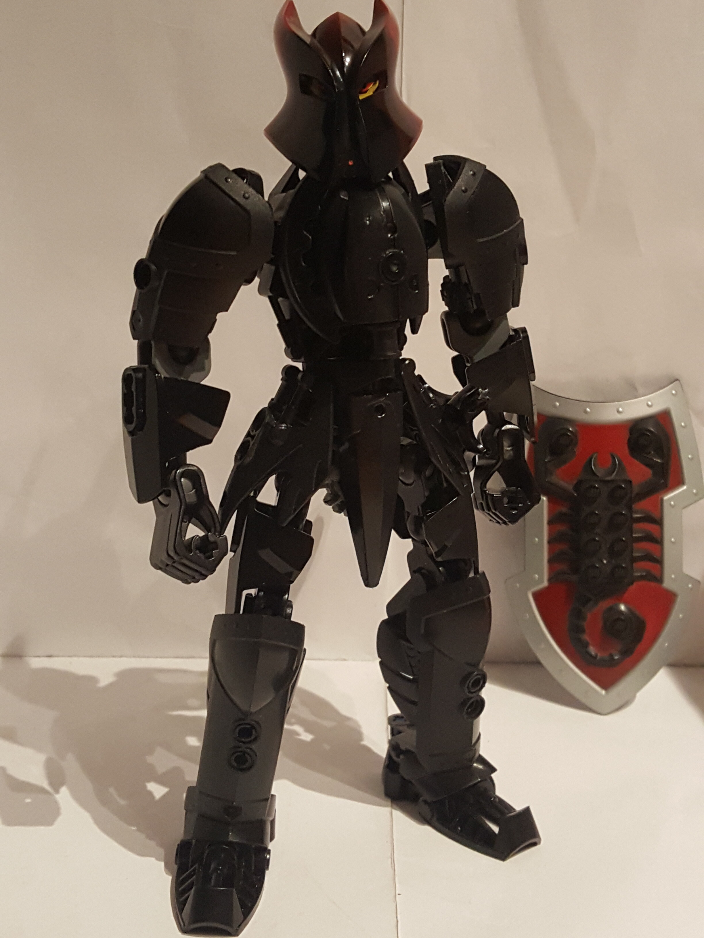
That Vladek helmet always looked awesome.
No Metru red? disgusting
This is an interesting experiment. I’m curious how the other knights would look in the Metru style.
5 Likes
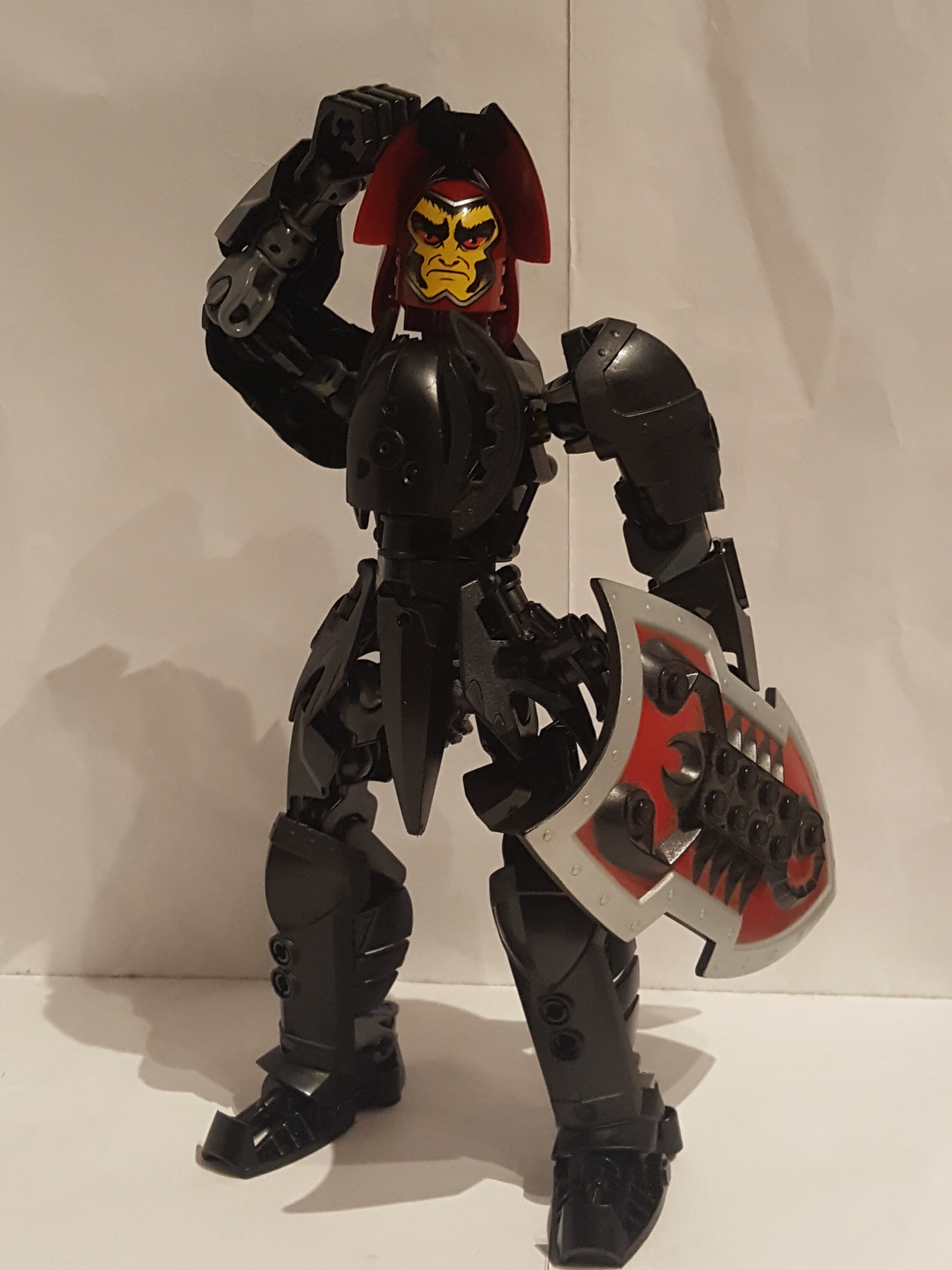
i don’t like how lego did his eyes it makes him look high
2 Likes
For such a simple build, this looks very good!
2 Likes
Knights Kingdom G2 should be and should look like this.
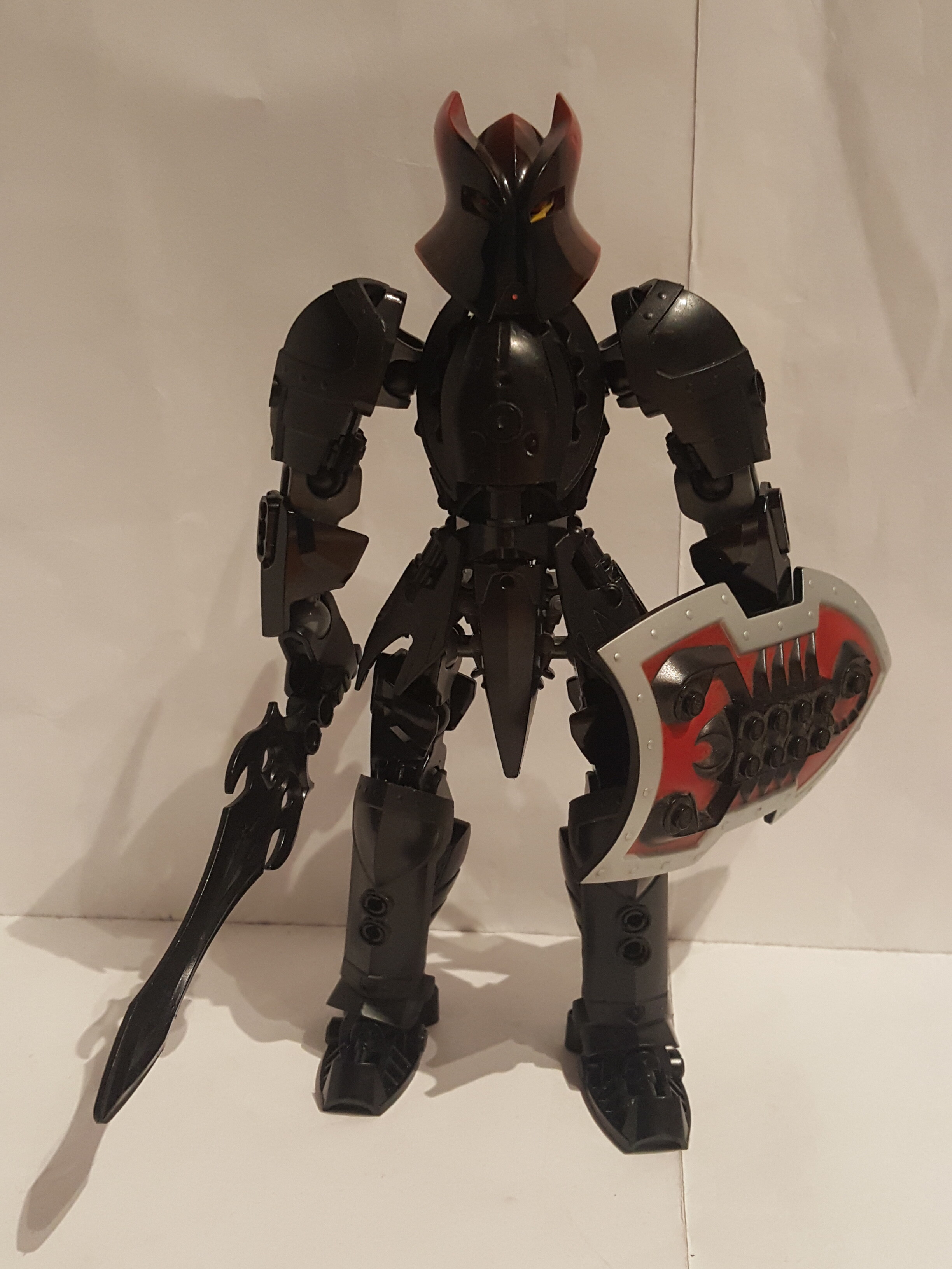
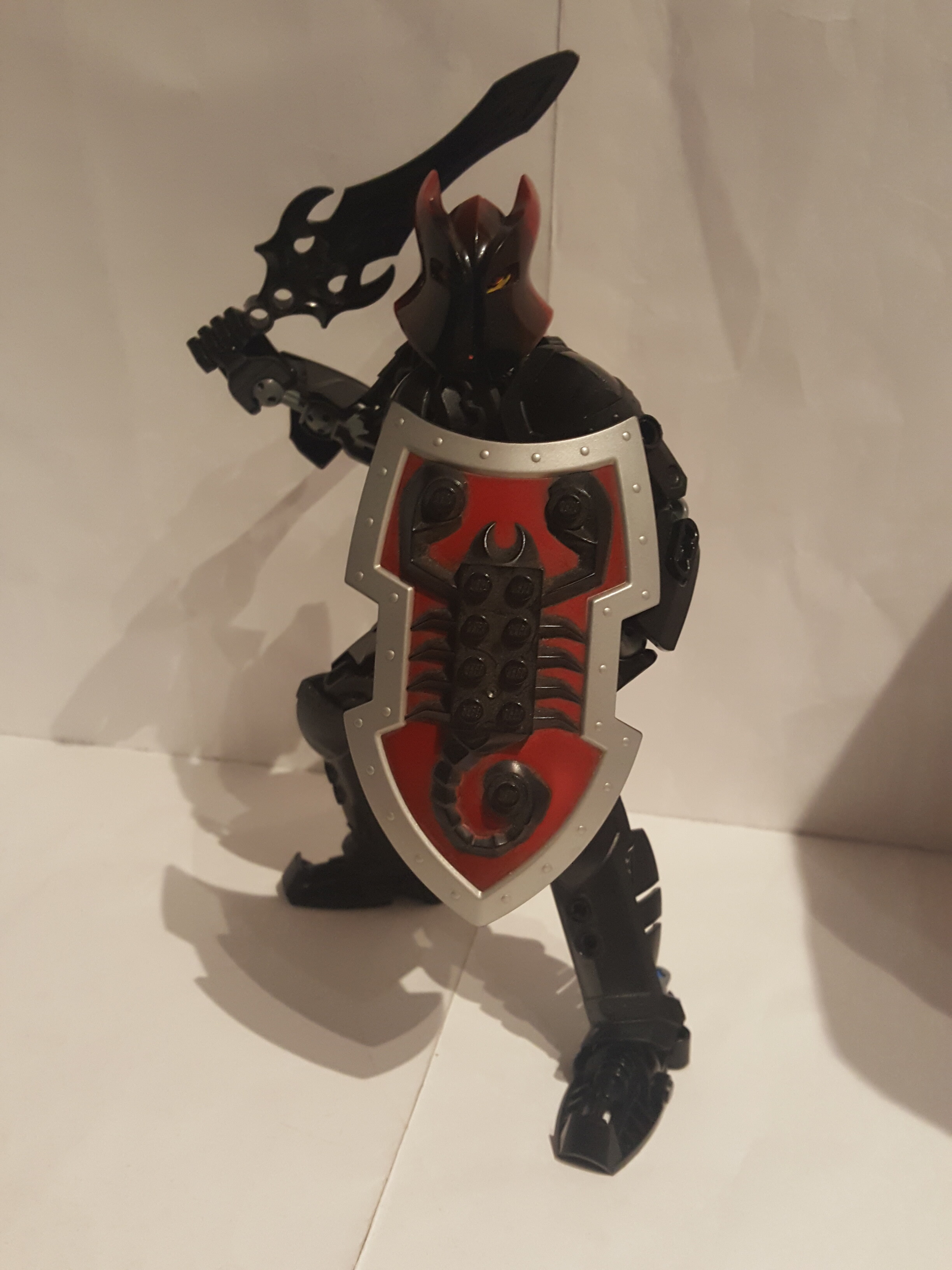
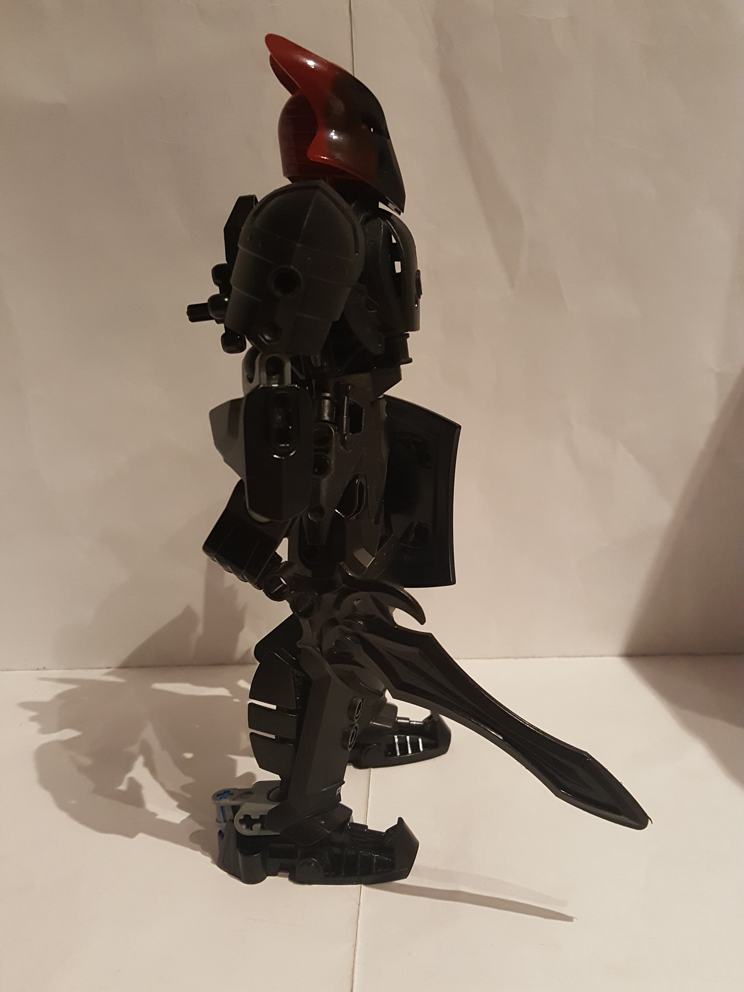
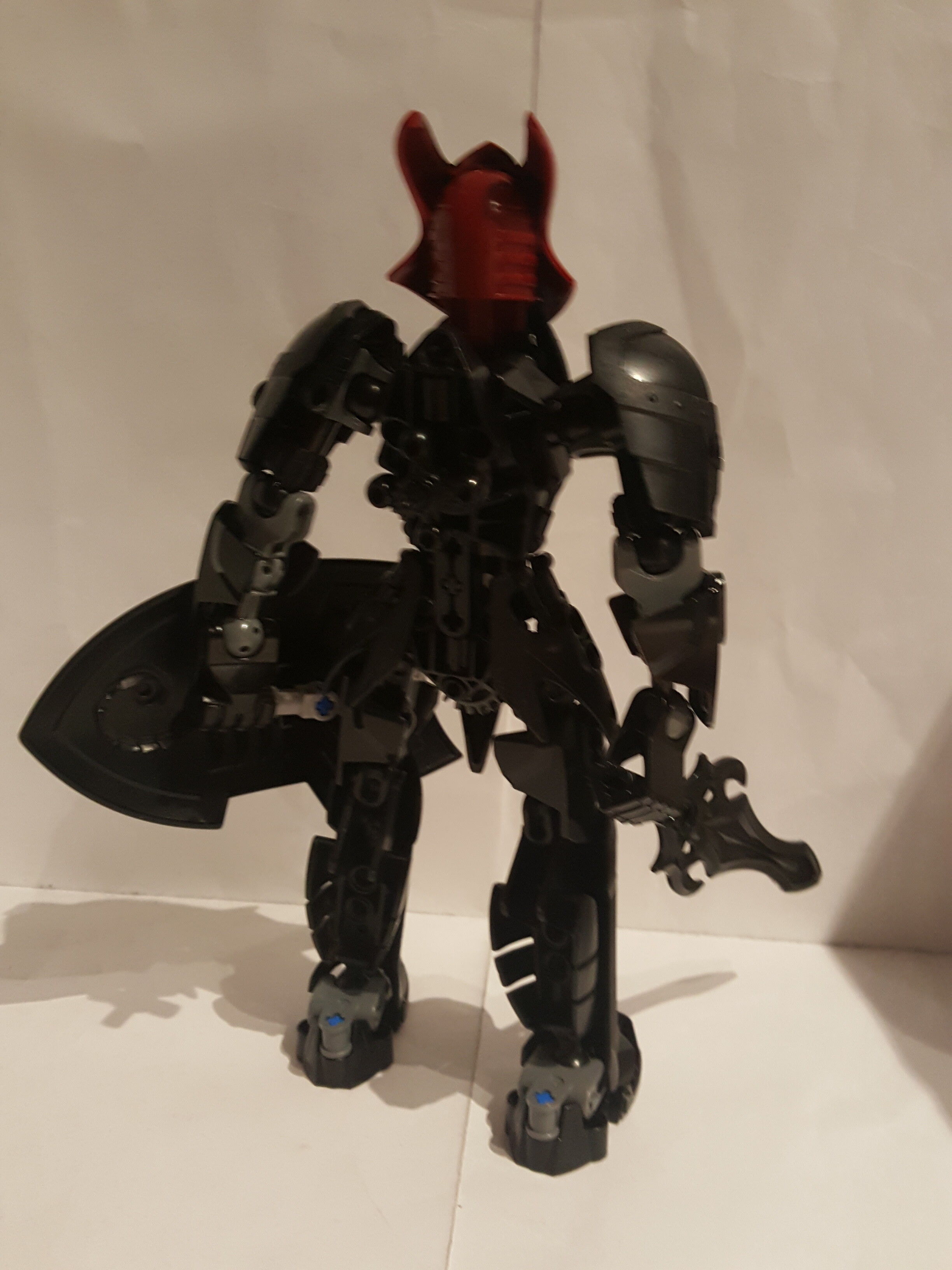
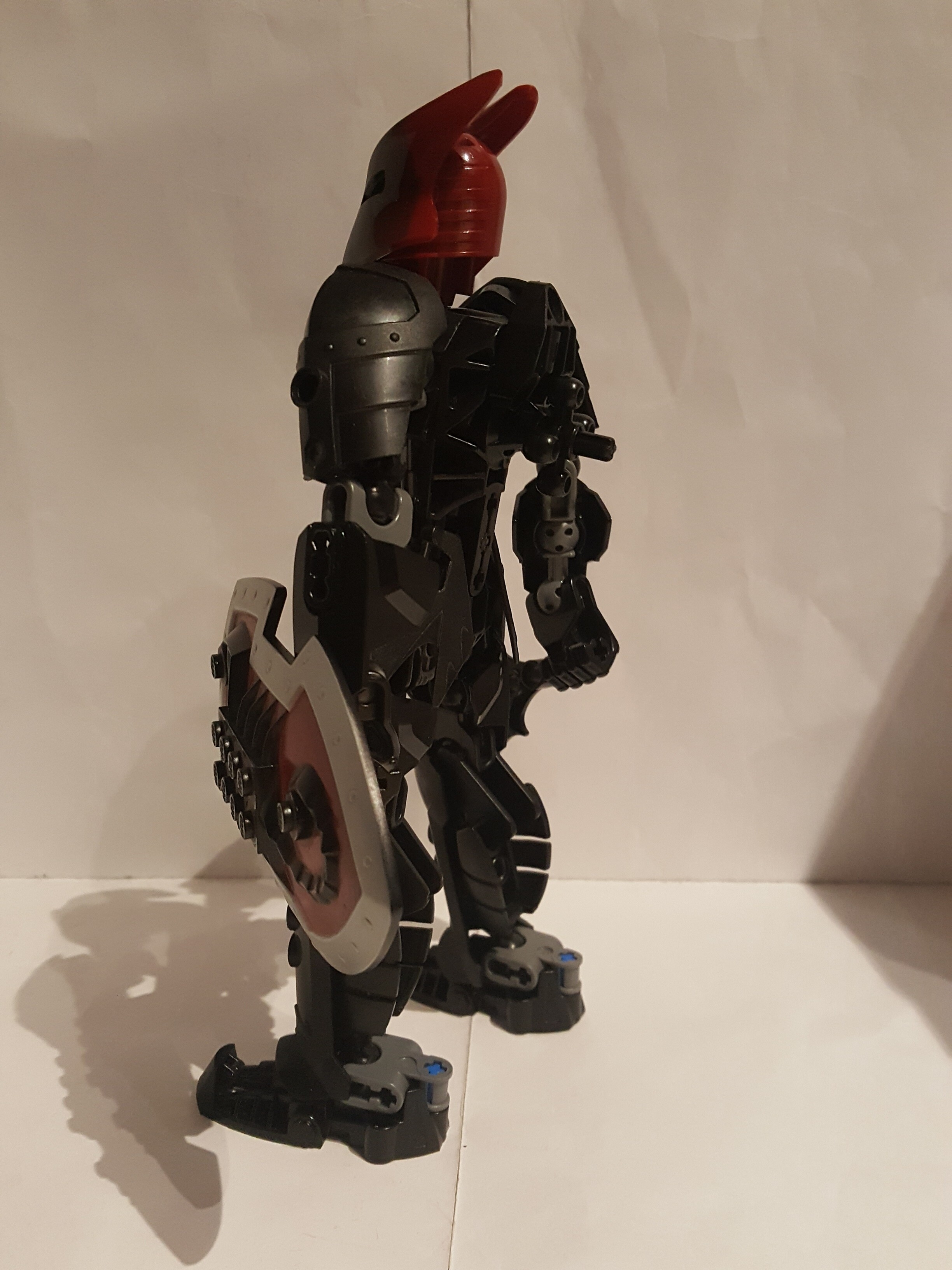
Pretty nice build, but adding some red actually might be nice, so that mask helmet and shield do not look too alien. Cool combo of CCBS and classic Bionicle too.
4 Likes
Very nice. Now do Makuta Knights Kingdom II style.
3 Likes
I’m torn. It’s a good build, but Vladek just doesn’t look right in this style to me. I’m surprised how well the CCBS shells go with the Knight’s Kingdom armor, though.
1 Like
Very nice, I feel that the sword should have a little bit under his hand, love the shaping around the waist, keep up the great work!
1 Like
We were so blessed to have Knight’s Kingdom pieces that work so well with BIONICLE. Nice job! I like the chest shaping, the rahkshi head really doesn’t stick out awkwardly at all! I like the loincloth armor too, those Skrall bits look really nice there. And hooray for gear functions! A very good Metru-build that doesn’t look clunky or overly-designed!! I think I’ll echo the sentiment that it could have used a little Metru-red in there, but I appreciate the choice to keep it all dark. It just makes the red parts of the helm, head, and shield stick out a fair bit. But then again, it keeps the build a little more interesting than if it was all monochromatic.
Thank you for sharing your work! This one is really good!!
2 Likes
Like Groose and Guile before him, Vladek goes with everything.
1 Like
Yeeeees!!!
Great moc, but needs some more red.
1 Like