Before I post anything, I just want to be EXTREMELY CLEAR that the original artwork I used as a reference for this is NOT mine.
It’s an official piece of concept art for Mandalorian. If you want to see the unaltered original piece, I’ll try and get it for you as well as the artist who made it.
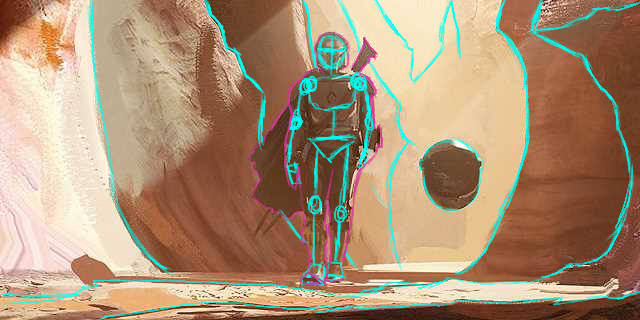
This was made as practice to try and get the structure down, as well as just working on digital painting in greyscale.
here’s the practice part, with all the lines for his bone structure and what I thought the rock structures were like.
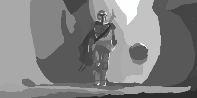
and here’s the final painting.
I think you really nailed the values here. Not only is it good skill practice for you, it’s also a testament to the mastery in the art direction and visual storytelling in The Mandalorian.
Everything is so clearly framed with the differences in contrast very clearly denoting the Child’s pod as the focal point. The darker values on Mando next to the shadowy rock help understate his presence a little; he’s just the guardian, the valuable thing here is the Child.
Only things I have in terms of critique would be the attempts at the shading on Mando. It works, for the most part, and it isn’t bad, but I can’t help but feel parts of it like on the thighs and the helmet look a bit messy. The rim lighting is also pretty linear, feels more like an outline here than light. It’s a hard thing to do (I also don’t know the secret to it).
It’s hard to compare since the original is drawn over, but this is a good study! Good attention to the shadow and light shapes and the values!