I think some of the ccbs parts (I sound like a hero factory hater) clash w the technic and suspension pieces, I’d say focus on the more technic and og bionicle from the more mechanical feel which u think looks really hood on the model
1 Like
Nah, that’s a very valid argument. There’s a difference between disliking the use of pieces because they don’t fit the aesthetic of the rest of it, and blanket hating them because they “aren’t BIONICLE”.
1 Like
Neat build, but it needs thinner arms and blades/thumpers… and something on its back
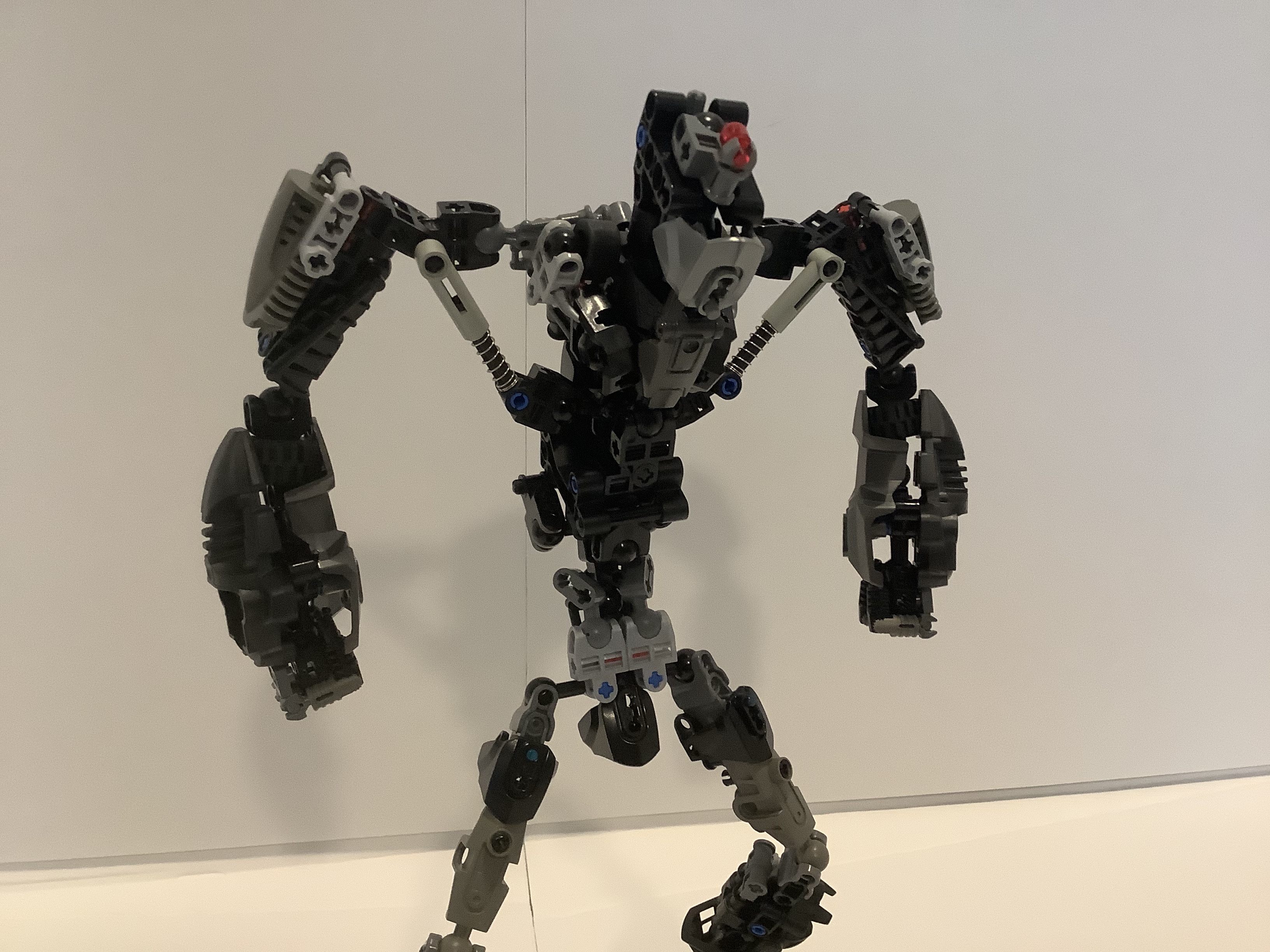
Glad you like it! Just so you know, I posted a second version of this guy a little while back, maybe you can check that one out and see what you think. I wasn’t entirely happy with the new one, either, so I’m currently working on V3.
(edit, for future viewer’s reference, they were all merged into one topic.)
1 Like
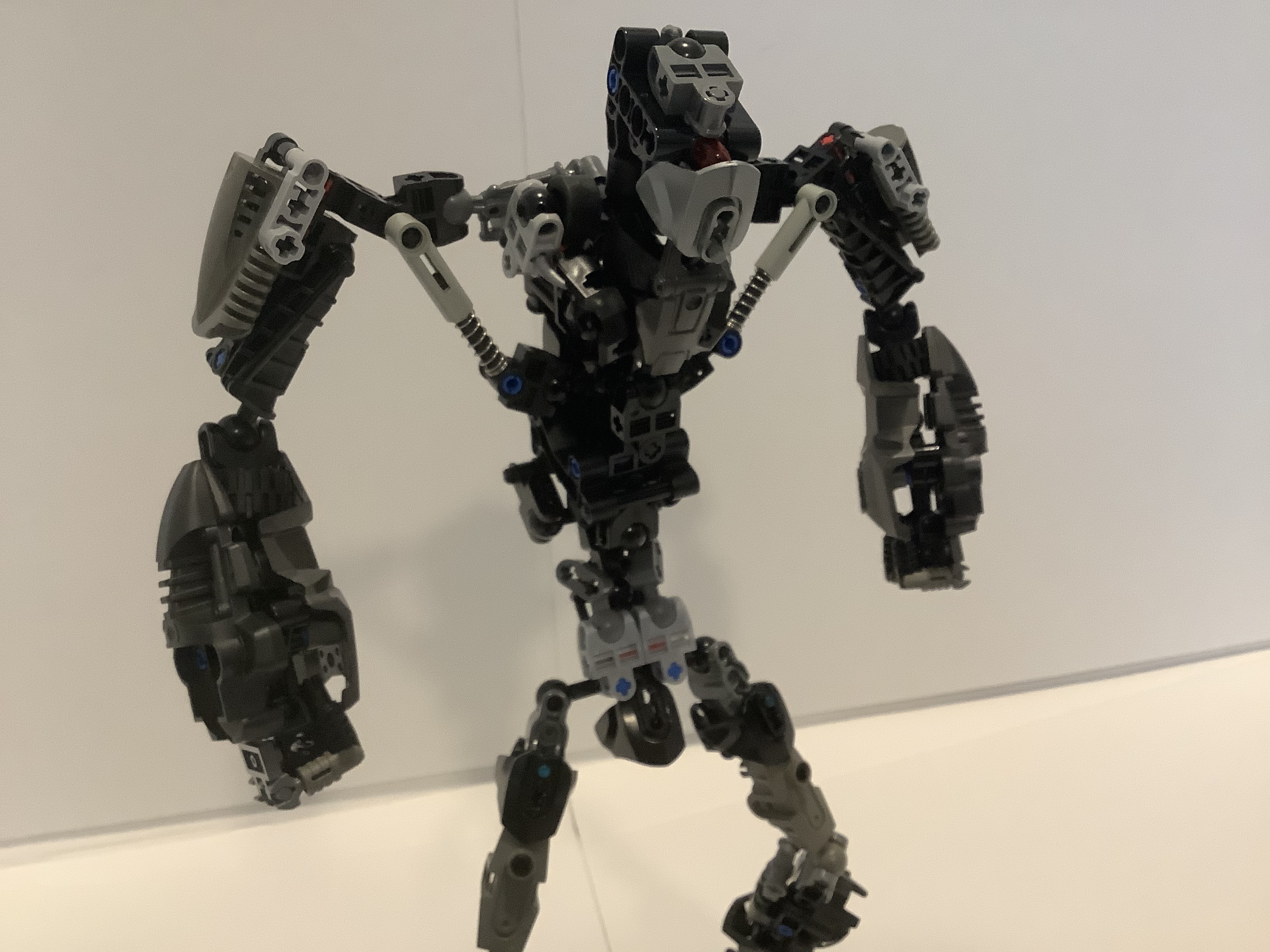
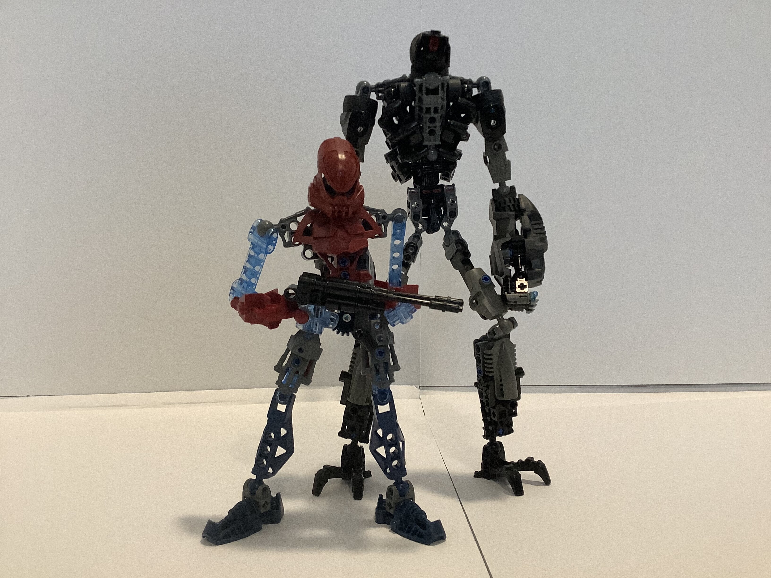
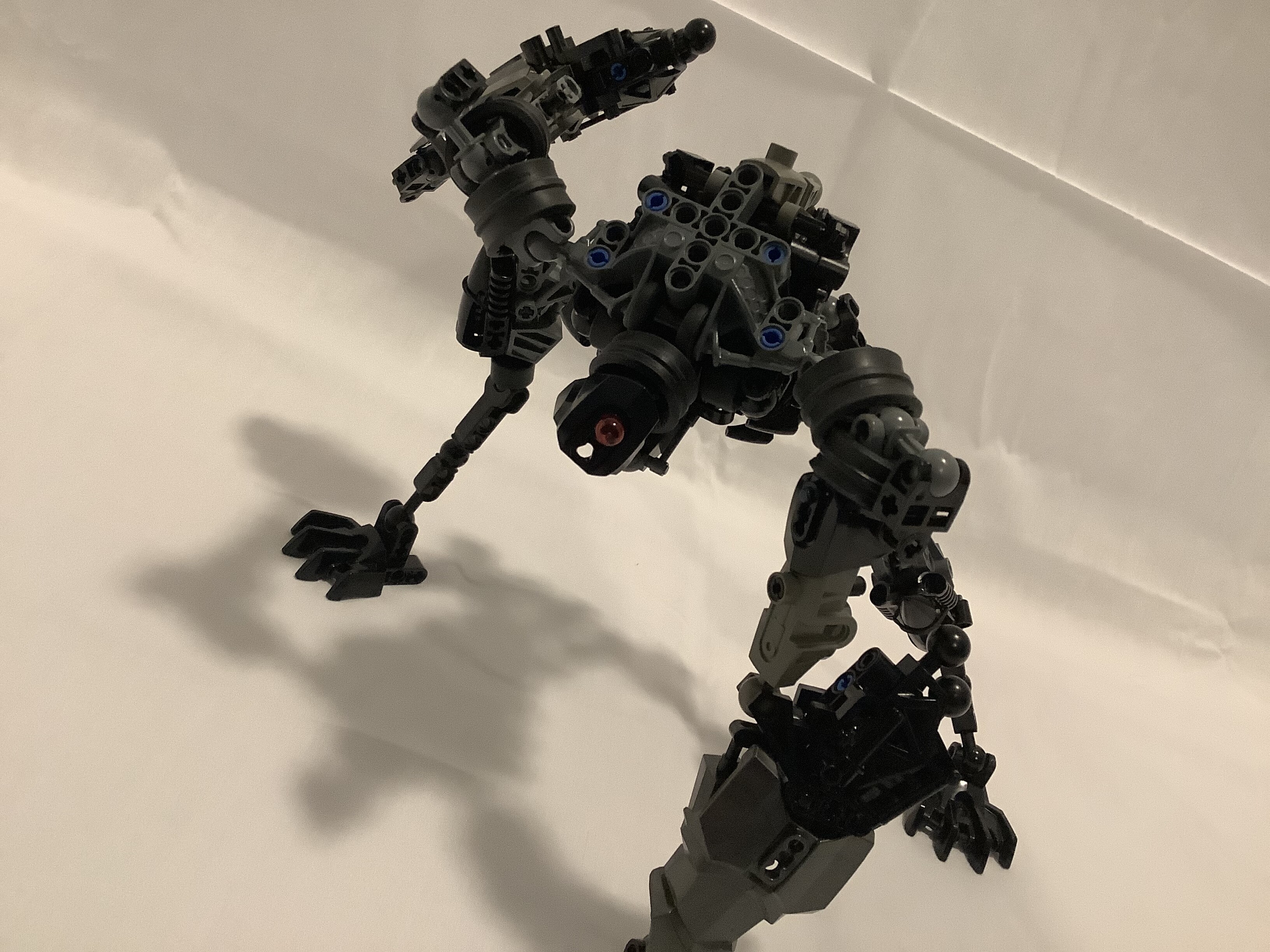
So, for anyone who doesn’t know, a while back I posted a Marendar WIP I had been working on for a little while, just to get some constructive criticism. So I some of that criticism, and I put some of it into the dude, and here’s the result. I can already tell you this isn’t gonna be the last iteration, since his legs are weaker than noodles.
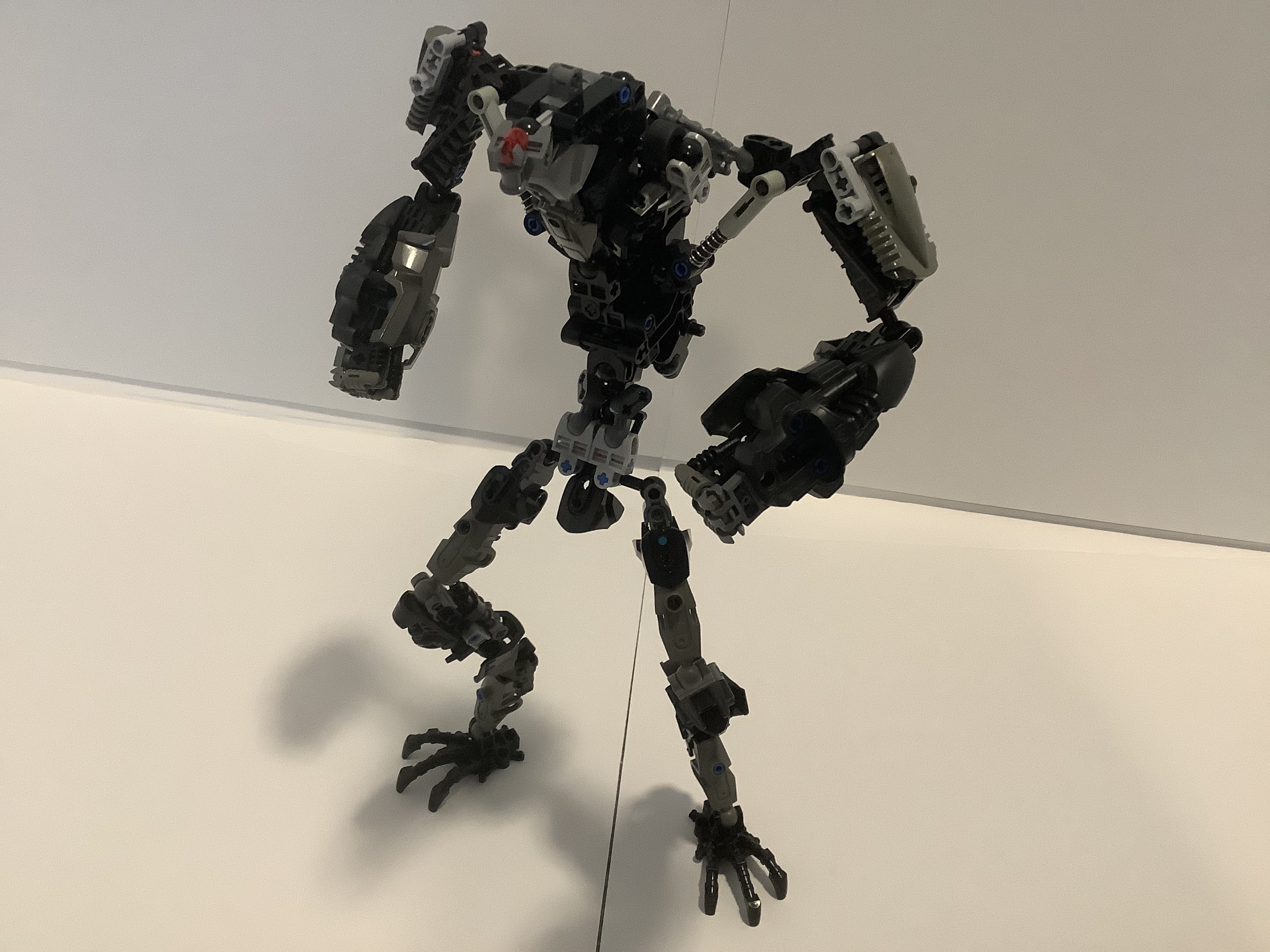
Main Event
Front
Back
Alt Head
Alt Head 2
My original intention was to take a little inspiration from all the other Marendars currently out there, but then it ended up being inspired by a completely different thing, namely Sachiel from Evangelion. That was the original version. Now… some of that carried over, I guess?
Well, again, any criticism is appreciated, and make it as harsh as you want. Don’t mention the waist, though. I already know it needs improvement. (If you were wondering why I didn’t just recolor some of the parts… I’m out of waists.)
19 Likes
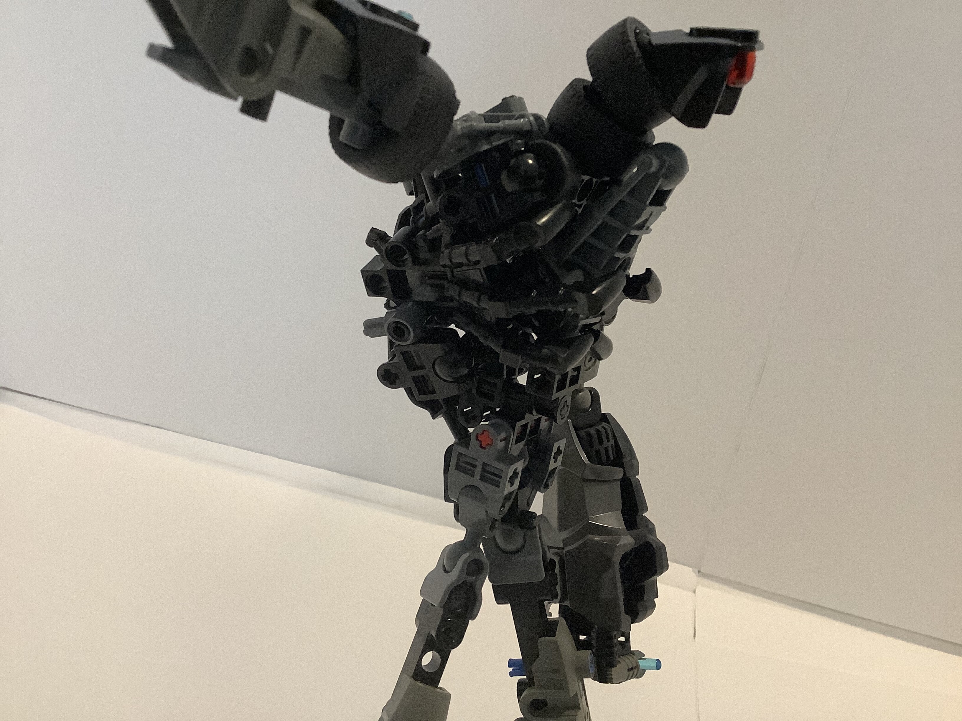
Wow, there are definitely a lot of improvements here - nicely done! That said, a few things still bug me:
For one, those shoulders still feel a bit too flimsy. They are absolutely a great improvement over what you had before, but I still feel that they could use a bit more solid of a connection with the torso itself.
Then there’s the legs. I’m trying to figure out if their long, skinny proportions are a bug or a feature. Maybe they could use a bit more dynamic shaping to them - like if the thighs or ankles&feet were the thickest part and the rest of it stayed fairly slim? Dunno, I’m sure others will have more to say about it.
And, of course, you have the head. Again, a marked improvement over your previous version, but it’s still not quite there yet. Unfortunately I don’t have much direction on this one - I’d just recommend trying a bunch of stuff and seeing what you can come up with. Of course, I’d be more than willing to comment on any ideas you come up with if you post them here.
Now, a few other things:
-
I know people asked you to take off the claws, but the arms look weird without them. They just kinda end in stumps now. I’d recommend finding some other sort of claw/hand/fingers to put there.
-
The back looks a bit bare, I’d recommend finding some sort of armor or detailing to cover up back there.
-
The armor sticking out between the legs is a bit awkward - is there a ball joint there you can’t get rid of?
Overall, though, very nice progress. I look forwards to seeing what you come up with next.
1 Like
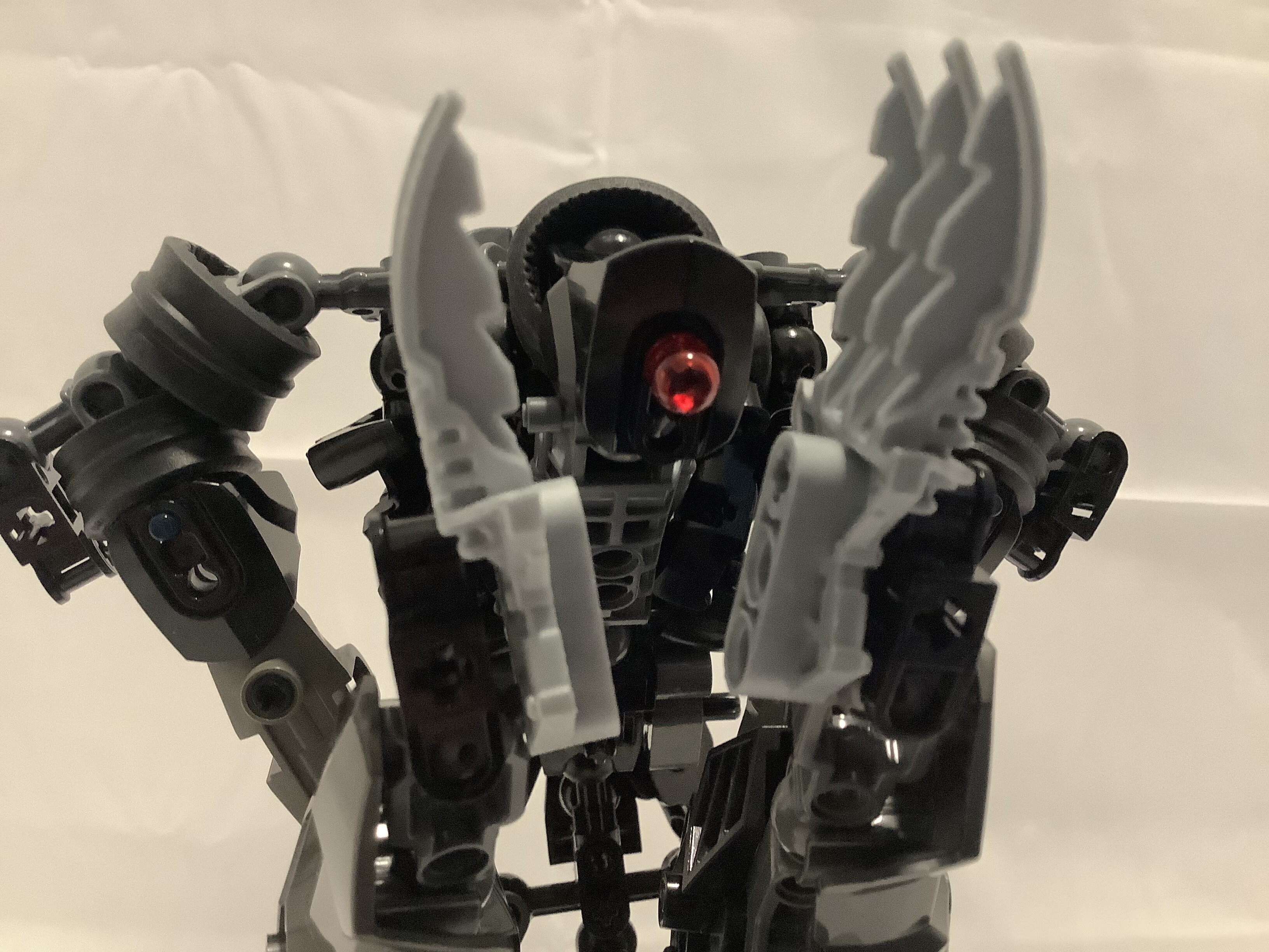
Oh, I forgot to have him open his fist! Yeah, if you look, you can see he does actually have (not very good) fingers.
Heh, yeah. That’s the neck to one of the two Hero Factory torsos in this guy. I just can’t seem to be able to find a good waist with my limited pieces, and I can’t just go full Little Brotherhood Studios and just cut it off, since this’ll be entered in the competition.
2 Likes
This is a big improvement. I rather like the battering ram arms now. Since you already intend to change the legs, I think my only critique is the head–it just seems too small for the body. Perhaps it could be wider…?
Yes, I know the joke is only technically correct if I use it for the second one, but just give me a pass this one time.
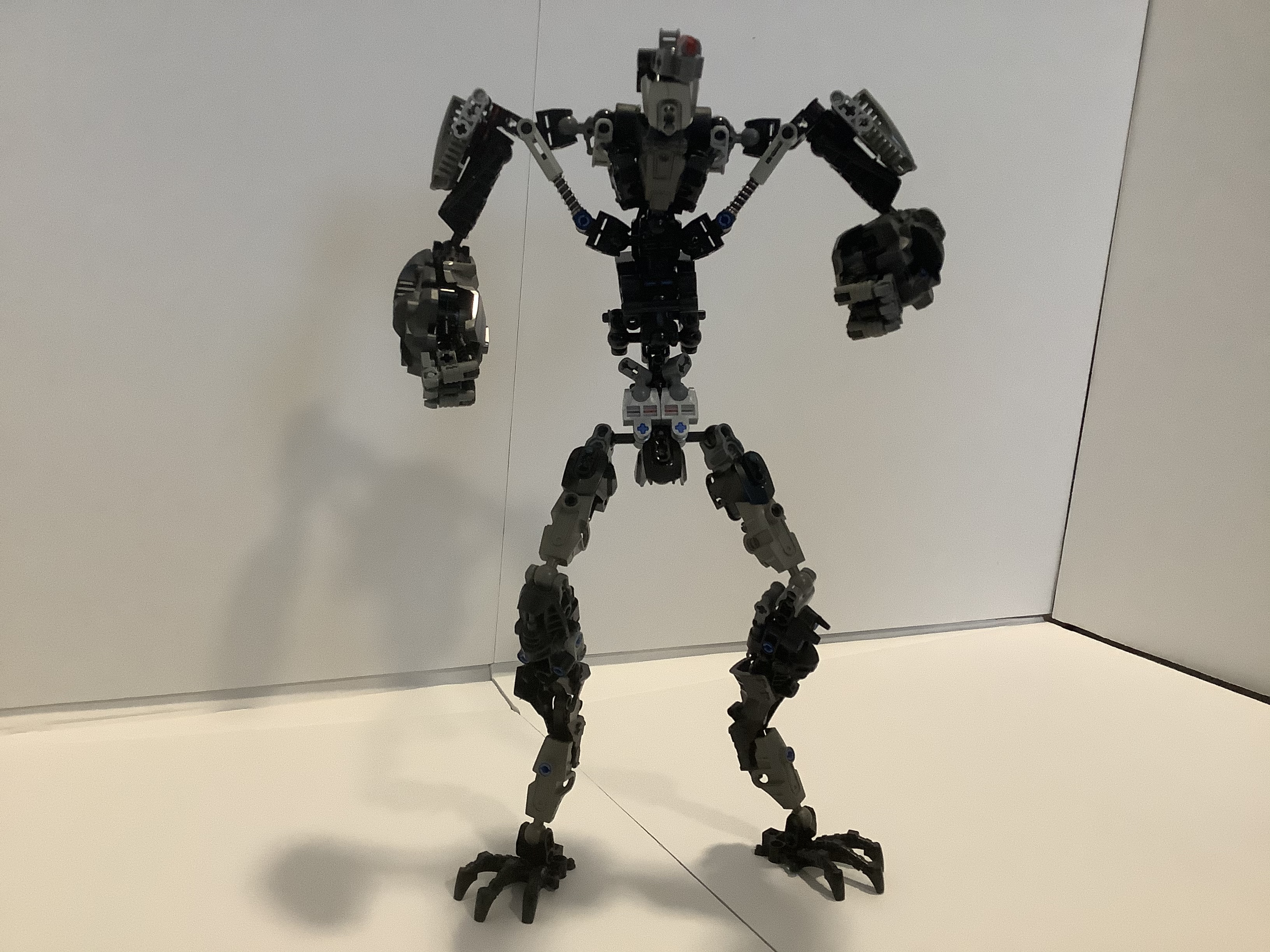
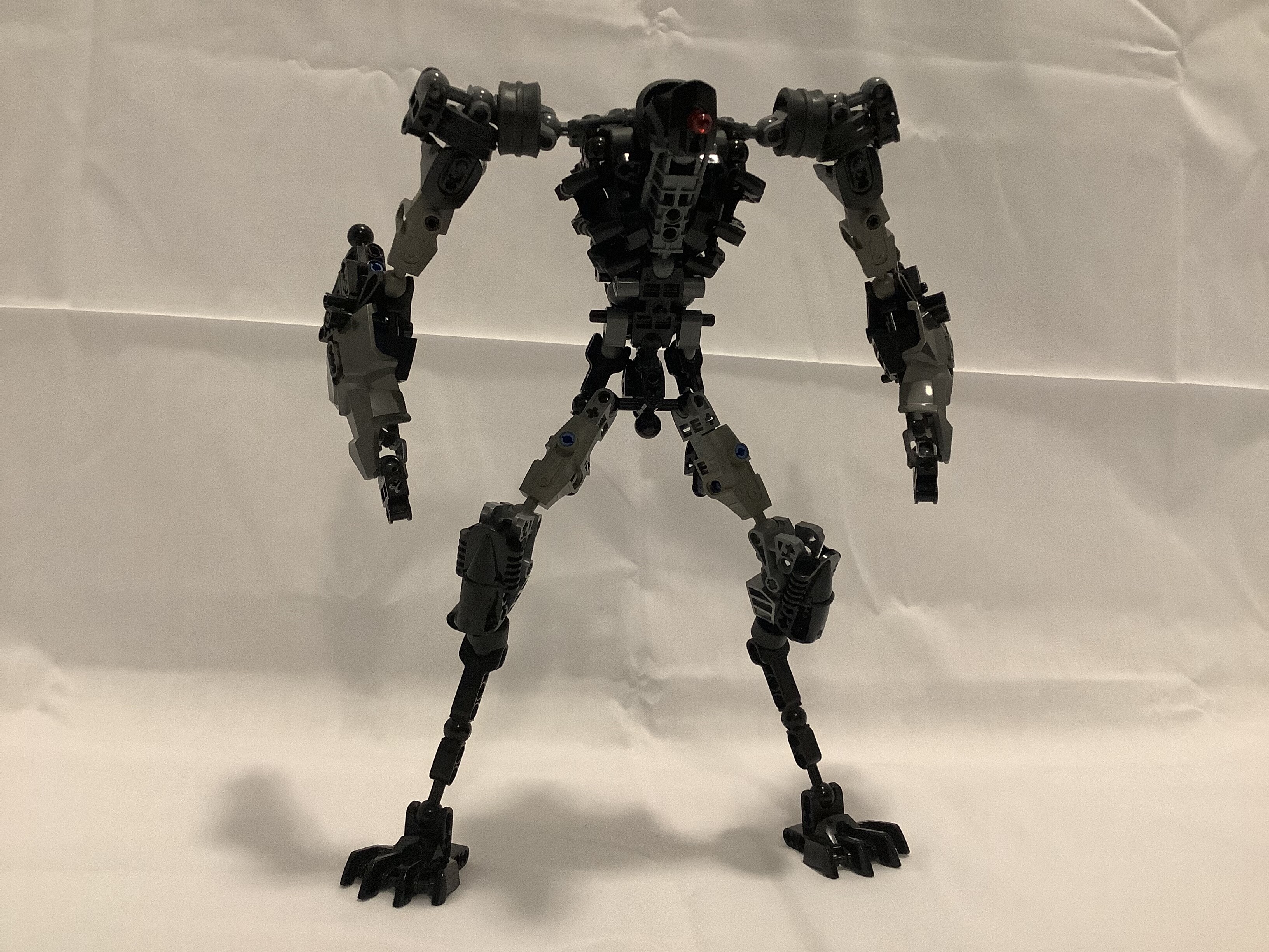
Well, here I am for the third time. I think I’ve finally got a winner this time. (Not like for the competition, though that would be nice, just like, figuratively.)
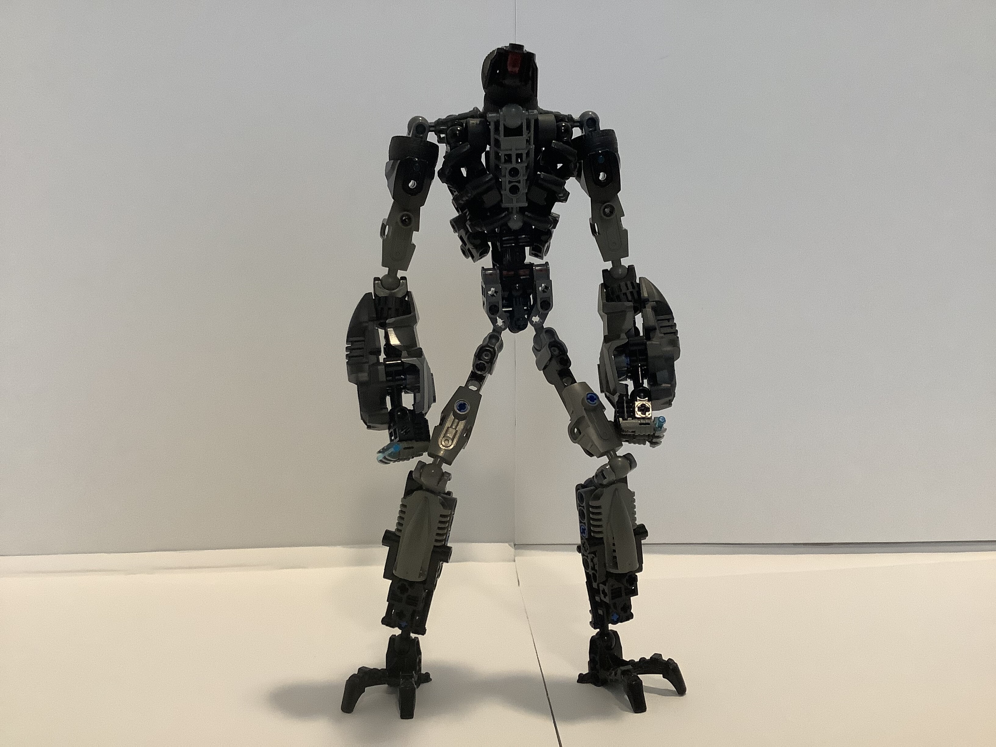
Front, obviously.
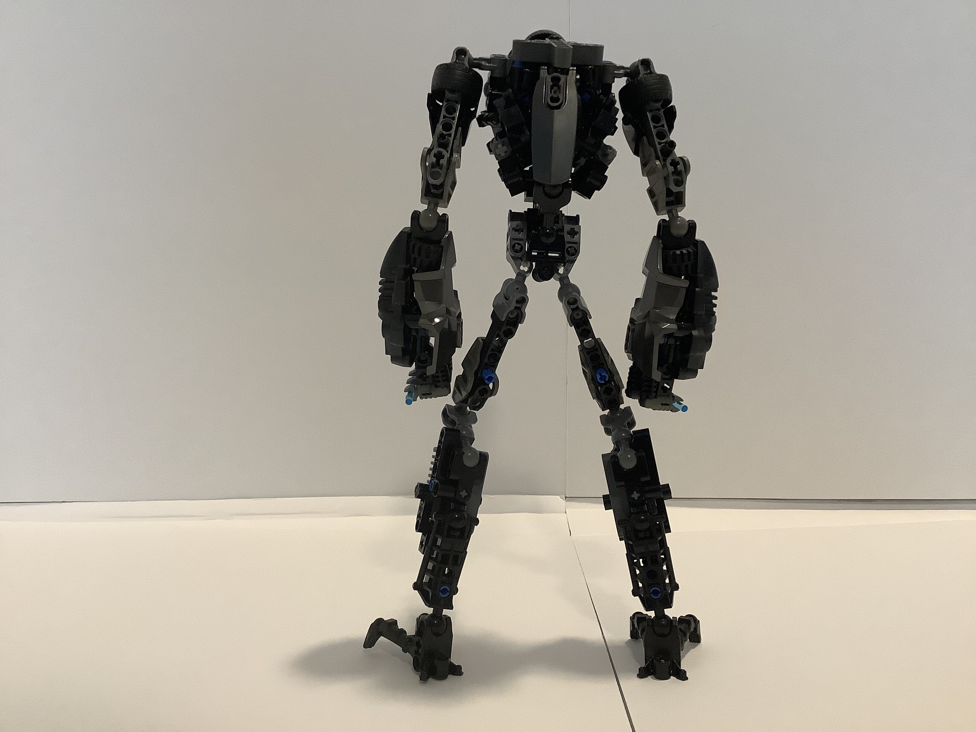
Back
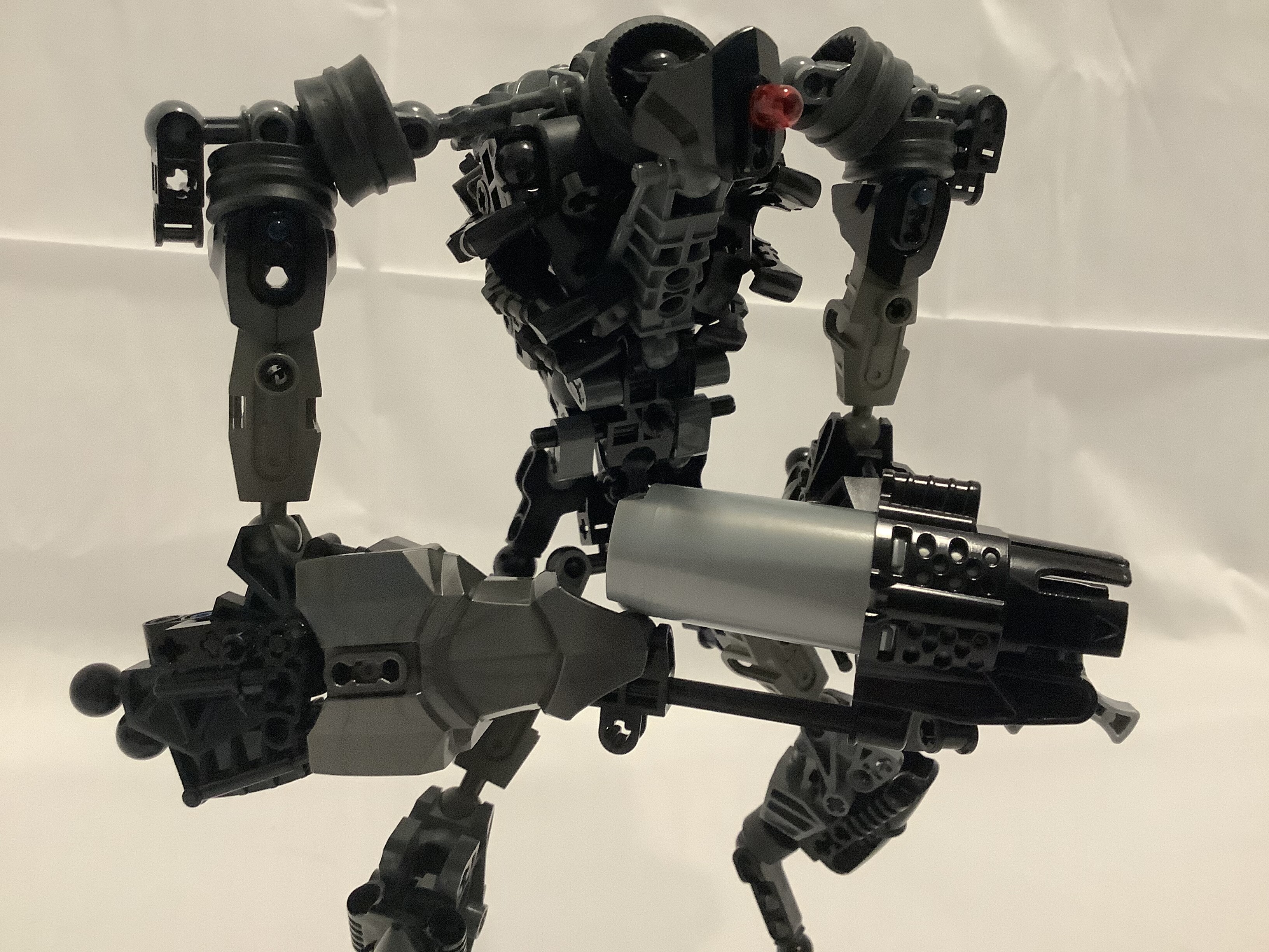
Got himself some fingers!
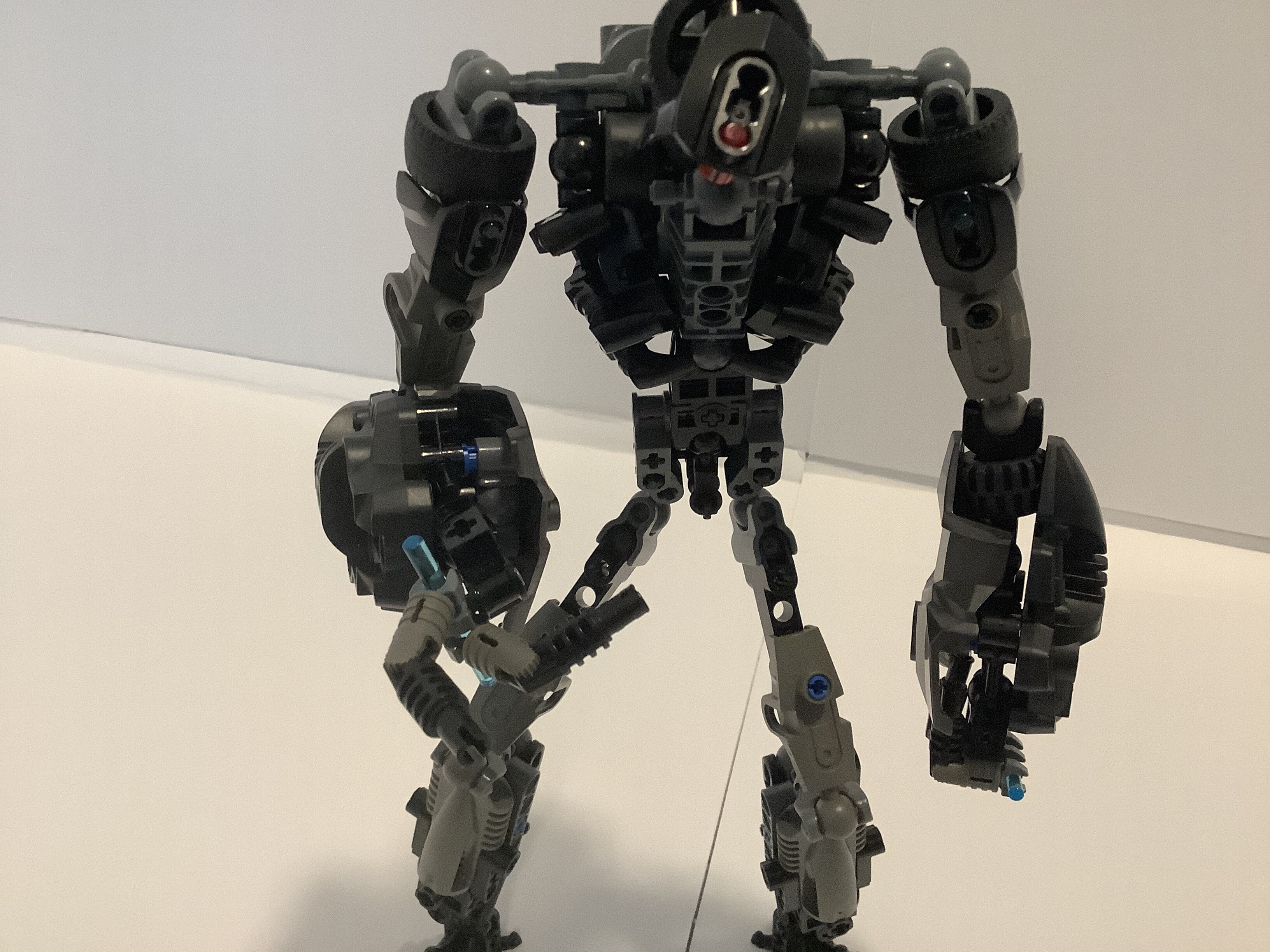
Looks like Joe acquired a gun. Good on him.
A shot so you can see easier what’s going on.
Like the last two versions of this guy, tell me every little thing you can think of that I can improve. I want this to get as far as possible in the competition, after all!
(edit, all of the different versions used to be their own topics, and the joke is that the title was Marendar 3: The Search For More Money.)
18 Likes
If I’m being honest, I preferred the second version, although I don’t think it’d be too difficult to change that.
First off, the hips seem really off, with the sudden change from 3L to 4L apart. I feel like it would be a much bulkier variant of a 5L length.
The upper legs seem way too skinny. It works for the most part on the arms (more on that later), but since the legs are much longer, it winds up looks really off. I think they should be bulked up a bit, but not to much. Make him look lean but not skeletal.
The arms seem OK for the most part. The forearms might be slightly to bulky, but it’s not too bad. The main issues is the shoulders - I think there needs to be an extra, small shoulder joint, to change the posing from just a robot to a menacing one.
And finally, the head. The disproportionality, instead of looking alien, just looks a bit derpy. Although honestly I have no idea what other design you could do.
also i miss the pistons 
1 Like
s h o c k a b s o r b e r s
Good feedback. Many thanks.
(I think from now on I’ll post all the new versions here. I don’t want to oversaturate the market with Marendars.)
2 Likes
You should probably put all of the wips into one topic…
1 Like
I’m not a fan of this blandendar. Needs more color.
But I love the lil’ Spaceballs refrence
I’ll echo what I’ve said earlier, that the head just seems too small and the thighs are disproportionately skinny. I also grieve the loss of the shock absorbers, because shock absorbers are cool. I definitely liked the broader shoulders and digitigrade legs on the second version more. Overall, this one seems… too thin. The silhouette of the previous version was more memorable, if I’m being brutally honest which I am because you asked us to be =P.
1 Like
#bringtheshockabsorbersback
Seriously, those are what made this moc stand out.
1 Like
i’ll try…
So, update:
I’m currently visiting a relative, who also happens to live in the same town as the nearest Bricks & Minifigs, so i’ll finally (hopefully) be able to find a good black waist. Be expecting an update around Tuesday.
Who is @Ben? @bob too?
1 Like
Luckyyyy I’ve always wanted to go a BnM, but the closest one is at least seven hours away. ![]()
Don’t diss my boi, Ben
1 Like
moar marendar
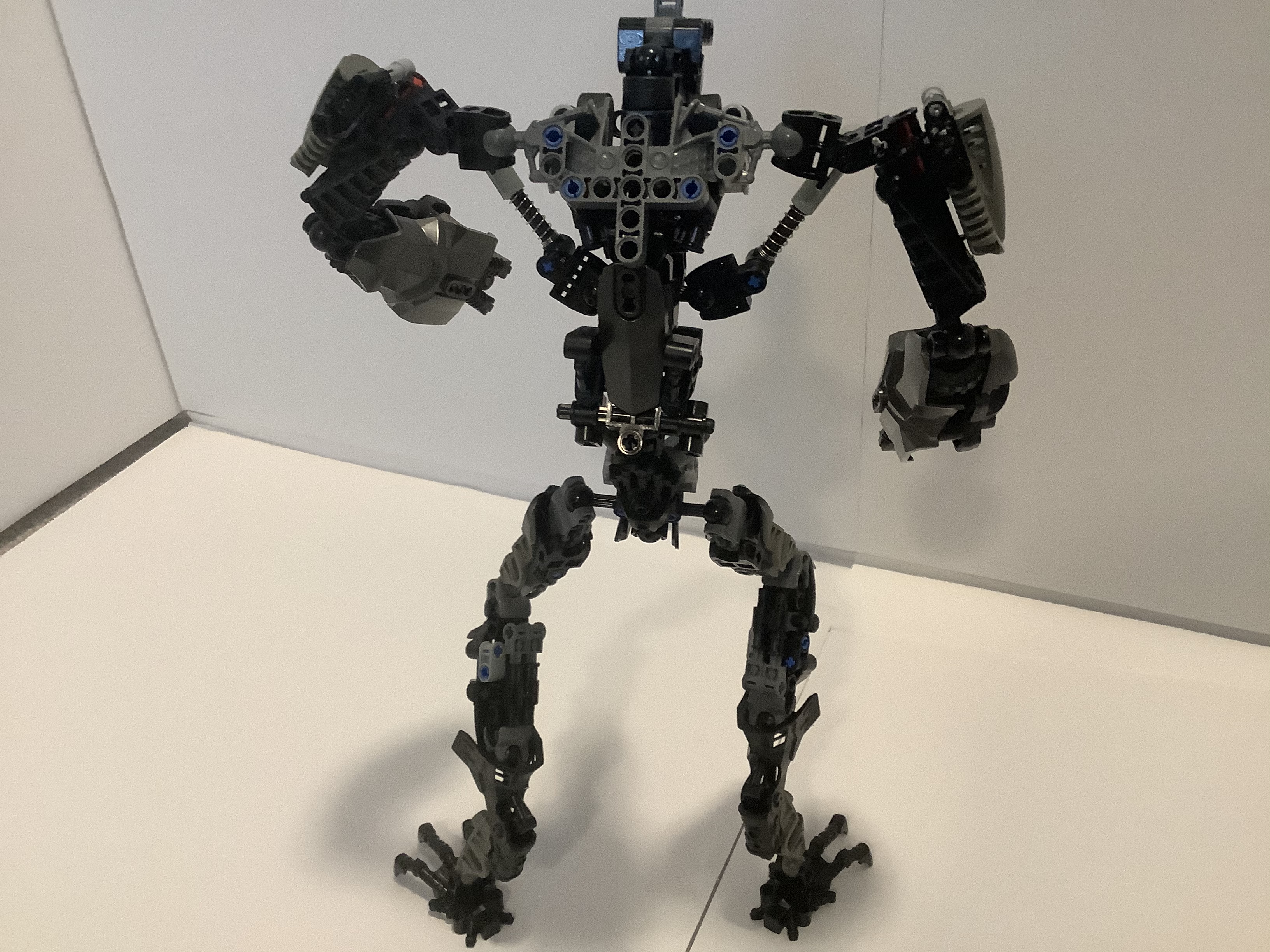
So, you didn’t necessarily asks for it, but here it is anyway! This is version 4.0 of Marendar, by yours truly. For this edition of Marendar, we took everything good about v2 and v3 and then we made his legs stable. Enjoy!
Front
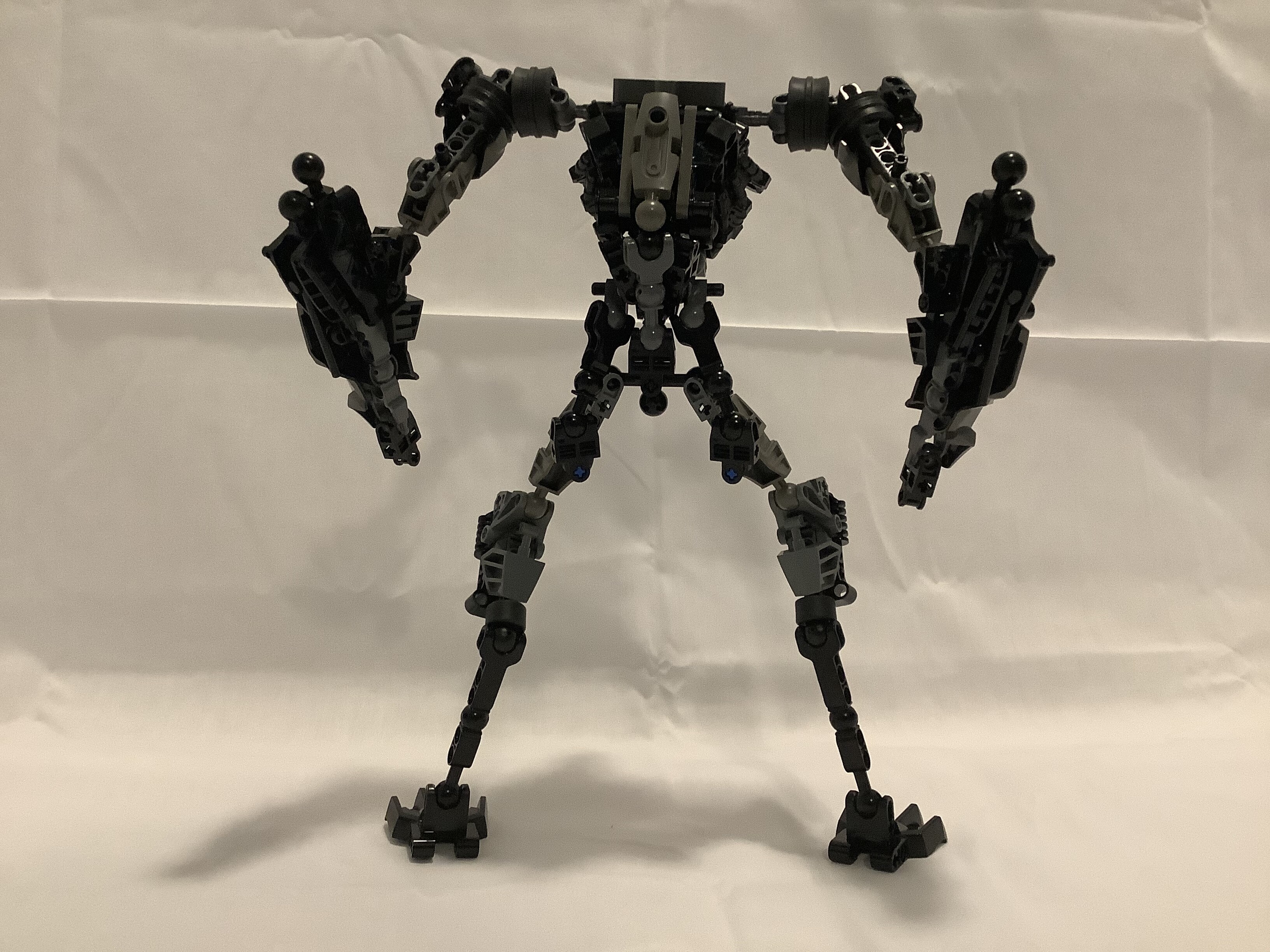
Back
Cool lookin pose
I imagine he can just turn his hands into anything he wants.
Gun
Well, you know the drill. Do as you must.
7 Likes
bring
back
the
shock
absorbers
5 Likes