Congratulations! You deserved this well, this has become my favourite on the moment I saw it.
3 Likes
This is the one I was looking forward to win and it did. Congratulations!
3 Likes
I found Apple of Eden here! nice easter egg. Is there a chance you could upload that pic in higher resolution so I could set it as wallpaper?
2 Likes
I like the artwork, but I feel like you made him look like a neckbeard Redditor vigilante, which is kind of weird, considering the model just looks like a Death Knight. I don’t really feel like it suits the model.
Congrats on the win
Congratulations 

This was definitely my favorite from the moment I saw it, I’m glad it won. Congrats!
1 Like
Welp I got to the semi-finals, I didn’t win, but honestly I’m not upset AT ALL.
This… this artwork is gorgeous. Perfect. Not a single thing wrong with it - AT ALL. Perfection.
2 Likes
Updated the post with a link 
2 Likes
Congratulations, Mr! 
Of course I was want to win, but Honestly this mask-concept is just FANTASTIC, and your art-style too! 

3 Likes
I know you’ve said that the circular runes are in reference to the Makoki stones, and a few of the symbols are clearly UDD symbols, but is there any significance to the other carvings?
The short answer is kinda, but my main focus was to make a mask that’s appealing even when stripped of the runes in case you wanted to get wild with your own interpretation of the symbols.
Long answer is over the course of October, this mask went through some alternative iterations that were for lack of a better term wilder with there depiction of ruins and symbols. However, once I settled on the direction I did go for with the silhouette, the ruins took a hit in aesthetic variety in favor of later print consistency. Direct uses of the more thematically favorable Matoran font would warp under certain conditions of 3D print, so I decided to avoid the thin circular/hexagonal design. At current point, they’re meant to amalgamate the direction the movie concept art was working towards and the G2 ruins since the use that I observed of the former were tied to people and locations of universal significant (Great Temple, Turaga, etc) and both were stylistically simplistic enough to not lose much fidelity at lower resolutions of print. As such, I interpreted “patterns and designs that reflect the universe” in a more abstracted way of “the mask reflects your perception of the world” than a direct translation of the concept.
Here’s the original drafts that I mentioned before:
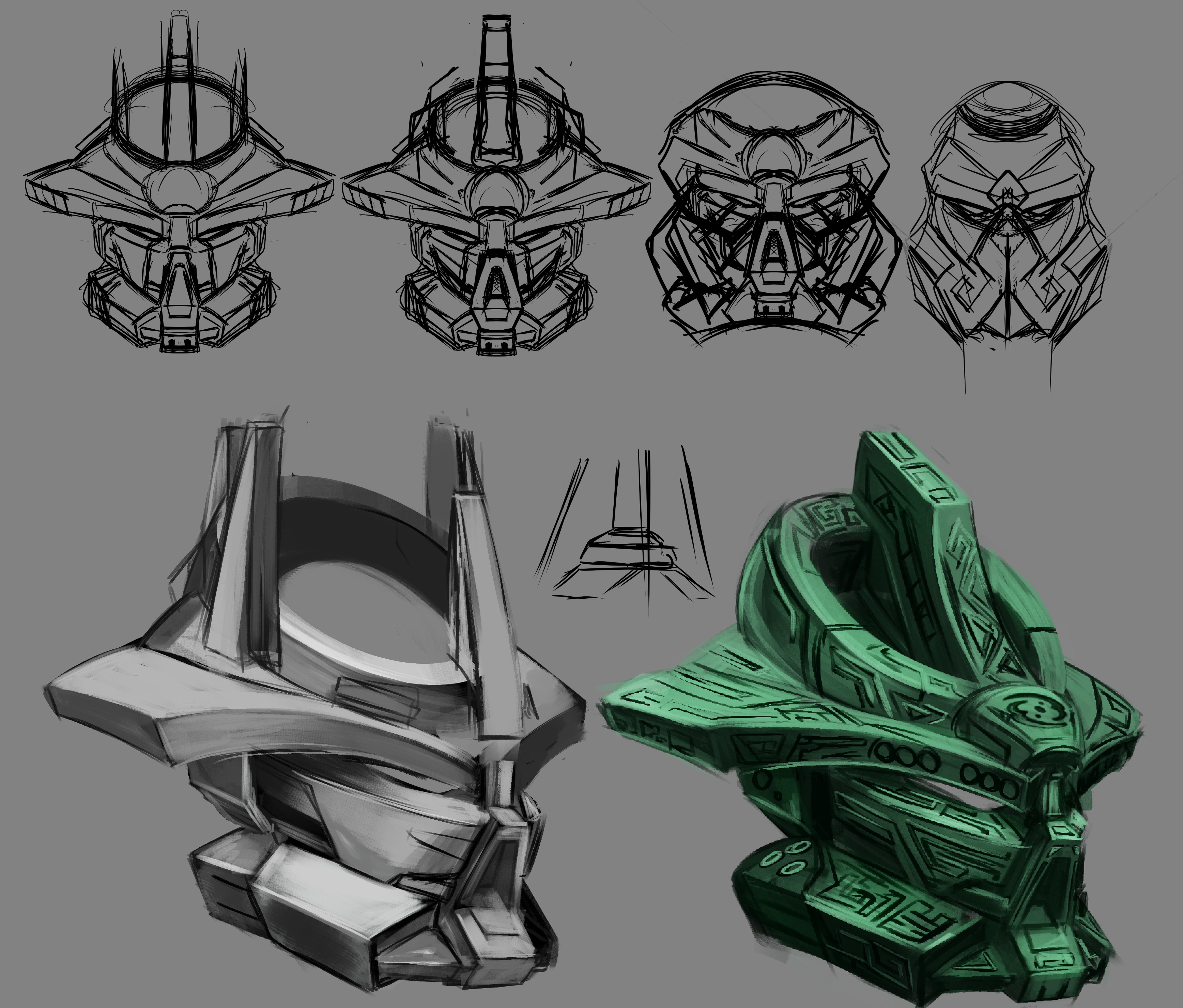
10 Likes
Not gonna lie, I love that the final mask incorporates the Kini Nui, but purely aesthetically, I think I prefer the single-horn look. It adds more to the menace.
Like I said, this is incredible.
Congrats on the win
I like the dark green mask too .