tak210
April 6, 2016, 2:54pm
1
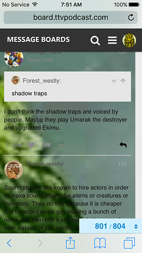
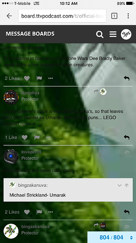
So some times mobile doesn’t have the proper background making it nearly impossible to read in dark spots of the background:
It’s been getting more and more common as of late, and making hard to read or comment on topics. Has anyone else experienced this?
23 Likes
Yup I have, and I’ve been getting around it by going to desktop view whenever it happens.
1 Like
Ninja
April 6, 2016, 3:05pm
3
Odd, I haven’t had that issue.
tak210
April 6, 2016, 3:21pm
4
Ya it’s becoming a real problem
1 Like
Triple
April 6, 2016, 3:28pm
5
Same issue, it seems to happen sporadically. One minute it’s normal and the next it’s broken.
3 Likes
Xevins
April 6, 2016, 5:25pm
6
I mostly use the desktop version but I have noticed a glitch where sometimes old background or banner colors return for a few seconds.
Maybe this is the boards briefly showing up as the transition phase background that happened during the civil war?
Yeah I have been having this happen as well.
It was kind of annoying. But I have gotten use to it.
This just popped up yesterday for me. Either that or I haven’t been on one of the forums with a picture. I have a tip for at least dealing with the problem: highlight the text.
Looch
April 6, 2016, 8:04pm
9
I think it’s related to the whole boards change.
1 Like
This is the case every time I go to the BIONICLE category since I joined. It’s a bit bothersome.
A simple way to read the text is to highlight it.
4 Likes
For me it’s only on the bionicle catergory, but it always happens there.
Plus I made cameo!
1 Like
tak210
April 7, 2016, 1:24am
12
Hopefully ttv can fix this soon, just a small coding issue in sure.
1 Like
Atomik
April 7, 2016, 2:52am
13
this has been happening to me aswell , i think its kinda cool though
tak210
April 7, 2016, 2:53am
14
It would be cool if the background wasn’t blurry or I could read the comments. The problem is the lack of seeing what others have to say.
1 Like
Votuko
April 8, 2016, 11:10am
16
I was just coming here to make a thread about this.
For me, the white background is always transparent on the BIONICLE subforum when viewing on my Windows Phone. (Strangely, it’s fine on my iPad, which presumably uses the same mobile site. Something to do with the screen size, perhaps?)
I’ve had this problem since the message boards were messed around with for the TTV Civil War.
3 Likes
Ninja
April 8, 2016, 2:25pm
17
Okay, it happened to me. It’s only the Bionicle topic, though.
It’s actually affected the Ninjago, HF, and Chima categories. Really any category without the default background.
4 Likes
Mayple
May 25, 2016, 2:49pm
19
It’s still a problem. I can’t go on mobile anymore, it’s way too tedious to highlight anything I want to read
4 Likes
tak210
May 25, 2016, 2:55pm
20
I’m many on mobile, and just can’t read bionicle topics. This kinda needs to be fixed at some point, cause right now mobile is a pain to work with.
3 Likes


