I enjoy doing digital drawing in my free time, so over the year I’ve accumulated a whole bunch of artwork that I… never posted here. Mainly because it’s not really all that good.
But whatever the case, I thought I’d just group them all together into one topic since I don’t think they’re really worth making separate topics about.
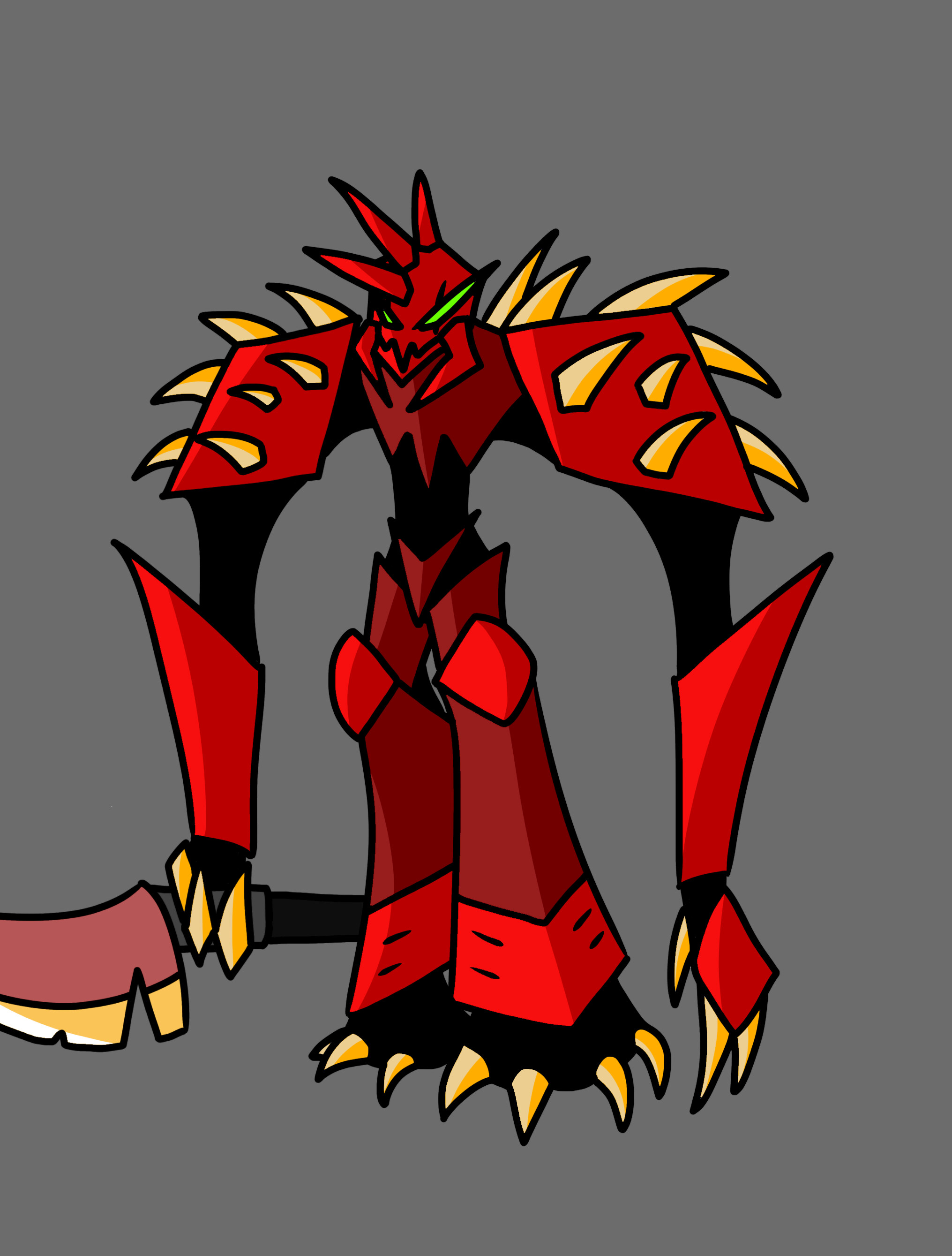
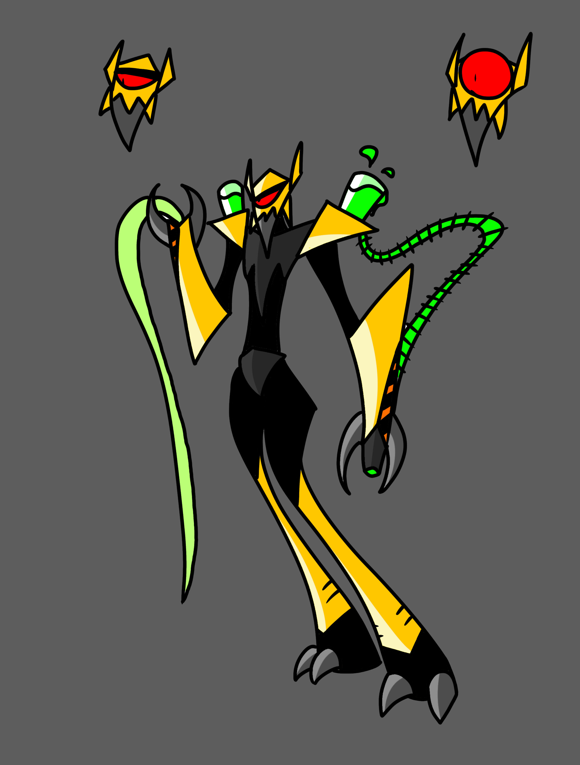
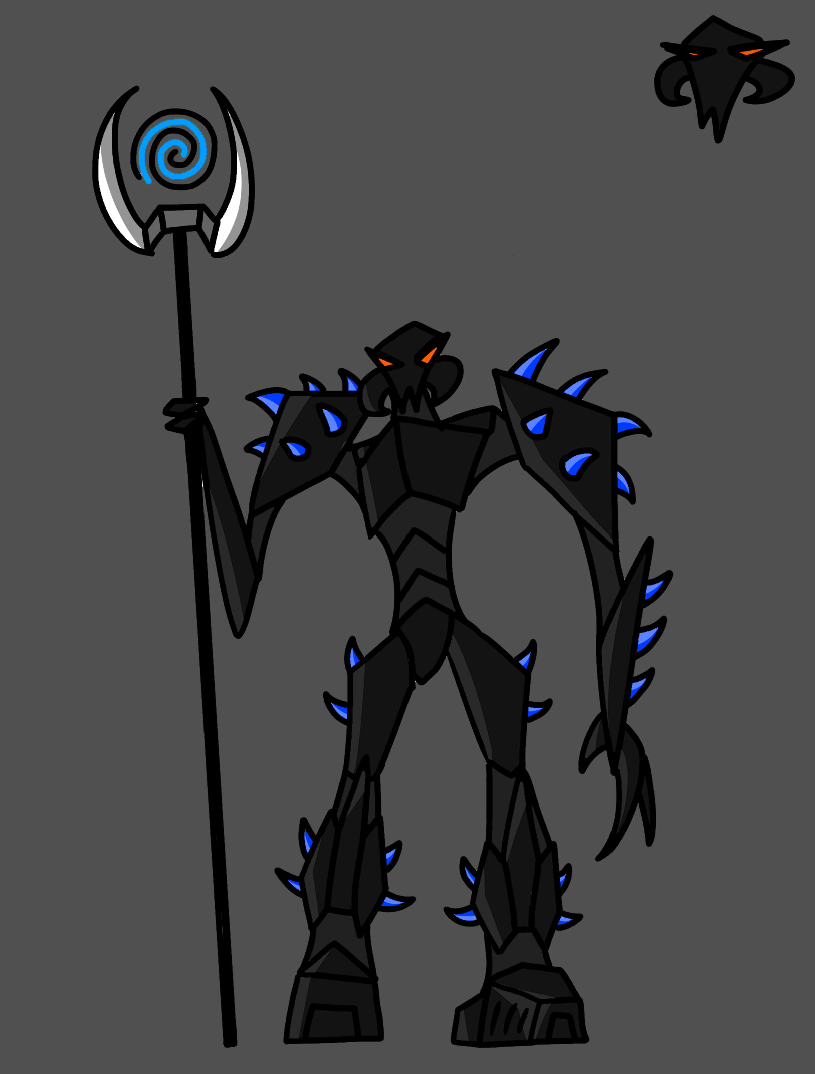
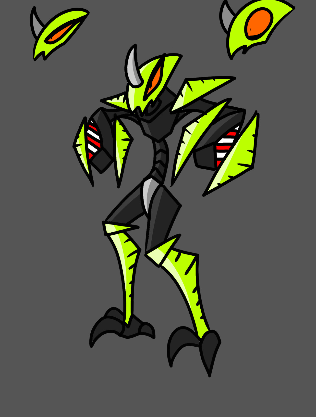
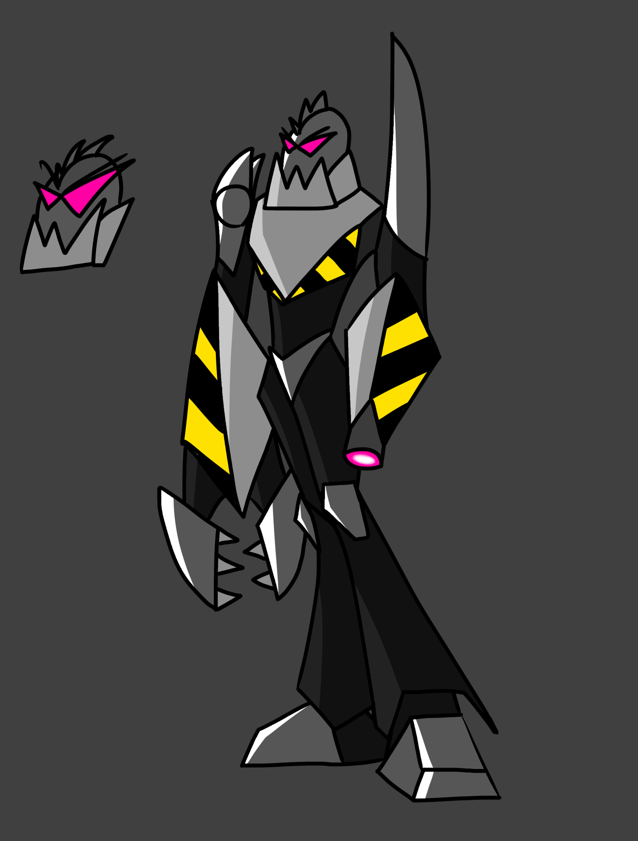
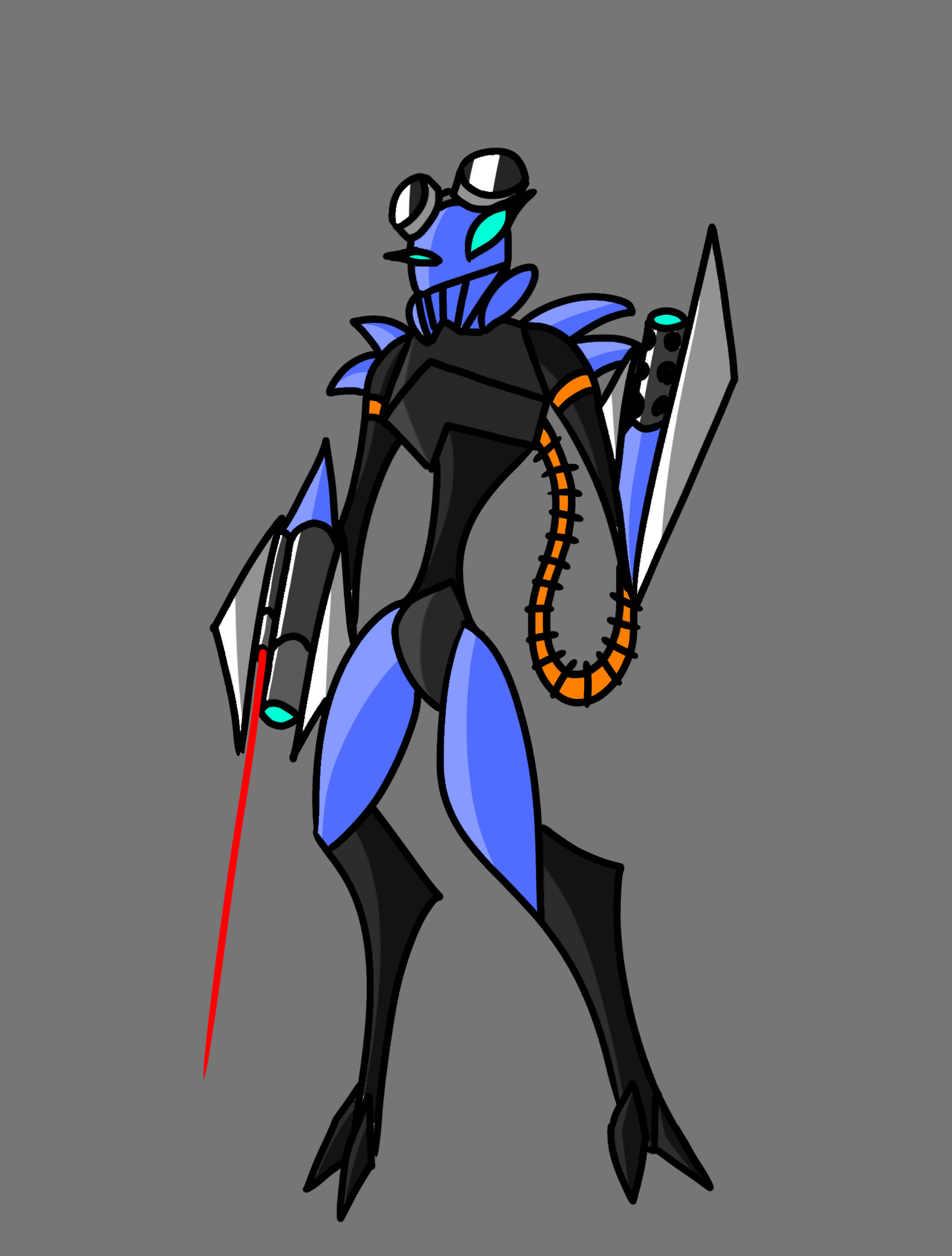
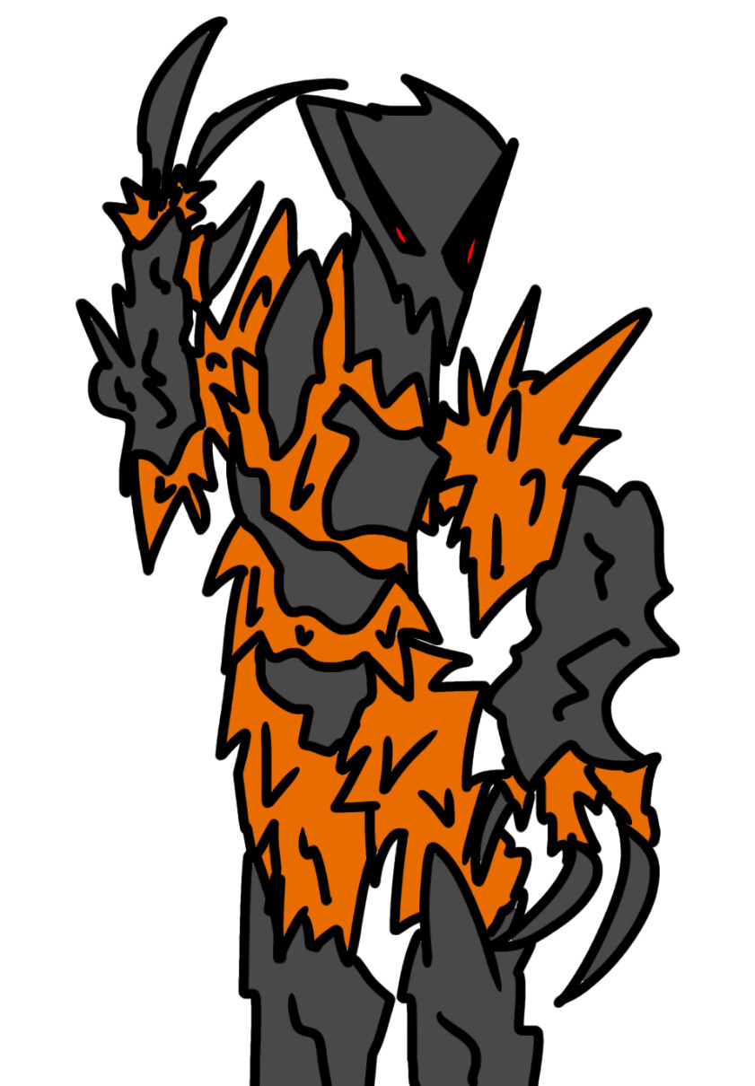
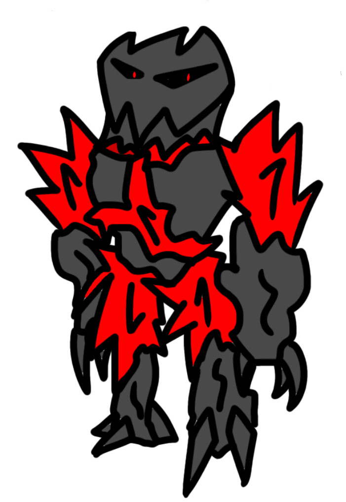
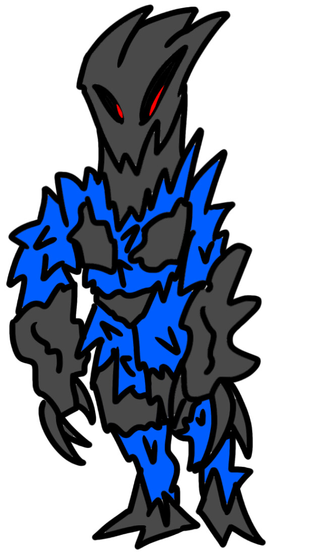
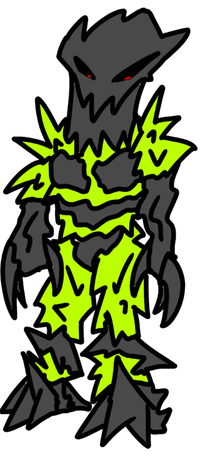
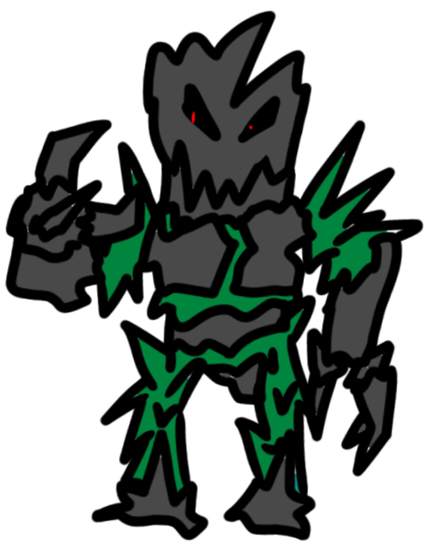
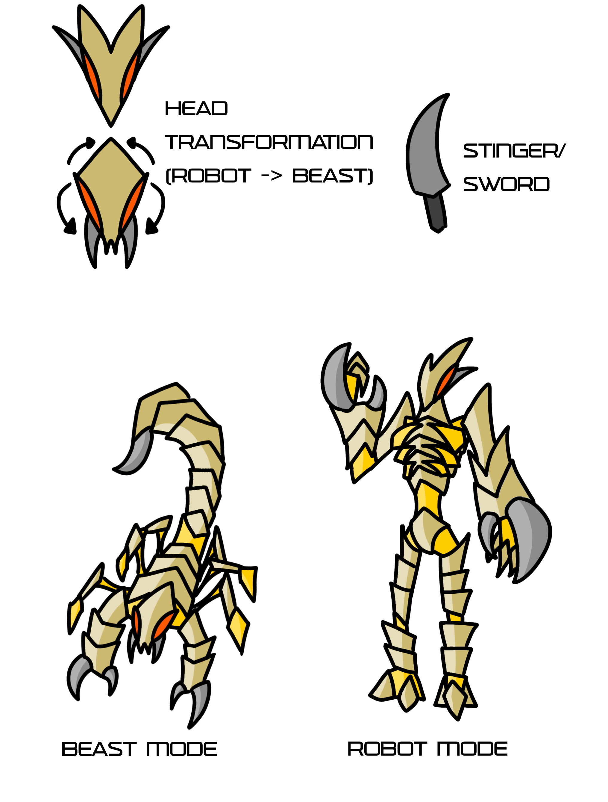
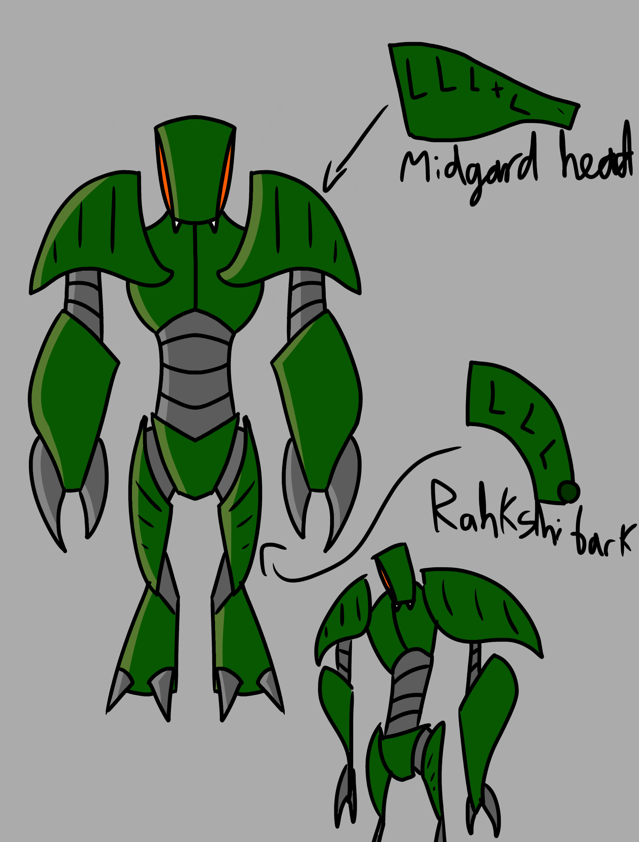
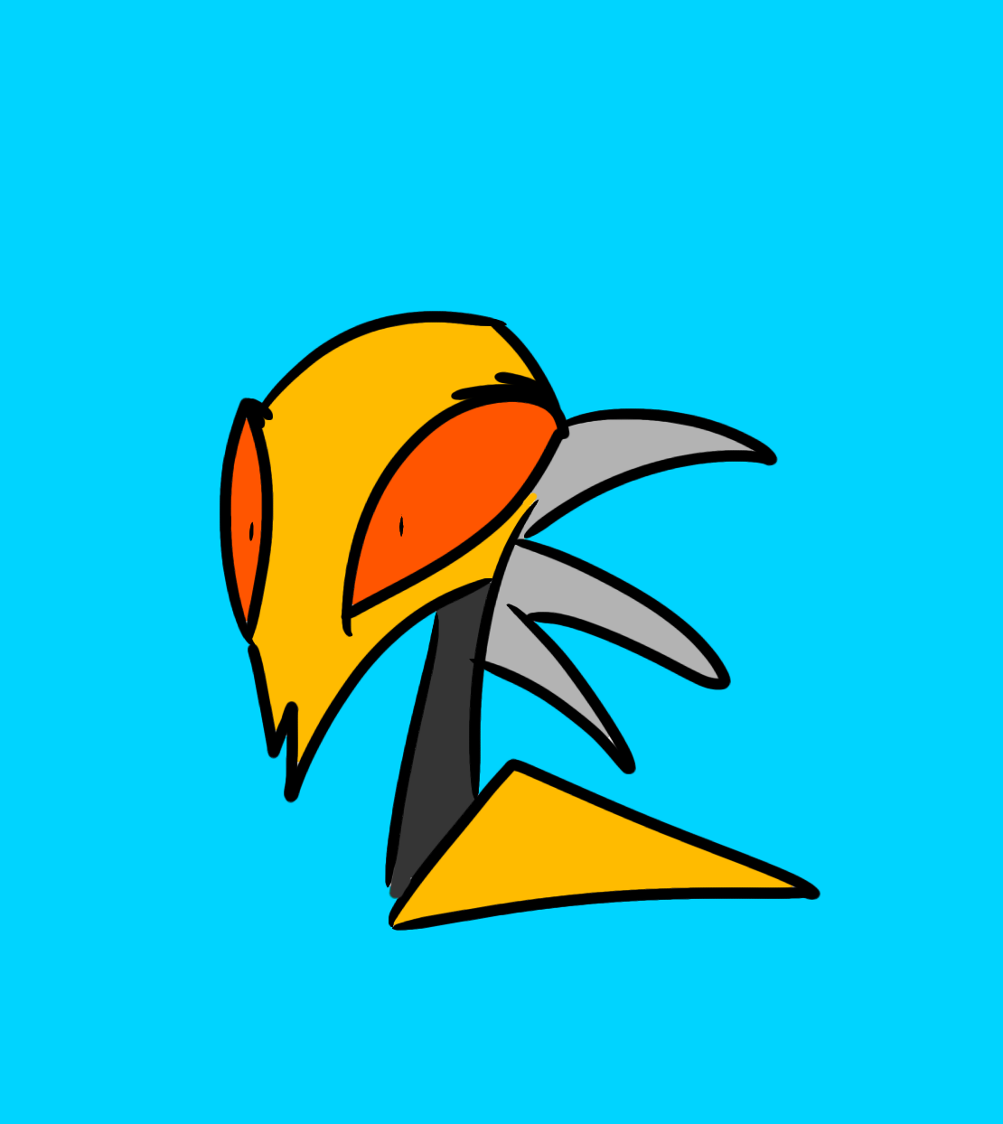
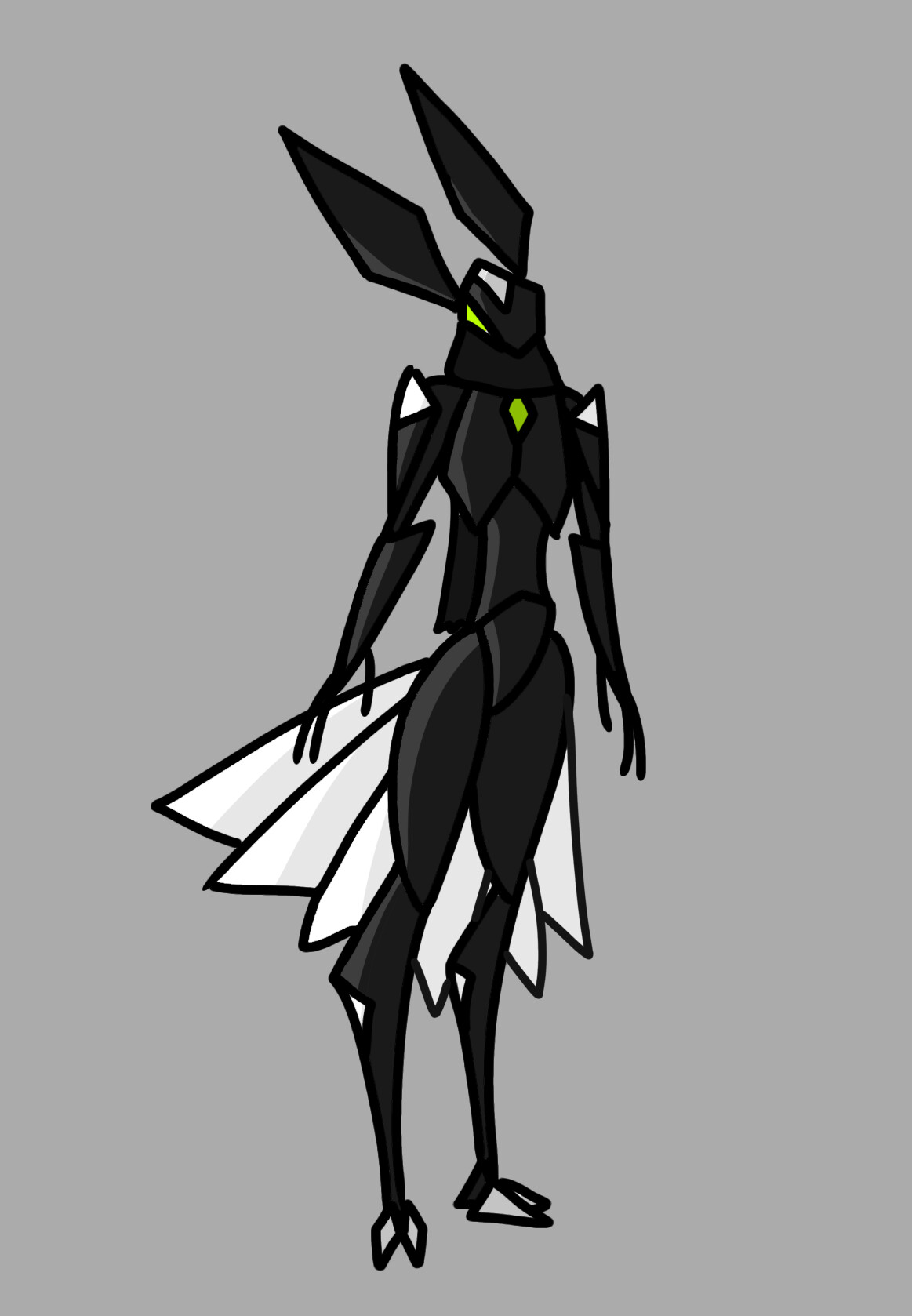
Without further ado, let’s begin with the thing I’ve been working on most recently; heavily stylised reimaginings of the Hero Factory 1.0 villains.
Yeah as someone who also has a bunch of what I feel are mediocre drawings lying around I think I can say these are pretty nice. The reimaginings of the villains are fine, I agree about Vapour. I like the Rock Monsters especially, they have a lot of character and are a bit of a…mood? I think that’s the correct slang?
You think these aren’t good? They look great to me, very stylized, nice use of colour and shading, interesting designs and proportions. They look like they would work well for an animated web series, I really like them.
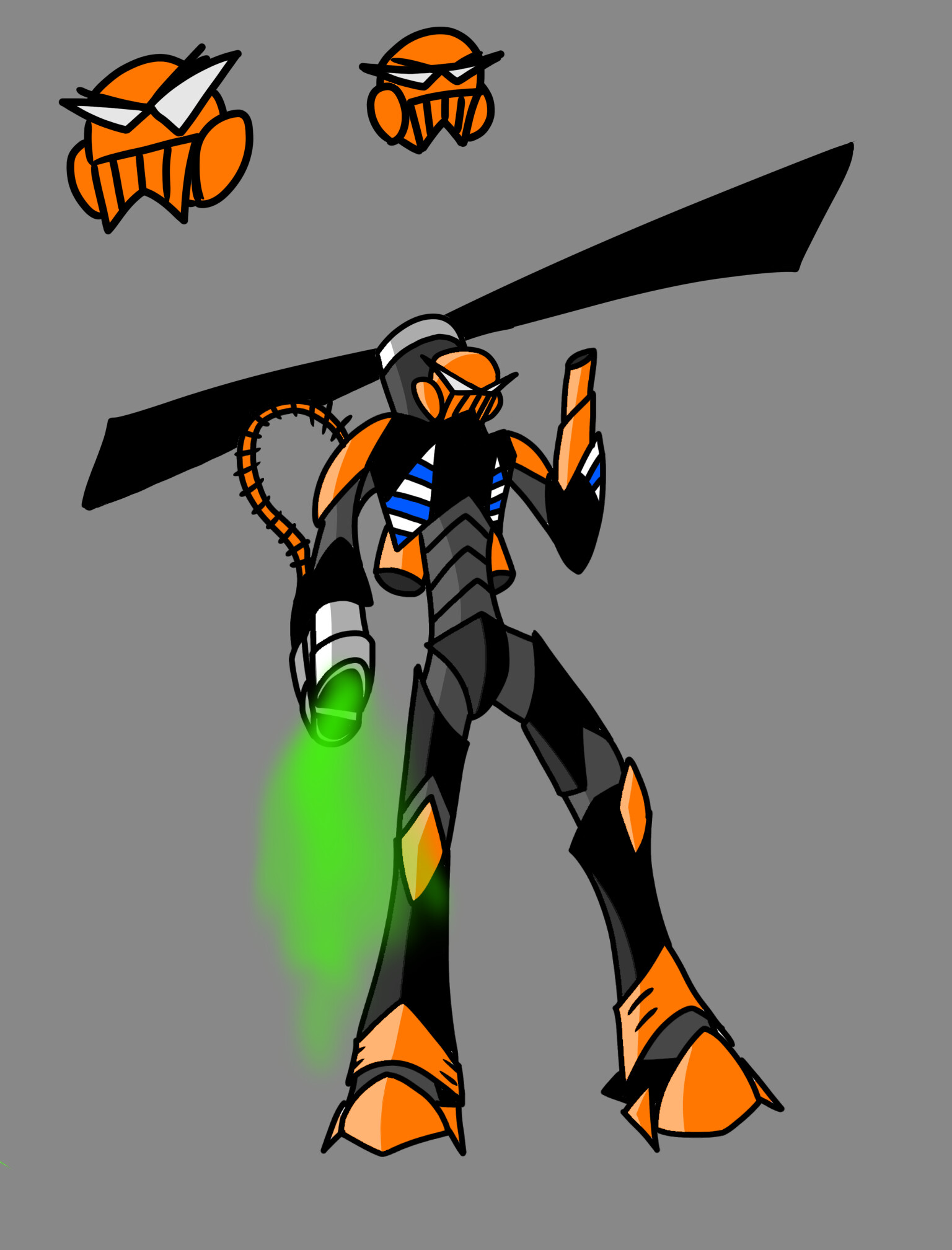
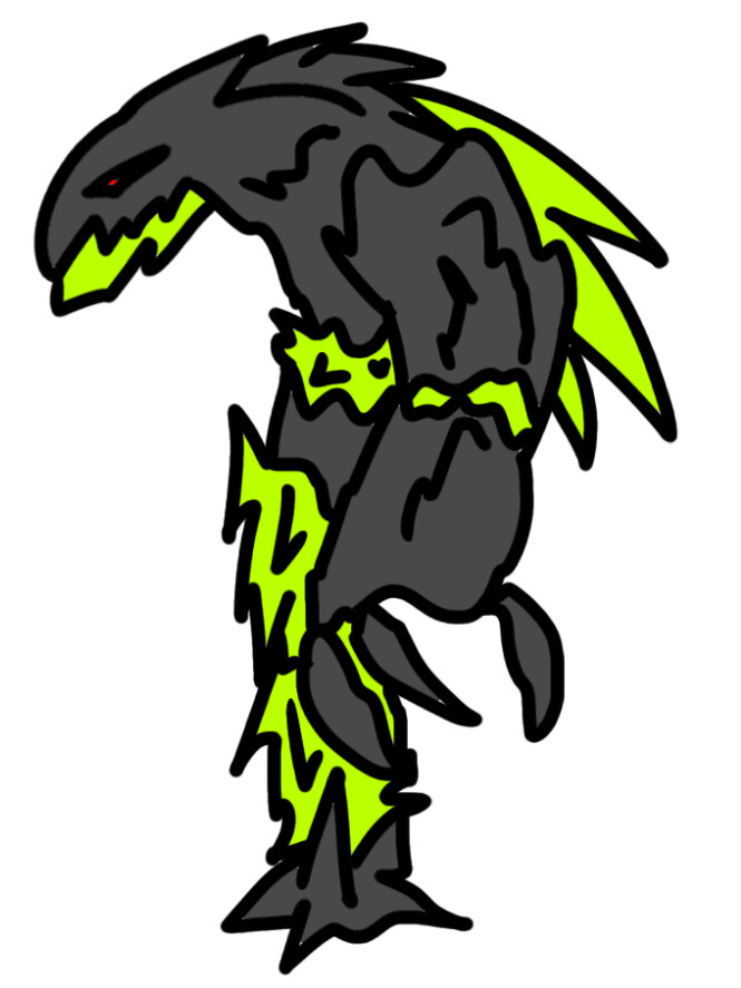
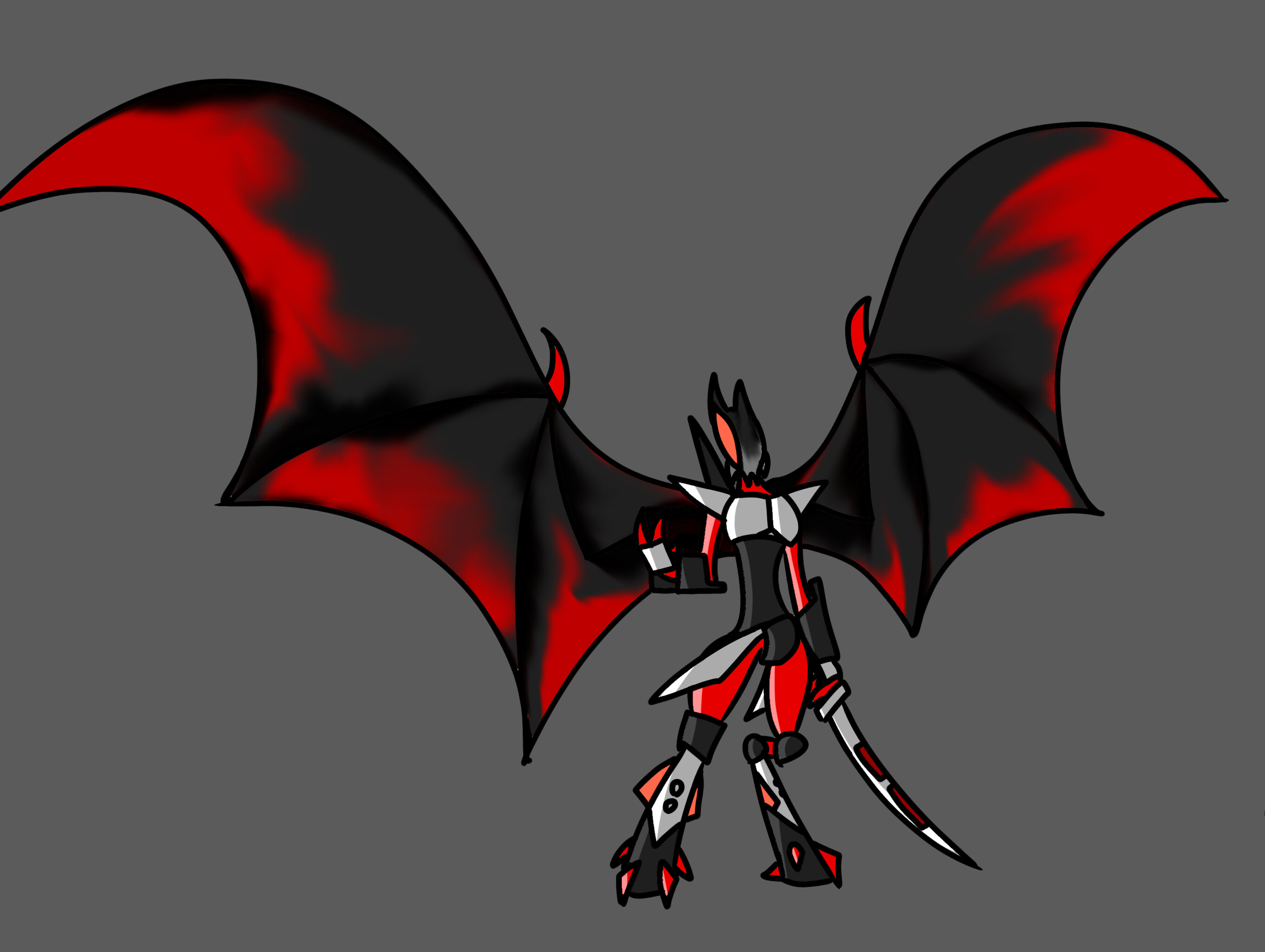
Seeing as I’m inactive, it’s not often that I get notifications from here anymore, much less for people drawing my Self-MOC.
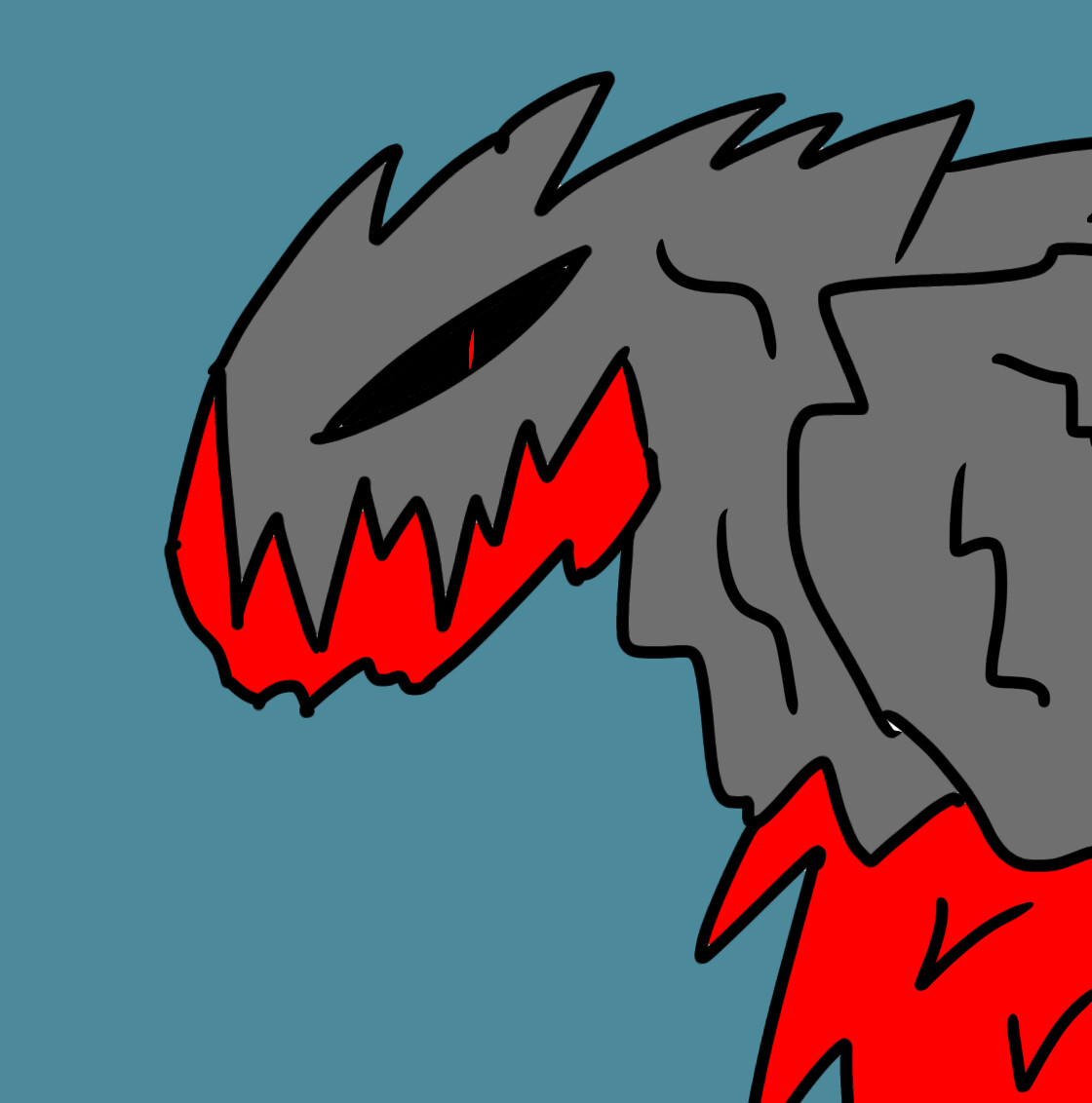
I might be biased because I’m the one that made the design in the first place but I do actually really like how you stylized him. Somewhere between bug, bat, bunny and peacock, which is pretty much on point for the idea, and the sort of cartoony design works well, much like with your HF villains. Not as big of a fan of the rock monsters, though - I think maybe the style you have works better on the smoother, robotic designs like the villains. Just my thoughts, though.
At any rate, thanks for drawing my boi! Definitely did him better than I could have done…my hands put plastic together and type…not so good at the drawing thing.