Mutant Toa Hangara: Four years of evolution and tweaking

Please choose your words more carefully. There are ways to communicate your criticisms on a MOC without using patronizing language. No one here is perfect at the craft, and not everyone can work at the same speed. There is merit to what you have to say, but there are much better ways to go about saying it.

As for the MOC, I’d say it looks fine, but there are some inconsistent aesthetics that, if reworked, could make the MOC look much better. The proportions are good, and the torso build is pretty well done. The legs could be better, perhaps by incorporating more technic and less ccbs? You’d have many more options as well as more consistency with the look of the torso. The color scheme is a bit inconsistent, but I see what you’re going for. I would drop all the different shades of red and blue and focus on maybe just three of those, say for example, mata red, dark azure, and dark trans-blue.

The best part about evolution is that it never stops. If you should make any adjustments to this MOC, I look forward to seeing it- hopefully sooner than four years!

8 Likes

Alright, after reading these comments, I took the liberty into incorporating some ideas into the MOC. After having her for so long, I lost track into what the character actually was. She is meant to be an assassin and not necessarily a model.

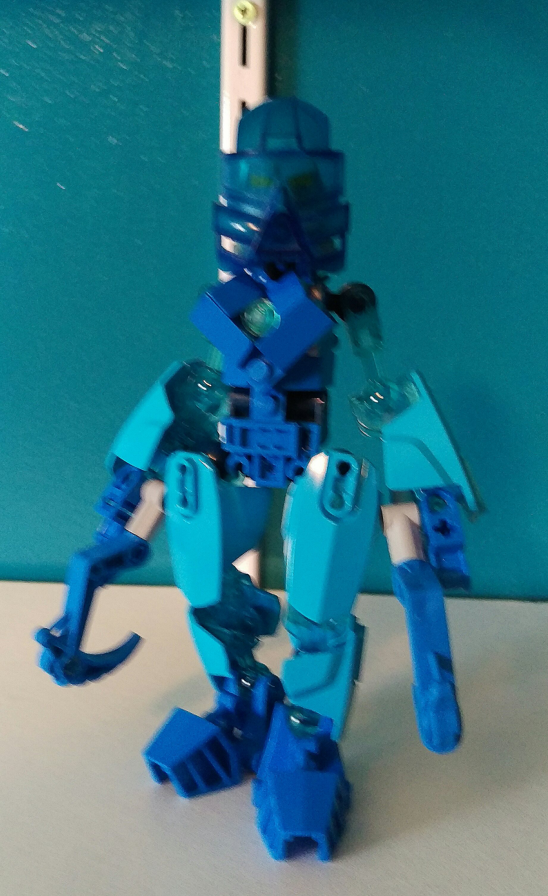
I especially wanted to convey that she was once a stone cold killer with swift cat-like movements and the ability to produce high-energy blasts. This is what the trans-orange system pieces on her hands convey. I also made her color scheme and overall aesthetic much more concise, being mainly only one shade of blue now and having Metru limbs. The use of Metru limbs I feel makes sense in this case as she has the genetic information of Toa Metru Nokama as a base. I still wanted to keep the CCBS on her upper thigh to give her legs that rounded shape typical of many females. I like torso design as it is, it is very unique and I feel it gives her a agile, feminine vibe without over-sexualizing or making her look anorexic. That was the main complaint I had when I first built her. I also incorporated more silver, particularly in her neural cord and took out the red. The red was proving to be very distracting, despite the fact that it is my favorite color.

Her upper arms were very tricky as many armor options would restrict movement and pose-ability which I did not want. So I went for two light trans-blue system rods. These one, serve in the story as her veins or vein markings which light up when she is using her powers, and two, do not bulk up the arms too much and, three, do not restrict movement.

Now I want to address some comments because I believe some of her design in regards to her story premise is a bit misunderstood.

@Toa_Vladin This sounds a bit offensive to me and I see this a lot with other female MOCs. Women come in a huge variety of body shapes. I would seriously consider that you go out and actually pay attention to what real people look like before you make such generalizations. What does a woman have to look like exactly? Also, I really would not be critiquing a MOC when you have not even tried these builds before and most of your other MOCs are BASIC CCBS MODELS that take really no time to complete. Before you critique anybody, if I were you, I would first work on your own MOCs, because these just seem like some generic Hero Factory sets/Bionicle 2015 sets and not something that looks like you put in any thought into. Also, I don’t see any female builds coming from you. What really turns me off about a person is if they have this “do as I say, not as I do” type attitude, especially if you are going to come off so harsh like this. I suggest you buy yourself some parts and work on your own MOCs before you start critiquing. And no, I don’t really accept your apology; it doesn’t sound genuine and it only sounds like you are sorry you got caught.

Ok, now that I got that off my chest;

@Likus Trying to keep this PG-13 at most so no thanks lol.

@Risebell I did this mostly but I feel like sometimes using an element is necessary in order to achieve a certain look/aesthetic. But I agree, the MOC before I modified her was looking offputting with complex torso and simple arms.

I’m a very busy man guys. I only have time to come on here and post on here only once in a blue moon as well as make subtle tweaks here and there to my MOCs if I see fit. That and the vision that I wanted for this MOC was blurry at the time. I appreciate the nice constructive criticism I did get though. It really helped in making this MOC look more concise and making it look more on how I wanted to look.

Edited post to abide by board rules- Prentice1215

3 Likes

this Looks really Better! I like how without the red it looks a lot more calmer and gives it that assassin look that she has

yeah, I sometimes think about that before making a Female Moc or even any Female Character for that matter. and I’m glad I’m not the only one who thinks that.

1 Like

Firstly, that inika shoulder is awful, get rid of it, bare technic would look better than that, replace it with something or just leave it off, but it has to go. The upper arms don’t look great either, just a bare double socket with some bars loosely attached to them, maybe you should try building up something with system for the shoulders, and speaking of system. The chest is just exposed technic, I’d suggest making something out of system to properly contour the chest, I used system on my gali moc for the chest and it worked out well, I think it would here as well.

Also I entirely agree with rise, consolidate your textures, now the ccbs on her is even more out of place. I’d suggest keeping the ccbs and adding system personally, but it’s up to you.

Finally, she doesn’t really look that feminine imo, the shoulders are much too wide, looks more like a svelte male, like lewa, you need to narrow the shoulders to be closer in width to the hips.

1 Like

@Payinku Can you show me a picture of that Gali MOC just so I could see what you did with the chest? I sort of want a Xenomorph/malformed genetic experiment type vibe, how would I be able to express that?

1x2 vent plates maybe?

@Lugztina You could put a black tile on the back as a censor bar.

Well the change in colors alone makes it look a lot better. But you’re introduced a minor problem, and that’s that the CCBS thighs are super smooth while everything else is textured.

Previous comments the front of the torso still stand.

I will say I think your response to Toa_Vladin was uncalled for; first off because personal attacks don’t necessarily invalidate his critique (and can be hurtful), and secondly because “basic CCBS models” aren’t inferior than complex builds by default - I have a couple of years of absolutely disgusting but custom MOCs to attest to that. If you don’t like someone’s critique or think it’s too harsh, you can just ignore it.

2 Likes

I apologize that I had to retaliate like that. It is not in my nature to cause arguments. However, it’s very frustrating when someone makes a critique on a problem and then doesn’t follow through on how to fix said problem. This is especially true for a character that I truly hold dear and want to fix, especially when it’s a femmoc and making it look female is extremely difficult to begin with. It got to the point to where even the Mods told him to stop and he didn’t and he just kept trying to reason himself. It also got to the point to where it became too much which is why I felt the need to clap back at him. Again I apologize if I caused a scene here and I also apologize to @Toa_Vladin for retaliating like that.

@Toa_Vladin I do want to say this though because I feel like I need to critique your critiquing style. You need to give an explanation on how to fix said problem rather than just say “oh this is terrible, this sucks”. Because it is very counterproductive and can come off as even insulting. Like what @Ven and the other MODs said, in order to properly critique, you have to choose your words carefully in order for it to actually matter. If this MOC doesn’t look female to you for example, give an explanation on how to make it look female (too late, @Payinku already did this) rather than just say “it doesn’t look like a female to me or just looks like a pillar of technic pieces.” That doesn’t fix the problem. Next time when you critique please try to use this advise.

Ok, I think I am finished debating this matter. I want to get back to the MOC itself.

1 Like

I am pretty sure that midway throught the wave of mods I stopped defending myself. The moment when I apologised.

Of course I forgive you. To be honest it stepped on my nerves at first, but I was the first to do the wrong move.[quote=“Lugztina, post:31, topic:50152”]
e your words carefully in order for it to actually matter
[/quote]

Wow. Wait. I do accept the fact that I should have gave examples of how to fix it (if I had any examples), but me saying this is bad because remains valid.

I am also not him. My opinion might differ.
An athletic female must have a sleeker body, on all tge sides, must be able able to crounch forwards and backwards, to use her diaphrame point, to have shoulders and hips that stick out a little, not that are in like with the rest of the body. Otherwise it looks boxy.

Ok do after reading all of this and experimenting, I may have to go back to the drawing board with this one. I can see now that the Technic is becoming way too complicated than it needs to be. I think I will work towards a more organic looking model using CCBS.

1 Like

Iteration is the name of the game my friend!

2 Likes

Ok, so even though it may not look like it, I did a lot of experimenting as well as a lot of thinking. and I decided to keep the previous look of the MOC with a few alterations here and there. I’m probably going to get a lot of flack from this but here we go.

I highly agree that the Inika shoulder had to go so I slimmed down the waist bigtime with a few Technic pieces. It really does wonders. I tried narrowing the shoulders down but it didn’t quite look right because she looked too skinny for my taste and also it interfered with pose-ability somewhat. I decided to keep the CCBS thighs.

Honestly I like her like this right now. I know that to some she looks inconsistent, messed up, and aesthetically unpleasing, but I think that fits into her origin of being a science experiment pretty much. Mutran basically had to gene splice traits from other beings in order to achieve this. This also explains the digitigrade legs, her thin arms, and the cord at the back of her neck. I think I am going to own these too. And also, I’m kind of done with this thing. You guys can leave your own opinions if you want. I may give her other forms in the future like Frieza, some more grotesque than others.

Also I gave her a death ball.

2 Likes

I think you’ve improved your MOC immensely. I think my original suggestion still stands, as where the area where the chest meets the neck feel a bit unnatural.
I think you could use this piece


and this piece

to improve that and make it more natural.

Another suggestion, more of a nitpick when it comes to the theme of the character, is perhaps when posing you could give them a hunch and make the digitigrade legs more emphasized like in nature. My example being this picture comparing human legs to a pair of digitigrade legs from an animal.

one way to think about digitigrade legs is that that the second joint is really where the heel would be.
I’ll make an illustration to point that out.

Overall I really like what you’ve done with the MOC.


heels my illustration where I circled where the “heels” would be compared to a human set of legs. A set of digitigrade legs is kinda a design where you’re on your toes all the time, if that makes sense.
@Lugztina

1 Like

The torso looks so much better, thank you.

I think there’s two things you could still stand to work on: first off, find a way to replace or cover up the grey arms, which ruin what’s otherwise a really solid color scheme of Mata blue and black. Could use some armor too, to prevent it from being flat. (The silver waist is passable, however, if you have that piece in Mata blue or black it would work better.) Secondly, the transition from the chest to the head is super sharp, which I think is what Jcton is getting at. I could go into further detail, but I think you’ve worked on this particular MOC for long enough for a while.

2 Likes