This was the part of the contest that I’ve been looking forward to, mainly because I already had an image idea in my head. The only thing to wait for is which build design won the first contest.
I had lots of fun making this, and I truly hope that people enjoy it as well…
So the artwork has a somewhat similar vibe to the official artwork of Karzahni, it even has a shadowy silhouette of him in the background. It also has the silhouette of the canisters in the background, which are of course in reference to the Toa Mata. I moved his cape up and over one shoulder, mainly because I just like that look in general.
The runes all over his body are similar to that< in design anyways, to the rune look of the 2015 mask of creation. The same goes over to the mask itself.
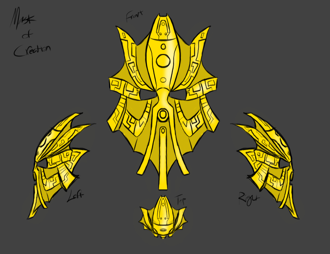
The new mask design I made is similar to the already used 3D printed mask on the actual MOC, the biggest difference here is that mine looks far less familiar to that of the Mask of Light like the original mask in the MOC.
I think the mask already used is great, even the color works great, but again I wanted to do something different and new.
This mask resembles that of an alternate crown design and a beard-looking mouth. The biggest inspirations here were both the light drained version of the great kanohi Avohkii, as well as the great knaohi Olmak. Both primarily inspired the size and thickness of the mask. There is also inspiration from the mask of creation from 2015, as well as the mask already on the MOC, but perhaps that’s a given.
Again, I hope that people like this and I can’t wait to see what others do!
Thanks to those that come here!
I think this is a strong opening for the art contest. You hold onto the build of the moc but gave it runes. Those runes on the chest look like they could be made into stickers on the MOC version.
I do like how things about artakha are represenred in the picture. Karzahni, his brother with whom he fought for the mask of creation.
Maybe there could have been kanohi avohkii? And Kraahkan since both were created by him.
Oh wow, for first out the gate this is really good! It looks almost like a movie poster. I like the outlining, lovely balance of clean lines and detail.
I like yor entry very much!
My only problem with it is that the runes aren’t easily recognizable as runes - they look more like the regular texturing of the armor/mask.
Really cool artwork ! We can really see the power coming coming from Artakha. We already guess at first glance that he’s not someone to mess with !
The only nitpick I have is the background. I like that you put elements of Artakha’s story (the canisters, his brother,…) but I feel like these elements s h i f t some of our focus from Artakha himself (maybe a more subtle background like a temple would have worked better imo).
But hey, like I said it’s just a nitpick. Your artwork is still fantastic and definitely one that has the potential to win this contest.
Keep up the good work !
I can definitely see the Avohkii and Olmak inspirations, and it reminds me somewhat of some concept art for the 2015 mask. I love the Karzahni, I love the canisters, I love what you did with the cape, and I love the overall style and coloration. I can also clearly see the designs on his armor and man, it comes together well. I wouldn’t mind seeing this alongside the official Karzahni art.
best “moc acurate” entry so far
heck, it’s even doable IRL if you practice scribing and panel lining
and geometric “rune thingies” are a lot better than trying to emulate nuva or g2 text
as far as the mask goes, i’m not sold
it’s very original (i’m sick of people ripping off the G2 MoC)
and it looks pretty good
however i feel it is bland and lacking in identity (looks like a abstract folded metal art piece with engravings, or origami folded from a maze puzzle in the general shape of a face)


 !
!
