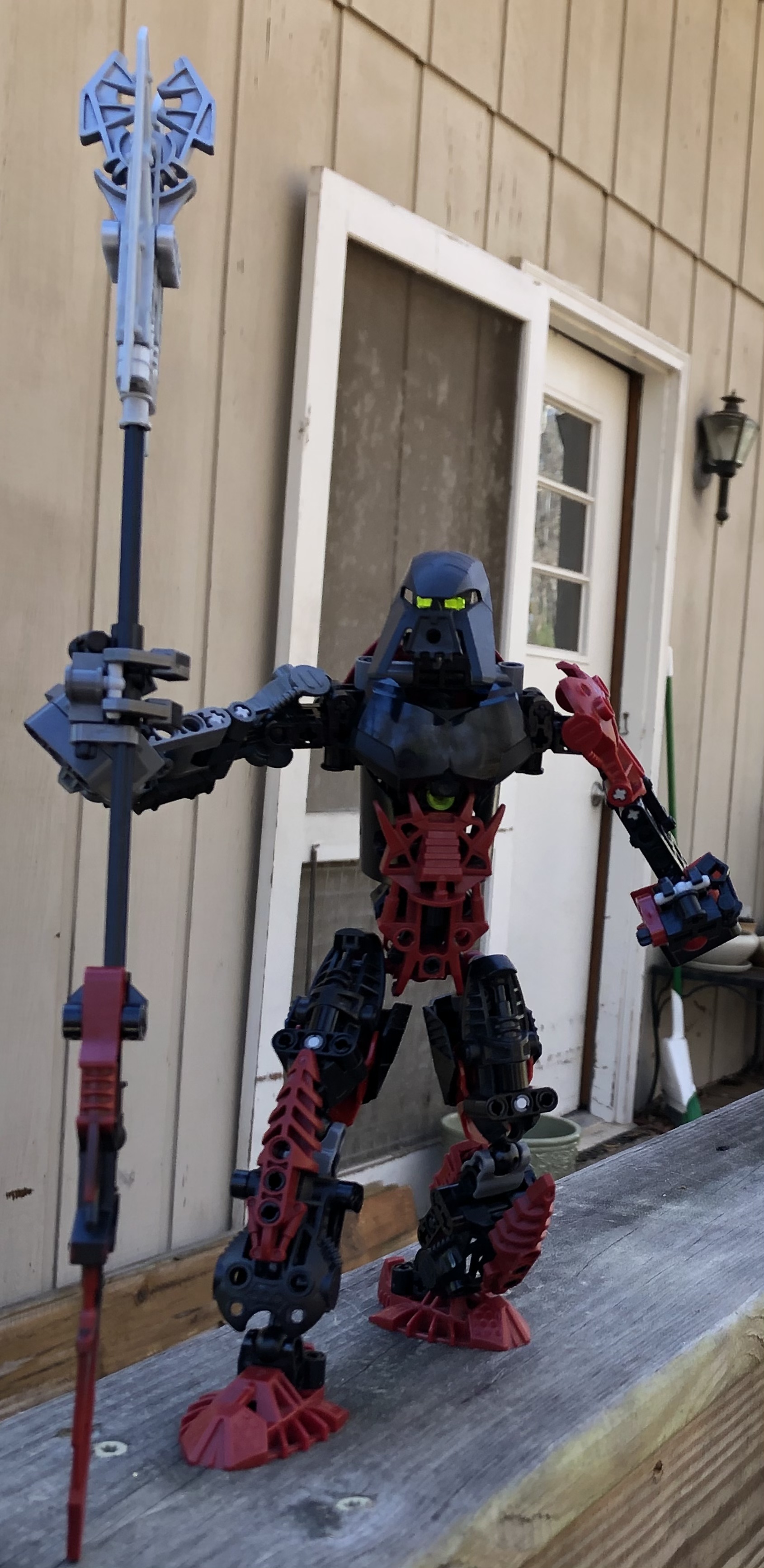
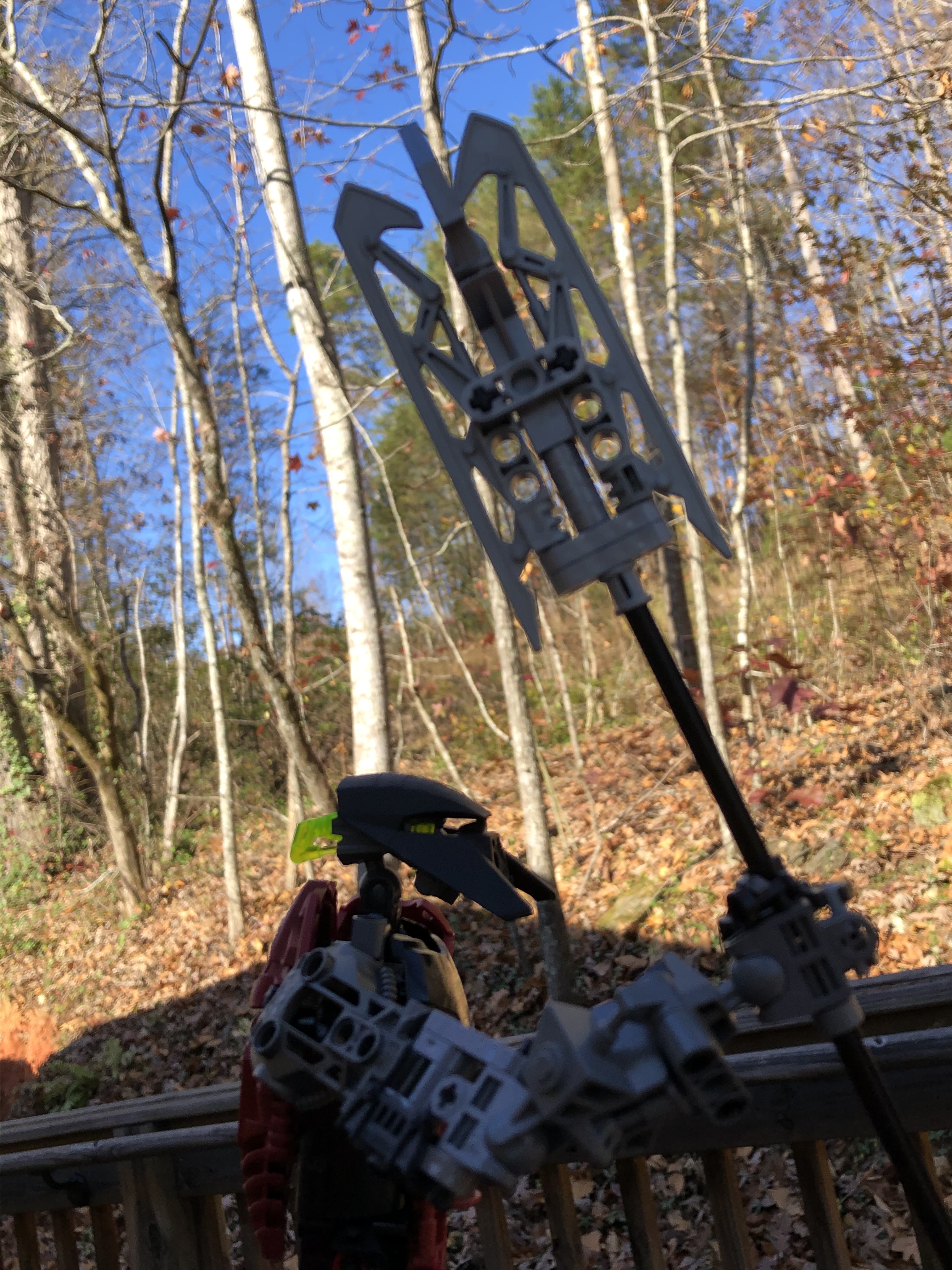
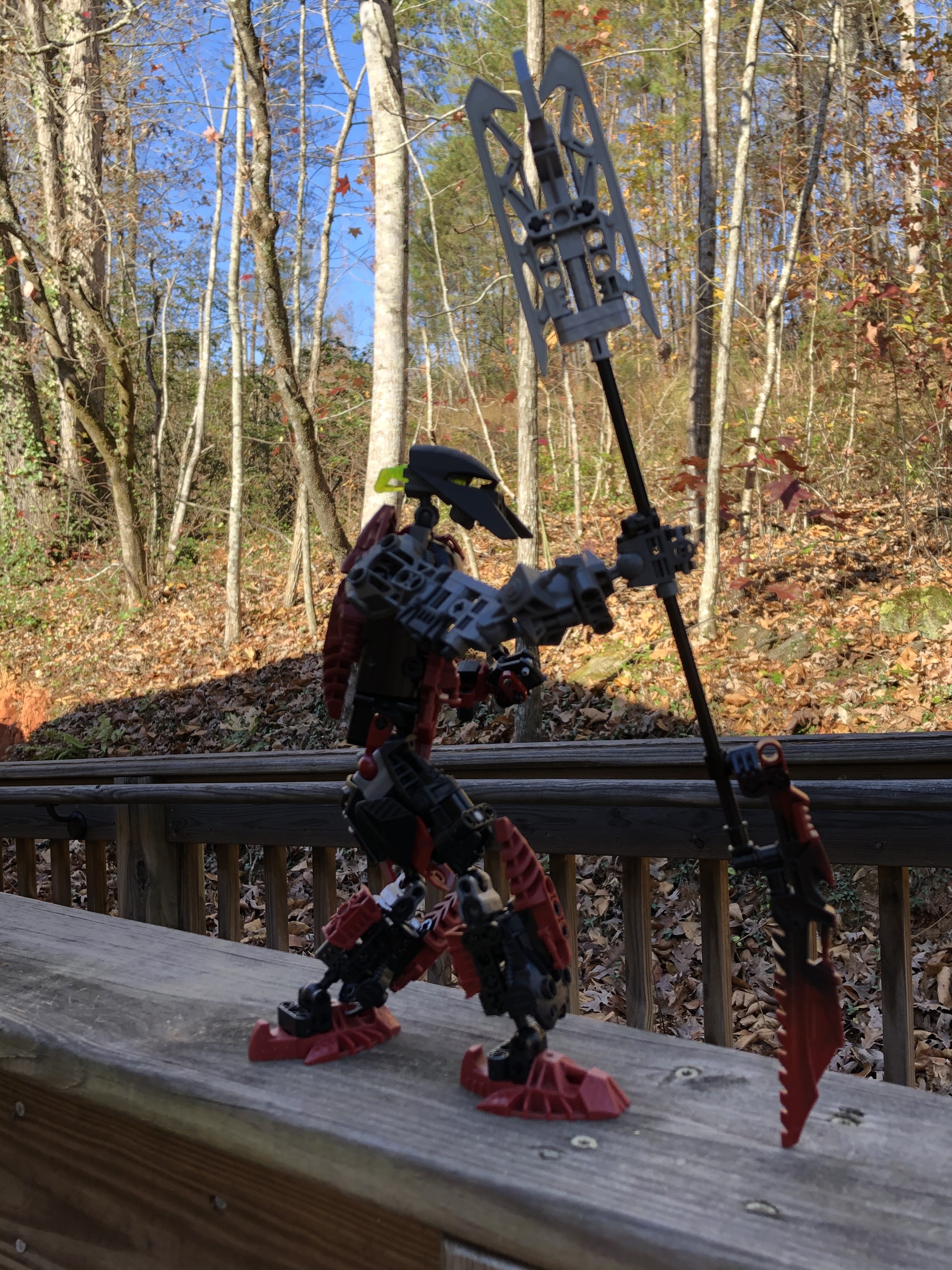
If you saw the last version I posted, the weapon is virtually the same. I was so satisfied with the spear-thing, that it has been the weapon for the moc for the last 5 or 6 editions.
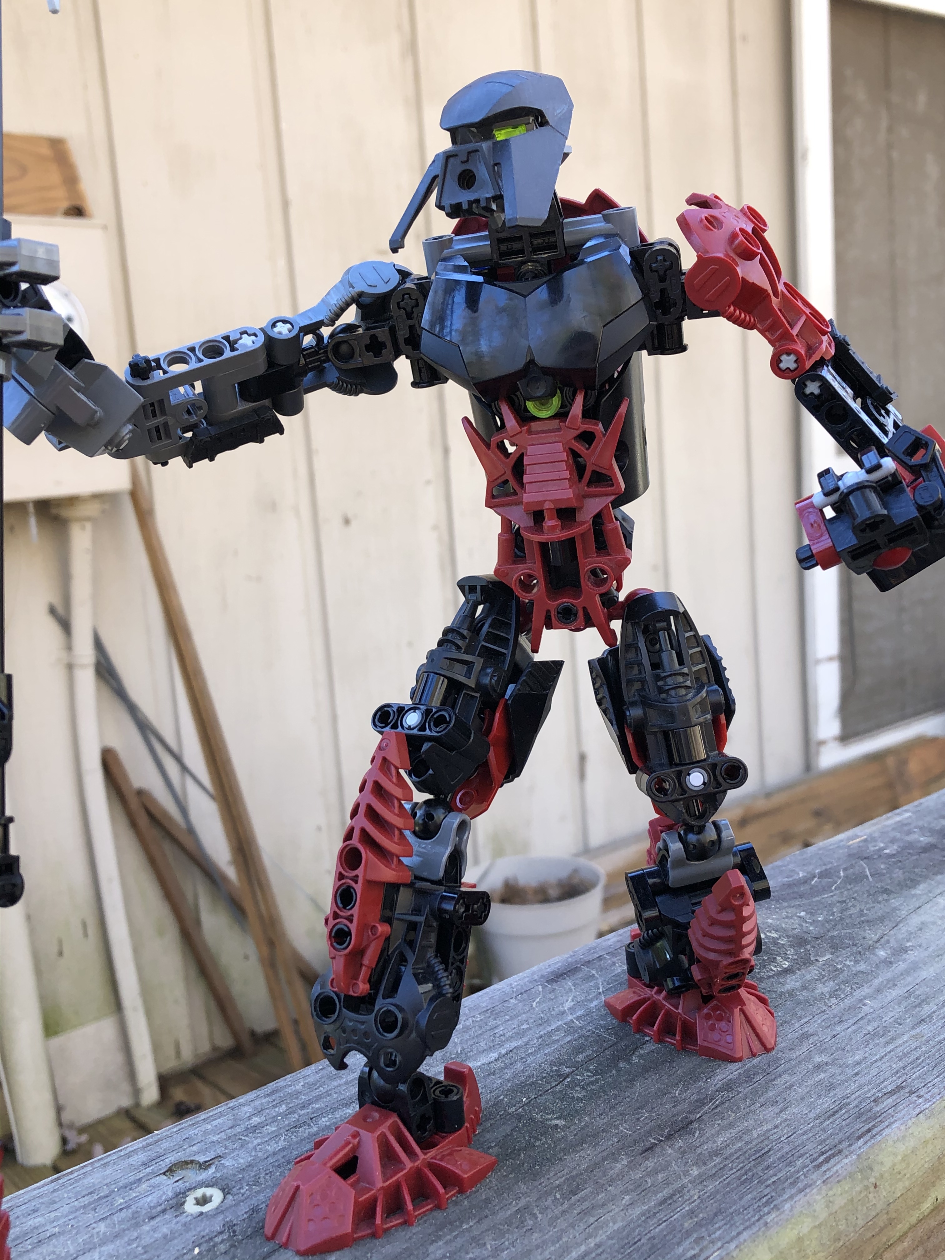
The chest armor throws the textures off a lot to me, and I feel like some of the general technic units could be cleaned up, but overall this looks pretty good to me, definitely better than anything I could do.
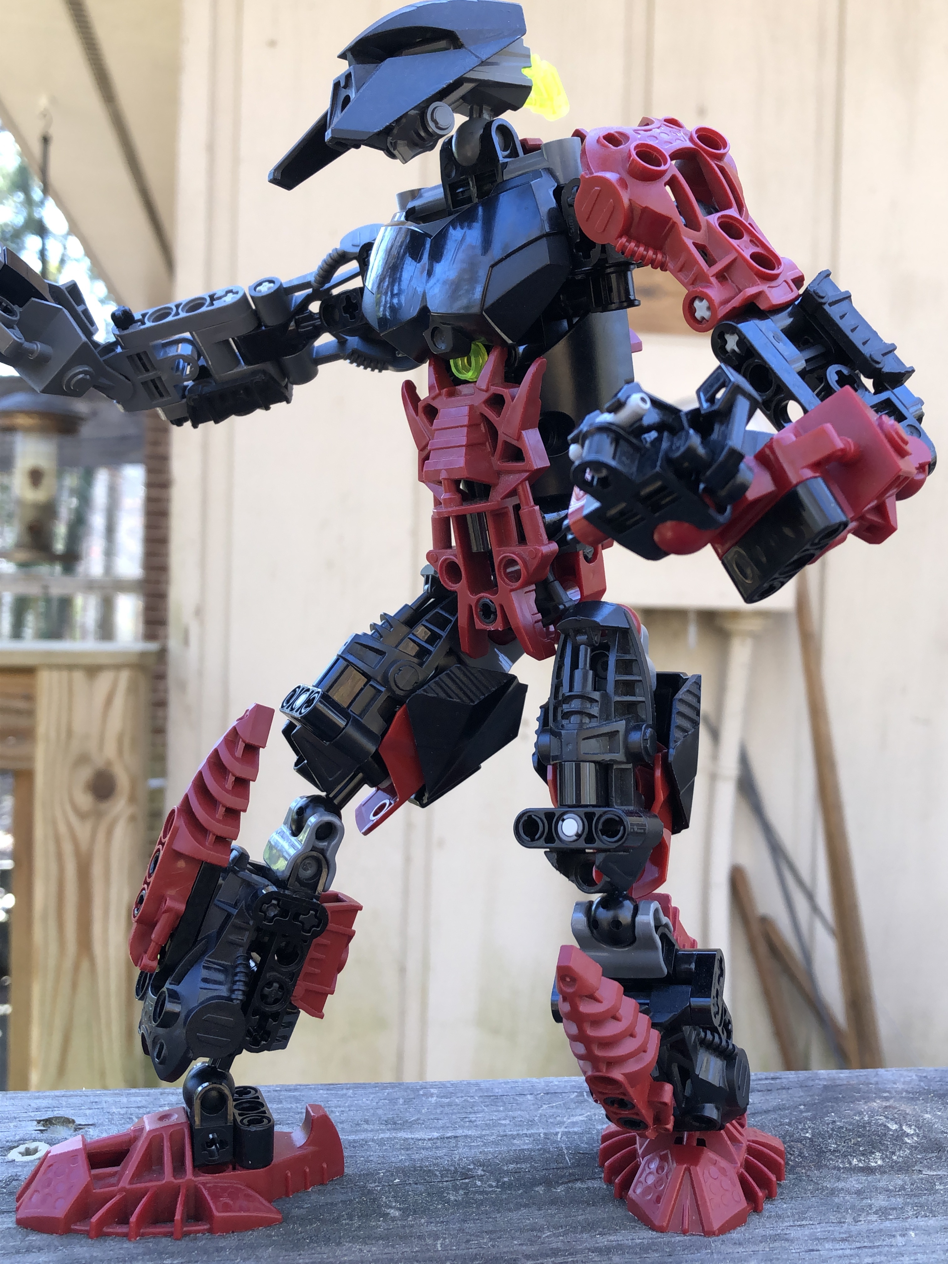
One other not, maybe try moving the fingers to the other side of the hand connector? I’ve always felt that having them on the inside makes them look gangly and unwieldy.
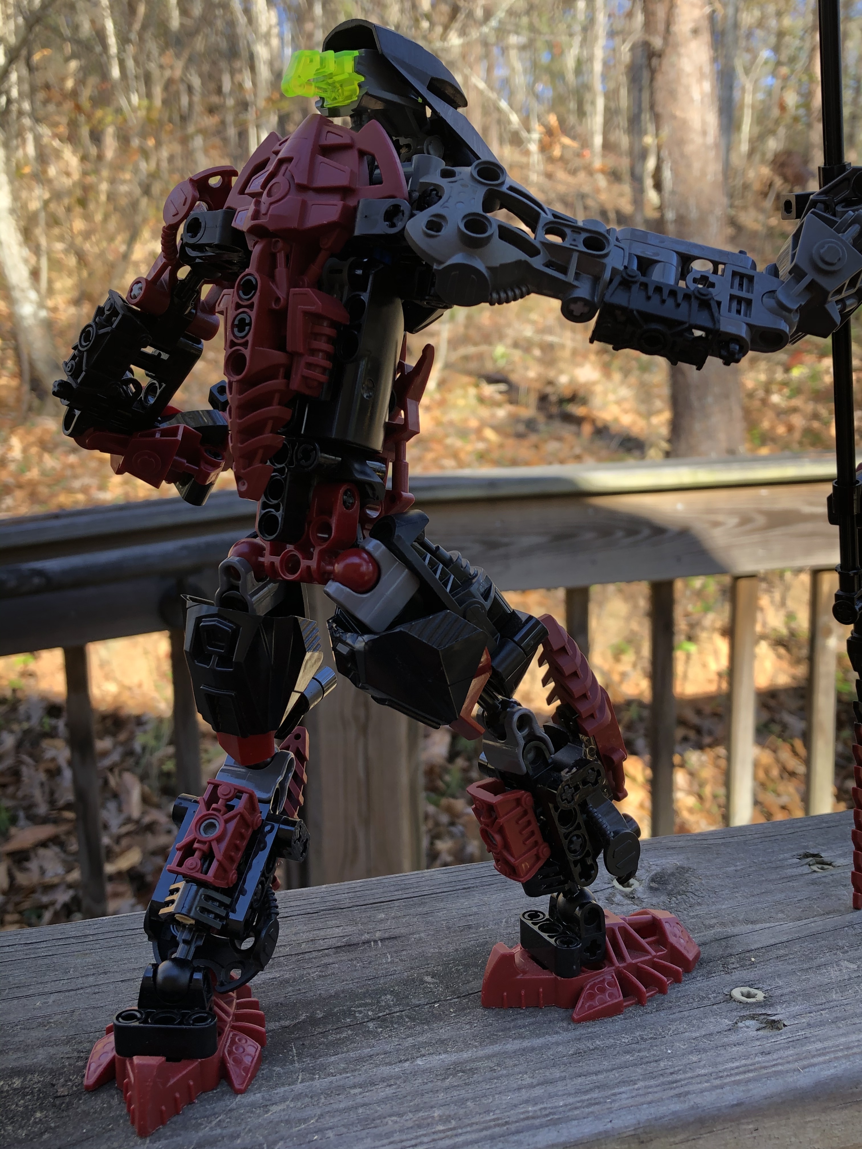
edit: also, what lead to the decision to build the shoulders with the socket on the torso? That restricts mobility by quite a lot, and as far as I can tell it wouldn’t be too difficult to switch it up. That would have the added bonus of allowing you to shorten the upper arms, which seem a bit too long to me.
Thanks for your comments! I do agree as far as the chest, I have yet to figure out another option, but I would like to.
I did think about moving the fingers, but I think it looks good either way normally, so I haven’t moved them.
No real reason, but that is something I’m going to change next time; I don’t like the mobility restrictions.
I have to echo what @Winger said, The chest plate does kinda clash with the rest of the build and I feel as if the arms are a little too long. But other than that it looks really good
I feel like this MOC is really close to being very good. I like the color scheme, and the mask choice is great. From what I can tell, the core of the torso build seems to work, but I’m not a huge fan of the armor choices, especially the front. I think shortening his upper arms a little would be both very viable, and help the look. His legs also have a problem being gappy at the joint. Personally, I’m not a fan of A symmetry with colors, but that is very subjective.
Thanks, I didn’t see the arms as too long, but now I can’t un-see it. @Krelikan can you clarify about the legs? I don’t see what you’re saying, and I want this to be as good as possible eventually.
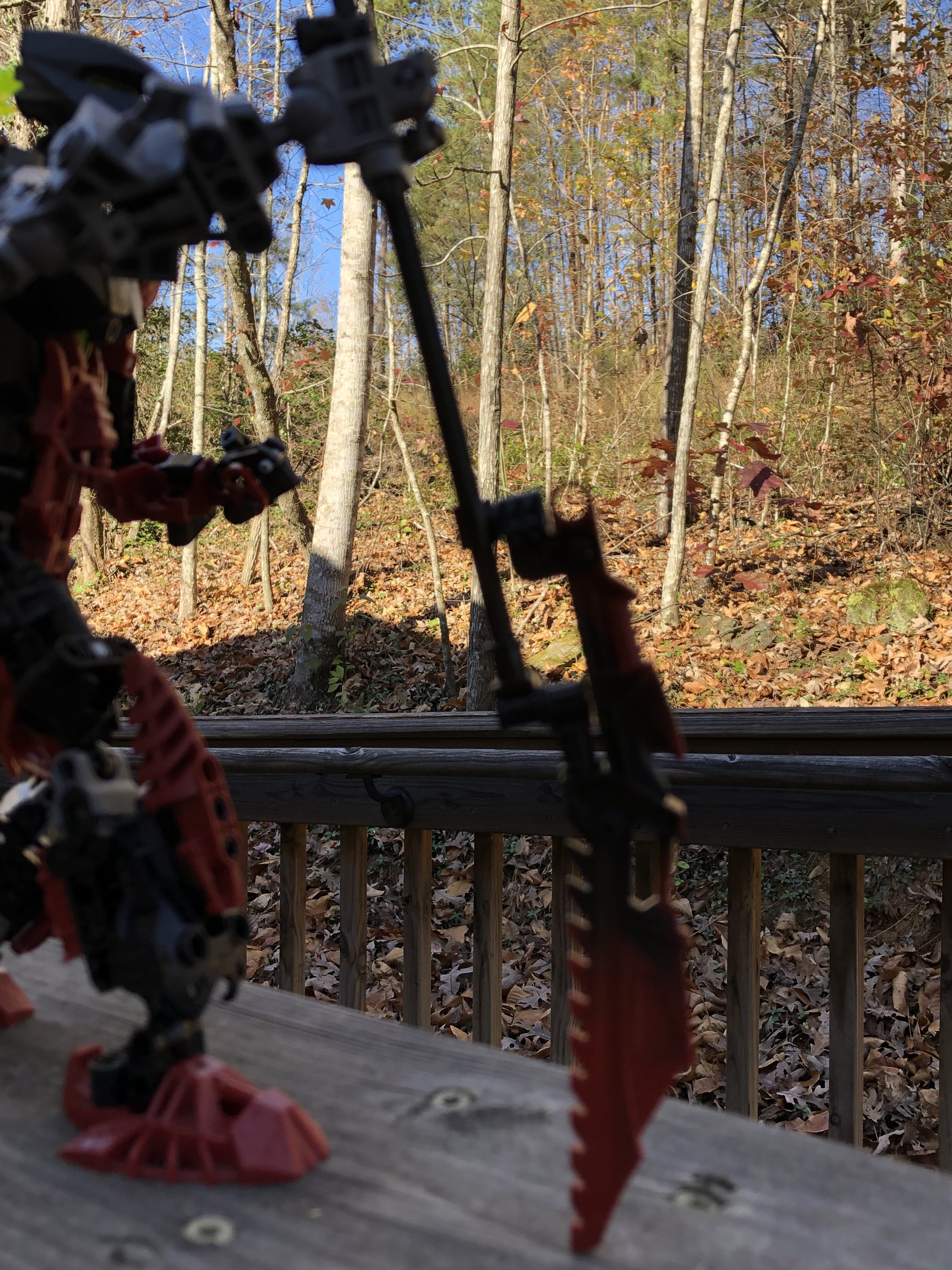
Take a look at the second picture. Where the knee is, there isn’t anything covering it from the sides, or coming off the front armor. No matter how you position the legs, from the side, you will always be able to see through it.
Ohhh me likey, (probably ‘cause it’s on my level of building), my complaints are the upper arms, they need a little bit of thickening and the gap between the two leg sections, and one question, did you paint the mask or was it bought?
This is a brilliant MOC! I really like how you blended CCBS with classic Bionicle pieces. The torso and leg constructions look particularly interesting. Great colour scheme too.
I’m curious whether you could incorporate small black CCBS shells on the sides of the arms. That might be cool so the arm texture could be more similar to the chest.