Photez, guardian of the cosmos (self moc)

Photez is back for her 33rd iteration! Am I far too indecisive about what she should look like? Yeah, probably.

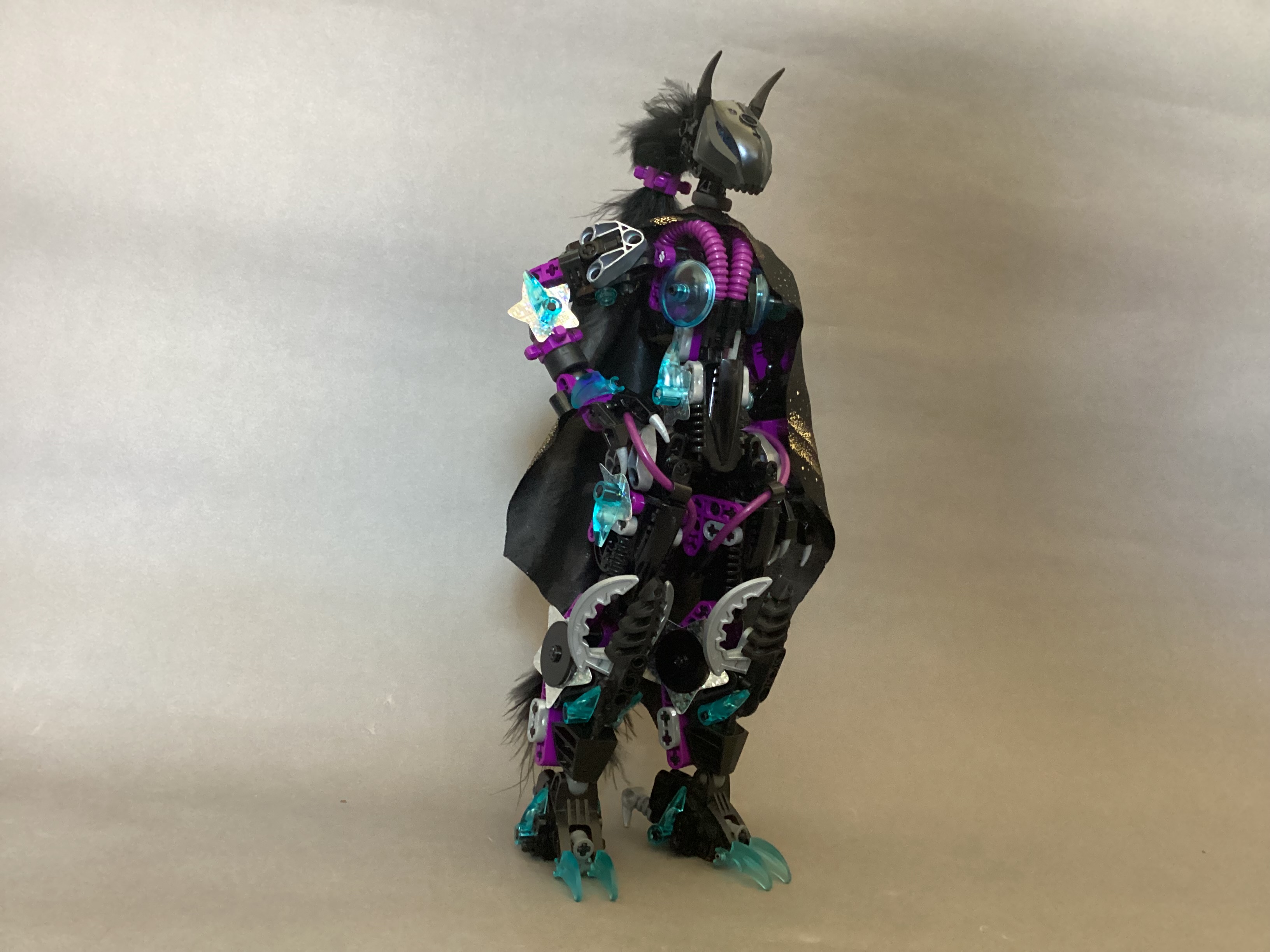
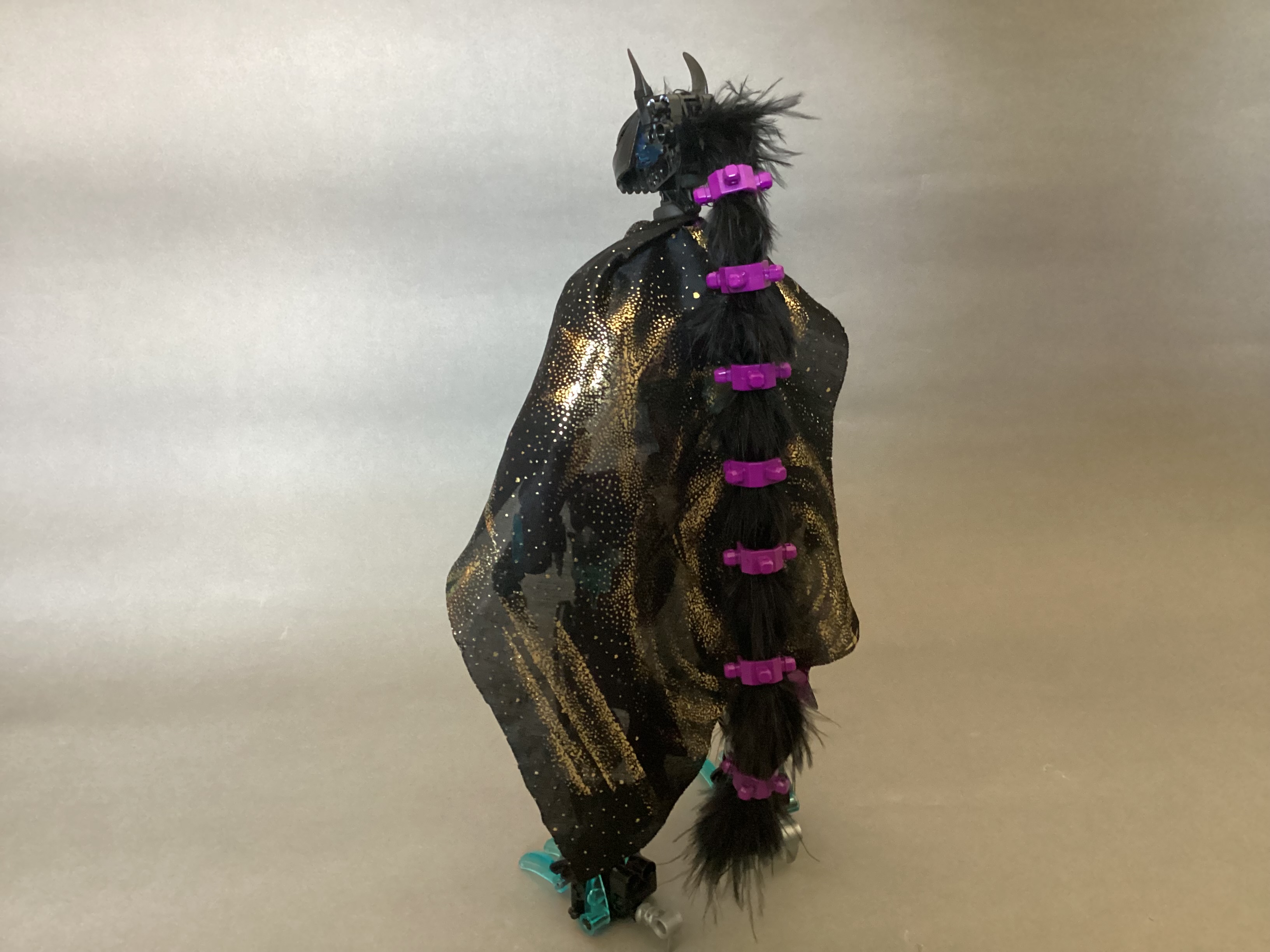
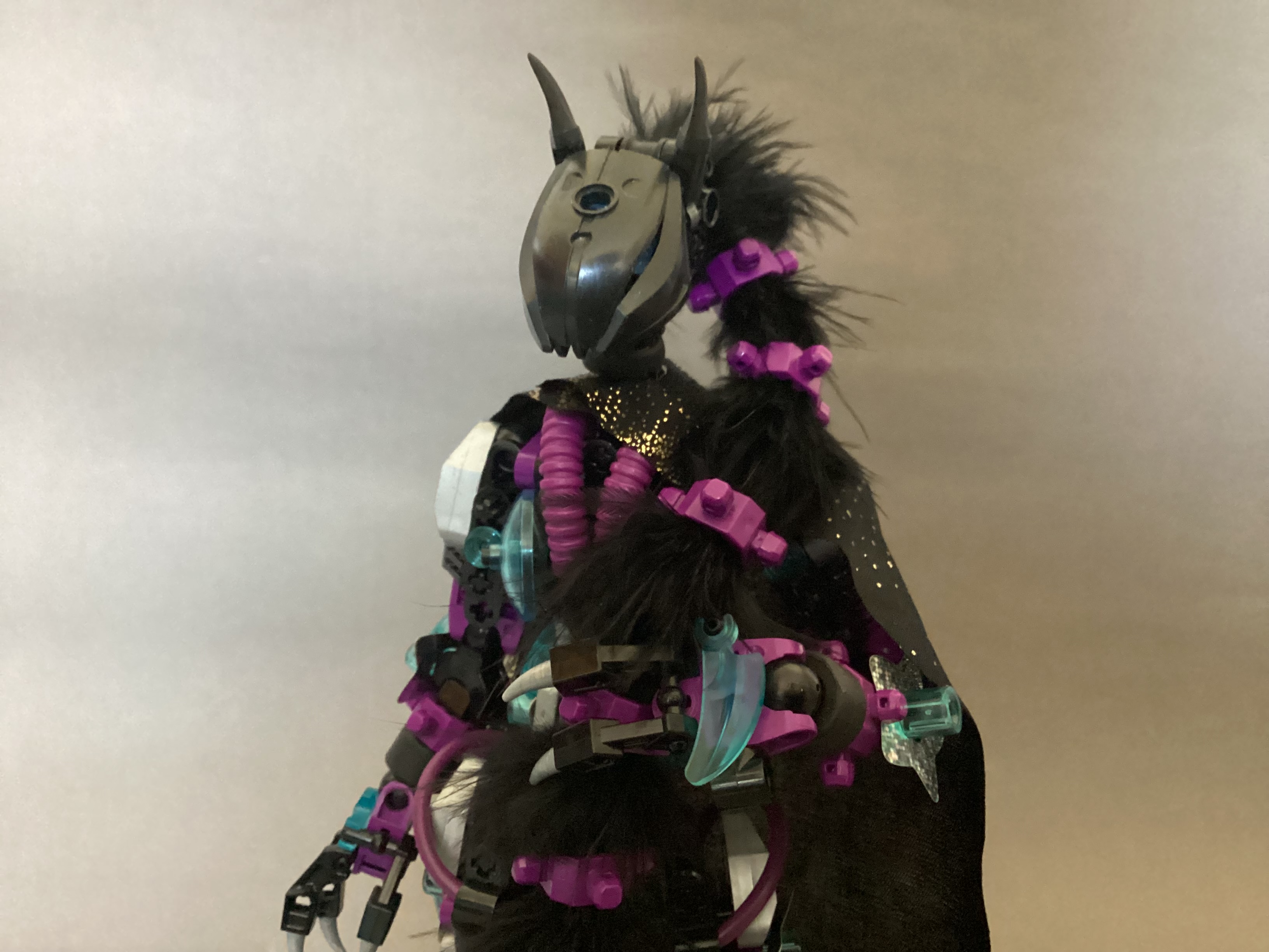
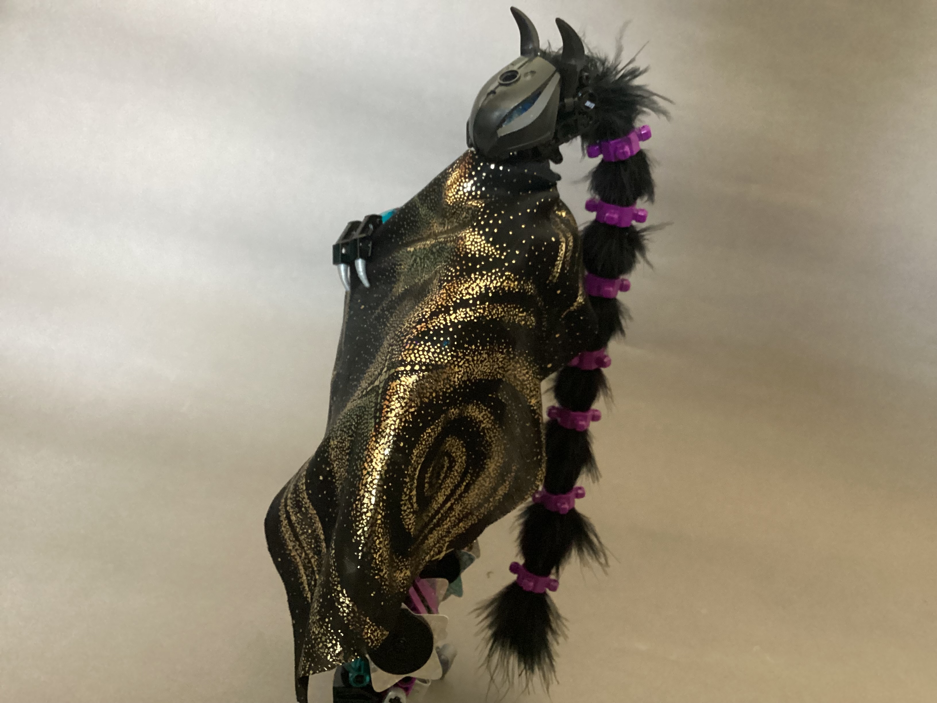
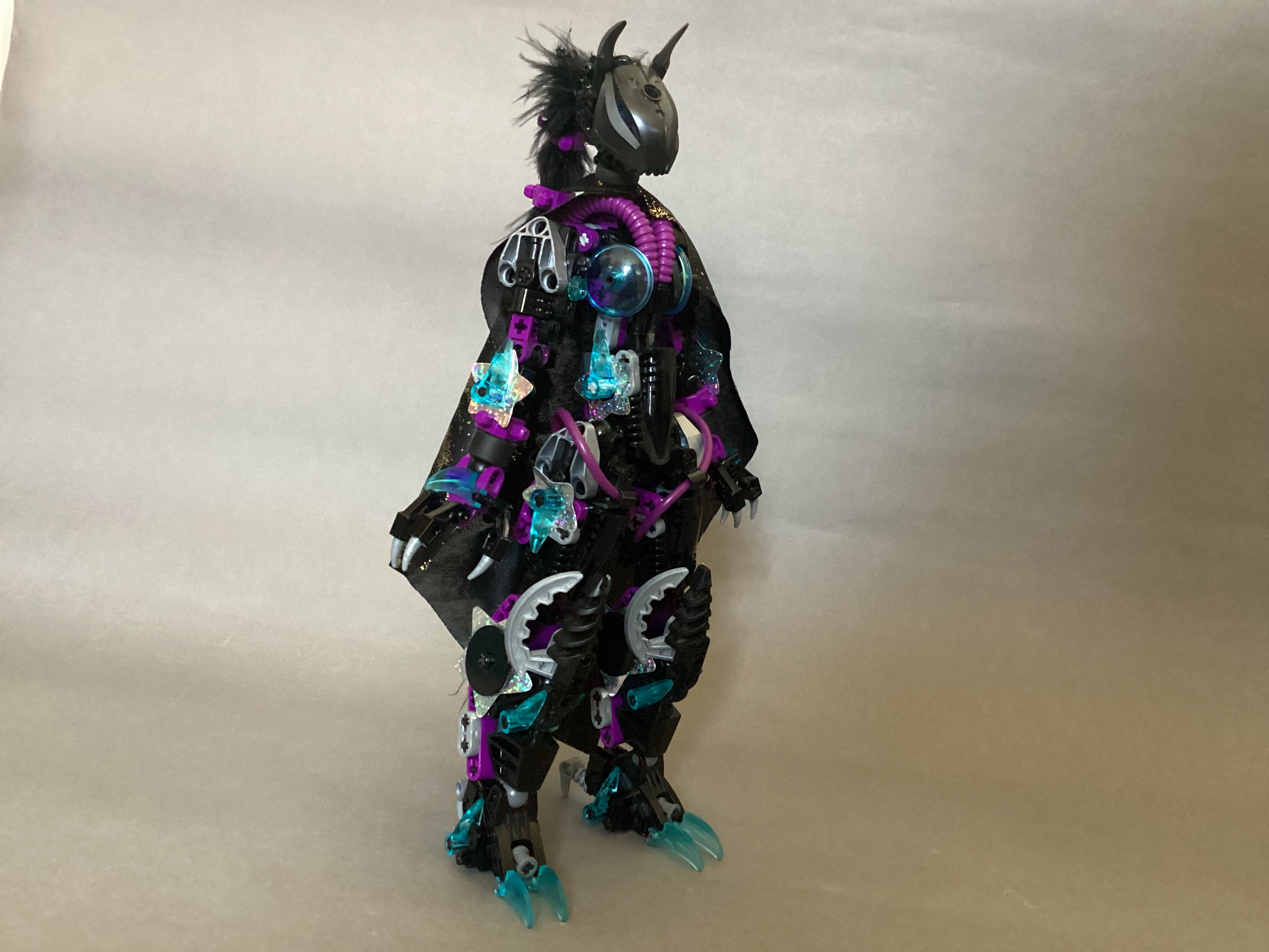
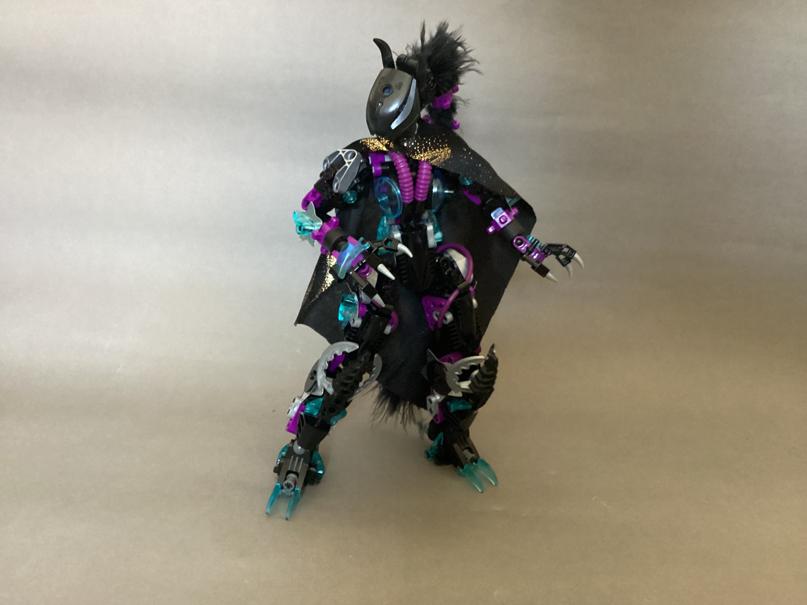
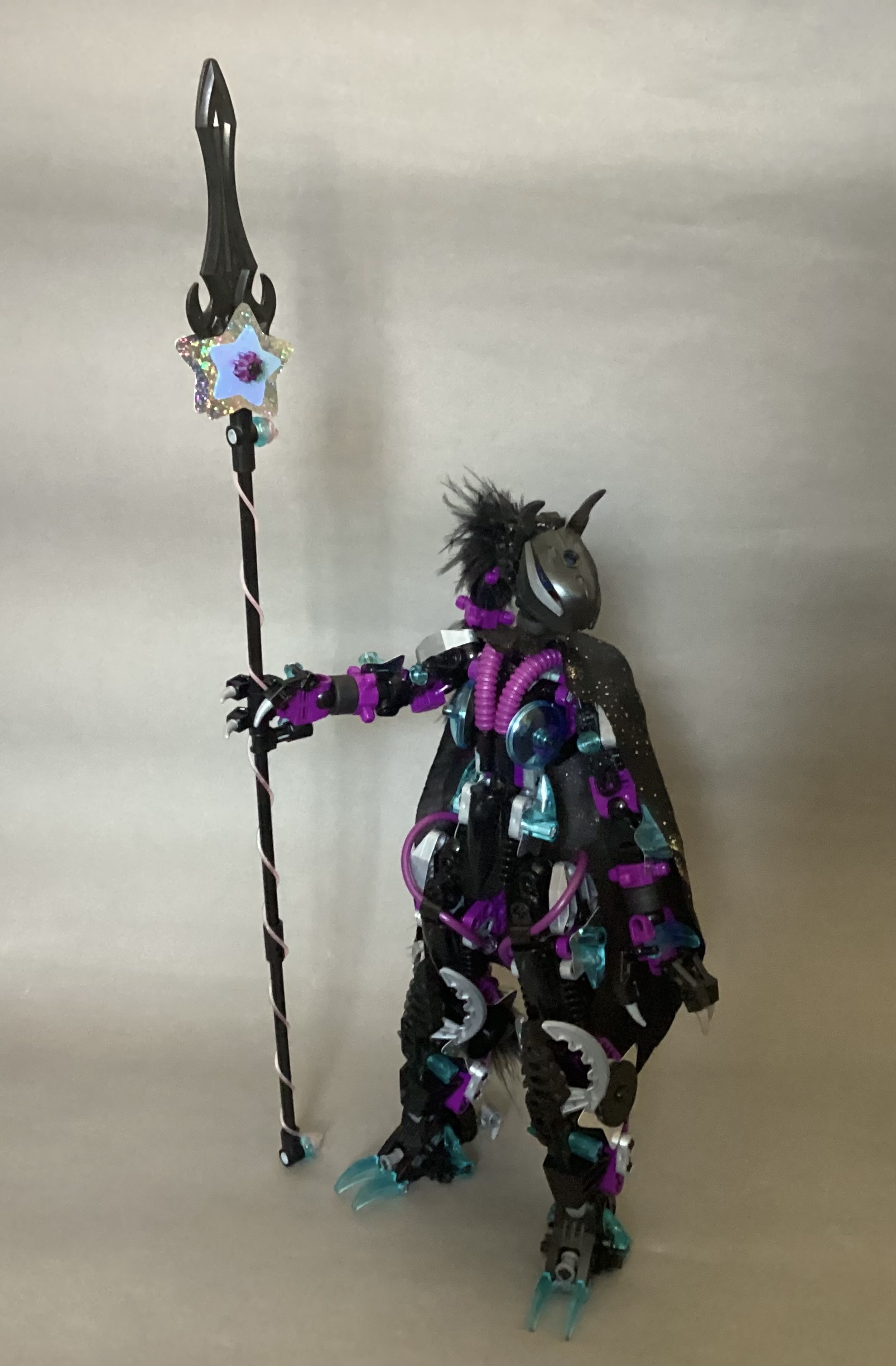
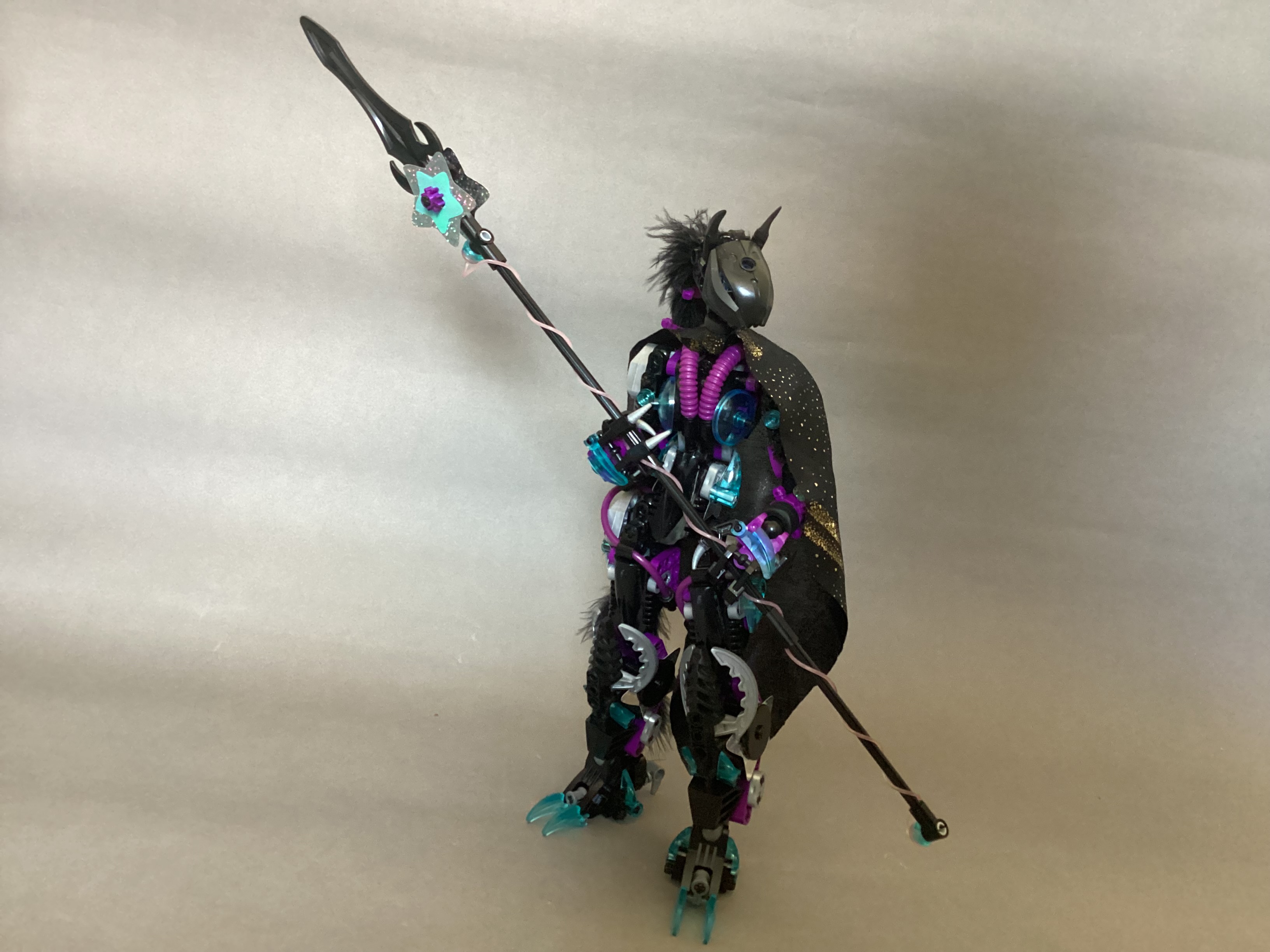
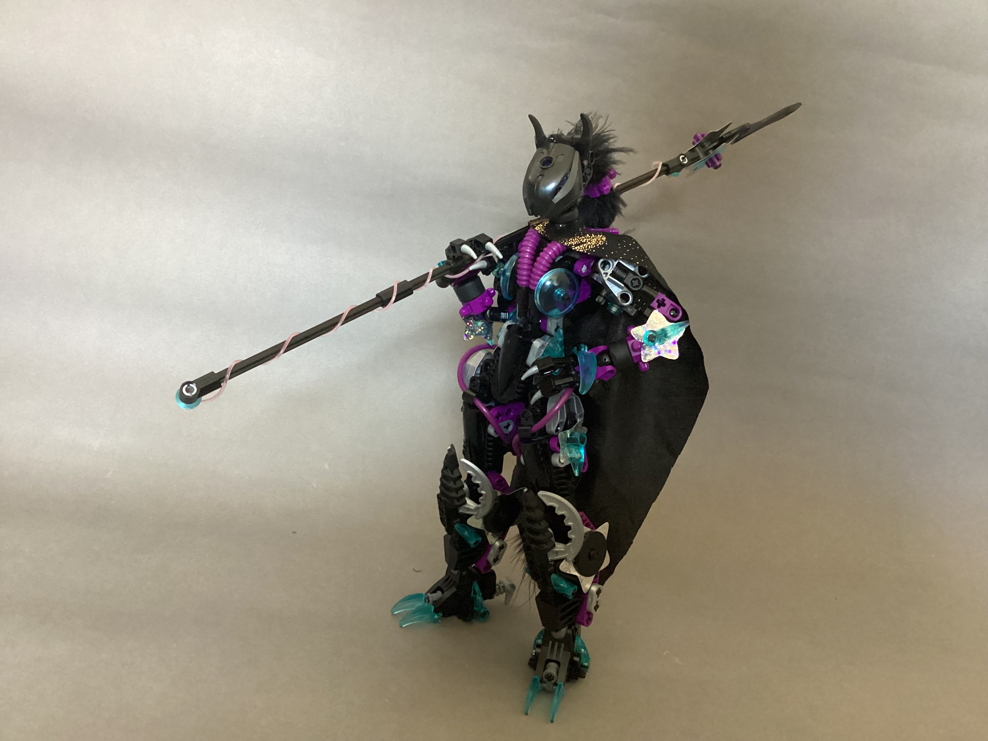
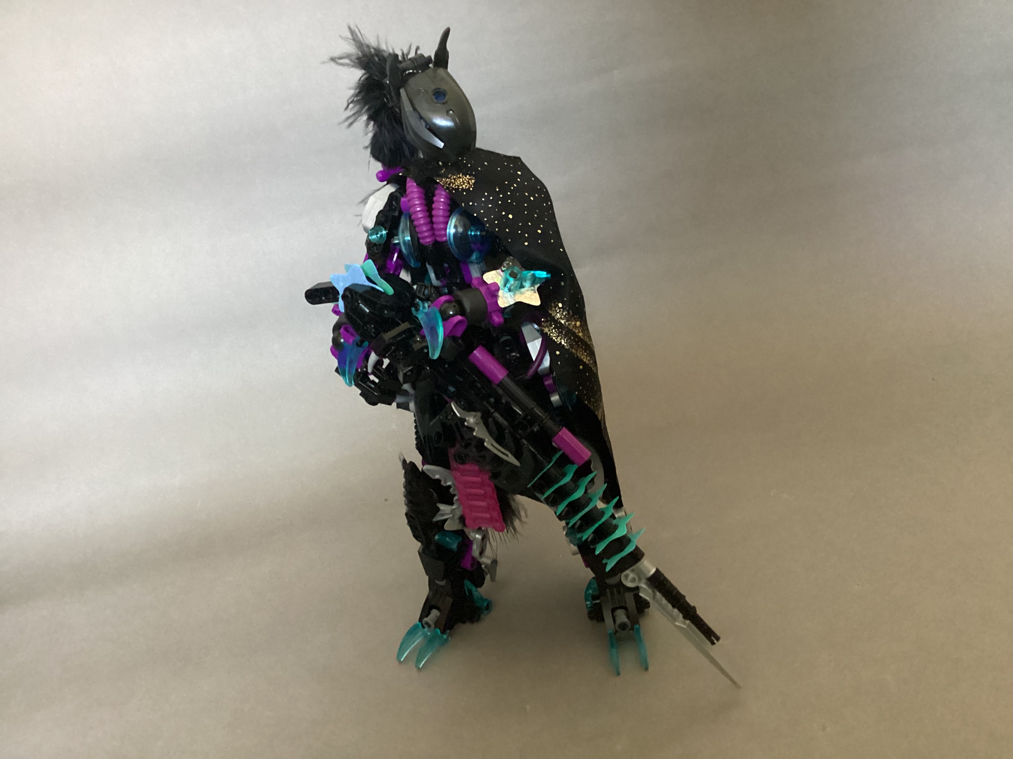
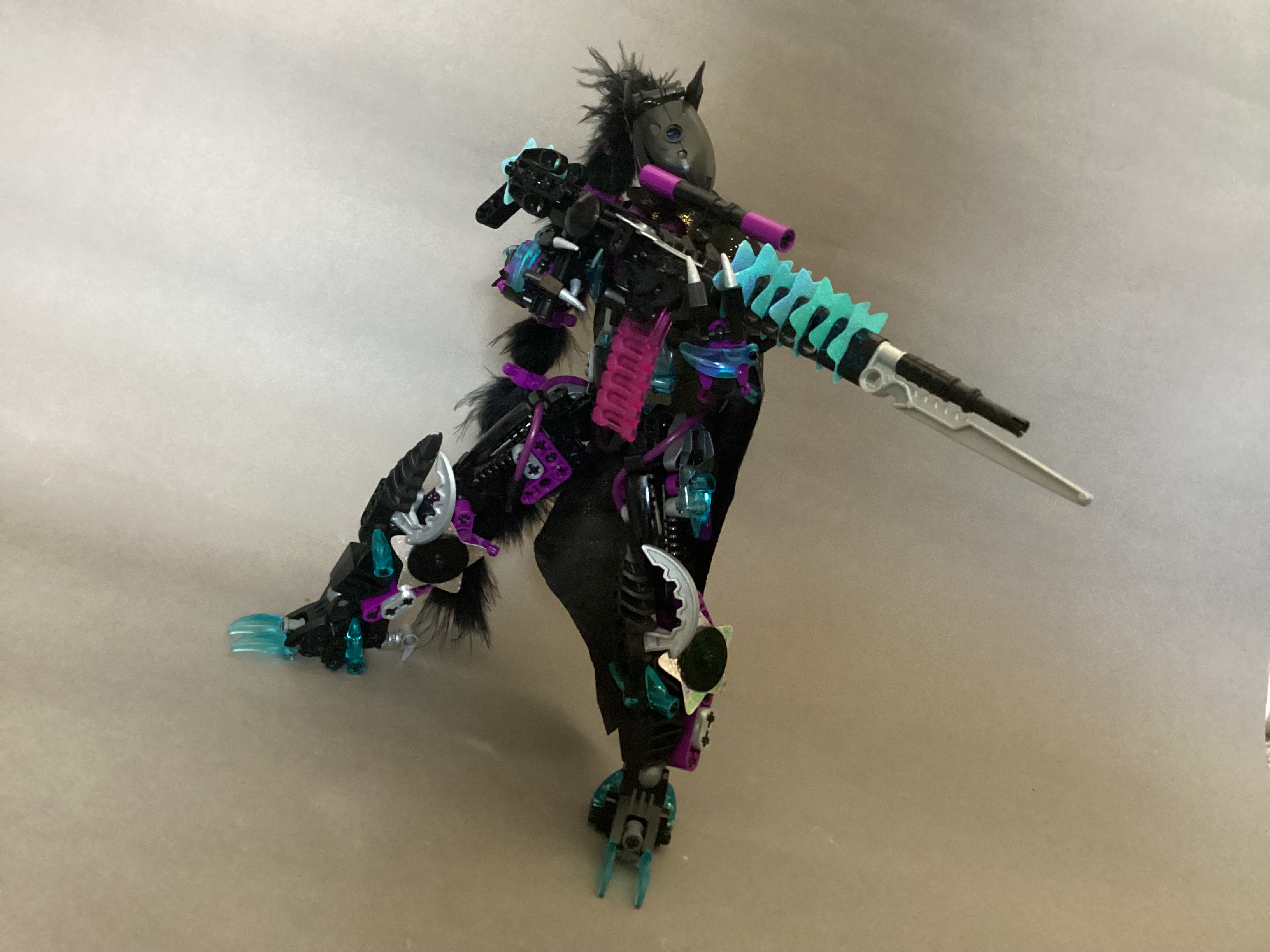
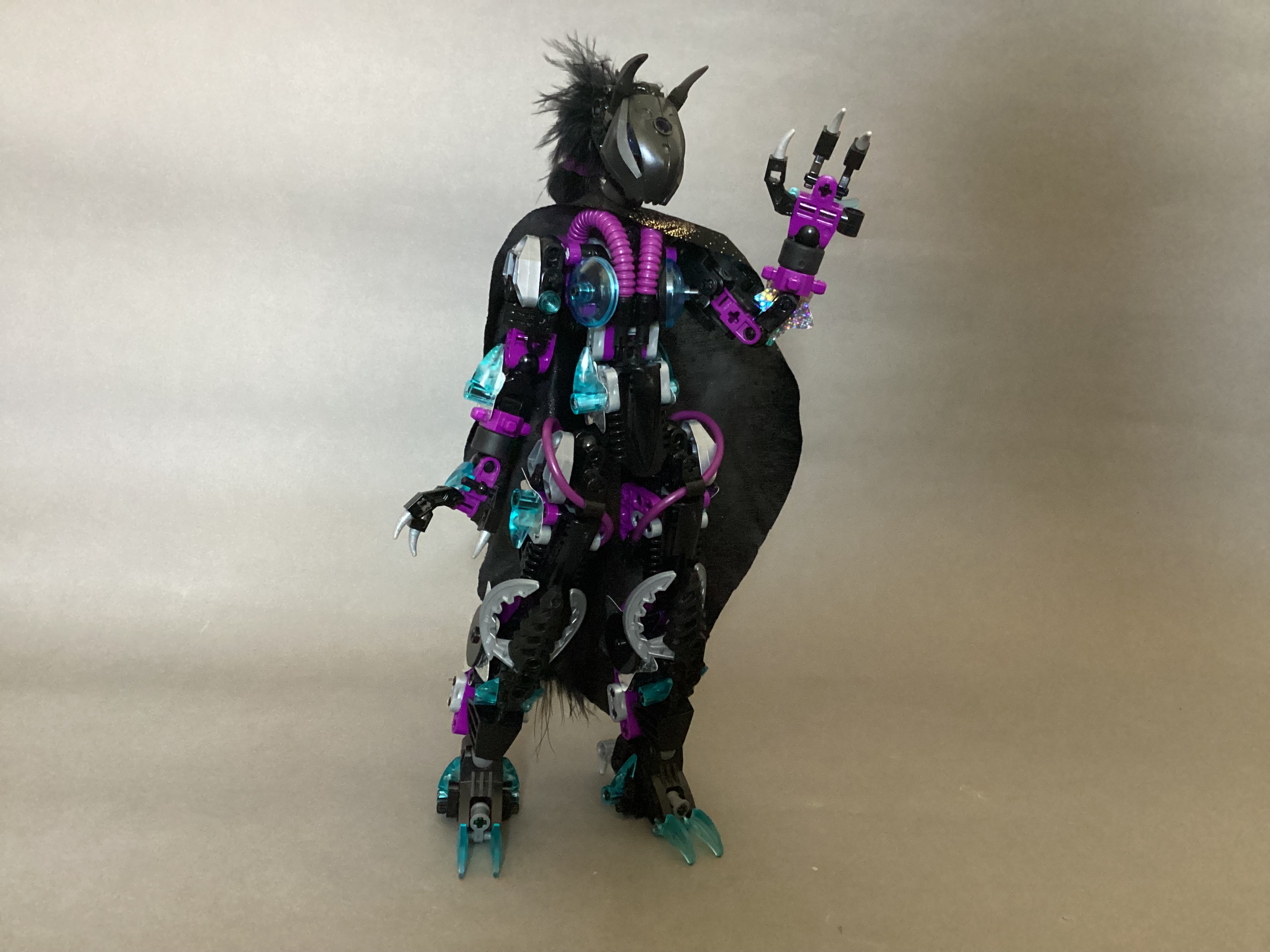
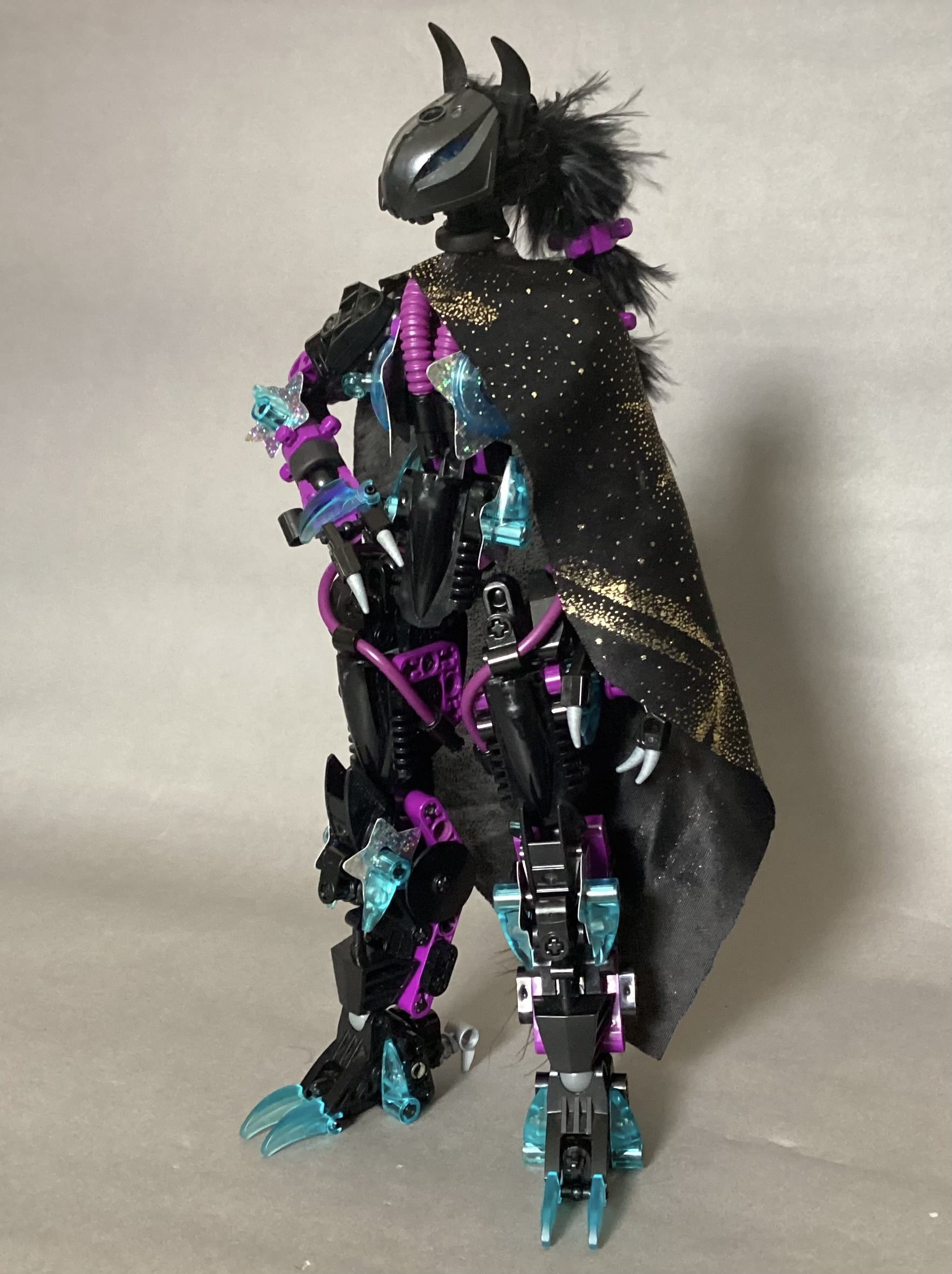
Photez has gone through some major changes since her last version and is now sporting another new colour scheme and some brand new equipment. First of all, she now has a couple of custom-made bits, most notably her hair:

It’s kept in place by a bunch of Znap connectors and is extremely flexible.

Her Astral Cloak is another custom piece. She can use it to deflect any oncoming attacks.

Photez’s body is also now covered in reflective solar panels, which she can absorb energy with and then fire said energy back at opponents.

Her first new weapon is the Lunar Sceptre:

Her other new weapon is the Starburst Rifle:

Well, I hope you enjoyed Photez’s new look. This may be the first time that I actually keep her built the way she is for a while since I’m so proud of her new design.

Bye for now!

oh yeah also Photez is female now, deal with it

26 Likes

very nice

photez has really gone through a lot of changes recently, which are all for the best. The new color scheme works a lot better, and I love the use of unconventional parts (especially the clikits stars and watch chains). keep up the good work!

8 Likes

Photez the Space Wizard Warrior is dope

5 Likes

This is quite nice! Love the use of Clikits parts.

4 Likes

this looks absolutely beautiful, i love the colors and that torso is great (also the cape is a fun addition!)

5 Likes

I see that you have kept taking my advice.

The black, purple, and silver coloration makes the introduction of trans light blue pop really well. Not much to comment on the custom bits, but I don’t see the “reflective solar panels” as a visible design element. I’m guessing that’s what the star pieces represent, but I think I initially dismissed those because of the existing silver bits. Not to keep getting you to reduce your color selection, but having the silver just on those bits would draw more attention to them.

Don’t awkwardly stick conical pieces on her previous chest design and then we’ll talk.

7 Likes

The clikits and colour combinations make her look all the more stylish, great moc

based™

8 Likes

oh no

that was completely unintentional, it’s been a part of the design since V30 I think but I hadn’t noticed what it looked like until you pointed it out right now

4 Likes

What’s the issue here?

3 Likes

I think it looks more pectoral than anything. Too unpronounced to be overt

4 Likes

One of the best rifle designs I’ve seen in a while

8 Likes

She looks really good. The cape and Clikits parts look really nice. Though I feel like the hair is a bit too fluffy, but it looks cooler than the spine hair. Also love the colours.
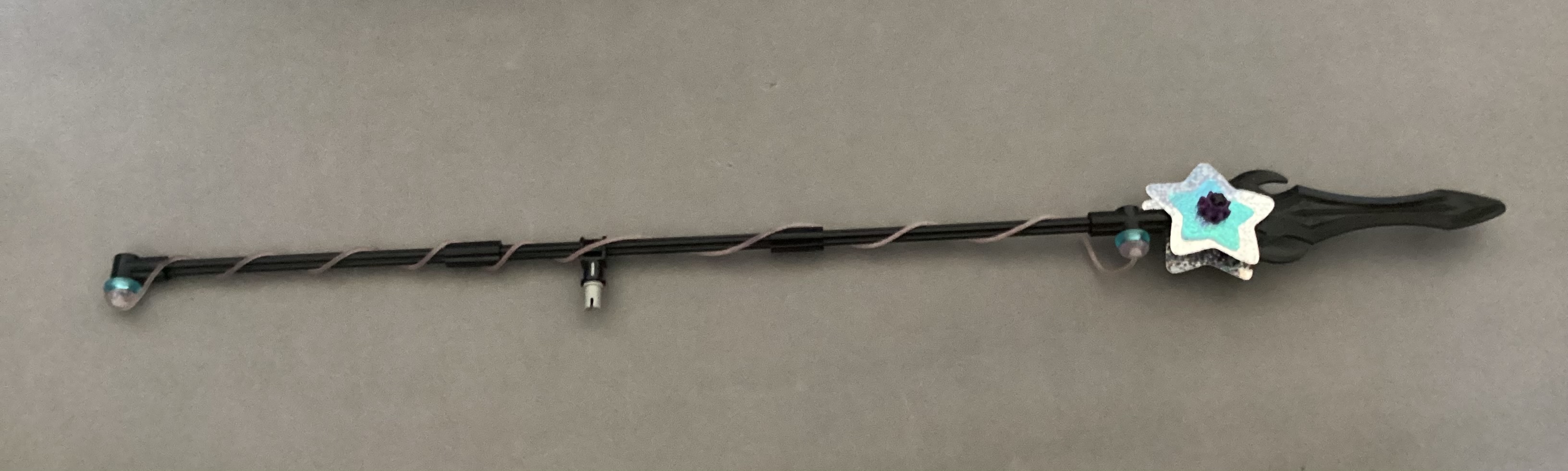
The weapons are pretty nice too.

5 Likes

@Hawkflight

I took your advice and removed all the silver but I can’t tell whether it looks better or worse

What do you think

11 Likes

I may be Team Silver. The smattering of metallic coloring compliments the starfield aesthetic imo

8 Likes

I think it looks more coherent that way, regardless of making the star panels pop out more. I’d keep it that way

8 Likes

I think I agree, she just looks too bland without the splashes of silver

I’ll be reverting to the silver version but I may rework the positioning of the clikits stars

7 Likes

i think a mix of both could be my preference, perhaps tuning down the silver could look good?

3 Likes

Ah, I see she’s going for the Wyldstyle color scheme, always a wonderful choice.

6 Likes