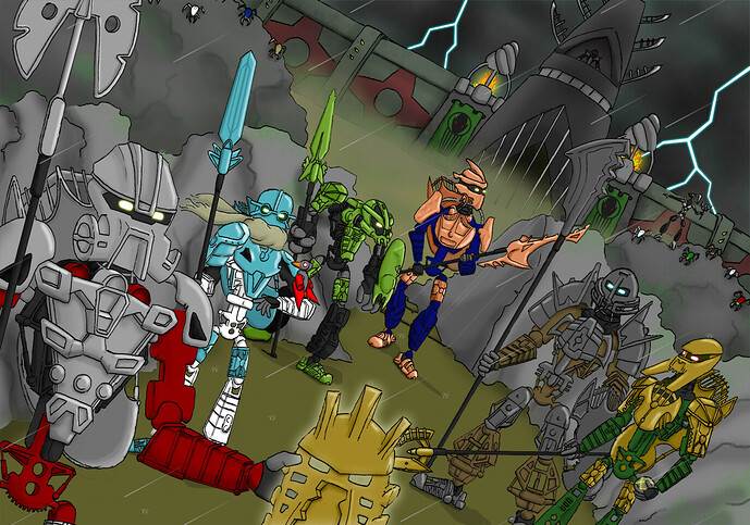
Rebellion of Destiny (Bionicle Canon Contest #3: Honor Guard, Part 2)

Hello,

Here is my entry for the Bionicle Canon Contest #3: Honor Guard, Part 2.

So, a little context and explanation to my entry:

Overall, I wanted to depict the Toa Hagah in the scene that defined their entire further lives and the lives of everyone in the Matoran Universe. As soon as I heard this contest was going to be a group shot, I’ve had this idea in my head. I’m really happy with how it came together. I also really found it important that everything pictured here is from existing canon, from the Makuta fortress to even the Rahi bird.
For their metallic colors I tried the 1/1/1/1/1/1 and 3/3 distributions, but eventually the 2/2/2 distribution turned out to be visually the nicest in my opinion. Because of this 2/2/2 distribution, I also tried to do this for the speartips and for the masks, to really bring the team together.

Norik and Iruini don’t need much explanation.

Kualus:
I really liked the model and I loved the idea of giving him a little Rahi bird. I tried all kinds of metallic colors. Gunmetal didn’t really fit for me personally, and gold made him look like a Toa of light. The metallic blue from the MOC was the nicest, so I kept it.

Bomonga:
I love the chunky build, I liked to colors, so I really didn’t change anything about him either. Mask stayed the same Faxon variant by Galva (Heroes of The Lost [MASK PACK #5] by Galva - Thingiverse)

Gaaki:
I really liked the build of this MOC, I loved how the legs, the shoulders armor, the tubes and even the speartip really gave off a water-vibe, so I kept those. The mask I changed into one of my own design, that I also used for my original entry. I did this because this mask really fits Gaaki for me. A picture of this is below.

Pouks:
I was in love with the knight-like appearance of the MOC and because the mask and speartip were allowed to be changed, I gave him the most knight-like mask I know: the Kanohi Arthron. I used the one from Galva (Heroes of The Lost [MASK PACK #5] by Galva - Thingiverse) to make him fit nicely with Bomonga. The speartip was changed to one of Takadox’ tools, so he fits with Gaaki (both have 2007 speartips). I also changed his metallic color to metallic blue, because of two reasons. One, I think metallic blue looks really nice on a Toa of stone. Second, I went for the 2/2/2 distribution, and didn’t like the “dirty snow” feeling that a gunmetal Kualus gave me.

I am really happy with how this drawing turned out and I hope you like it too!

Gaaki’s mask:

-LtoF-
30 Likes

Despite the fact that I want a 3-3 gold silver split, yours really makes the blue look a lot better. :wink:

3 Likes

Blouks for the win. Pretty neat artwork.

3 Likes

This is the exact color distribution that I wanted to see! Also, I like how the Kanohi Arthron looks next to Pouks’ shoulder armor.

1 Like

The fish-like mask really fits with the general aquatic vibe of the moc. Great job.

1 Like

I like that you brought your old mask back for Gaaki

1 Like

Gaaki’s mask is lovely. Plus it’s always nice to see Blouks. Very nice art, good luck!

1 Like

Things I like:

Little Roodaka.
Ambiguous Bomonga limbs.
Kualus Rahi
Pouks finally has a good spear tip.
Thunderthighs.
Iruini looks mettalic green.

Things I dislike

Gaaki’s mask looks kinda goofy. Too fishy for me.
Blue Pouks.

2 Likes

I mean, you changed Iruini’s color.

1 Like

I think it’s just a greenish gold, it looks like the same colour as the Avohkii.

It’s a significant enough difference to FDG that it has to be intentional, and i cannot for the life of me understand why you would choose that color for gold. It’s… hardly even yellow. It looks like pea soup.

3 Likes

Thanks for all the comments, I’m glad many of you like it!

@vootcaboot
It is indeed just gold. He is the exact same gold as the Avohkii and Bomonga in this drawing. I think it’s to do with the lighting I chose for this scene. Thanks for the feedback.
EDIT: I also noticed for some reason it looks a lot more golden on my pc screen than when I load this page on my phone. Strange difference.

1 Like

I really like pouks having a arthron, the shaping work really well with his shoulders, I don’t like that kualas’s spear is very blank, maybe a line going up through the middle would change that? But other all very good!

3 Likes

Gaaki’s mask feel a bit… too fish-like for me, but it’s not a deal-breaker. Everything else I really like here! The Arthron suits Pouks well and I like the use of the existing Makuta Fortress design.

4 Likes

Gaaki’s and Kualus’ masks look too much alike

3 Likes

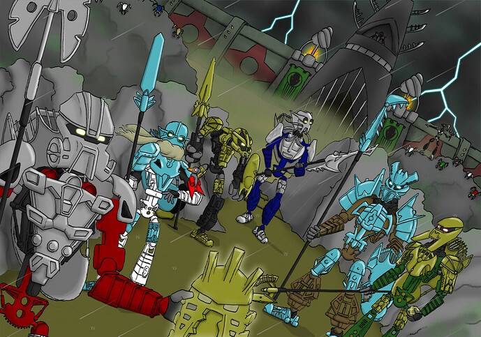
As a celebration for the end of the Toa Hagah contest, I wanted to redo my entry, and I wanted to share it with you guys on here.
It wasn’t much of a redo, mostly recolors and changing some things people had suggested, but hey, I really felt like doing it anyway.
I really like SpectreL’s winning entry, it really makes the Toa Hagah pop!

-LtoF-

6 Likes