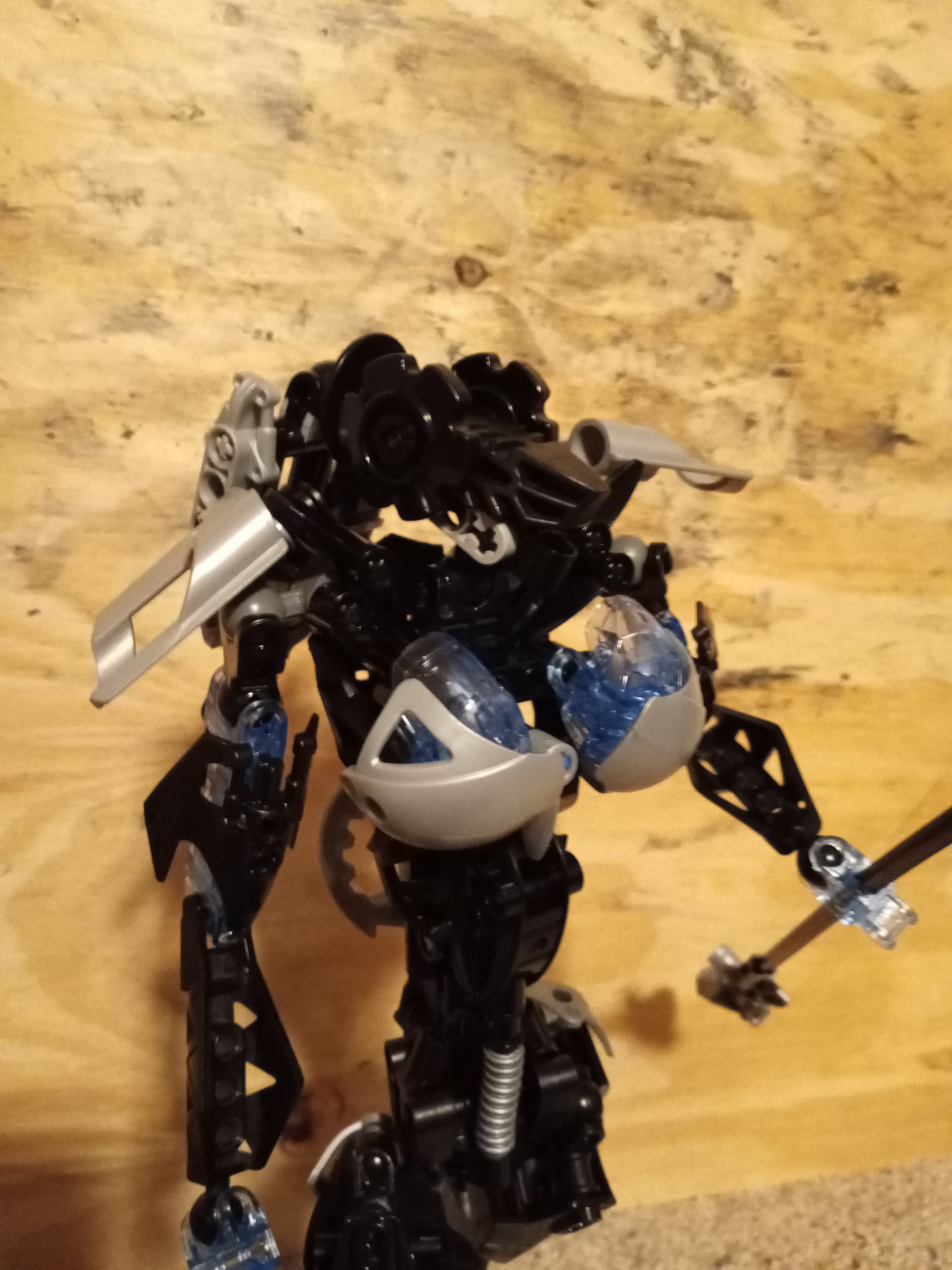
Here’s my revamp of everyone’s favorite Vortixx! I had this build lying around half-finished for months and finally got around to completing it. It’s a bit rough around the edges on account of me really wanting to just finish it rather than fiddle around with all the minute details, but I think it came out pretty well overall.
After the torso, the thighs were the most challenging portion to build. I gave her a staff just to try something new (and also to avoid the headache of revamping the Catcher Claws and attaching a Rhotuka launcher), and the hair was inspired by another (admittedly sleeker) Roodaka version here on the boards. The black life counters on her head are… Princess Leia buns, I guess…?
idk I’m more a fan of the dude that Roodaka abandoned to die on The Mountain.
I feel like I should address the, um, focal points first. They’re a part of her design, so I’m not going to argue with their existence like I did on the MOC the design came from. They do feel a bit high up, and also a little too round, and they doesn’t feel as integrated into the torso as you had planned. The latter could be partially fixed with better coloration - if it was silver armor all the way down the abdomen, it would indeed look like corset armor; as it is it looks like she’s just wearing a bikini top.
I’m not super familiar with the rest of Roodaka to know what all changed, but looking at the big picture the breast armor still stands out in a bad way, as nothing else bar her butt uses large silver pieces. Going off the silver corset idea, I’d like to see the black hero factory panels in silver as well, and some black pieces on the inside, to further the illusion that the smooth silver pieces are armor , but that her armor shows a bit more “skin” than average. Perhaps a bit more silver on the torso would also help the hairstyle you gave her stand out more as well.
Lastly, I do like the trans medium-blue highlights, it’s one of my favorite LEGO colors.
This feedback is so reasonable and well thought out for a MOC like this that I want to actually implement it. Thanks a bunch, Hawkflight! If I may ask a few clarifying questions:
Yes, yes, and yes–reducing their visual prominence is definitely a good idea for to highlight the rest of the MOC. Does that entail making them smaller (which I’m not averse to–really they’re not stable at all as is…)?
Also a good idea, and admittedly I didn’t even think of that. The original had coloring that looked like a bikini top, but I think I’d rather try for the corset.
Speaking of which–would more silver make the butt better integrated, or should I drop that too?
I’ve been doing this for a long time. Thanks for listening to it.
I think there are ways to use the existing design, primarily by rebuilding the torso so that they’re recessed into the torso design a little bit, rather than attached on top of an otherwise gender-agnostic torso design. You could definitely experiment with other designs, especially with what works with the corset idea.
I think all of my critique was meant to work as well as it could with what you already added. I think you could make the butt work with those, and adding more silver around the thighs would make them stand out less while still giving you the recognizable shaping. But personally, I think taking those off and going fully black for the thighs, combined with a silver corset and silver high heeled boots, would be even better for the type of character she is.
Well, Hawkflight is pretty much the guy when it comes to fair MOC criticism on this site. Thanks to him many MOCs here have become better than they would normally be, and that includes some of mine
So, I agree with everything Hawkflight has said about this MOC, but I still have some criticisms and suggestions of my own to give, so here we go
Not to repeat what has already been said, I’m primarily going to focus on the proportions of everyone’s favourite vortixx. Generally, the accentuated um… bits only work well on MOCs that have more “realistic” human-esque proportions, while looking tacked on and out of place combined with your standard bionicle body shape, which I think is what’s happening here. So I suggest you to focus on making her shaping more in line with what is generally associated with a stereotypical women’s figure. I’m mostly talking about the torso. That includes not only moving the chest lower and integrating it into the torso better as suggested by Hawkflight, but also moving the shoulders lower and making them narrower, reducing the overall size of the upper torso (that should give you enough space to give her a proper neck, because right now the head sits kinda awkwardly low on her shoulders), and adding more mass to the sides of the lower torso to make that transition from the big hips to the waist smoother and more natural. Making the upper arms less bulky would probably help with the shaping as well
I’d also try giving her proper fingers because her current hand design looks way too small for the body. Maybe something like Hydraxon’s hand design would work idk
My favourite thing about this design is probably the addition of trans-medium-blue highlights to the colour scheme. It’s something I’ve never seen on a roodaka before, so it would be cool if you found a way to add more of those to the lower body
Here’s a quick low quality edit of one of the pictures to illustrate my ideas better, because I’m much better with photoshop than with words lol
I threw some of Hawkflight’s ideas in here as well, including the silver corset thingy
By the way, why didn’t you give her eyes like in the original set? I’ve always thought that it was the most clever technique from it, so I’m surprised that it isn’t included here
Edit: what’s up with the gears on the sides of her head? They kinda remind me of Princess Leia’s haircut from the first movie and I’m not sure if it’s a vibe that fits Roodaka
Thanks overall for the criticisms and suggestions. I appreciate the thought given.
That’s a good question. One of my personal goals of this revamp was explicitly not to steal pieces from the physical, original set, because technically my brother owns it and not me (though I do have access to it). I only have one of the trans-orange robot hands in my own collection, so I could only do a one-eyed Roodaka using the original design. I may try to come up with a different way of incorporating eyes.
…Also, I’ve always seen the eyes on the Vahki heads to be the top two apertures in the very front, not where the Vahki’s/Roodaka’s eyes actually are, and I still haven’t divested myself of that interpretation. =P
I’m gonna guess you either missed that part of the original post or were subliminally influenced by it. =P I don’t think they fit her either, they’re more a casualty of me constructing about half the build in one day just to actually be done with it.
I can’t actually check if it works because I currently don’t have any bionicle parts on me, but certainly I remember seeing several MOCs with a similar head design with the eyes done like this
Huh, that’s a very interesting way to see it
Funnily enough, your interpretation is actually canon for at least one character
This is an official image of nidhiki from his box and instructions, and as you can see they highlighted the top front holes on the piece instead of the actual eyes of the vahki head
Yeah, I totally skipped that part accidentally. I guess this just goes to show how recognisable that feature is
Here’s a (significantly better-lit) torso design that I constructed after reading @Hawkflight’s insights. It’s not nearly as sleek or shapely as I’m aiming for, but I thought the technique of using Barraki mandibles to evoke ribbed corset armor was too cool not to share.
That’s a neat way to do it! Still feels disconnected from the chest though; probably would be fixed by having the top of the Barraki chest design be a brick higher or not.
It also occurs to me that, if you stick with that chest design, you should fill out the sides and back under the shoulders a bit more.
Yeah, it was a pilot design to test if the Barraki ribs actually worked. I think they look neat, but it does kind of highlight that the chest design overall doesn’t really go with the design aesthetic of the MOC. I kept it for a while partially because of the blue highlights it added and partially just because I did want to see if I could pull off a busty Roodaka. I don’t think I’ll keep working on the build, but if I did I’d definitely rework the torso for a chest more similar to the original, or else a general design language change to fit better with the current chest.
If anyone’s got the guts (and the design proclivity), I’d like to see if this could actually pan out. I don’t have any silver Nuparu Mahri armor, though, which I think is my favorite candidate for the corset idea.