“I thought my cause was justified, but then I got this acccursed mask… I can’t remove it… and I probably shouldn’t.”
-Tarak
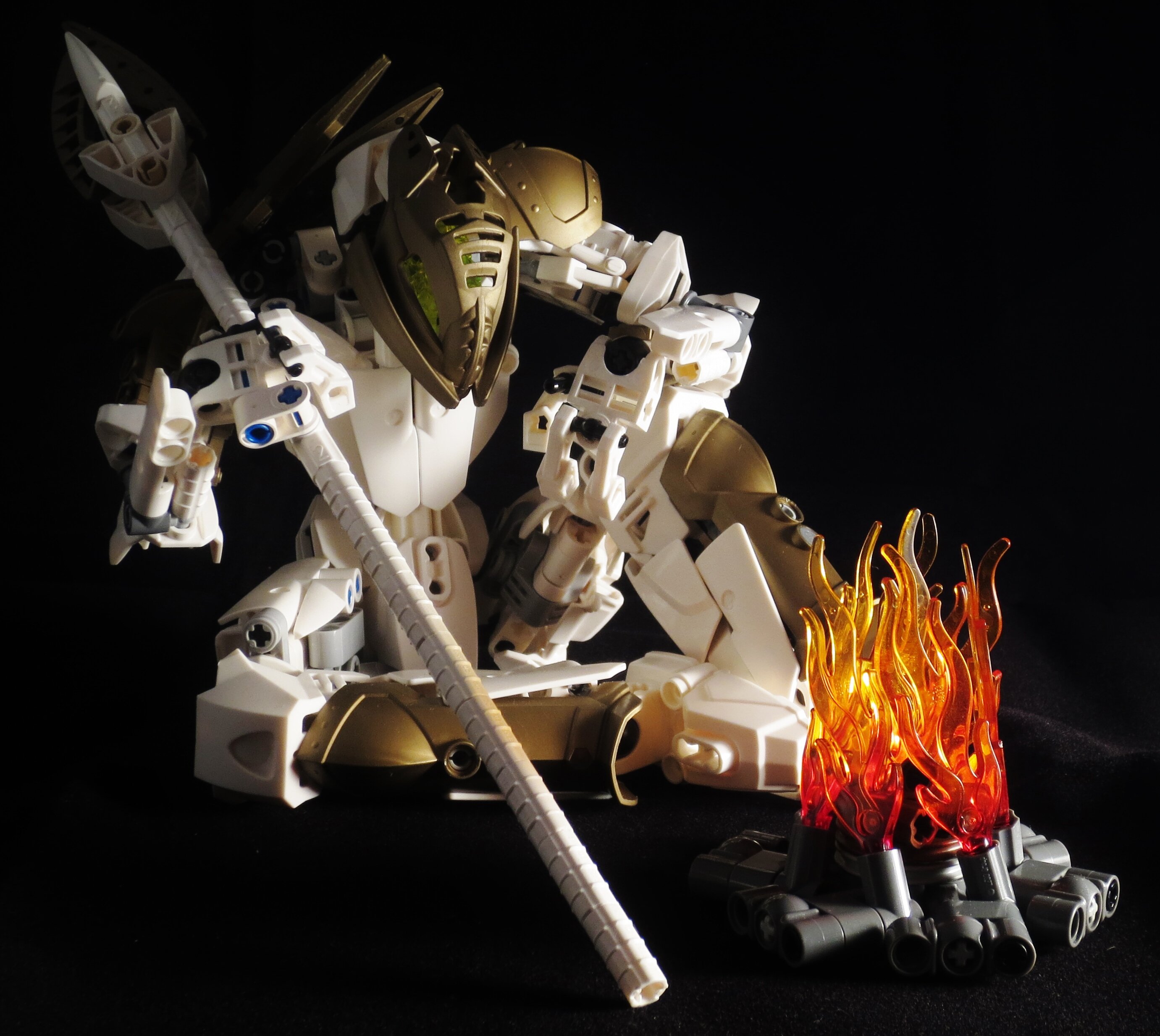
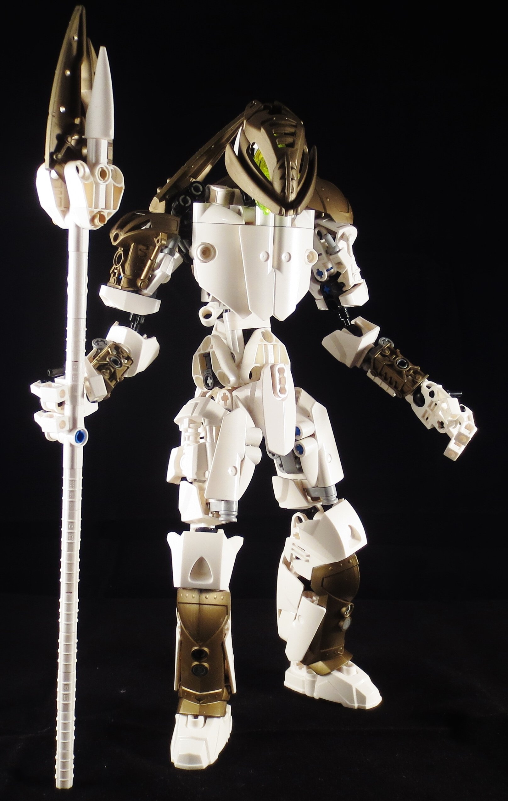
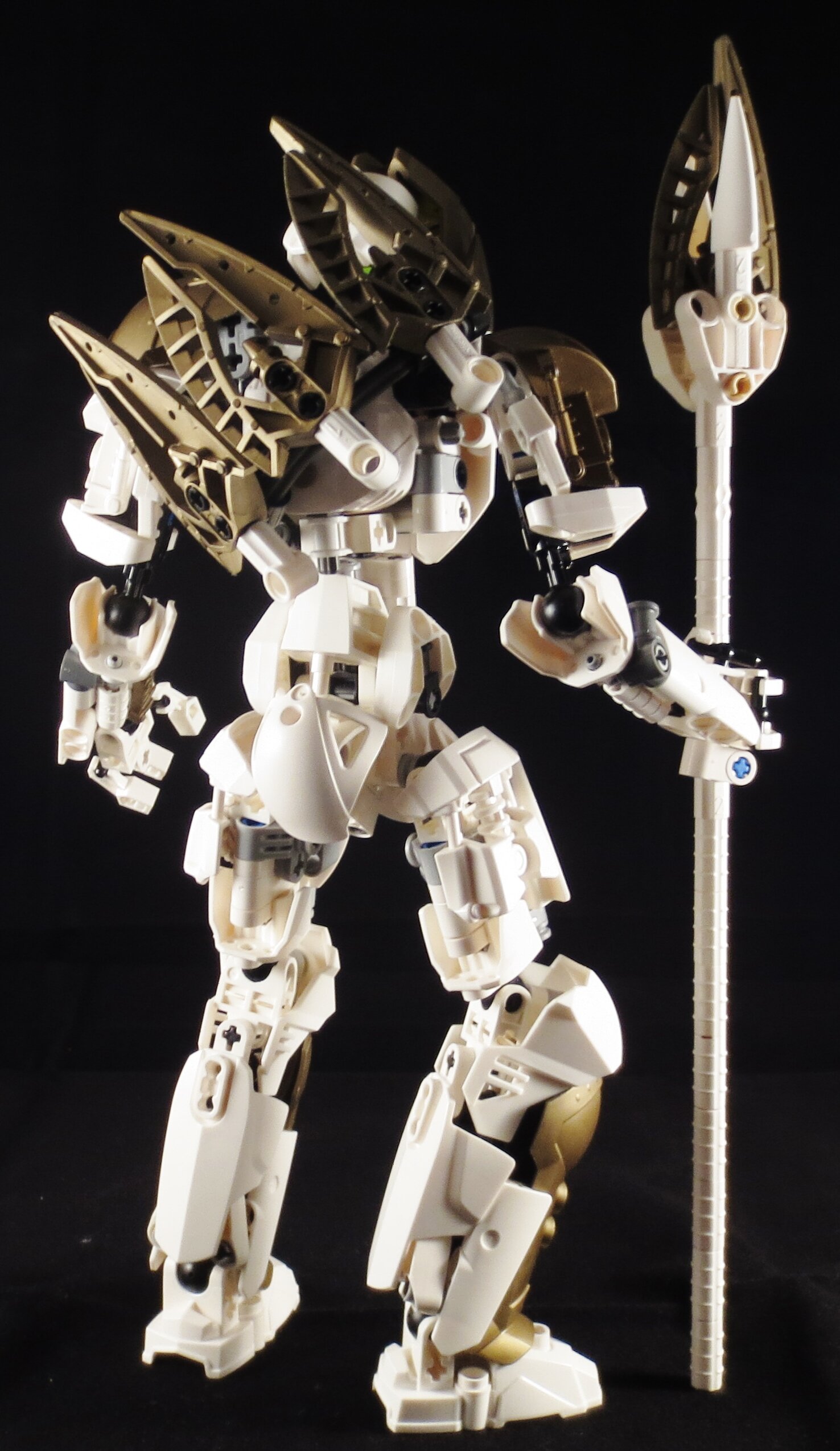
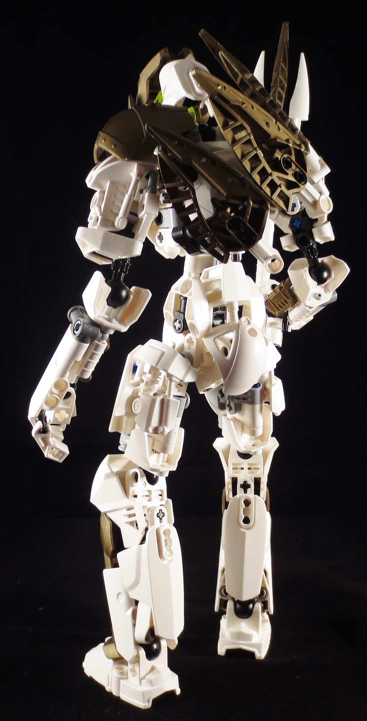
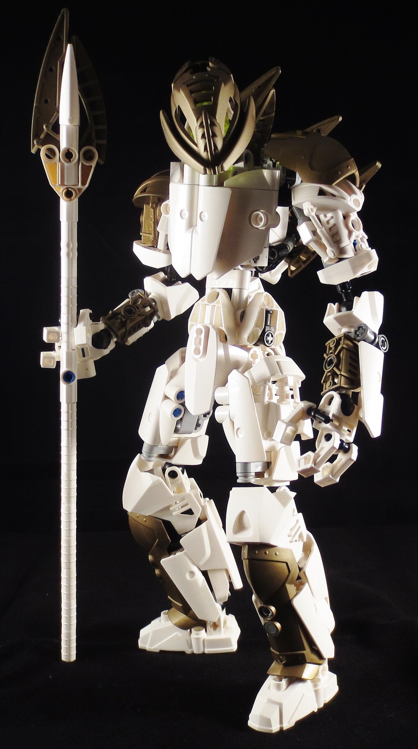
Tarak the Sullen of the Divided. Protector of the sanctum, who refuses to collaborate with his companions. He constantly seems lost, both in thought as much as life. He was given the mask of shadows discovered in the Sunken Forge, which turned him into his current downcast state.
Despite their unkown origin, the base and protective presence of the Divided attracted matoran, forming a small community, now known as the Sanctum of the Divided.
Please don’t tell me how he looks like that AU Teridax. I realised that very late in the process.
Anywho, Tarak is my first moc of the Divided, a ragtag group of characters in the desolate land of Maanos in my new storyline. I have atleast 3 other characters planned, if not more.
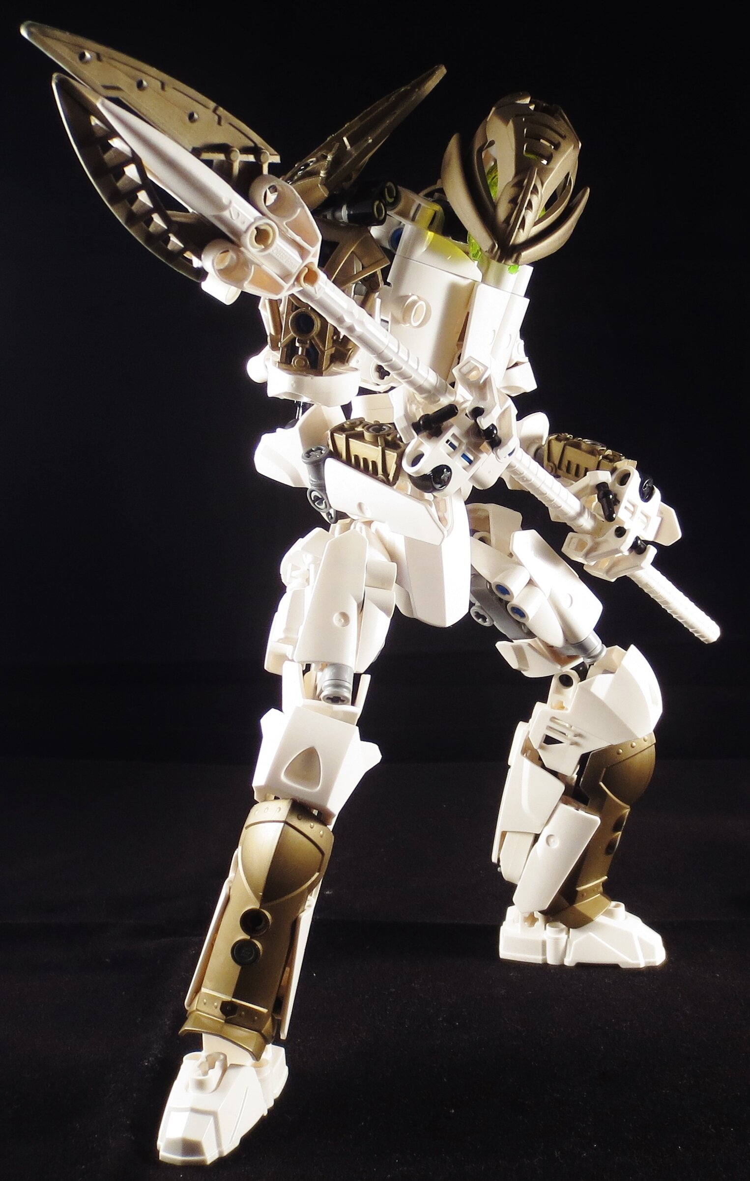
He has one of my most complex designs in a while. The lower legs have a lot of tension going to keep everything in place and the thighs are very experimental, but quite functional. I love 'em. The lower arms are also a bit of an experiment inspired by Oblivious521’s Syraelle, though I went for more bulk.
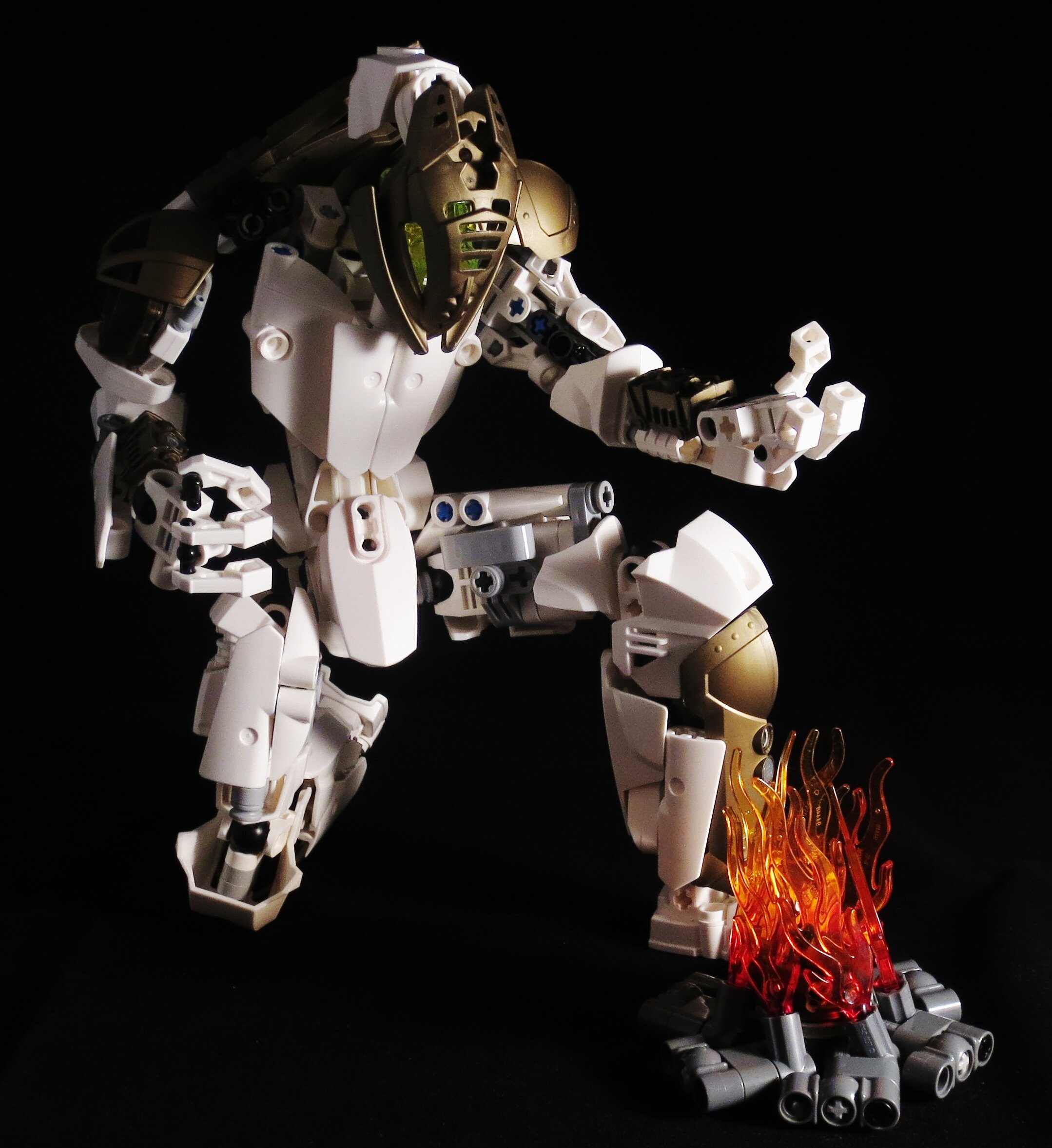
I built the campfire as a prop, since I figured it’d be nice to have a theme of sorts at the next exhibit in 2 months. I’m trying to go for warriors sitting around a fire doing whatever. For extra authenticity I threw a couple of brown axle connectors into the flames as firewood.
Comments appreciated. For the sake of constructive criticism, give me something positive before you slap on the negative, otherwise it’s demotivating. Positive->negative->suggestions is a good guideline that I personally use.
alright
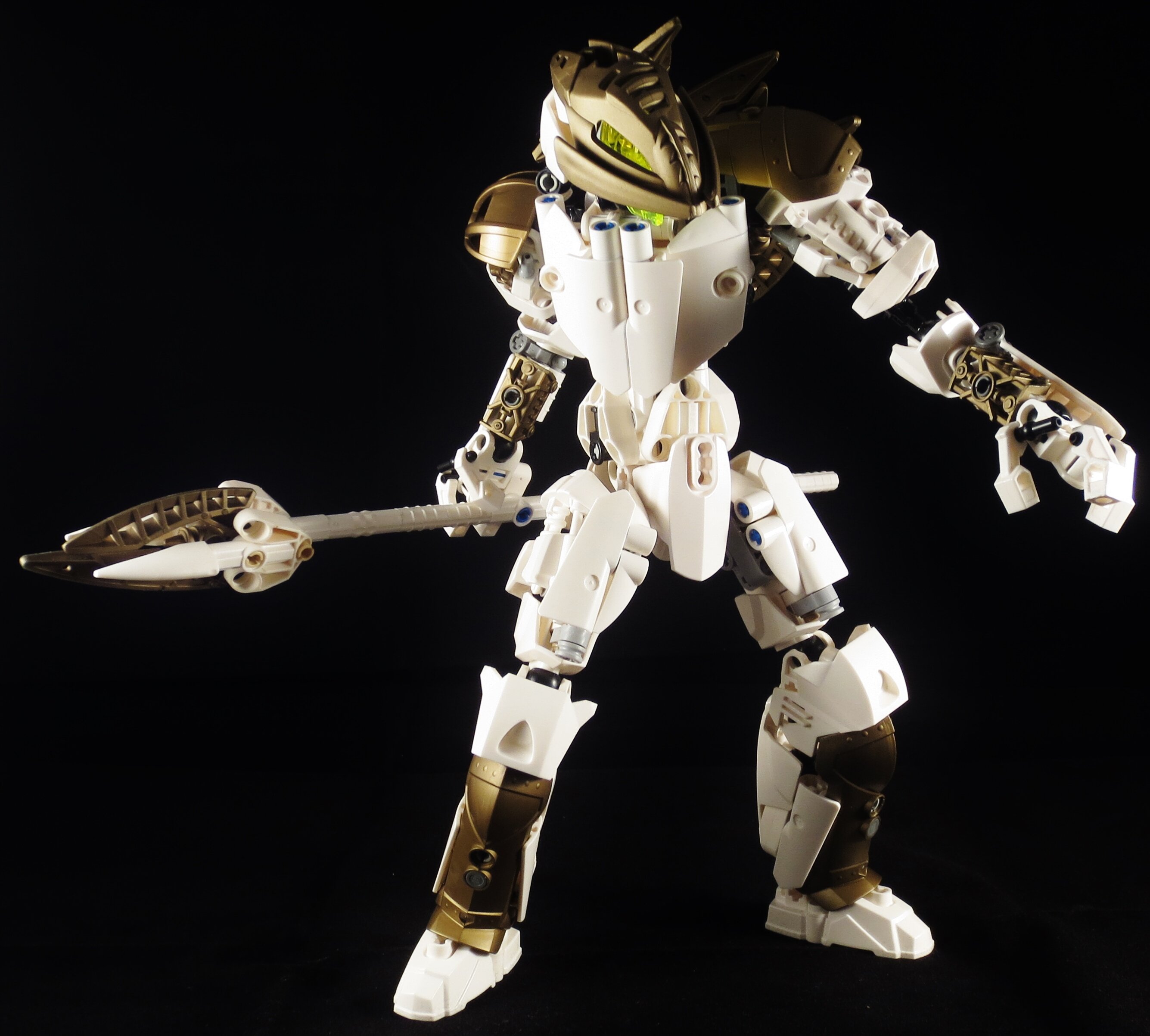
I love the colorscheme and the build, I also like how poseable it is → on the other hand, I dont really like how smooth the chest is, the head is also weird (the ttans green piece) → I would try adding a little bit more texture to the chest, and try something like this for the head
overall I like the moc, but that’s no surprise, I love every moc you have made so…
I do really like moc although that could be my soft spot for the mask of shadows. I do feel the eyes are a bit lacking and not really overly visible in several pictures. So like the above post would suggestion a custom head.
Allow me to plug my own eye design
That’s a actually a good one, think I’ll mod it a bit though.
Edit: I replaced the socket with a balljoint and swapped the shell to a size 4 tr-green one. Figured it holds a bit better. Surprisingly I have no tr-yellow size 4’s, hence the color swap. I don’t think they ever made those, actually =l
I’m always a sucker for old gold, works pretty well in this case, although yeah i definitely agree a different custom head behind the mask or at least a different eye colour would look a lot better
The thigh armour looks pretty good, you made it look like it’s supposed to be there. I do agree with @star-lord that the chest doesn’t have enough texture. Is the Nuva shoulder armour on his lower back support for when he is sitting? Because it feels out of place a little bit.
All in all great MoC!
Oh yeah in the two years since i made it ive modified it with a ball joint instead of a socket. I would suggest using a 4 long axle instead of the 3 that is depicted in the old pictures. I will take the idea of using a 4 long shell as i used to and cant remember why i stopped.
That was the best choice from a group of bad options. His butt is a mata foot, so I weighed a lot of options on how to cover it, including a tail, skirt armor and ccbs shells. None of them looked good and hindered his ability to sit, which allowed his lovely pose in the first picture. The smooth shape made it more armor-like, which fits his knight-like theme.
For that same reason I personally think the smooth chest suits him better, it’s more armor-like and fitting for a knight, and matches the smooth shaping elsewhere. I did think the larger panels alone looked odd, which is why I broke that shape with the two smaller chest panels.
I’m pretty much telling the Divided story Dark Souls style. A bit of info, a bit of lore and maybe a quote.[quote=“Omega_Tahu, post:16, topic:38856”]
The upper chest looks too big and flat, and the shoulders seem to be set way too low.
[/quote]
I personally like the chest. It looks like an armor plate, which suits the knightly appearance.
The shoulders are pretty much at a realistic height, though admittedly they do lack bulk upwards. The shoulder pads or the shoulder joints could be one stud higher, but then the pauldron wouldn’t work.
But it’s a large piece of plain flatness when the rest of the moc is full of texture.
The shoulders should be one stud higher, maybe even two. They normally are level with the top of the body, before it transitions into necks and stuff. And I’m sure you could figure out a way for the pauldron to work.