Better late than never! I originally aimed to enter these about two weeks ago, but thanks to a combination of boring life stuff and good ol’ procrastination, I never got around to finishing them until last night.
My overall goal for these was to make them as cohesive with Norik and Iruini as possible, and to my mind’s eye, that meant having them share builds with one another. If you care for more reasoning on this, for a real life explanation, I remain convinced that that’s how it would have been done in 2005 had we gotten the remaining four Hagah. As for an in-universe explanation, the way I see it, their armor is their uniform, metallic and non-metallic alike. Even though the Hagah came from all over the universe and would reasonably look different from one another, the Makuta gave them new metallic masks and armor to designate their new jobs as elite Toa, so it makes sense the rest of their armor would be refashioned to make them resemble more of a singular unit.
As an extension on this uniformity of theirs, if I’m completely honest, I had half a mind to give the remaining four matching spear tips based on if they shared a build with Norik or Iruini, but I figured that level of extremism might push it for some people ![]() . I also purposefully avoided using Rahkshi spear tips for them, just to make their Hagah and Rahaga forms more distinct. Additionally, I tried to keep as many pieces as possible in existing colors, although it’s debatable how well that worked out in practice.
. I also purposefully avoided using Rahkshi spear tips for them, just to make their Hagah and Rahaga forms more distinct. Additionally, I tried to keep as many pieces as possible in existing colors, although it’s debatable how well that worked out in practice.
(I realize that the entry poses of these guys may not be as dynamic or interesting as possible, but as a complete newbie to Stud.io, after a point it felt like I was banging my head against a wall trying to get them posed, so if that costs me some votes, then so be it ![]()
![]() ).
).
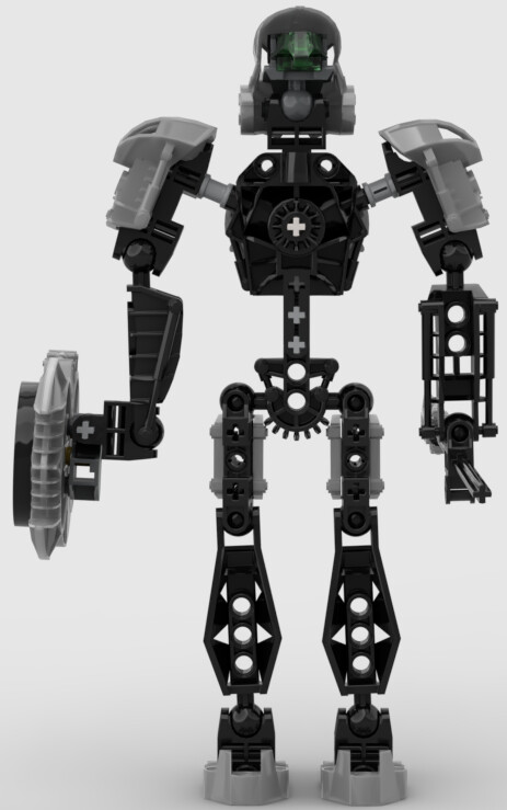
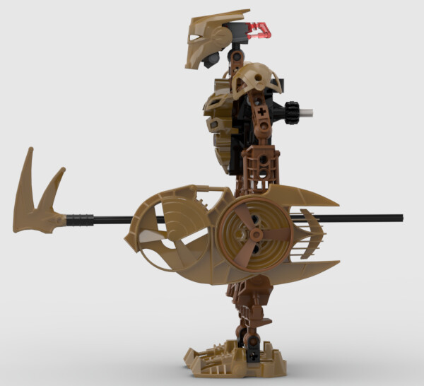
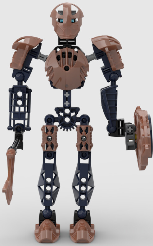
Bomonga
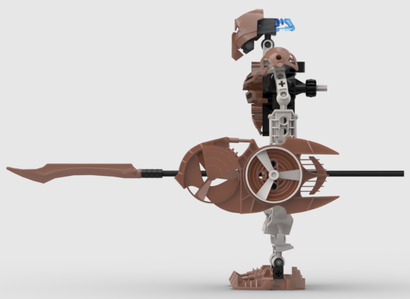
Bomonga might be the most controversial one here, solely because he’s a tall Toa of Earth. Originally, I was planning on making him share a build with Norik since Bomonga is the Hagah’s deputy leader, thus retaining a typical Earth Toa’s height. But, because I wanted Bomonga’s metallics to be silver, and how I laid out the metallic color schemes, that meant that Bomonga necessitated being Iruini tall. And you know what? I think it kinda works. If nothing else, it sets him apart from most other Toa of Earth. As for why I wanted him to be silver, well, it’s all Norik’s fault for having silver as team leader. Essentially, I’ve headcanon’d it that silver protodermis is the “most valuable” metallic protodermis (like how gold is in our world) since that’s the color of Energized Protodermis, and that’s why, as team leader, Norik would wear silver armor as opposed to more-expected gold armor. And thus, as team deputy, it would follow that Bomonga would likewise wear the “most valuable” metallic armor. It’s ridiculously convoluted and stupid, I know, but that’s my headcanons for ya
As for why I went with the Huna, I wanted to choose masks that had generally smooth surfaces, in order to give customizers an easier time painting masks, should any of my entries win. In the eleventh hour however, I did consider giving him Lhikan’s Hau (which, might I add, looks fab in silver). But, while I’m sure one of the Hagah would have worn that Hau had the other four been produced at the time, I ultimately decided against it for two reasons: to avoid potential confusion about whether Bomonga wore that mask in honor of Lhikan, and to keep that Hau as the more regional (and in my mind rare) form it is. And honestly, I don’t think the Huna looks too bad when paired with that Gahlok-Kal shield piece. Meanwhile, the rational for the Kopaka blade being the spear tip is that that piece actually exists in the correct shade of silver, although I will fully admit it might be too long.
Additional Images
Stud.io File: https://drive.google.com/file/d/1IBeJkoIFT92-5GkVJph5nzxCjvNEeIXL/view?usp=sharing
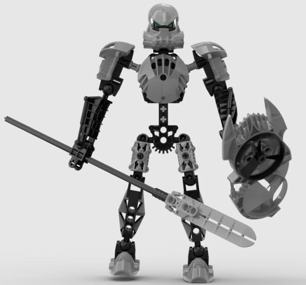
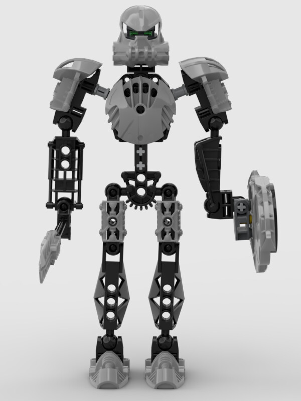
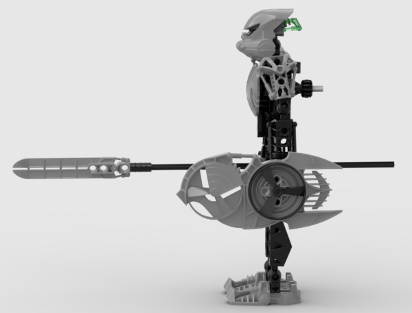
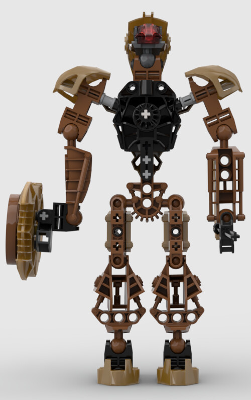
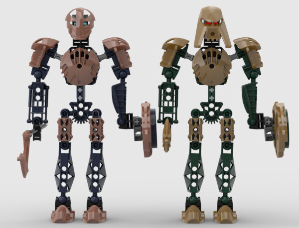
Kualus
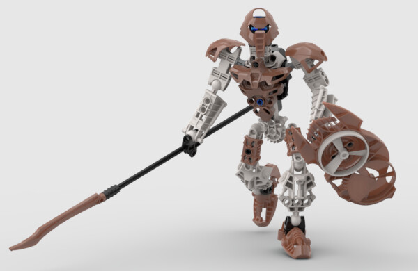
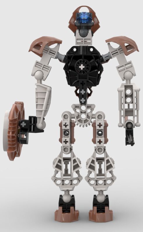
Being my favorite of the Hagah, I initially planned on only entering Kualus, but upon finishing him, I decided that I’d might as well round out my version of the team. Kualus was also the one that went through the most design changes. Namely, changing his mask, spear tip, and metallic coloration. I also wanted to give him a Pohatu-style torso for the longest time so he could have some leg kicking action, but I ultimately couldn’t come up with a design I liked in that regard. As for choosing the copper metallic armor for him, I think that the copper-on-white looks quite nice.
As for his mask, I chose the noble Huna simply because it already exists in copper; it’s a preexisting mask that wouldn’t necessarily need to be customized in terms of colors. Realistically, I don’t think the designers would have used pre-2004 masks for the Hagah, but I’m willing to break my own rules in this regard simply to reduce the need of customizing. That said, I am cognizant that the spear tip, while coming in copper, is a different shade of copper from the mask in real life, so recreators would need to reconciliate the two in some manner (and to add to this, the copper in Stud.io matches neither shades of copper the pieces were actually released in, so… sorry). And in another eleventh hour decision, I considered making his mask a Faxon, partly because I think that mask compliments nicely his mask’s actual powers, and partly in reference to this semi-canon/apocryphal/fanon story where Lesovikk and Kualus meet. However, partly to avoid confusion about whether Kualus was actually honoring Lesovikk, but mainly due to Stud.io and Biopack’s lack of the Faxon piece, this idea was quickly nixed.
Additional Images
Stud.io File: https://drive.google.com/file/d/1tfh1qScJ4FszYgoosNwt88KCsQVyTP5m/view?usp=sharing
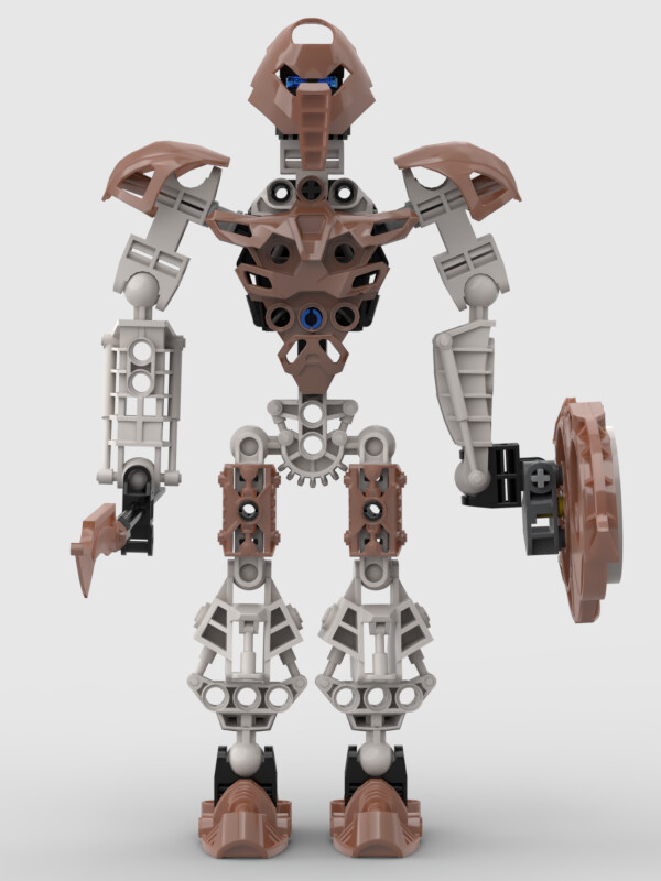
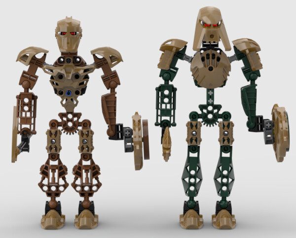
Pouks
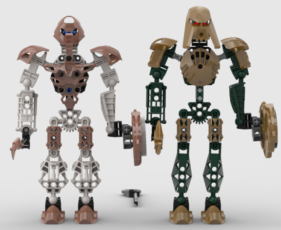
If you had asked me while I was initially designing him, I would have told you that Pouks received the short end of the stick. Being the last one I designed, he basically got design concept leftovers (ie, body-type and metallic colors). But now? He’s rather grown on me. The shortness works, considering he’s a Toa of Stone, and the metallic gold I go back and forth on whether I like or not in combination with the brown, but at the moment I think it works, especially since he utilizes the Metru-toran chest piece.
The mask I was a little dubious on at the start, but I think it looks quite nice as well now. If nothing else, to me I like the parity of a mask that emulates another’s powers having the form of a mask that emulates another’s appearance. The spear tip I also wasn’t convinced of at the start, but now I like to imagine that the top spikes are useful for rock climbing and other similar activities (just don’t ask me how you rock climb with a huge honking staff ![]() ). Finally, the eye color he was locked into thanks to extenuating circumstances (see Gaaki’s profile for more on that), but I think it works, if for no other reason than as a reference to how the Stone types had red eyes in the MNOG+ stuff.
). Finally, the eye color he was locked into thanks to extenuating circumstances (see Gaaki’s profile for more on that), but I think it works, if for no other reason than as a reference to how the Stone types had red eyes in the MNOG+ stuff.
Additional Images

Stud.io File: https://drive.google.com/file/d/1pT3_AshplhcjdG9e11QDs26qPLZeNWMI/view?usp=sharing
Gaaki
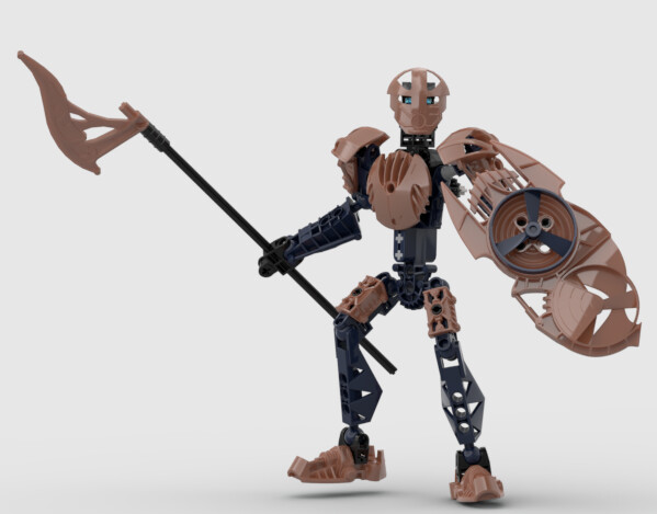
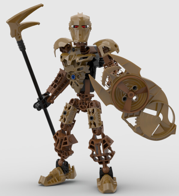
Gaaki is the one I have the least to talk about. Copper was chosen for her because I think it looks quite nice on the blue. The noble Komau was chosen meanwhile because it was one of the two preexisting copper masks, and because the Komau’s powers somewhat work with her Mask of Clairvoyance. The spear tip meanwhile, while not existing in copper, I think does look quite nice in copper, and has a general aesthetic that I think works with Water types.
So, the eye color! Some people may have noticed that the eyes don’t always one-to-one line up with the precedent for eyes established with the Metru, Metru-toran, and Hordika. The reason for that all has to do with Iruini, who uses the neon-orange eye piece otherwise reserved for Water types during this era. I did consider simply using the red eye piece for Gaaki and being done with it, but I have a feeling that the upcoming Tuyet contest is going to use a lot of red eye pieces, and I wanted to avoid having that piece on another Toa of Water, especially one that isn’t evil. So I did some rearranging, and came to the current layout, with Pouks, Gaaki, and Kualus having different eyes from their counterparts. Pouks I already commented on. Kualus with the dark blue isn’t that far from the light blue of the Metru (and matches the dark blue of the Mata, Turaga, and Nuva). Gaaki meanwhile I like for the contrast between the dark blue of her armor, and the light blue of her eyes.
Additional Images


Stud.io File: https://drive.google.com/file/d/1WOH05fuU7am5zE5iiPhdUKpc5Cs9Xkjp/view?usp=sharing
These were all made in Stud.io. All pieces not found in Stud.io (such as the masks, Metru gearboxes, and Rhotuka Shields) all originate from the Biopack, with full credit to those creators.
Permissions:
I give consent for my mask to be altered in the final group art if the artist chooses: Yes, on the condition that it is done so to avoid more than one Toa wearing the same mask, and that the new mask is not based on a preexisting 3D printed mask.
I give consent for my metallic color choice to be altered in the final group art if the artist chooses: Yes, on the condition that the change is only done so that the group retains a balance of metallics, with balance being considered as groupings of 3-3, 2-2-2, or 1-1-1-1-1-1.
I give consent for my spear tip to be altered in the final group art if the artist chooses: Yes, on the condition that it is only done so to avoid more than one Toa using the same spear tip, and the new spear tip is not based on a preexisting 3D printed piece.
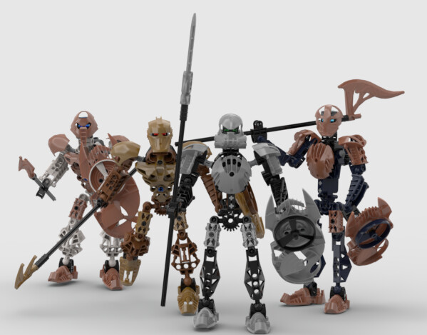
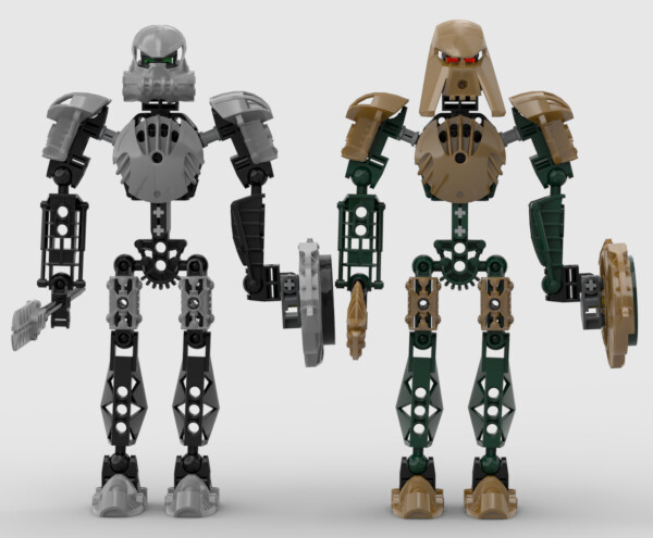
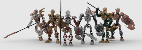
If you’ve made it this far, thanks for checking out my topic! I realize they’re not as insanely complex or unique as some people might prefer, but I’m quite happy with how they’ve turned out, regardless of whether they do well in the polls. And seeing how this will probably be the only one of these contests I enter, I’m extremely happy to be involved at all in them. As a bonus, here’s some group photos!
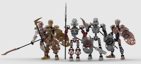
And, entirely to make @Willess12 happy, here’s the Hagah, minus that one loser who quit:
Good luck to all the entrants, and happy voting to everyone!

