I decided to go with the comic book style from the issue #25 released in 2005, as that was my first real exposure to my favourite Toa team ever. As such I have tried to be as faithful to the comic style as possible. I also decide to go with a 3-3 metallic colour scheme as I like the uniformity, Kualus been changed to gold and Pouks to silver.
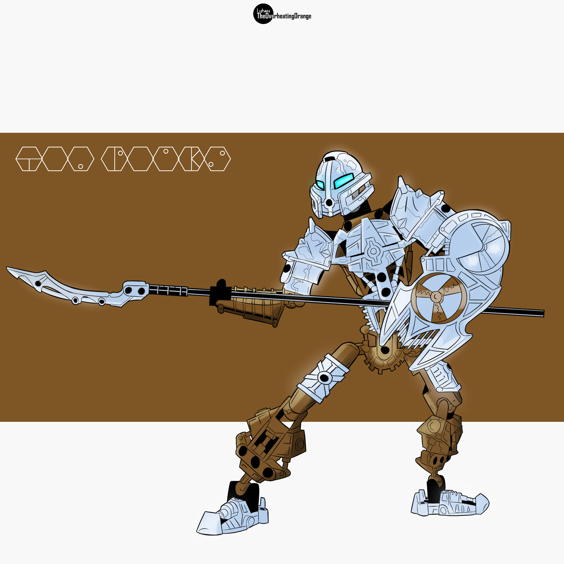
Norik & Iruini
There is no real reason to change these two, so here they are as they appear in that comic.
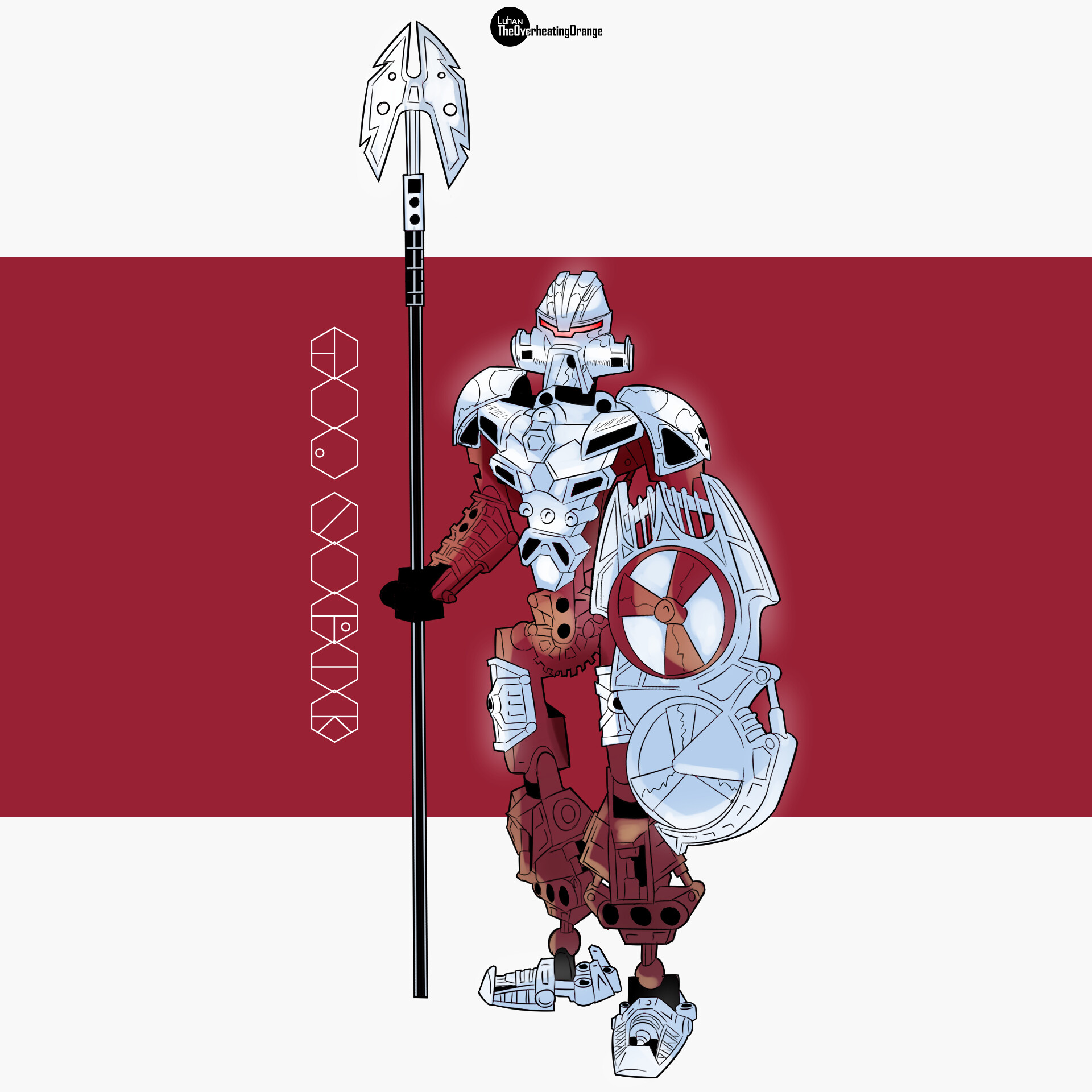
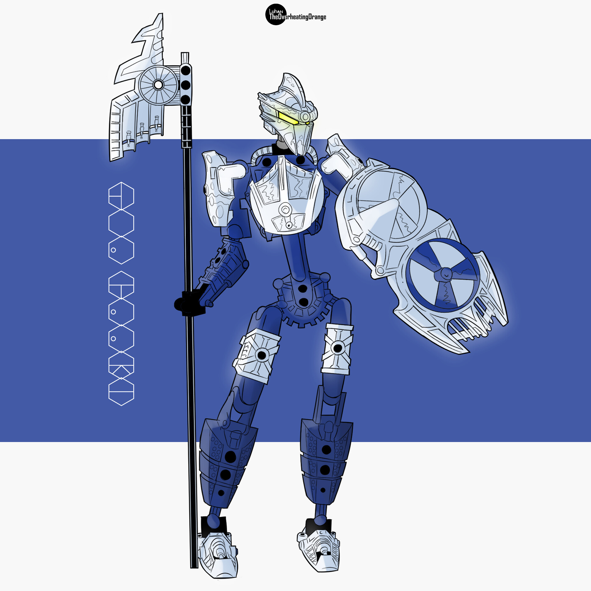
Pouks
Pouks was the first one I started in this drawing and was the sort of basis for the others. his spear tip changed to a Small Weapon Blade Hewkii Mahri / Solek (57543) and his colour metallic changed to the flat silver we see in Bionicle sets from 2002 to 2005. I was going to change its mask, but I grew to like the mask choice of the original Moc.
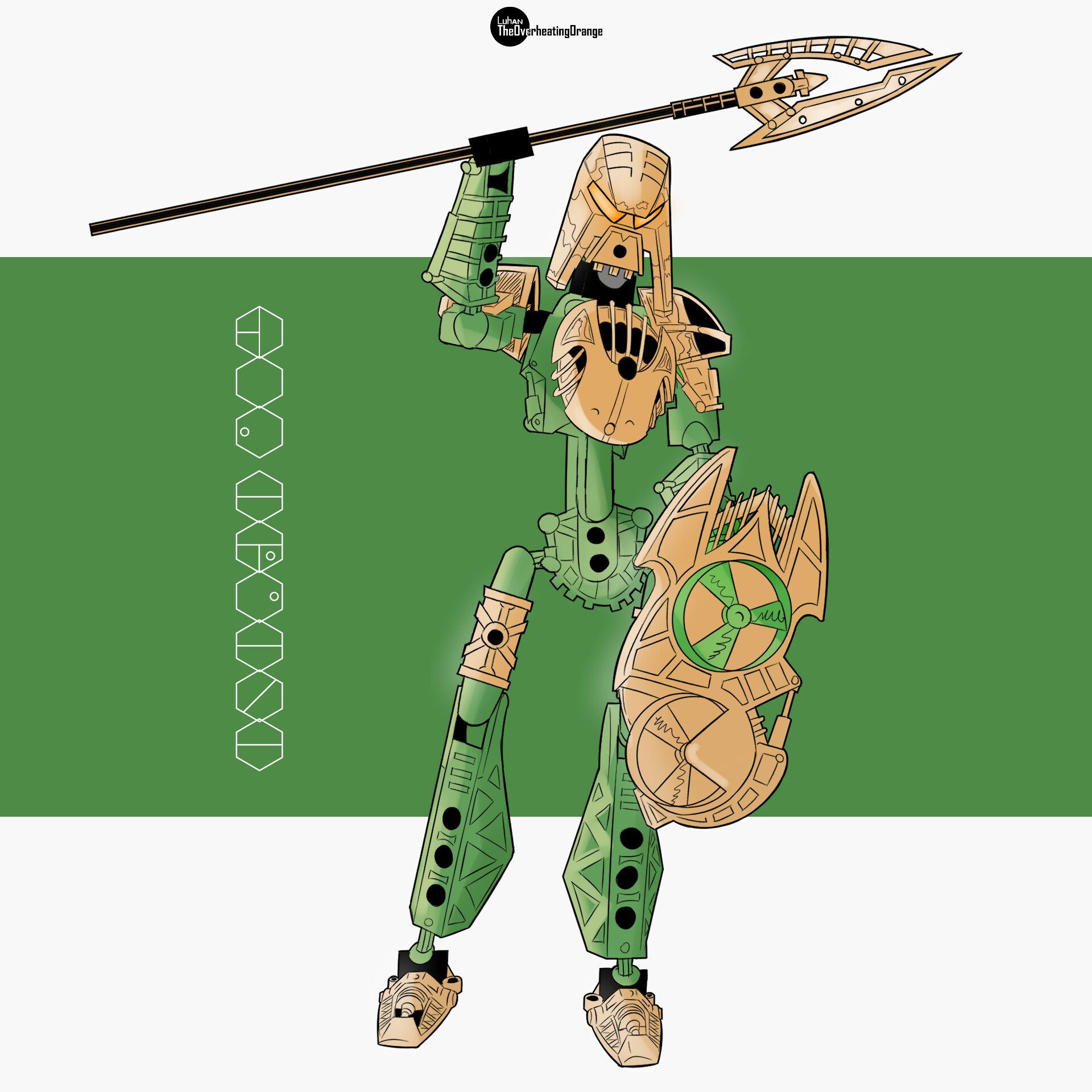
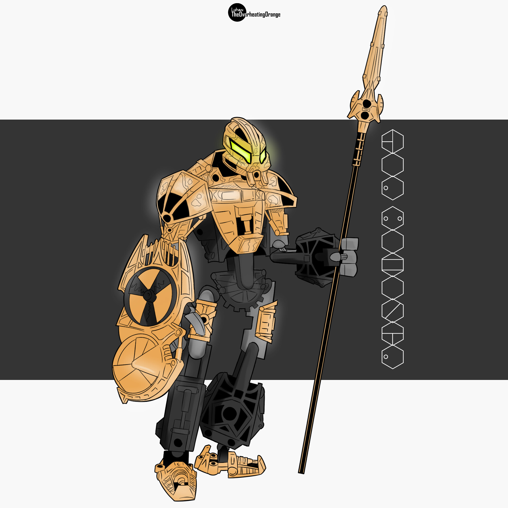
Kualus
Originally I was going to keep this metallic blue but I changed his colour to the gold from 2002 to 2005 because i wanted to use parts available in the real world. So my goal with Kualus became to make him more builder friendly colour wise.
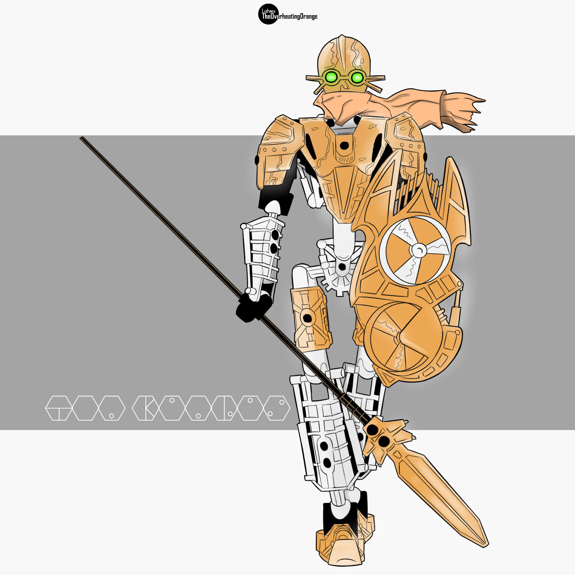
Gaaki
Gaaki what is the most difficult out of all of the Toa Hagah in my opinion as I tried to find a style with her I really liked. I ended up changing her mask too Galva rendition of her mask (link will be below) as I felt it did fit the character rather well. On top of that the spear tip was also changed to Weapon Axe Blade / Glider Wing (19089I) decided to do this not because I didn’t like the original Moc’s spear tip but more because of the part availability on that piece and to make it easier on builders, so I changed it to something similar in size, style and weight.
Thank you for having a look at my rendition of the Toa Hagah, I really hope everyone likes my contribution to the Hagah Art Contest and any feedback is always welcomed!
Finally, someone who isn’t afraid to make my ice man gold. Your style has a flashy charm to it and I love how you drew Bomonga! This is getting my vote
The more I look at this, the more I love it! You nailed the classic style, and the color combo actually works a lot better than I thought it would… I’m definitely torn on the issue now
Surprisingly, I believe this is the most purist entry so far. Only two (right?) official parts need painting. You may have me convinced on a 3-3 ratio.
I can’t say I’m too fond of the changes made to Kualus’ and Pouks’ armour colours, or Gaaki’s new spear tip - at least compared to what the original models used - but that aside, I really like the style you’ve gone for here and I could easily see this doing well in the contest. Best of luck!
I’m not a fan of the 3/3 split at all, but personal preference aside this is some good art. Definitely nailed the comic style better than any entry so far. Good luck!
Nice work, though I’m still not convinced about a 3-3 color split. I’m a much bigger fan of some of the 1-1-1-1-1-1 color splits I’ve seen, I just love the diversity it gives the team. Regardless, this is an excellent piece of artwork, great job, and good luck!
Well, you’ll definitely get the vote of the people who want a 3-3-3 split, unless someone else does one. I’ve been hoping we’d get at least one. Surprised you made Kualus gold and not Gaaki, but I can see why if purity was your aim.
Definitely has my vote.
but it probably won’t be allowed because kualus’ scarf is like 2 degrees off from the correct shade of tan
I know the Kalmah foot on Pouks’ chest is one, what’s the other?