Toa Chiara MOC

Other Views


This is my take on Toa Chiara.

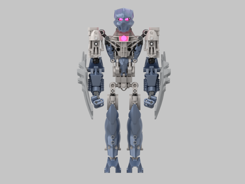
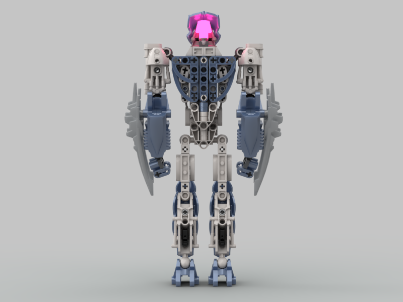
First things first, credit to @Kodiak and bobthedoctor for the claw weapons; I’m not quite sure who came up with it first, but both MOCs inspired me to use the same weapons here. The way I’ve implemented them on her forearms, I figure that they can also act as shields/additional armour.

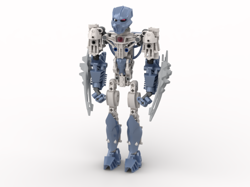
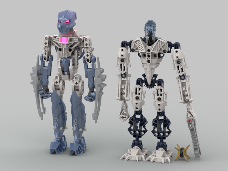
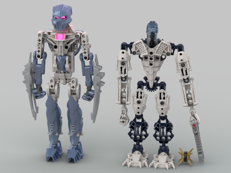
Since Chiara appears alongside Gelu in The Yesterday Quest, I made her Inika scale. Even in that scale, she’s still pretty tall:

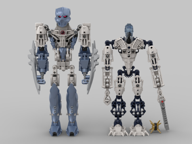
Her height was an intentional decision, though I’m wondering if it’s currently a bit much.

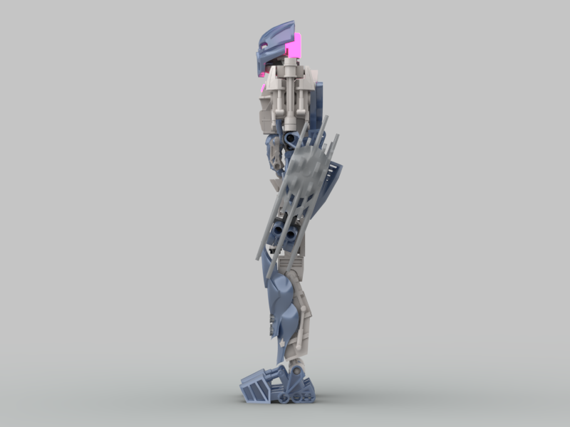
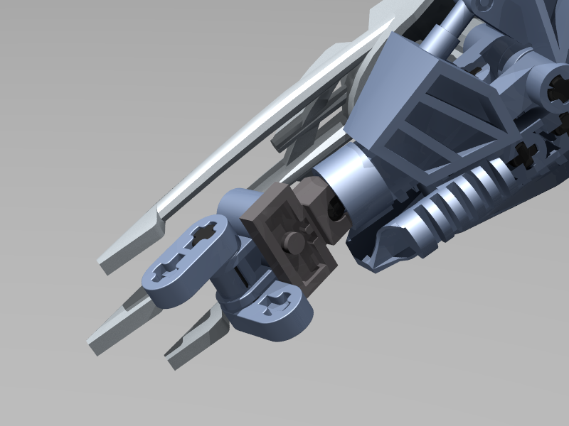
The MOC uses white and metal blue for the colours, concentrating the blue in the forelimbs. With the standard “hand” piece not coming in metal blue, I decided to try custom hands with rudimentary Mata-hand-style fingers. I wouldn’t call them poseable, but she’s capable of pointing to things:

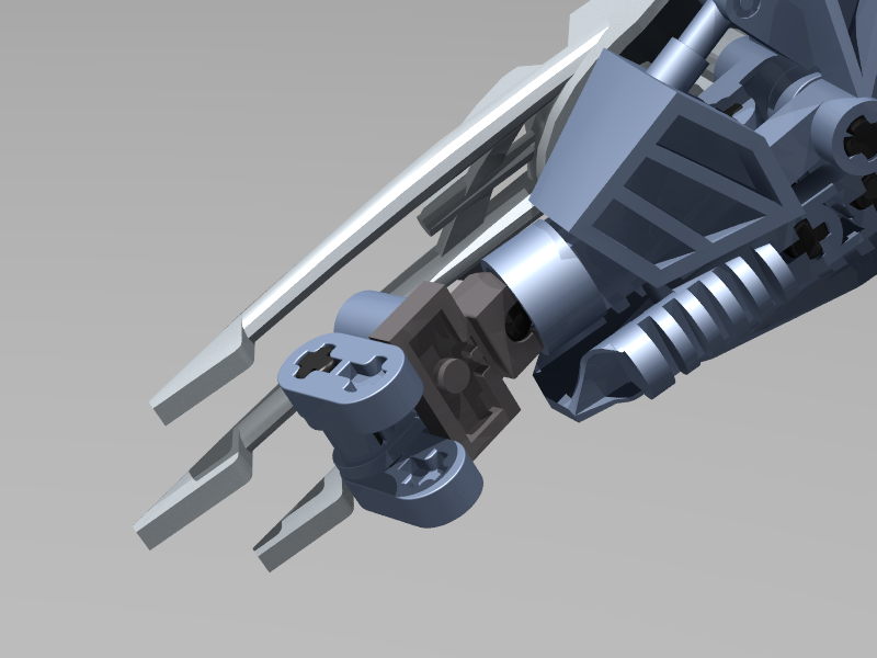
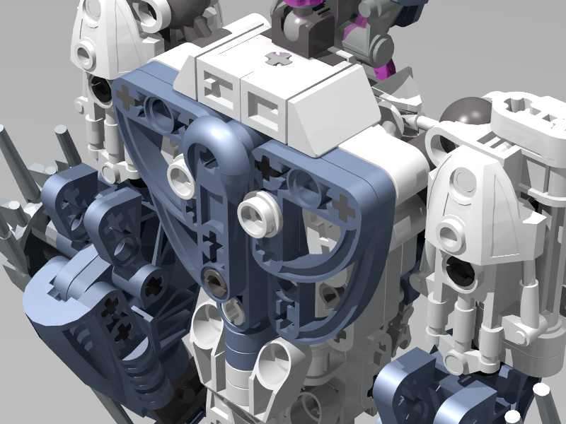
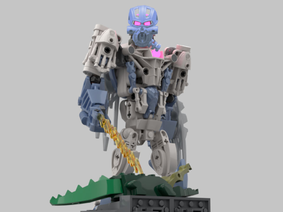
Finally, she is capable of storing her tools on her back, though the connection is really unstable, with the weapons connecting to loose pieces in her shoulder blade area:

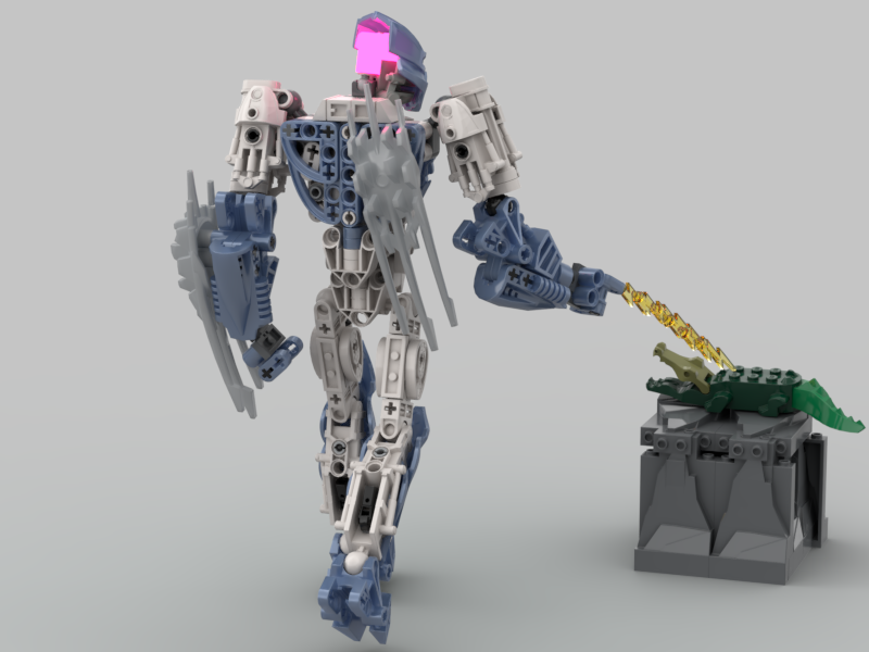
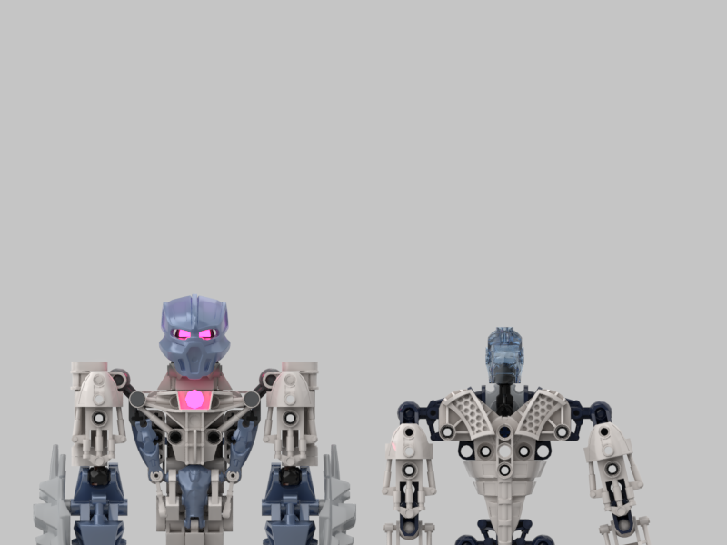
One of the things I’m unsure of is the mask; I think the metal blue looks better, but white would probably be easier to do physically.

In addition to the mask, there’s already a few changes I have in mind. Most obviously, the shins are placeholders; I’d like to use the Knight’s Kingdom shins once I can get a file.

The other thing that I’m on the fence about is the Super Battle Droid arms on her chest; on the one hand, they do wonders for the torso shaping; on the other hand, I had thought it might be neat if her “abs” were the only blue on the front of her torso. (Plus the arms run around 15 USD each on BrickLink.)

  • Mask colour?
  • Too tall?
  • Droid arms on chest?

Credit to Khingk for the stand-in Volitak used in all of the images besides the first one; for that one, credit to bobthedoctor for his Nidhiki MOC that I pulled the Volitak from before editing it into the image.

25 Likes

It looks pretty cool, and it’s an interesting take on the canonical color scheme of Toa of Lightning.
But the legs
GAH the clipping

6 Likes

Looks a bit top heavy for a female Moc (Not that female MU inhabitants have to closely follow typical shaping) The hands are clever. The thighs are very small compared to the large body and the lower legs. The clipping down there is an obvious drawback. But overall it is a nice start, the metallic blue is a good choice and the the mask is nice. I think it is bit too big at the moment.

2 Likes

Metal Blue Chiara is the way to go, @Lamentte’s WIP shows that, but she could use a lot of work.

First off, yeah, she’s top-heavy, and while that’s not a gender issue, it is just a general issue with her look, and could either use less bulky arms or more bulky legs.

Secondly, the legs’ slimness isn’t the only issue - the general lack of smooth texturing doesn’t work with the Knight’s Kingdom shins, at least not without some more work on the rest of her body.

EDIT: Also, the color layering is a bit off - it at first looks like white-over-blue, but her legs are blue-over-white.

4 Likes

I think she looks great!

1 Like

I agree that the droid arms on the chest look out of place.

1 Like

Looks a bit beefy for my interpretation. I could see Marender being built like this though

2 Likes

“You think your life is hard? I’m a Toa of lightning wearing size 13 kanohi. Men’s size 13 kanohi”

Legs:

  • I can’t imagine a way for the KK shin armor to attach nicely on the hordika leg, without sticking out awkwardly. I recommend switching them out for rahkshi, piraka, or metru shins.

Torso

  • The size of the torso can probably be reduced while maintaining the abs, to an extent
  • The back is quite bare a flat. Adding a rahkshi foot or bohrok shield would armor it up sufficiently, though.
  • Some armor pieces are attached with a single bar connection. More secure connections would be ideal.

Arms

  • The shoulders are very square. Maybe you could add some nuva shoulder armor in white, or some other armor piece to round it out a bit.

Overall it’s a good start. The color scheme’s quite nice.
My biggest suggestion would be to just compress her down a bit.

5 Likes

this is good! the clipping of parts is a little distracting, but it should probably be easy to fix. keep up the good work! also rip lizard

2 Likes

Again, those parts are stand-ins. The final version will (hopefully) use the Knight’s Kingdom shins.

It actually works way better than you might think. I built it with physical parts for my Pouks almost a year ago, and they fit together super well:

(I wish I had a back view, but all the back views I can find use an alternate attachment method)

Hmmm, interesting. I was going for more of a thin, wiry build. That’s part of the reason for the thin legs that you mentioned. I guess I kind of lost the theme in the latter half of the build.

Funny enough, her thighs were originally really smooth, before I decided that they didn’t work with the rest of the build:

This also shows an earlier, thinner version of the torso, before I added the “armpit” armour. I almost kept it like this, but decided against it because it looked too blocky, and because the curved Technic liftarms on her back looked awkward. Could this thinner design maybe still work?

Quick fix:

Better?


As for the general feedback about ■■■■■■■■■■■, I think my current plan is to shorten the thighs by a stud, and redo her upper arms to be thinner. The torso is going to take a bit of work, but I might be able to bring it down by a stud as well.

I might also try to thin out the forearms, but I don’t have a whole lot to work with in terms of colour availability there.

EDIT: that censored bit is supposed to say “size / height”. That censor never takes a day off.

EDIT 2: Assuming that I’m able to take 2 studs off her height as planned, the height comparison looks like this:

A lot better, I think.

5 Likes

this is good

What in the world got censored here?

He was trying to say “size/height.”

It got censored because it has a certain four letters in a certain order. This site’s automatic censor is suuuuper sensitive.

1 Like

You really need to assess your sass or I’ll send an crass assassin to drop a glass bass on some grass during class.

To stay on-topic, Chiara here looks like she skipped leg day and it’s bizarre. This just doesn’t look good with the super-jacked proportions. The custom hands are super dinky and odd, and the shoulder articulation is pretty limited (trust me, that is NOT a good setup). Everything’s custom just to be custom and not to make the MOC…well, good.

8 Likes

Anyway, yeah, if her upper half is gonna be a brick, her lower half could use that bulk too.

I think this is really it - it feels like simpler solutions would result in better color distribution and shaping instead of the current mess where everything is overly complicated AND lacking cohesion.

4 Likes

Agreed here, it kinda looks like she skipped leg day.

I do like the over all design and asthetic though but yeah could use some extra bulk on the legs.

1 Like

ahem.
german profanity methinks is still profanity.

3 Likes

I like that most of the pieces she was made with exist in their colors. It’s almost actually buildable!

The legs… are sure victims of clipping lol I’m sure they’d look better in person.

Overall I like the moc. It’s clever and well-made, but something about it doesn’t really hook me. Maybe the white and sand blue doesn’t create enough of a color contrast? I’ll reserve my final judgment though, I’ll reiterate that this would probably look much better in-person.

Thanks 4 sharing!

1 Like

Proportion check:

First off, her thighs and torso have been shortened by a stud each, so she’s now much closer to Gelu’s height.

The other feedback I tried to address here was that either her legs were too skinny, or her upper torso was too big. I was aiming for a thinner build when I started, so that’s the angle I went for here; her shoulders are much narrower, and some of the bulk has been removed from her chest. (As well as the $15 droid arms)

I would have liked to keep the original forearms, but between the shortening of the torso, and the narrowing of the upper arms, they just looked way too big in every dimension.

I also made a version with the new arms, but the taller torso:

I kind of like the extra height. Is it too much?


Except for the mask, all parts used exist in the colours shown.

Those are stand-ins for parts that I can’t get in stud.io yet. The pins you can see clipping through are meant to attach the Knight’s Kingdom shins. If you look back to my previous reply, I included a picture of what the construction should look like.

Metal blue.

6 Likes

Yooo that’s a mistake on my part lol

Also I don’t like reading full posts haha my bad again